How to Make On-Brand Logo Presentation Boards With Nano Banana Pro
This guide shows brand designers how to build client-ready logo presentation boards in 30 minutes or less using Nano Banana Pro, with targeted prompts for lockup panels, color systems, typography samples, and industry-specific mockups. It includes troubleshooting for common AI issues like distorted logos and off-brand colors, plus a final checklist to ensure every deck feels polished and cohesive. Designers can cut presentation prep time from 4+ hours while maintaining strict brand consistency.
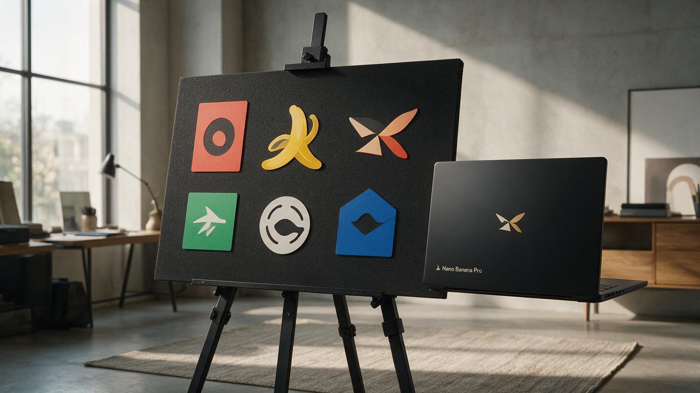
Table of contents
Skip the 4-hour logo presentation grind
After spending weeks refining a logo design, the last thing you want is to burn another 4 hours assembling a presentation board. Sourcing mockups, aligning lockups, matching color swatches, and formatting typography samples feels like tedious busywork—especially when you’re ready to share your work with the client.
Generic AI mockup tools cut down on time, but they often produce distorted logos, off-brand colors, and generic stock-style scenes that make your work feel unpolished. nano banana pro solves this with reference-based style locking and precise image control, so you can generate every component of a client-ready logo presentation board in minutes, not hours.
As an ai image generator built for creative professionals, it lets you lock your logo’s geometry, match exact brand colors, and tailor mockups to your client’s industry—no generic templates required.
What a client-ready logo presentation board includes
A great logo presentation doesn’t just show the final mark—it tells the story of how the logo works across contexts. A standard client-ready board should include these core components, each styled to match the brand’s personality:
- Primary, secondary, and icon lockups: Clean displays of every approved logo version, with clear spacing around each.
- Brand color palette: Primary and secondary colors with hex codes, plus monochrome and reverse (white) logo variants.
- Typography pairings: Heading and body font samples that complement the logo, with weight and size examples.
- Contextual mockups: 2–3 real-world applications relevant to the client’s industry (e.g., a paper cup for a café, a laptop screen for a SaaS brand).
- Clear space guide: A simple visual showing the minimum empty space required around the logo to keep it legible.
The best boards feel cohesive, not like a collection of random assets. Every component should share the same color palette, visual tone, and spacing system.
Prep your reference assets before generating
The key to consistent, on-brand results is having your reference assets ready before you start generating. Gather these four items first:
- Final logo files: High-resolution transparent PNGs of every lockup (primary, secondary, icon). You’ll upload these as reference images to lock geometry.
- Brand color hex codes: Exact codes for primary, secondary, and neutral colors. Avoid vague terms like “blue” or “warm gray”—use specific hex values for accuracy.
- Brand font names: The exact names of your heading and body fonts. You’ll add these to prompts, and overlay final text manually if needed.
- Brand personality note: A 1-sentence description of the brand’s vibe (e.g., “minimalist, earthy specialty coffee brand focused on sustainability”). This keeps styling consistent across all components.
Having these ready upfront means you won’t have to stop mid-generation to track down assets, and you’ll get more consistent results across every piece of the board.
Generate each component with targeted prompts
Instead of trying to generate the entire presentation board in one go (which often leads to messy layouts and distorted elements), build each component separately. This gives you more control and makes it easy to swap out pieces if the client wants changes.
Logo lockup display panels
These panels are the core of your presentation board—they show each logo lockup clearly, on a styled background that matches the brand. Upload your logo PNG as a reference image, and set the reference weight to 0.8–0.85 to keep the logo’s geometry perfect while letting the model style the background.
Use this prompt as a starting point, swapping in your brand details:
Minimalist logo display panel, primary wordmark lockup centered on a soft cream background, subtle warm terracotta accent border, generous white space around the logo, clean flat design, no text other than the logo, brand colors: #F5EFE0 (cream), #C8553D (terracotta), brand vibe: cozy earthy specialty coffee shop, high resolution, print-readyGenerate one panel for each lockup (primary, secondary, icon) using the same prompt and style seed to keep backgrounds consistent.
Color palette and typography panels
These panels show the brand’s color system and font pairings alongside the logo. Since AI can struggle with accurate text and exact color swatches, generate the styled background panel first, then add precise hex codes and font samples in your design tool (Figma or Illustrator) for 100% accuracy.
Use this prompt for a combined color and typography panel background:
Clean brand system panel background, left side with three empty circular swatch slots, right side with two empty text line slots (one heading, one body), soft cream background matching #F5EFE0, subtle terracotta #C8553D divider line, minimalist flat design, no existing text or colors, generous spacing, high resolutionOnce you have the background, drop in your exact color swatches and text samples in your design tool. This takes 2 minutes and guarantees perfect accuracy, which is critical for brand system deliverables.
Industry-specific contextual mockups
Generic mockups (like a random laptop or billboard) make presentations feel lazy. Instead, generate mockups that are specific to your client’s industry and business model. Upload your logo as a reference image with a weight of 0.85–0.9 to ensure the logo stays crisp and undistorted on the mockup surface.
Use this template, swapping in your client’s details:
Realistic mockup of a matte kraft paper coffee cup, logo printed on the front in terracotta ink, sitting on a wooden counter next to a small linen napkin, soft natural window light, shallow depth of field, warm earthy tones, brand colors: #F5EFE0, #C8553D, brand vibe: cozy minimalist specialty coffee shop, no other text or logos, photorealistic, high resolutionGenerate 2–3 different mockups (e.g., a storefront sign, a takeaway bag, a social media profile picture) to show the logo’s versatility across touchpoints.
Assemble the final cohesive board
Once you have all your individual components, you have two options for assembling the final presentation board:
- AI-generated layout: Upload a rough sketch of your board layout (or a simple text description) and use image-to-image to generate a fully styled board. This works best for initial concept drafts. Use this prompt: “Logo presentation board layout, 3 columns: left column with primary lockup and color palette, middle column with secondary and icon lockups, right column with coffee cup mockup and typography samples, cream background, terracotta accents, clean minimalist design, consistent spacing, high resolution”
- Manual assembly in Figma/Illustrator: For pixel-perfect control (recommended for final client deliverables), drag your generated components into a design file and align them to a grid. This lets you adjust spacing, add exact text, and make small tweaks without re-generating assets.
Whichever method you choose, stick to a consistent grid and spacing system. Align all elements to the same baseline, and use equal padding around every panel to keep the board feeling intentional and professional.
Fix common AI presentation issues fast
Even with great prompts, you might run into small issues. Here are quick fixes for the most common problems:
- Distorted logo edges: Increase the reference image weight to 0.85–0.9, or use inpainting to clean up blurry or warped lines. For best results, mask only the logo area and re-generate with the original logo as a reference.
- Off-brand colors: Double-check that you’ve included exact hex codes in your prompt. If colors are still off, upload a 1x1 pixel image of your primary brand color as a style reference to lock the palette.
- Generic, unoriginal mockups: Add specific, sensory details to your prompt (e.g., “matte kraft paper with subtle fiber texture” instead of “paper cup”). Avoid vague terms like “modern” or “professional” — they lead to generic outputs.
- Inconsistent styling across components: Use the same style seed and brand personality description for every generation. This ensures backgrounds, lighting, and tone stay consistent across all panels.
Final checklist for client-ready boards
Before sending your presentation to the client, run through this quick checklist to make sure everything is polished and on-brand:
- All logo lockups are geometrically accurate and match your final vector files
- Brand colors match your approved hex codes exactly (use a color picker to verify)
- Typography samples use the correct brand fonts and weights (add these manually for precision)
- Mockups are relevant to the client’s industry and feel true to the brand’s personality
- Spacing and alignment are consistent across all panels (use a grid to check)
- The clear space guide is easy to understand and shows the correct minimum spacing
- There are no AI artifacts, blurry lines, or distorted elements anywhere on the board
Keywords
logo presentation board, nano banana pro, ai brand design, ai logo mockup, brand presentation, ai image generator, graphic design prompts