Why AI Animated Poster Loops Blur Text (3 Fixes With Vidu)
AI-animated poster loops for digital out-of-home campaigns often suffer from blurry headline text, warped logos, and generic motion that undermines campaign effectiveness. This article breaks down three root causes of text blur in AI-generated animated posters and shares actionable fixes using Vidu’s image-to-video mode, including motion masking, targeted prompts, and reference-based sharpening. It also includes reusable prompt templates and a quality checklist for brand and graphic designers creating DOOH assets.
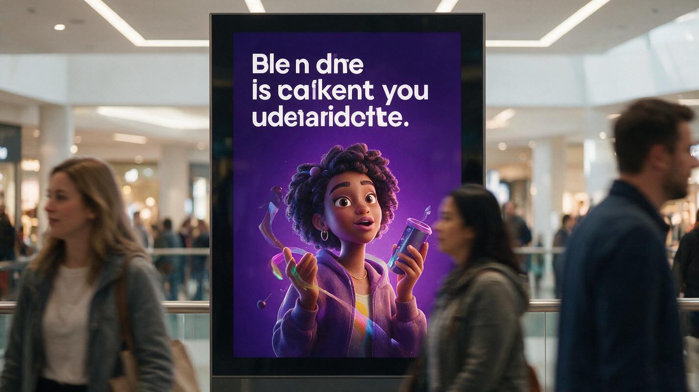
Table of contents
Blurry text makes animated DOOH posters unreadable at a distance
You spend hours refining a crisp, on-brand static campaign poster—tight kerning on the headline, perfectly weighted logo lockup, exact brand colors—then drop it into an AI tool to make a short loop for digital out-of-home screens. The result? Soft, blurry headline text, a slightly warped logo, and generic motion that pulls focus from your core message.
For DOOH posters, text sharpness is non-negotiable. Viewers only have 2-3 seconds to read a billboard or mall screen while walking or driving, so even minor blur can make a campaign ineffective. Most ai video from image tools struggle to preserve crisp text when adding motion, but Vidu’s targeted motion controls and reference locking make it possible to create clean, on-brand animated loops without sacrificing legibility.
Lock text and logo zones with a motion mask before generating
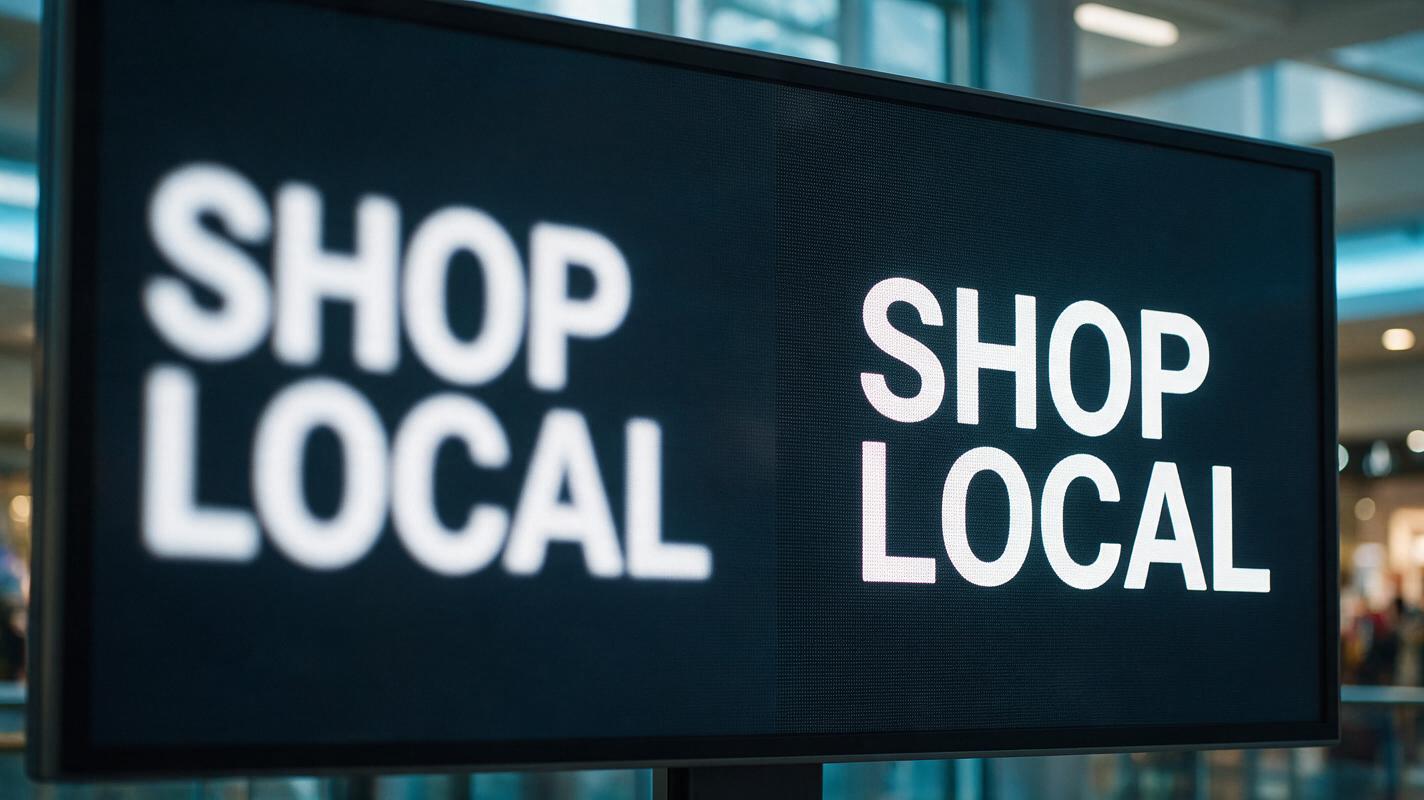
The #1 cause of blurry text in animated poster loops is AI models trying to add motion to static text elements. When you prompt a tool to "animate the poster," it assumes every part of the image should move—including your headline, subhead, and logo. The model warps or softens text to create the illusion of movement, even if the movement is subtle.
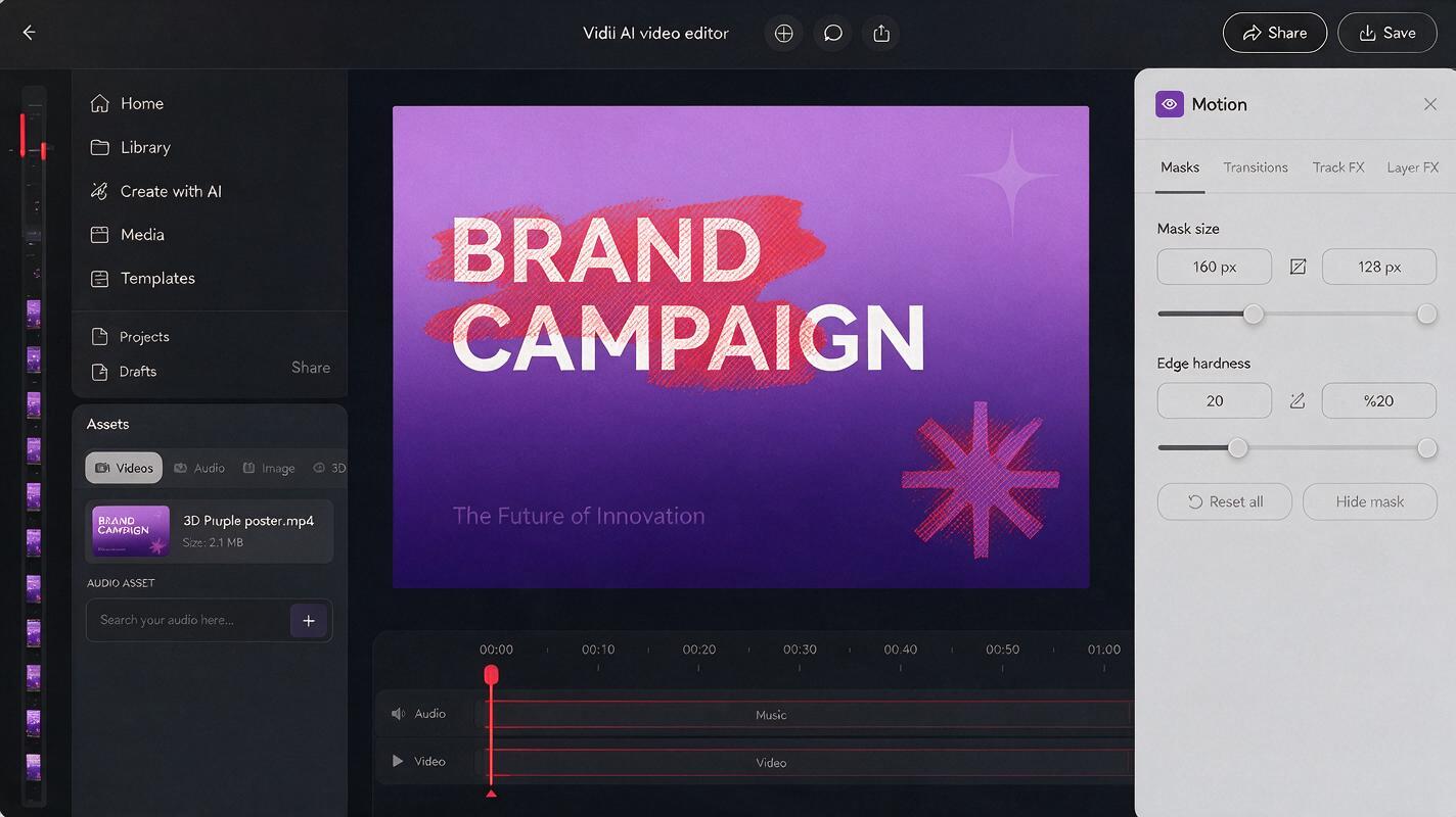
Vidu’s motion brush tool lets you mark specific regions of the poster as off-limits for motion, so text and logos stay completely static while other elements animate. Start by uploading your high-res static poster to Vidu’s image-to-video mode, then select the motion brush tool. Paint over every text element, logo, and lockup that needs to stay sharp, and set those regions to "no motion."
Pro tip: Zoom in to 100% when painting masks to avoid missing small text elements like fine print or taglines. Even a tiny unmasked edge of text can cause softness across the whole word.
After masking, add a prompt line explicitly reinforcing that text should stay static to reduce the chance of the model overriding the mask.
Use restrained motion prompts targeted at non-text elements
Generic motion prompts lead to generic (and text-blurring) results. Vague requests like "subtle animation" or "make it move" give the AI permission to shift every part of the poster, including areas you didn’t mask. Instead, write prompts that name exactly which elements move, how they move, and which elements stay completely still.
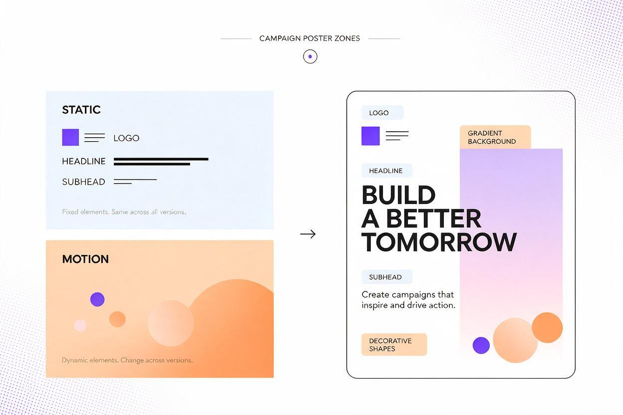
Focus motion on non-critical, non-text elements: gradient backgrounds, decorative shapes, product imagery, or subtle light effects. Keep motion slow and gentle for DOOH, since fast movement can be distracting and make text harder to read even if it’s technically sharp.
Use this reusable prompt template for most campaign poster loops:
4-second seamless loop, subtle slow animation of [specific non-text element: e.g. soft purple gradient background shifting, 3D product floating gently, decorative star shapes pulsing softly], NO movement on any text, logos, or headline, crisp sharp 4K text, exact brand color matching, no camera movement, flat 2D poster style, high contrast texttest this prompt yourself to see how targeted motion preserves text sharpness better than generic animation prompts.
For event posters, swap the motion element for something aligned with the event vibe: confetti falling slowly for a launch, light streaks gliding across the background for a tech event, or soft wave movement for an outdoor brand.
Sharpen text in a second pass with a text reference layer
Even with masking and targeted prompts, you may notice slight softening on text edges after the first generation—especially if your poster has very thin or small text. Instead of re-generating the whole loop from scratch, run a short second pass in Vidu using your original static poster as a text reference.
Upload your first-pass animated loop as the base, then upload your original high-res static poster as a style reference. Use the inpainting brush to select only the text and logo regions, and prompt the model to "restore crisp sharp text, match original poster text exactly, no changes to font or kerning." This tells Vidu to use the original text as a guide to sharpen the animated version, without altering the motion you already created in other areas.
For extra precision, you can also upload a separate PNG of just your text layer (with transparent background) as a reference. This gives the model an even clearer target for text shape and sharpness.
Ready-to-use Vidu prompts for common DOOH poster types
Adjust these prompts to match your brand and poster design, and pair them with the masking steps above for best results:
- Product launch poster: 5-second seamless loop, slow 360-degree spin of a skincare bottle in the center of the poster, soft golden glow pulsing around the bottle, NO movement on headline text, product name, or brand logo, crisp white text on navy background, no camera movement, high resolution
- Music event poster: 4-second seamless loop, subtle neon light flicker on the background gradient, small music note icons floating gently upward, NO movement on event name, date, or venue text, bold sharp neon text, high contrast, no camera movement
- Brand awareness poster: 6-second seamless loop, soft slow color shift of the brand gradient background, subtle parallax movement of decorative leaf shapes, NO movement on tagline or logo, crisp black text, flat 2D style, no camera movement
Final quality checklist for animated DOOH posters
- Text is sharp and legible when viewed at 100% scale (zoom in to check for soft edges)
- Logo shape, color, and proportions match the original static poster exactly
- Motion is slow and subtle enough that it doesn’t distract from the headline
- The loop is seamless with no visible jump or cut between the end and start
- Brand colors match the approved palette with no shifting across frames
- All fine print and small text is still readable (even if it’s not the focal point)
Keywords
animated poster loops, vidu, digital ooh posters, ai video from image, brand campaign posters, blurry text fix, poster animation