Why AI Brand Graphics Miss Your Exact Color Palette (and 3 Ways to Fix It)
AI-generated brand graphics often return with slightly off-color hues that don’t match approved brand palettes, forcing hours of manual color correction. This article breaks down why AI struggles with precise color matching and shares three actionable methods using Seedream 4.5 to get on-brand colors every time, from reference sheet locking to targeted inpainting. Whether you’re creating campaign posters, key visuals, or packaging renders, these methods cut down correction time and ensure brand consistency.
Table of contents
The hidden cost of off-brand AI graphics
If your AI-generated brand posters and key visuals always come back with slightly off-brand blues or washed-out oranges, you’re not alone. For brand designers, that small color gap isn’t just a minor annoyance — it means hours of manual color correction in Photoshop, delayed campaign timelines, and the risk of inconsistent brand assets across channels.
Most ai image generators prioritize visually appealing, natural-looking color over exact hex code matches, which is great for creative exploration but frustrating when you need to stick to an approved brand palette. The good news is you don’t have to settle for “close enough” — there are targeted methods that deliver near-perfect color accuracy without ditching AI entirely.
Why AI struggles with precise color matching
Before diving into fixes, it helps to understand why AI gets colors wrong in the first place. The issue isn’t that you’re writing bad prompts — it’s built into how image models work:
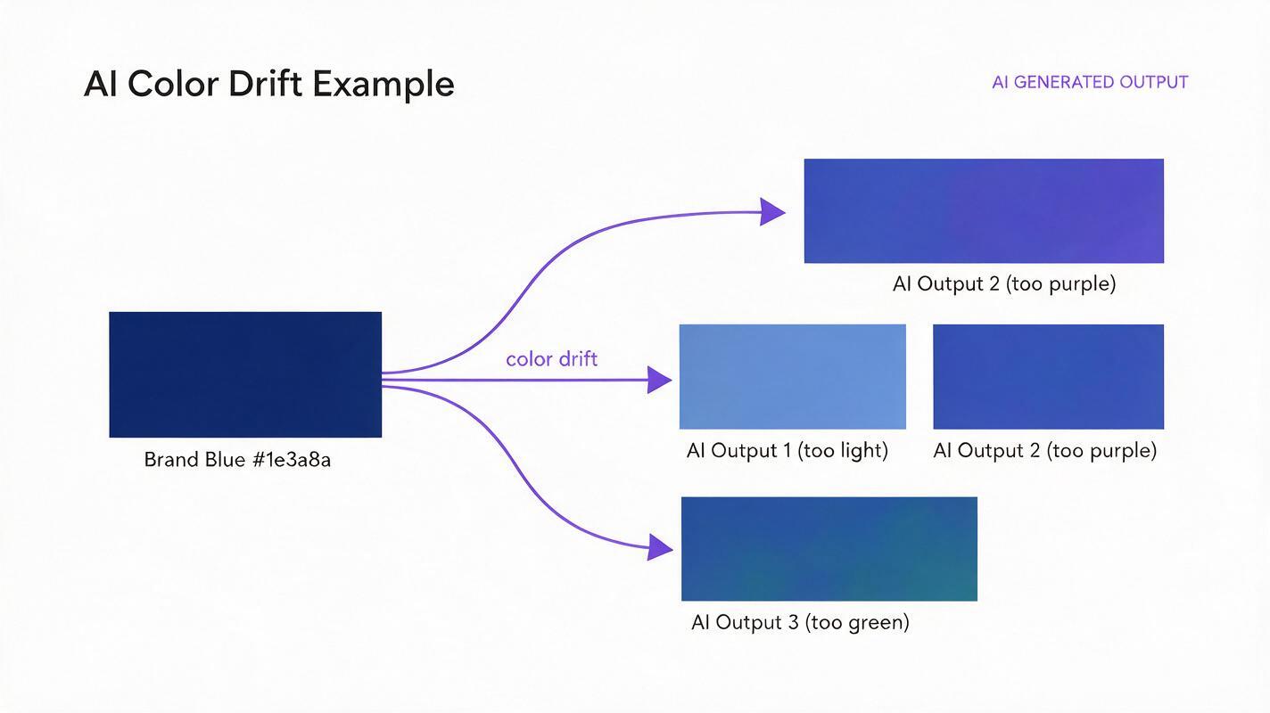
- Training data bias: AI models learn from billions of images where colors vary by lighting, camera settings, and editing. They associate objects and scenes with “typical” color ranges, not single exact shades, so they default to what looks natural rather than what matches your palette.
- Prompt ambiguity: Even if you include a hex code in your prompt, text-to-image models don’t interpret hex values as precise color instructions. They treat them as text tokens, so “navy blue #1e3a8a” usually results in a close guess, not an exact match.
- Style and lighting overrides: When you add prompts for lighting (like “golden hour” or “soft studio light”) or artistic style, the model adjusts colors to fit that aesthetic. A “soft cream” brand color might turn yellow in warm lighting or pale blue in cool lighting, even if you name it explicitly.
Lock colors with a brand palette reference sheet
The most reliable way to get exact brand colors in AI graphics is to use a physical reference sheet as a style guide for the model. This method works with any AI image tool that supports reference image input, and it’s especially effective with Seedream 4.5’s style lock feature.
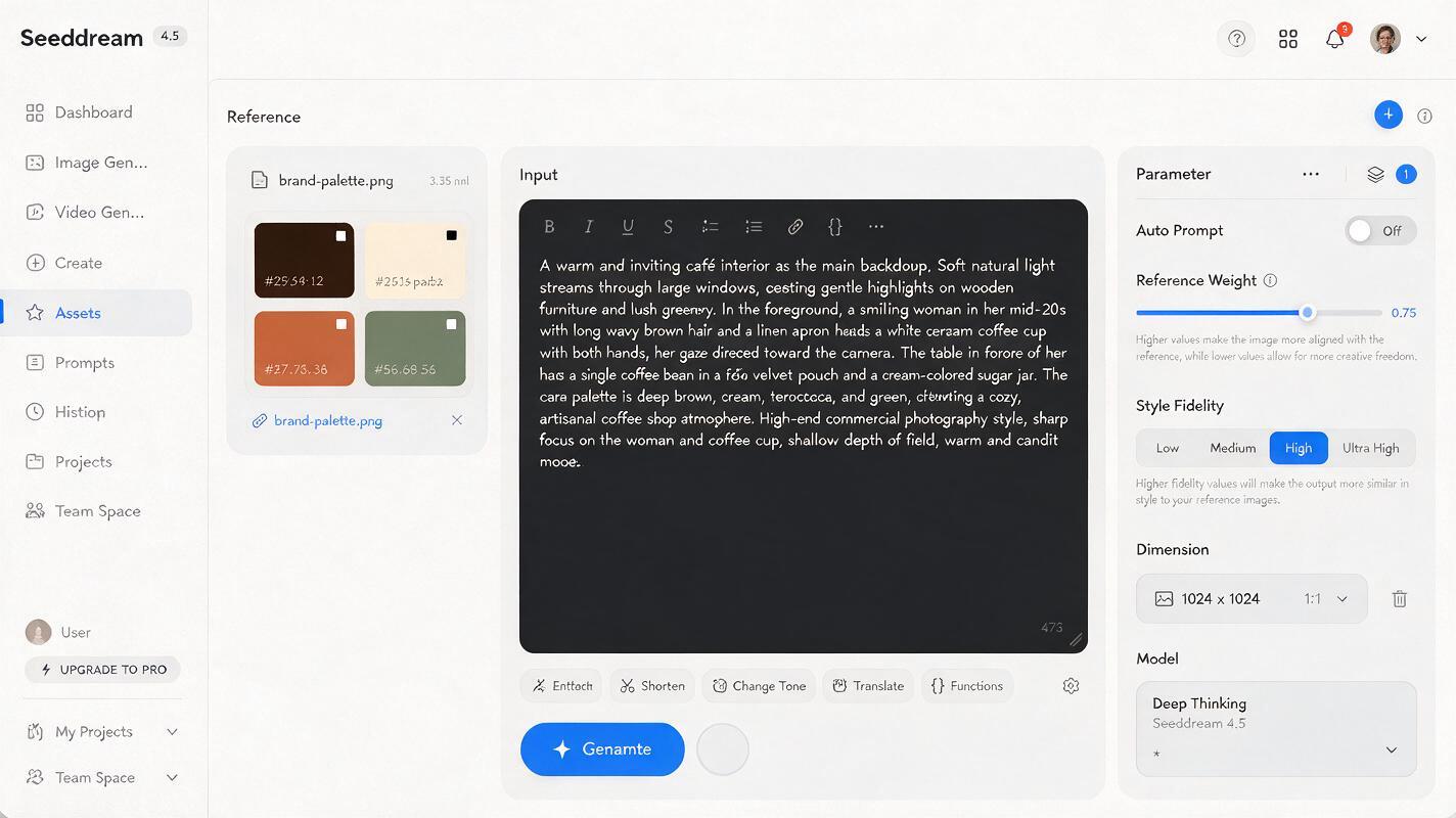
Start by creating a simple reference sheet in Figma or Illustrator: a 1080x1080 canvas with 3-5 solid color swatches of your primary and secondary brand colors, each labeled with its hex code in plain white text. Save it as a JPG or PNG — no fancy design needed.
When generating your asset, upload the reference sheet as a style reference, then set the reference weight to 0.7–0.8. This is high enough to force the model to pull colors directly from your swatches, but low enough that it won’t add the swatches or text to your final image. Pair it with a clear prompt for your desired asset.
Example prompt for a coffee brand campaign key visual:
Minimalist campaign key visual for specialty coffee brand, single matte black coffee bag centered on light oak counter, soft natural window light from left, clean negative space for headline text, no text on image
Reference: brand palette swatch sheet
Reference weight: 0.75
Style fidelity: High
You can test this prompt yourself with your own brand palette to see the difference in color accuracy compared to prompt-only generation.
Inject precise color cues into your prompt structure
If you’re using a tool that doesn’t support reference images, or you need a quick asset without extra setup, you can improve color accuracy by restructuring your prompt to prioritize color consistency. Generic prompts like “use brand colors” do almost nothing — you need to be specific, repetitive, and restrictive.
Follow this formula for better results: name each brand color explicitly, tie it to a specific element in the design, repeat key color terms, and add constraints to prevent color shifts. Pair common color names with hex codes (even if the model doesn’t read them perfectly, they reinforce the shade you want) and add negative prompts to exclude unwanted color changes.
Example prompt for a sustainable skincare poster:
Minimalist campaign poster for sustainable skincare brand, solid sage green #84a98c background, white frosted product bottle centered, soft terracotta #e07a5f geometric accent shapes in corners, exact color matching, no color deviation, flat design, no text
Negative prompt: oversaturated, washed out, color cast, tinted, hue shift, gradient background
This method works best for flat, graphic designs like social media posts, simple posters, and icon sets. It’s less reliable for photorealistic renders, where lighting and shadows naturally alter color appearance.
Correct drifted colors with targeted inpainting
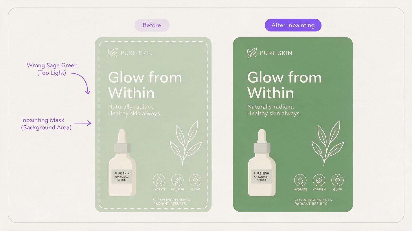
Sometimes you’ll generate a near-perfect image — great composition, perfect lighting, exactly the right vibe — but one key element is the wrong shade. Instead of regenerating the whole image (and risking losing the good parts), use targeted inpainting to fix only the off-color area.
Seedream 4.5’s inpainting tool lets you mask a specific section of the image and repaint it with color guidance from your reference sheet. To do this: mask the off-color area (like a product box, background, or accent shape), upload your brand palette reference sheet, set the reference weight to 0.8–0.9, and write a short prompt describing the area and its correct color.
Example inpainting prompt for a miscolored product box:
solid deep navy blue #1e3a8a product box, same shape, size, and lighting as original, no texture changesThis method delivers the highest color accuracy of all three, because you’re only adjusting a small area without disrupting the rest of the composition. It’s ideal for high-stakes assets like billboard key visuals, packaging renders, and hero posters where every detail matters.
Which color matching method works best for you?
Each method has tradeoffs depending on your workflow, asset type, and accuracy needs. Use this table to pick the right approach for your project:
| Method | Color accuracy | Setup time | Best for |
|---|---|---|---|
| Brand palette reference sheet | 9/10 | 5 mins initial, 1 min per asset | All brand assets: posters, key visuals, packaging |
| Precise prompt cues | 6/10 | 0 mins | Flat graphic designs, social media assets |
| Targeted inpainting | 10/10 | 1 min per fix | Touching up near-perfect high-stakes assets |
For most brand design workflows, the best approach is a combination: use the reference sheet method for initial generation, then do 1–2 quick inpainting touch-ups if any small areas are off-color. This gives you near-perfect accuracy with minimal extra work.
Final checklist
- Save a standard brand palette reference sheet in your project folder for quick access across all AI tools
- Test color accuracy with a single asset before generating a full batch of campaign graphics
- For photorealistic renders, add “neutral color grading” to your prompt to reduce lighting-induced color shifts
- Always do a quick color picker check on critical assets before sending them to clients or print
- Use inpainting for small color fixes instead of regenerating — it saves time and preserves good composition
Keywords
ai brand graphics, brand color matching, ai image generator, seedream 4.5, campaign key visuals, ai poster design, brand palette consistency