Why AI Comic Page Layouts Break—and the Read-Order Fix
AI-generated comic pages often look polished but become confusing when panels compete for attention, gutters disappear, or speech balloons pull readers in the wrong direction. This guide presents a lettering-safe layout method using Nano Banana Pro to preserve hierarchy while generating panels individually.
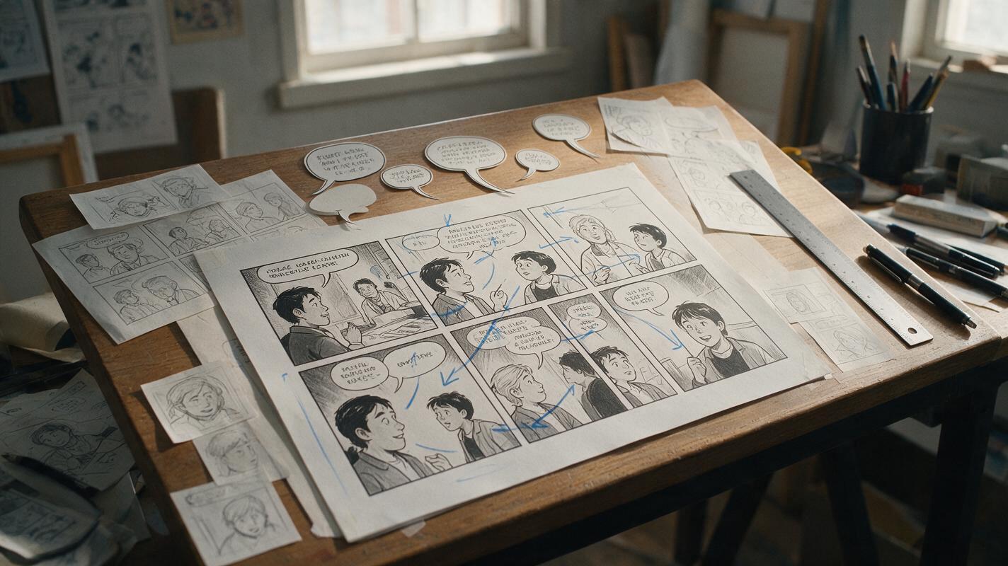
Table of contents
Readable pages start before rendering
An AI comic page can contain attractive art and still fail as visual storytelling. The usual symptoms are ambiguous panel order, inconsistent gutters, oversized close-ups, speech balloons pointing across boundaries, and decorative images that compete with the story’s key beat. The most reliable fix is not a longer style prompt. It is to separate page planning, panel generation, and lettering so each decision remains controllable.
This workflow uses nano banana pro for reference-guided panel creation and editing, but the layout principles apply to manga pages, Western comics, vertical webtoons, and illustrated storyboards.
Core rule: let the page layout control the images. Never ask independently generated images to invent the page layout after they have already been composed.
Why generated comic pages lose their reading order
A comic page is not simply a collage. It is a timed sequence in which panel size, position, character gaze, movement, contrast, and balloon placement all direct the reader. A generation model may understand the appearance of a comic page without reliably preserving that underlying sequence.
Several conflicts commonly appear when an entire page is generated in one pass:
- Every panel requests equal attention. Similar sizes and contrast levels remove the intended climax.
- Panel boundaries become decorative. Gutters narrow, merge, tilt, or disappear behind figures.
- Characters face away from the next beat. Gaze and movement pull the eye toward the page edge instead of the following panel.
- Lettering becomes part of the illustration. Balloons are filled with malformed text and become difficult to replace cleanly.
- Wide compositions are squeezed into narrow cells. Important hands, props, faces, or environmental clues are cropped.
These failures are especially visible on dialogue-heavy pages. The artwork may be individually convincing while the conversation feels slow, reversed, or difficult to follow.
Convert the script into a visual beat map
Before generating finished art, reduce the page to narrative beats. One panel should usually communicate one dominant change: new information, a reaction, a movement, a reveal, or a pause.
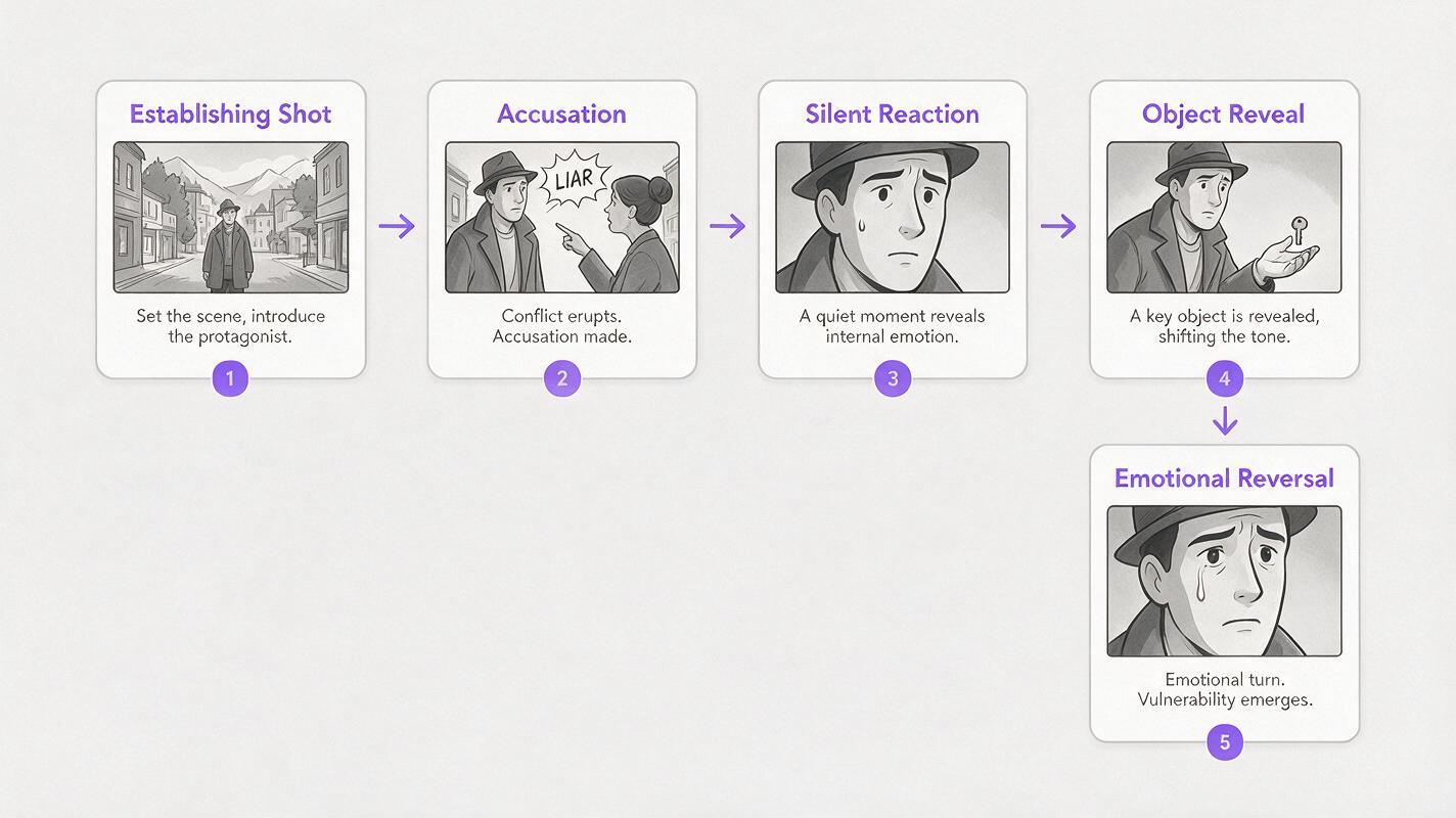
For a five-panel confrontation, the beat map might look like this:
| Panel | Story function | Framing | Reader direction | Balloon space |
|---|---|---|---|---|
| A | Establish the distance | Medium-wide two-shot | Figures face inward | Upper left |
| B | Deliver the accusation | Speaker close-up | Face turned toward center | Above shoulder |
| C | Hold an uncomfortable pause | Silent reaction | Eyes lead downward | None |
| D | Reveal the hidden object | Hand and object insert | Diagonal toward final panel | Small caption only |
| E | Land the emotional reversal | Large reaction panel | Face turned into page | Clear upper region |
This map identifies what each image must accomplish before style details are introduced. If two neighboring panels perform the same function, combine them or change one into a reaction. Repetition weakens both pacing and hierarchy.
Build a layout skeleton with explicit hierarchy
Draw the page as rectangles using only three values: black for major subjects, gray for secondary forms, and white for balloons or captions. At this stage, anatomy and rendering do not matter. Test whether the page remains understandable at thumbnail size.
Assign one panel as the page’s visual anchor. It can be the largest panel, the darkest panel, or the panel containing the strongest face. Avoid making it all three unless the moment is genuinely climactic.
Use gutters as timing controls
A narrow gutter creates a quick transition. A wider gutter can suggest a pause, location change, or emotional separation. Keep ordinary gutters consistent so deliberate variations remain meaningful.
Reserve lettering space inside the composition
Do not place empty speech balloons over completed art as an afterthought. Mark approximate balloon regions in the skeleton and compose figures around them. Keep essential facial features, hands, and story props outside those regions.
For left-to-right reading, test a simple eye path from the upper-left entry point toward the lower-right exit. For right-to-left manga, reverse that logic. Vertical webtoons need a different test: each screen-height segment should contain one clear entry point and one downward visual lead.
Generate panels separately without losing page unity
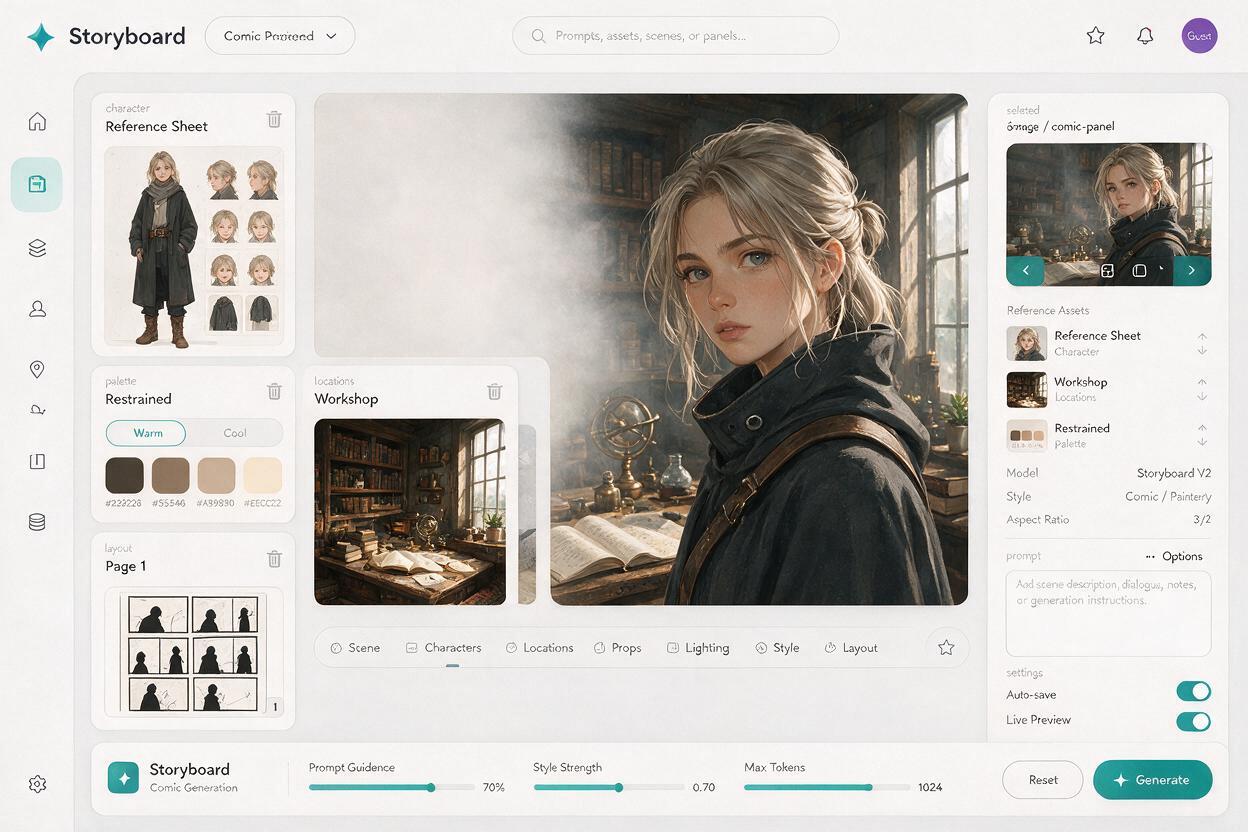
Use the layout skeleton as a composition reference, then render each panel independently with ai image generator. Separate generation gives every panel enough resolution and prevents the model from blending borders, duplicating characters, or treating multiple scenes as one environment.
Keep a compact continuity packet beside the layout:
- A character reference with fixed face, hair, costume, and proportions
- A location reference showing stable architectural landmarks
- A page palette containing dominant local colors and lighting
- The panel’s crop and camera height
- The intended empty region for lettering
Prompt each panel as a storytelling unit rather than as a generic illustration:
Comic panel, medium close-up of Mara during a tense conversation.
Preserve the attached character identity, short black bob, amber eyes,
navy mechanic jacket, narrow facial proportions.

Mara stands on the right side of the frame and faces left, into the page.
Her expression is restrained suspicion, lips closed, one eyebrow slightly raised.
Keep the upper-left area visually quiet for a speech balloon.
Background: the same workshop reference, simplified and lower contrast.
Clean ink contours, controlled cel shading, consistent page palette.
No text, no letters, no speech balloon, no panel border.
The phrase faces left, into the page describes a compositional job, not merely a pose. Likewise, upper-left area visually quiet is more useful than asking for “space somewhere for dialogue.”
Match camera choices to panel shapes
Generate art for the actual panel ratio. Cropping a square close-up into a narrow vertical panel often removes the shoulder line, gesture, or gaze direction that made the composition readable.
| Panel shape | Useful content | Frequent mistake |
|---|---|---|
| Wide horizontal | Two-shots, location changes, lateral action | Empty scenery with tiny unreadable faces |
| Tall vertical | Entrances, falls, full-body reveals, height | Wide gestures cropped at both sides |
| Small square | Reaction, object insert, brief transition | Too many characters or background details |
| Large irregular panel | Climax, reveal, environmental spectacle | Decorative composition with no clear focal point |
When a panel repeatedly fails, reconsider its shape before rewriting the art prompt. A storytelling beat may simply require more horizontal or vertical room.
Add balloons only after the artwork is stable
Generate clean images without final text, speech balloons, captions, or sound effects. Assemble the panels in a page-layout application, then create lettering as editable vector or text layers.
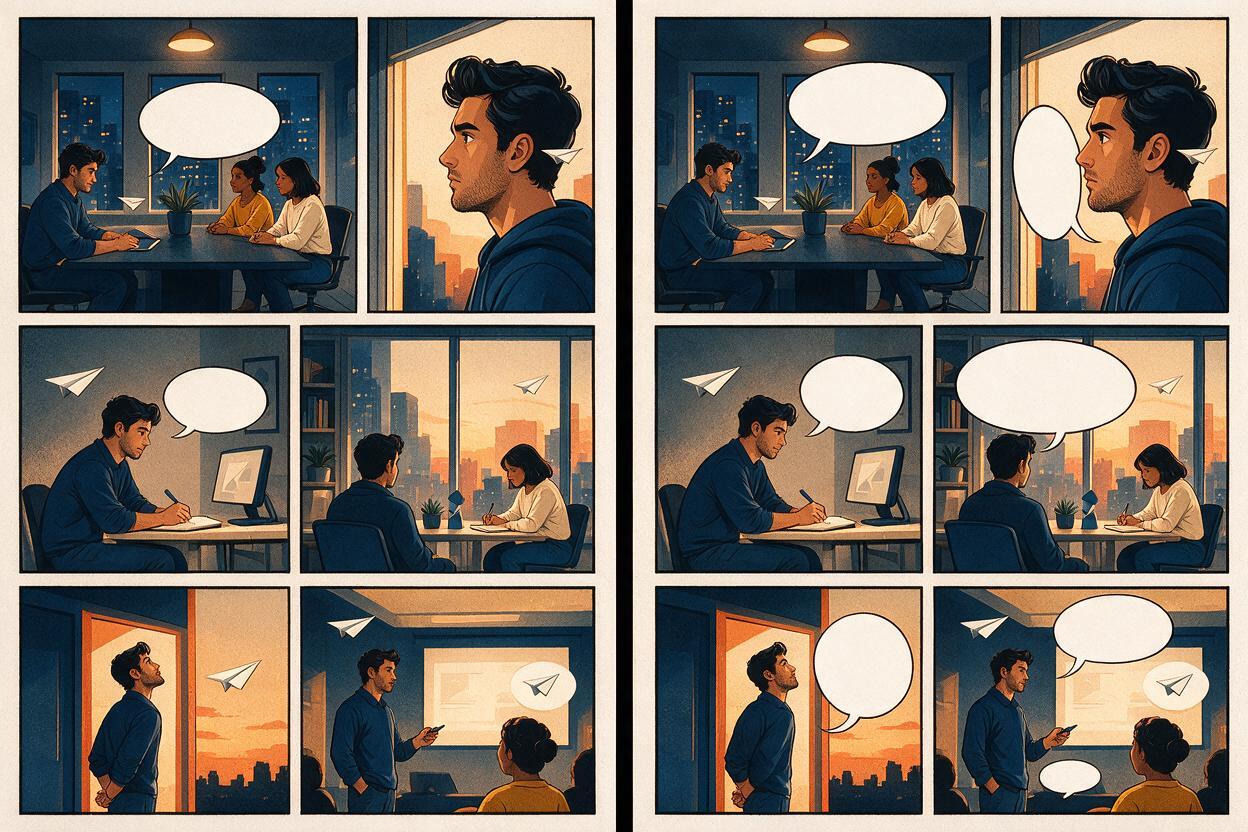
Place balloons in reading order before drawing tails. The reader should be able to follow the dialogue by looking only at the balloon shapes. After that, point each tail toward the speaker’s mouth area without crossing another character, face, tail, or panel boundary.
- Keep related balloons close enough to read as one exchange.
- Avoid placing the first balloon lower than a balloon meant to be read later.
- Break long dialogue into short, balanced units rather than shrinking the type.
- Leave consistent padding between letters and balloon edges.
- Use sound effects as compositional elements, but keep them from obscuring essential contact points.
If the dialogue order is unclear without tails, the balloon layout—not the tail drawing—is the problem.
Repair individual conflicts instead of regenerating the page
After assembly, inspect the complete page at three sizes: thumbnail, normal reading size, and close zoom. Each view exposes a different problem.
- Thumbnail size: reveals weak hierarchy and competing focal points.
- Reading size: reveals confusing order, poor balloon placement, and cramped panels.
- Close zoom: reveals continuity errors, broken hands, and border artifacts.
If a face competes with the intended anchor panel, reduce local contrast or background detail. If a character faces out of the page, edit that panel rather than regenerating every image. If a balloon covers an important gesture, expand the quiet area around it or adjust the crop.
The page should only be regenerated when its underlying beat map is wrong. Local visual conflicts deserve local edits.
A reusable prompt for lettering-safe comic panels
[Panel format and shot type] showing [character and action].
Preserve the attached character and location references.

Story function: [reaction / reveal / movement / pause / new information].
Character position: [left, center, or right].
Character faces [direction] to guide the reader toward [next beat].
Keep [specific region] quiet and low-detail for later lettering.
Preserve clear silhouettes and visible story-critical props.
Match the established line weight, palette, and lighting.

No text, no letters, no captions, no speech balloons,
no sound effects, no panel borders, no extra characters.
Replace every bracket with a concrete choice. Avoid contradictory requests such as “dense machinery everywhere” and “clean empty space behind the dialogue.” If the environment is complex, designate one quiet wall, shadow region, or patch of sky for lettering.
When your skeleton and continuity references are ready, try this prompt for free on one difficult panel before committing to the full page.
Final checklist
- Give every panel one dominant narrative function.
- Choose one visual anchor for the page.
- Test the reading path at thumbnail size.
- Match each composition to its final panel ratio.
- Reserve specific low-detail regions for dialogue.
- Generate panels without embedded text or borders.
- Add balloons and lettering as editable layers.
- Repair local conflicts instead of rebuilding successful artwork.
- Check thumbnail, reading-size, and close-up versions before export.
Keywords
ai comic page layout, comic read order, nano banana pro, ai comic maker, manga panel generator, comic page prompts, visual storytelling ai