Why AI Comic Speech Bubbles Fail—and the Workflow That Works
AI-generated speech bubbles often contain broken text, point at the wrong speaker, or cover important artwork. This practical Nano Banana Pro workflow keeps panel art, balloon shapes, and lettering separate so comic and webtoon dialogue remains readable.
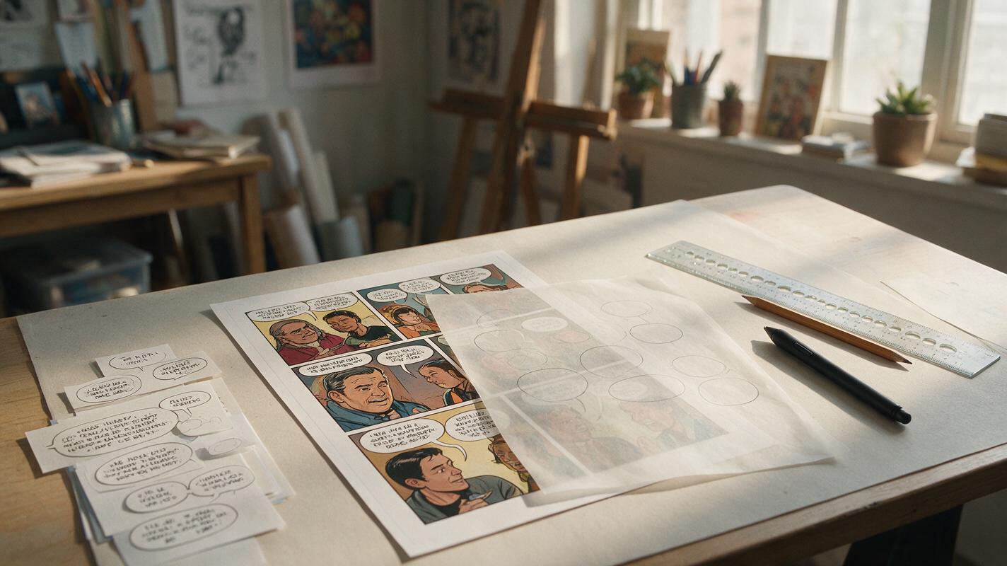
Table of contents
Keep AI artwork and comic lettering separate
Broken words, misspelled dialogue, misplaced tails, and balloons covering faces can make an otherwise strong AI comic panel unusable. The reliable solution is not a longer text-generation prompt. It is to generate clean panel art with deliberate dialogue space, then add balloon shapes and final lettering as separate editable layers.
Nano Banana Pro can help create or revise the underlying illustration, but the model should not be responsible for the final typography. Treat it as the panel artist rather than the letterer. This division gives comic artists control over wording, reading order, balloon placement, and late script changes.
The central rule: ask the image model to reserve space for dialogue, not to typeset the finished dialogue.
Why generated speech bubbles become unreadable
An image model interprets lettering as visual texture as well as language. It may produce shapes that resemble letters without preserving every word, punctuation mark, or line break. Longer dialogue increases the number of details that must remain exact.
Even when the words happen to be correct, the panel can still fail as sequential art. Common problems include:
- Unclear ownership: a balloon tail points between two characters or crosses another speaker.
- Incorrect reading order: the reply appears before the question because its balloon sits higher.
- Covered acting: dialogue blocks an expression, gesture, prop, or visual clue.
- Poor balloon proportions: a wide sentence is forced into a narrow oval, creating awkward line breaks.
- Inconsistent lettering: font weight, capitalization, spacing, and margins change between panels.
- Webtoon scaling problems: text that looks acceptable on a large canvas becomes tiny on a phone.
Regenerating the same prompt rarely fixes all of these issues at once. A better workflow assigns each task to the medium that handles it most predictably.
Reserve balloon space before generating the panel
Start with the dialogue and estimate how much room it needs before composing the image. You do not need finished typography yet, but you should know the speaker, approximate word count, emotional tone, and intended reading order.
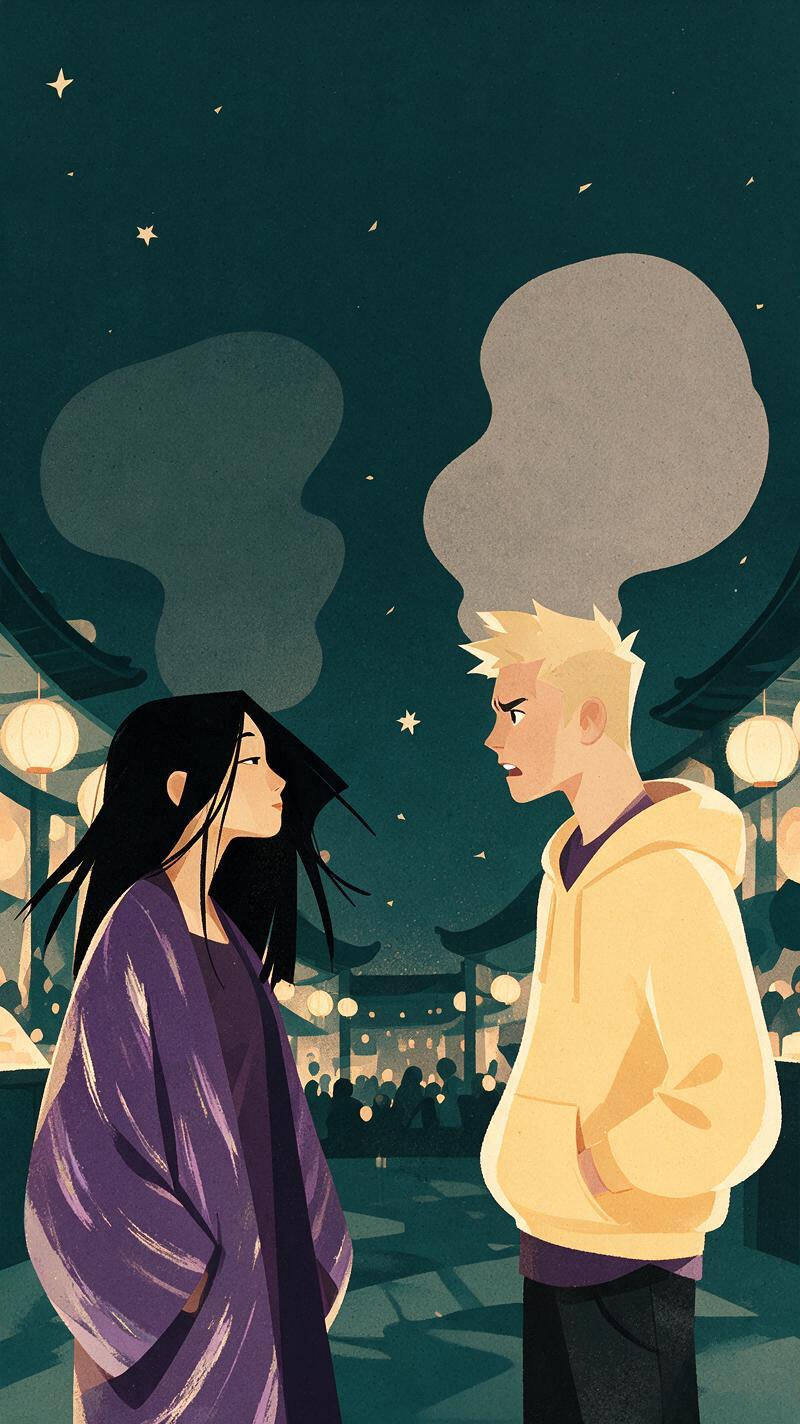
Translate that information into a simple panel map. Mark each planned balloon as a blank oval or rectangle, then arrange the characters around those zones. In a left-to-right comic, the first balloon usually needs to sit above or to the left of the response. For a vertical webtoon, the first line can occupy a higher pocket of negative space, with the reply revealed farther down.
| Dialogue type | Useful space | Composition choice |
|---|---|---|
| Short reaction | Small compact pocket | Keep it close to the reacting face |
| Two-line exchange | Two separated upper zones | Place the first speaker earlier in the reading path |
| Long explanation | Tall, quiet area | Reduce background detail behind the balloon |
| Shout or interruption | Large irregular zone | Leave extra clearance around the balloon edge |
| Caption or narration | Rectangular border zone | Avoid important scenery at the top or bottom edge |
When using an ai image generator, describe the reserved area as part of the composition rather than merely requesting “space for text.” Specify its position, size, and visual simplicity.
Vertical webtoon panel, medium two-shot inside a crowded night market. Mina stands on the left holding a torn envelope; Jae stands on the right, avoiding eye contact. Suspicious emotional tension. Preserve a clean pale area in the upper-left above Mina for a short dialogue balloon and a separate clean area in the upper-right above Jae for his reply. Keep faces, hands, signs, and important props outside both areas. No words, no letters, no captions, no speech balloons, polished color comic illustration.The prompt separates the two dialogue pockets and connects them to the speakers. It also prevents bright signs or detailed objects from competing with the lettering.
Ask for empty space, not empty speech balloons
It may seem efficient to ask Nano Banana Pro to draw blank balloons directly into the panel. That can work for rough planning, but it often limits later editing. A generated balloon may have the wrong width, an awkward tail, or insufficient internal padding once the real dialogue is added.
For production art, request an uncluttered region instead. Add the balloon afterward in a comic editor, illustration application, or vector layout tool. This keeps the artwork reusable if the script changes or the comic is translated.
A useful negative instruction is:
No typography, no readable symbols, no placeholder text, no speech-balloon outlines, and no important visual detail inside the reserved dialogue areas.Negative instructions are not a substitute for positive composition. “No text” tells the model what to avoid; “a clean pale area above the left character” tells it what to create.
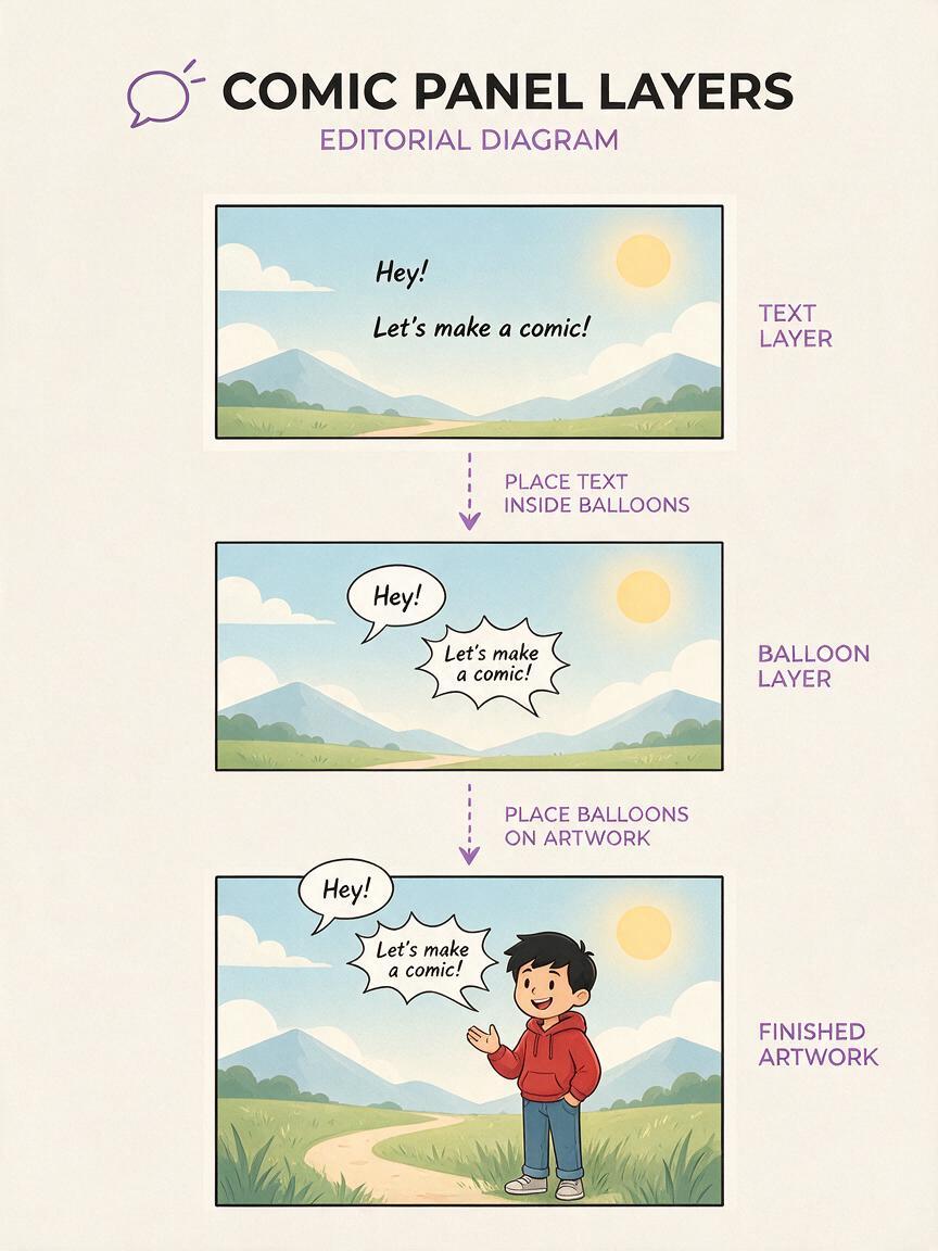
Build the panel in three separate layers
A durable comic-lettering file has three functional parts: the illustration, the balloon shapes, and the text. They may live in one document, but they should remain independently editable.
| Layer | Contains | Why it stays separate |
|---|---|---|
| Panel artwork | Characters, setting, lighting, effects | Can be revised without rebuilding dialogue |
| Balloon layer | Ovals, bursts, captions, tails | Can be resized and redirected |
| Lettering layer | Dialogue, narration, sound effects | Supports proofreading and translation |
Add the real dialogue only after choosing the panel crop. Shape the balloon around the text rather than forcing text into a predetermined oval. Balanced comic dialogue often forms a compact diamond or oval silhouette: shorter first and last lines with broader lines near the middle.
Keep a consistent internal margin between the letters and the balloon edge. If a sentence feels crowded, first rewrite it more concisely. If every word is necessary, enlarge the balloon and rebalance the art instead of shrinking the type until it becomes difficult to read.
Make balloon tails identify the speaker immediately
A tail should point toward the speaker’s mouth area without touching the face. Avoid crossing tails, panel borders, or another character’s body when a simpler path is available. Off-panel speech can use a tail that clearly exits the frame, while narration should use a caption treatment that cannot be mistaken for spoken dialogue.
Emotional shape should support the performance without overwhelming it. Rounded balloons suit ordinary speech, irregular bursts suggest raised volume, and restrained caption boxes distinguish narration. Use these conventions consistently so readers do not have to decode a new visual language in every scene.
Repair artwork that invaded the dialogue zone
If a generated face, hand, lamp, or background sign occupies the planned balloon area, do not immediately regenerate the whole panel. A targeted revision can preserve the successful acting and composition.
Use the original panel as the visual reference and describe only the local correction:
Keep the characters, facial expressions, costumes, camera angle, lighting, color palette, and panel crop unchanged. Simplify the upper-right background into a quiet softly lit wall area suitable for a dialogue balloon. Remove the hanging sign from that area. Do not add text, symbols, captions, or balloon outlines.The instruction protects the parts that already work and defines a limited change. For a difficult repair, mask or select the affected area if the editing interface provides that option. Check the result for altered fingers, facial drift, or accidental symbols before moving to lettering.
If you have a panel with this exact problem, test this prompt yourself using a copy of the artwork rather than the only production file.
Check reading order at final display size
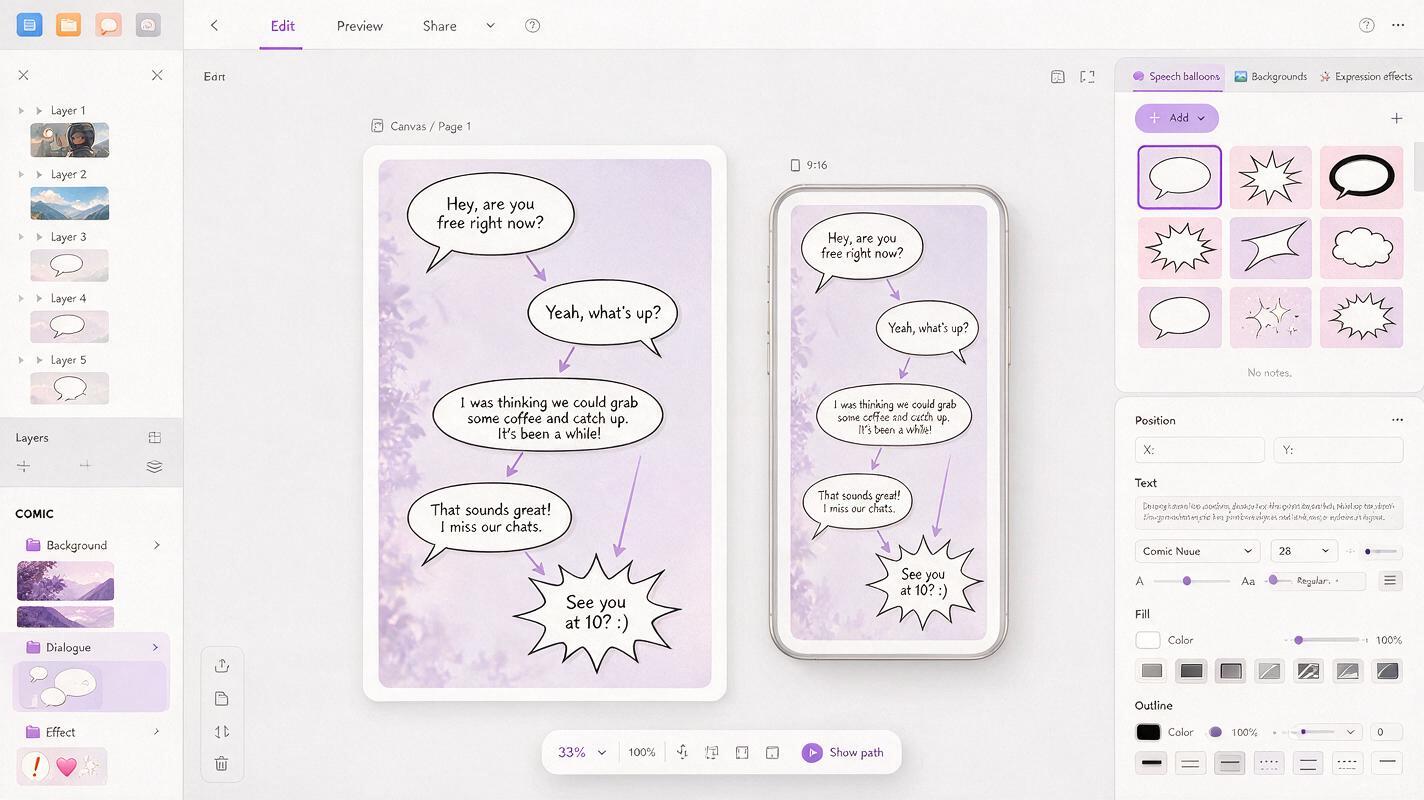
Lettering decisions must survive the size at which readers will actually encounter the page. Zooming into a large working canvas can hide weak hierarchy, narrow margins, and text that will become too small after export.
Preview a print page at approximate physical reading size. For a webtoon, inspect the exported strip at phone width and scroll through it naturally. Do not judge isolated panels only; balloon order depends on what appears immediately before and after them.
Run these checks on the finished sequence:
- Can the reader identify the first balloon without searching?
- Does the eye move from one balloon to the next without crossing backward?
- Is every tail attached to an unmistakable speaker?
- Are important expressions and hand gestures still visible?
- Does the smallest dialogue remain comfortable to read?
- Do font size, weight, case, and balloon padding match nearby panels?
- Would revised or translated dialogue still fit with modest adjustments?
A useful test is to temporarily blur or squint at the page. The text will disappear, but the large white balloon shapes should still form a clear path through the conversation. If the path feels tangled, reposition the balloons before polishing details.
Use a compact lettering brief for every episode
Consistency becomes easier when the series has a small production specification. Record the chosen typeface, standard dialogue size, emphasis style, balloon stroke, internal margin, tail treatment, and caption format. Include separate rules for whispers, shouting, thoughts, electronic voices, and sound effects only when the story needs them.
The brief should also define where dialogue is allowed to overlap artwork. A quiet conversation may use clean negative space, while an action scene might permit balloons to overlap low-priority background effects. Faces, hands carrying plot-relevant objects, and essential clues should remain protected.
Production shortcut: duplicate a correctly lettered panel file as the starting template for the next scene. Reusing styles is safer than rebuilding balloons and typography by eye.
Final checklist
- Plan approximate dialogue length before generating the illustration.
- Reserve distinct negative-space zones in the intended reading order.
- Tell Nano Banana Pro to create no text, symbols, or balloon outlines.
- Keep artwork, balloon shapes, and final lettering on separate layers.
- Shape balloons around edited dialogue rather than shrinking the type.
- Point each tail toward one unmistakable speaker.
- Repair invaded dialogue zones locally instead of regenerating successful art.
- Proofread and preview the full sequence at its final display size.
Keywords
ai comic maker, comic speech bubbles, comic lettering, Nano Banana Pro, webtoon dialogue, comic prompts, AI illustration generator