AI Food Ad Prompts for Clean Copy Space That Stays Usable
Food images often look impressive but become unusable when the dish fills the frame and leaves nowhere for a headline, price or offer. This guide provides Imagen prompt formulas, layout patterns and practical checks for generating appetizing restaurant campaign visuals with intentional copy space.
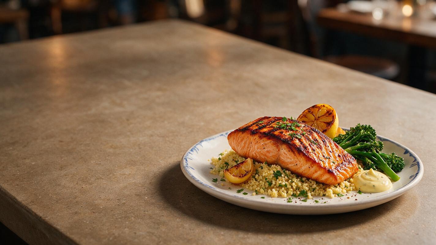
Table of contents
Make room for the message without shrinking the appetite
A strong food advertisement needs two things at once: an irresistible dish and a calm, intentional area for the campaign message.
Many AI food images fail the second requirement. The model centers the plate, enlarges every garnish and fills empty areas with cutlery, ingredients or decorative clutter. The result may be attractive as food photography, but it is difficult to use for a restaurant promotion, delivery-app banner or seasonal social post.
The solution is to describe copy space as part of the physical composition rather than simply asking for “room for text.” Imagen is a useful model for exploring these layouts because you can prompt the subject, surface, lighting and spatial arrangement together. Use an ai image generator to produce the clean photographic base, then add real typography, prices and legal copy in your design software.
Important: Generate the photograph without promotional wording. Add final text afterward so spelling, pricing, font choice and brand hierarchy remain under your control.
Why generic copy-space prompts still produce crowded images
“Food photo with copy space” is too vague. It tells the model what you want, but not where the empty area belongs or how it should look. Generators naturally try to make the whole frame visually interesting, so an unspecified gap may be filled with herbs, napkins, reflections or extra dishes.
A more reliable prompt defines five compositional decisions:
- Subject position: left third, lower-right corner or bottom quarter.
- Reserved region: upper half, right side or central background wall.
- Surface continuity: uninterrupted marble, linen, wood or painted plaster.
- Light behavior: soft gradients instead of hard shadows crossing the reserved area.
- Clutter limits: no utensils, ingredients, crumbs or props inside the copy zone.
This language makes the blank area feel intentional. It remains part of the photographed scene instead of resembling an unfinished hole.
Choose a layout around the final placement
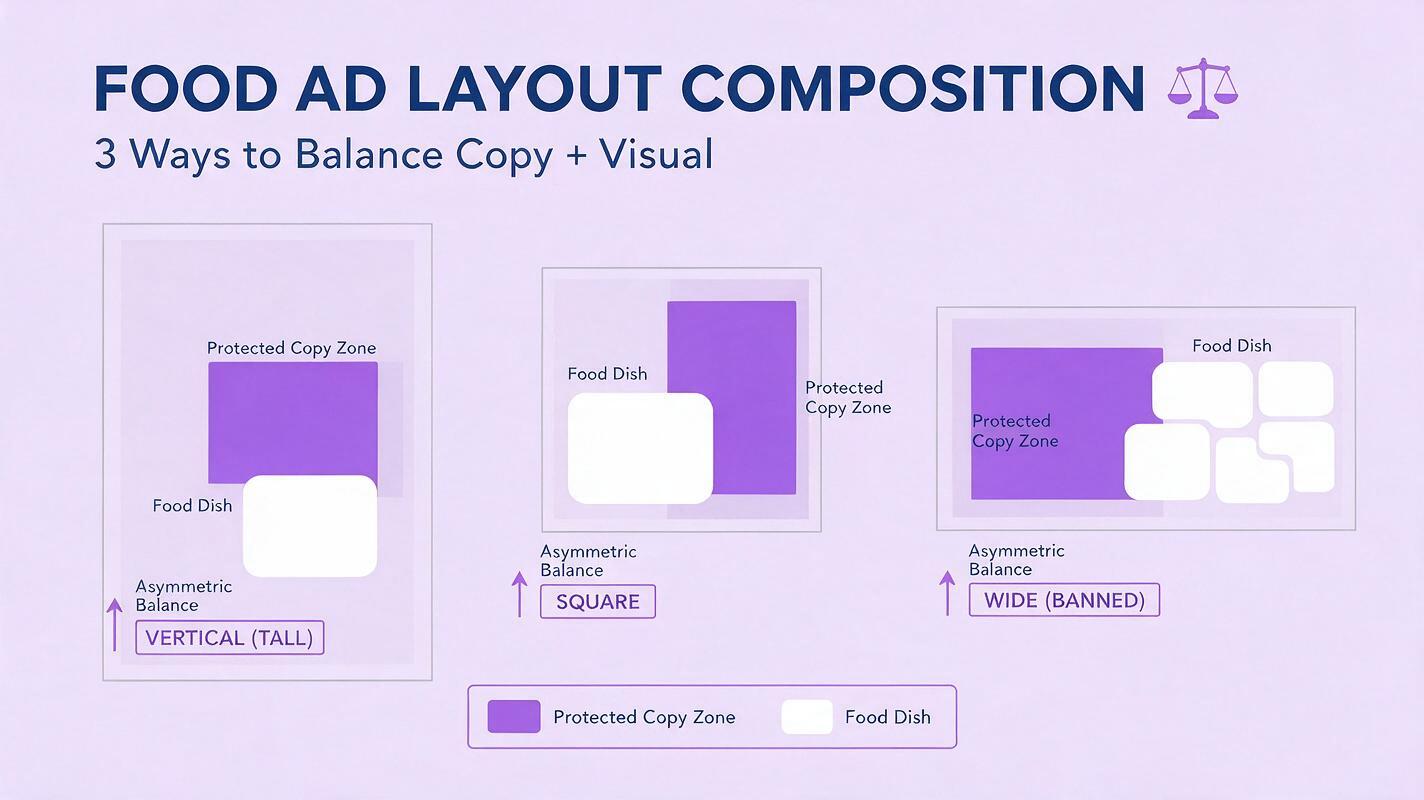
Do not generate one square composition and expect it to crop cleanly into every channel. Decide where the asset will appear before writing the prompt. A vertical restaurant Story needs a different food position from a wide website banner.
| Placement | Useful composition | Best copy region | Main risk |
|---|---|---|---|
| Vertical Story or Reel cover | Dish in lower third | Upper half | Tall garnish entering the headline |
| Square social post | Dish offset left or right | Opposite third | Plate expanding toward the center |
| Website hero banner | Food grouped on one side | Broad lateral area | Props scattered across the full width |
| Delivery promotion card | Compact plate in lower corner | Simple upper background | Offer badge covering the food |
| Printed table tent | Low food angle near the base | Wall or backdrop above | Busy shadows reducing readability |
Leave more room than the headline appears to need. The design may also require a price, call to action, logo, disclaimer or translation. A generous reserved region gives the designer options without forcing the type against the edge.
Build the prompt around a protected zone
A dependable food-ad prompt describes the hero dish first, locks its position, defines the empty area and finishes with exclusions. This reusable structure works for restaurants, bakeries, packaged-food concepts and beverage promotions.
Photorealistic commercial food advertising photograph of [specific dish],
served in [plate or package description], positioned entirely in the [location] of the frame.
The [opposite region] is a broad uninterrupted [surface or background], reserved as clean copy space.
[Lighting description], realistic food texture, controlled highlights, natural appetizing color,
intentional asymmetrical composition, premium restaurant campaign styling.
No text, no lettering, no logo, no extra plates, no scattered ingredients,
no utensils or garnish inside the empty copy area.
The word entirely helps reinforce separation. Naming the reserved area as a real surface—such as matte plaster or a continuous tabletop—also gives the model something concrete to render.
Vertical promotion with space above the dish
Photorealistic restaurant advertisement for a grilled salmon fillet with crisp skin,
lemon beurre blanc and delicate green vegetables on a matte ivory plate,
positioned entirely within the lower third of a vertical frame.
The upper half is a warm neutral plaster background with a subtle natural light gradient,
reserved as clean copy space. Soft side lighting, realistic moist fish texture,
refined modern bistro styling, restrained props near the plate only.
No text, no logo, no hanging garnish, no utensils or shadows in the upper half.
Wide banner with a quiet side panel
Wide photorealistic food campaign image featuring a stack of golden buttermilk pancakes,
berries and a restrained ribbon of maple syrup, grouped on the right third of the frame.
The left two-thirds show continuous pale stone with soft morning illumination,
clean and uncluttered for a promotional headline and button.
Natural crumb texture, realistic syrup highlights, editorial breakfast photography.
No text, no logo, no extra dishes, no fruit, napkins or cutlery on the left side.
Square offer card with diagonal visual flow
Square commercial photograph of three fresh vegetable tacos on a dark ceramic plate,
placed in the lower-left quadrant with the plate fully visible.
The upper-right quadrant is uninterrupted muted terracotta tabletop reserved for offer copy.
Soft directional window light travels diagonally toward the food without crossing the copy area,
crisp cabbage, distinct avocado slices, realistic tortillas, contemporary restaurant styling.
No words, no logo, no floating ingredients and no decorative objects in the upper-right quadrant.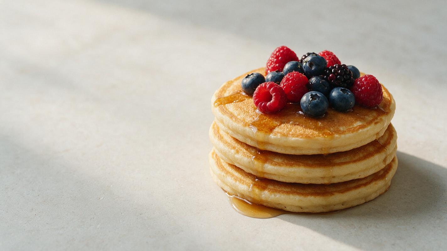
Keep shadows and highlights away from the headline
Empty space is not automatically readable space. A blank background can still fight with typography if it contains bright hotspots, deep shadow bands, strong grout lines or abrupt color transitions.
Prompt for a low-detail tonal field rather than a completely flat void. Useful phrases include:
- “subtle natural light gradient”
- “matte surface with restrained texture”
- “soft, even illumination across the reserved area”
- “no hard shadow edges behind the copy zone”
- “consistent midtone background suitable for white lettering”
If the campaign uses dark typography, ask for a light, evenly exposed region. If it uses white typography, reserve a medium-to-dark surface without bright reflections. This choice should come from the brand design, not from whichever background the model happens to generate.
Protect the food while simplifying the frame
Reducing clutter should not make the meal look clinical. Preserve appetite cues around the hero subject: realistic moisture, crisp edges, distinct ingredient boundaries and a small amount of local styling. Keep those details close to the plate rather than spreading them throughout the composition.
For example, a few basil leaves beside a pizza can support freshness. Basil scattered across the intended headline area destroys usability. A folded napkin can balance a plate, but it should remain inside the food-side visual cluster.
Useful rule: Detail belongs near the product; simplicity belongs behind the message.
When an exact menu item must be represented accurately, do not rely on a fully invented image. Start from an approved restaurant photograph and use controlled editing or compositing to extend its background. Confirm ingredients, portion size and plating against the real dish before publishing.
Repair a promising result instead of regenerating everything
A nearly usable image may only need a local correction. If the plate, food texture and lighting are strong, edit the crowded copy region rather than asking the model to rebuild the entire photograph.
Select only the unwanted prop or background clutter and use an instruction such as:
Remove the utensils, herb leaves and crumbs from this selected area.
Continue the existing matte stone surface naturally with matching perspective,
texture, color and soft illumination. Preserve the food, plate, shadows and framing unchanged.
Add no text, objects or decorative elements.
Inspect the edit at full size. Repeated textures, smeared surface seams and sudden lighting changes can become obvious once a headline is placed over them.
Test the photograph with real campaign copy
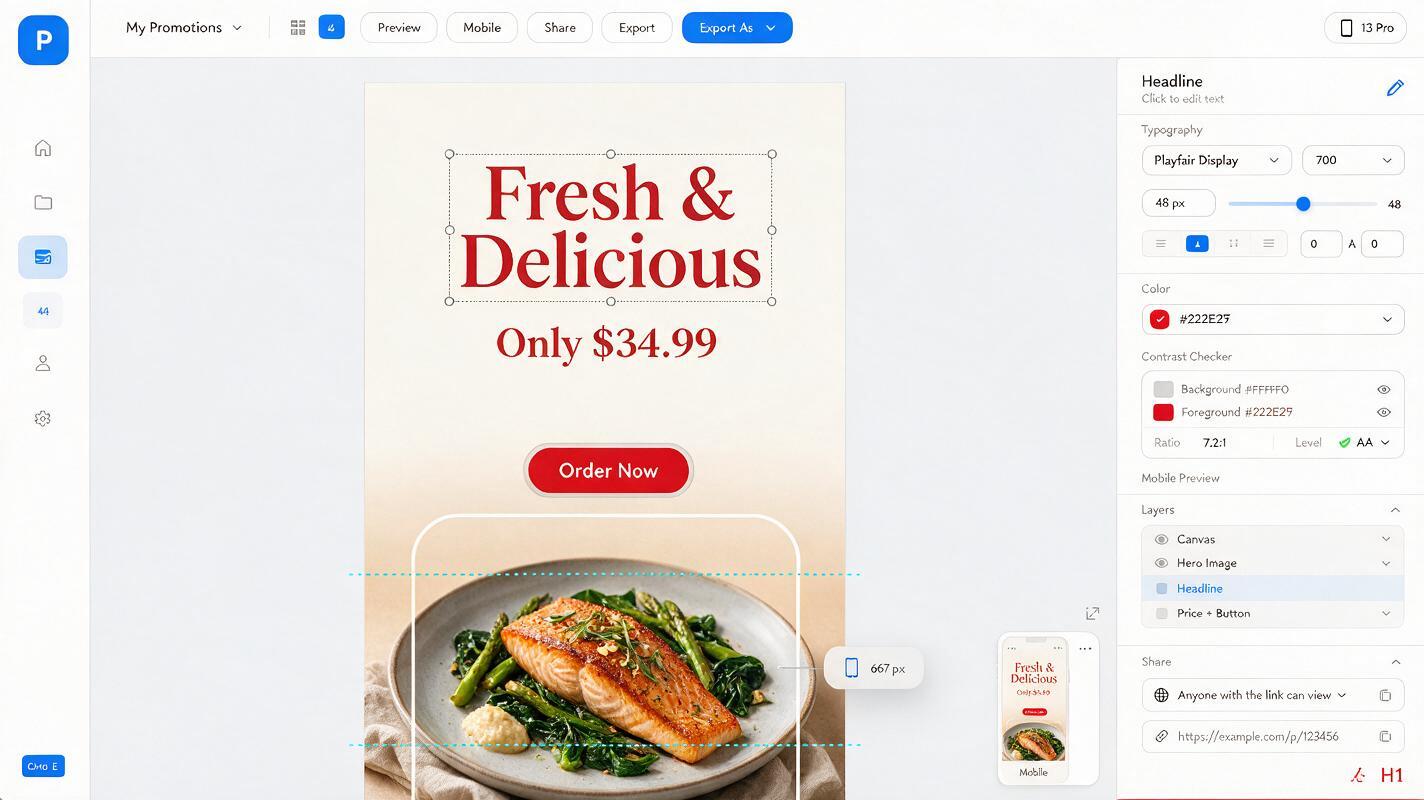
Do not approve the background in isolation. Place a realistic headline, price and call to action over the image, even if the wording is temporary. This reveals whether the copy zone has enough width, contrast and breathing room.
- Check the smallest mobile display, not only the desktop canvas.
- Keep critical words away from interface overlays and crop boundaries.
- Test both short and long versions of the offer.
- Confirm that the type does not touch steam, garnish, utensils or plate edges.
- Review the asset in grayscale to expose weak tonal contrast.
- Verify the final advertised dish against the restaurant’s approved reference.
If the message still feels squeezed, revise the composition prompt rather than reducing the font until it becomes unreadable. You can try this prompt for free and generate several spatial variations before committing to the final campaign layout.
Final checklist
- The food occupies a clearly defined region rather than the center by default.
- The copy zone is named by location, surface and lighting.
- No utensils, garnish or ingredient scatter enters the reserved area.
- The background provides sufficient contrast for the brand’s typography.
- The food remains appetizing, realistic and faithful to the advertised item.
- The image has been tested with an actual headline, price and call to action.
- All generated lettering has been excluded and final text is added separately.
- The layout survives the intended mobile, social, web or print crop.
Keywords
ai food ad prompts, food advertising, restaurant marketing AI, food image generator, copy space photography, Imagen prompts, restaurant social media content