AI Food Packaging Ads Without Warped Labels or Fake Ingredients
Create polished AI food packaging ads without allowing the model to redraw your logo, product name, nutrition claims or package geometry. This preservation-first workflow keeps the real pack intact while using Seedream 4.5 to build seasonal backgrounds, ingredient staging and campaign variations around it.
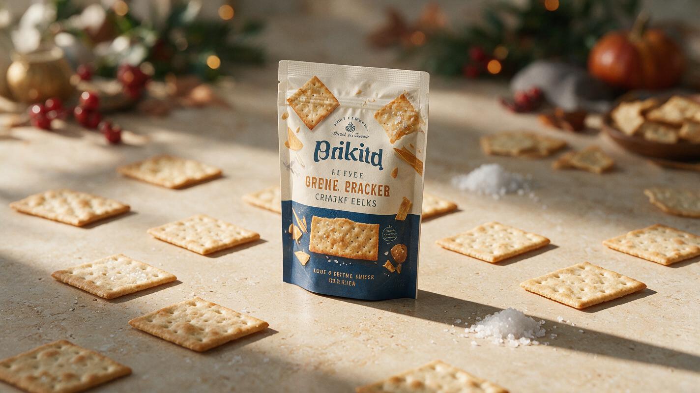
Table of contents
Build the campaign around the real package
The safest way to create an AI food packaging ad is to preserve the original package and generate the campaign scene around it. If the entire image is regenerated, logos can shift, labels can become unreadable and ingredients may appear that are not actually in the product. A preservation-first workflow avoids those problems while still giving food brands the speed to produce seasonal backgrounds, social variations and retail-ready concepts.
This method works for snack bags, frozen-food boxes, sauce jars, coffee pouches, bakery cartons and other packaged food products. It is especially useful when the approved pack already exists but a full studio reshoot is not practical.
Why full-scene generation damages packaging
Food packaging contains more precision than an ordinary product photo. A single front panel may include a logo, flavor name, product photograph, weight statement, certification marks and carefully positioned design elements. When a generative model rebuilds that panel, it interprets these elements as visual texture rather than fixed artwork.
The resulting image may look convincing at first glance while containing serious commercial errors:
- Invented lettering: the brand name or flavor becomes plausible-looking nonsense.
- Changed geometry: a rectangular box bends, a pouch seal disappears or a jar lid changes diameter.
- False product cues: extra fruit, nuts, chocolate or spices imply ingredients that may not be present.
- Unreliable claims: badges and nutritional statements are altered or replaced.
- Variant drift: package colors change between campaign formats, making the SKU difficult to recognize.
Treat approved packaging artwork as a truth layer, not as material for the model to reinterpret.
Separate the truth layer from the creative layer
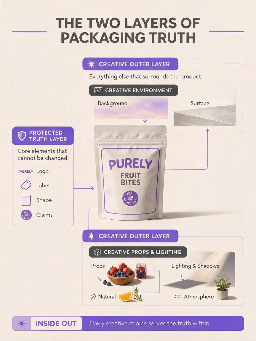
A dependable packaging visual has two distinct layers. The truth layer contains the real package, logo, typography, product claims and any ingredient information that must remain accurate. The creative layer contains the background, surface, lighting atmosphere, props and decorative motion cues.
| Truth layer | Creative layer |
|---|---|
| Original package photograph | Countertop, table or studio surface |
| Logo and front-panel text | Seasonal color palette |
| Package shape and proportions | Approved ingredient props |
| Real fill level or product quantity | Background depth and atmosphere |
| Regulated claims and certification marks | Shadows, highlights and campaign accents |
Generate or edit the creative layer with seedream 4.5, but retain the original package pixels whenever label accuracy matters. Even when reference editing is available, compositing the untouched pack over a generated background remains the safer choice for final advertising.
Capture a source package that is easy to preserve
Start with the cleanest product photograph available. A professional studio image is ideal, but a careful phone capture can work for concept development and social content.
- Photograph the package close to eye level to avoid exaggerated perspective.
- Use soft window light or a diffused lamp rather than direct flash.
- Keep the entire front panel sharp and readable.
- Leave visible space around every edge for masking.
- Avoid fingers, price stickers and reflections crossing the logo.
- Capture a second image from a slight angle if the campaign needs depth.
Glossy pouches, cans and jars require extra attention. Move the light until reflections describe the package shape without obscuring text. Do not ask AI to repair a large glare across important label information; use another source capture instead.
Generate the scene around the package
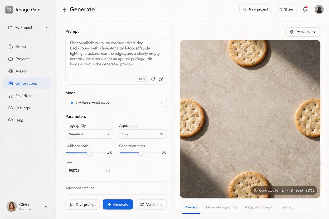
Use an ai image generator to create a background plate with an intentional empty zone for the real product. The prompt should describe the physical environment, camera position, light direction and approved ingredients without requesting a new package design.
For the cleanest composite, match the generated camera angle to the source photograph. A front-facing package needs a mostly level background. A package photographed from above needs a surface with a compatible overhead perspective.
Background plate prompt for a snack product
Photorealistic food advertising background for a premium sea-salt cracker campaign, warm limestone tabletop, soft late-afternoon window light entering from the upper left, subtle shadow area reserved in the center for one upright product pouch, a few real baked crackers and a small ceramic dish of coarse sea salt placed near the outer edges, restrained natural styling, realistic crumbs, shallow depth of field in the distant background, commercial editorial photography, no package, no logo, no text, no floating ingredients, no extra productsSeasonal background plate prompt
Photorealistic autumn campaign set for a packaged cinnamon granola product, muted terracotta surface, soft directional morning light from the right, clear empty vertical space in the center for a standing food pouch, small clusters of oats and two cinnamon sticks arranged away from the empty product zone, subtle linen napkin in the background, realistic scale, natural shadows, premium grocery advertising, no packaging, no labels, no typography, no invented fruit or ingredientsThe phrase “no package, no logo, no text” is important because the model only needs to create the environment. It should not produce a second fictional pack that later has to be removed.
Make the composite feel physically photographed
A pasted package usually fails because its light, contact shadow and sharpness do not belong to the generated set. Match these details before adding decorative effects.
Align the light direction
Compare the brightest edge of the real package with the generated scene. If the source is lit from the left, the background should also be lit from the left. Flipping the background can solve a mismatch, but never flip a package with readable text.
Build a believable contact shadow
The darkest shadow should sit directly beneath the package. It can become softer and lighter as it extends across the surface. A large uniform oval makes the product appear to hover, while a razor-sharp outline makes it look cut out.
Match texture and focus
A perfectly sharp phone photo placed over a softly focused editorial background can feel artificial. Apply only enough grain, contrast adjustment or edge softness to make both layers appear to come from the same camera. Keep the logo and important product text readable.
Use reflections selectively
A faint reflection can support jars, bottles or glossy cartons on polished surfaces. Matte snack bags and paper boxes usually need a contact shadow rather than a mirror-like reflection.
Keep ingredient styling truthful
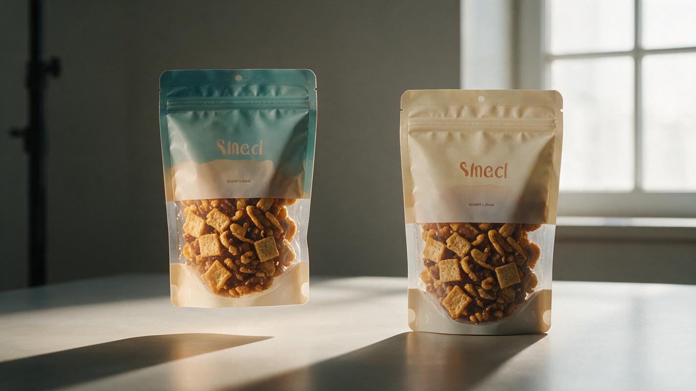
Ingredient explosions and abundant garnish can increase visual energy, but they can also misrepresent the food. Build the prop list from the approved product description rather than from what merely looks attractive.
- Show strawberries only if strawberry is a real flavor or ingredient communicated by the brand.
- Do not add whole nuts to a nut-free product for visual texture.
- Avoid showing a much larger serving than the package realistically contains.
- Do not use fresh dairy, meat or produce as shorthand for claims the product does not make.
- Keep allergen-sensitive ingredients visually separate from unrelated products in a multi-SKU campaign.
If the exact ingredient appearance is uncertain, use neutral supporting props such as a serving bowl, folded napkin, wooden scoop or color-matched surface. These can enrich the composition without creating a factual claim.
Adapt one approved key visual across campaign formats
Once the package, lighting and background are approved, preserve that combination as the master key visual. Create platform variations by extending the environment instead of regenerating the product.
| Format | Composition choice | Protected area |
|---|---|---|
| Square social post | Product near center with balanced props | Logo and front panel |
| Vertical story | Product in lower half with open space above | Top seal and complete silhouette |
| Landscape banner | Product on one side with copy space opposite | Package proportions and baseline shadow |
| Retail promotion | Simple background with room for price graphics | Claims, weight and flavor identification |
Do not regenerate the package independently for each aspect ratio. Reuse the same isolated truth layer, then create wider or taller background plates with matching light and surface materials. This keeps SKU color, logo size and pack geometry consistent across the campaign.
Fix the packaging failures that survive the first draft
| Problem | Likely cause | Practical fix |
|---|---|---|
| Package appears to float | Missing or misplaced contact shadow | Add a dense shadow directly beneath the lowest edge, then soften it outward |
| Label looks blurry | Original pack was regenerated or enlarged too far | Restore the untouched source package and use a higher-resolution capture |
| Scene feels like a collage | Light direction or color temperature differs | Regenerate the plate with lighting matched to the source photograph |
| Pack looks bent | Generative editing crossed the product boundary | Replace the altered area with the original package layer |
| Props imply the wrong flavor | Prompt used generic appetizing ingredients | Rewrite the prompt using an approved ingredient list |
| Campaign versions look inconsistent | Each format was generated from scratch | Reuse one approved package cutout and one lighting specification |
If a correction touches legal copy, a logo or a product claim, restore the original artwork instead of attempting to generate a cleaner version.
Final checklist
- The package silhouette matches the real SKU.
- The original logo, flavor name and front-panel text remain unchanged.
- The generated background contains no duplicate or fictional package.
- Light direction and color temperature match the source photograph.
- The product has a realistic contact shadow.
- Every visible ingredient is accurate and approved.
- Serving size and product abundance are not misleading.
- Social and banner versions reuse the same package truth layer.
- Final artwork is reviewed at full size, not only as a thumbnail.
Keep one real package at the center of the workflow and let AI handle the environment around it. When you are ready to build a campaign plate, try this prompt for free and replace the sample styling with your product’s approved ingredients, palette and lighting direction.
Keywords
ai food packaging ads, food product photography, seedream 4.5, restaurant marketing ai, food advertising, product label preservation, ai image generator