Why AI Food Packaging Photos Ruin Labels—and the Background-Plate Fix
AI-generated product photos often distort package labels, nutrition claims, logos, and container proportions. This preservation-first workflow uses a real pack shot with an Imagen-generated background plate, producing campaign-ready food photography without asking the model to redraw regulated packaging.
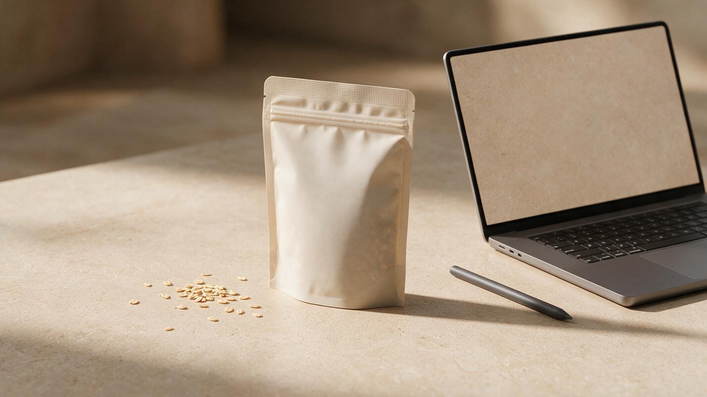
Table of contents
Keep the real package and generate only the scene
If an AI product photo changes your logo, flavor name, net weight, nutrition claim, or package shape, the image is not ready for advertising. Repeating the prompt rarely solves the problem because the model is being asked to invent visual text and preserve commercial packaging at the same time.
A safer method is to photograph the real product once, remove its original background, and use Imagen to generate a new environmental plate around it. The package remains authentic while the surface, lighting environment, props, color palette, and seasonal art direction can change.
The central rule is simple: treat the package as protected source material, not as something the model should redraw.
Why generated packaging loses label accuracy
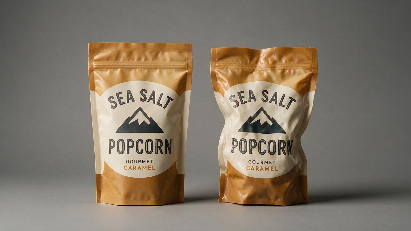
Food packages combine several details that generative models may interpret as visual texture rather than fixed information. A pouch might contain a logo, product name, certification mark, ingredient illustration, weight statement, and fine-print copy within a small area. Even when the overall design looks convincing, individual elements can drift.
Common failures include:
- Letter substitution: recognizable words become near-matches or decorative glyphs.
- Claim mutation: phrases such as “no added sugar” or “12 g protein” change meaning.
- Logo redesign: the brand mark gains different spacing, colors, or proportions.
- Flavor confusion: strawberry graphics appear on a raspberry product, or ingredients are invented.
- Structural drift: caps move, cartons widen, pouches become rigid, and jars gain impossible seams.
- Reflection damage: glossy highlights cover important copy or make printed text look embossed.
Negative prompts can reduce unrelated clutter, but they cannot guarantee exact typography. The reliable fix is to keep label-critical pixels outside the generation task.
Build a clean source pack shot
Start with one high-resolution photograph of the actual sale-ready product. A phone camera can work when the lens is clean, the camera is stable, and the package receives soft, even light.
For a useful source image:
- Place the product against a plain background with clear edge contrast.
- Keep the camera near label height to avoid excessive perspective distortion.
- Use a longer focal length or move back slightly rather than shooting very close with a wide lens.
- Remove dents, fingerprints, crumbs, and condensation unless they are intentional.
- Make the front label fully visible and check every claim at full resolution.
- Photograph transparent bottles with edge lighting so their silhouette remains distinct.
Capture a second frame with a ruler or simple scale reference beside the product. That frame does not need to appear in the campaign, but it helps the designer preserve believable proportions when adding props.
Cut out the product carefully, retaining natural holes, transparent regions, cap edges, and soft contact detail near the base. Save a version with transparency and keep the untouched original as the accuracy reference.
Generate a background plate with the right empty space
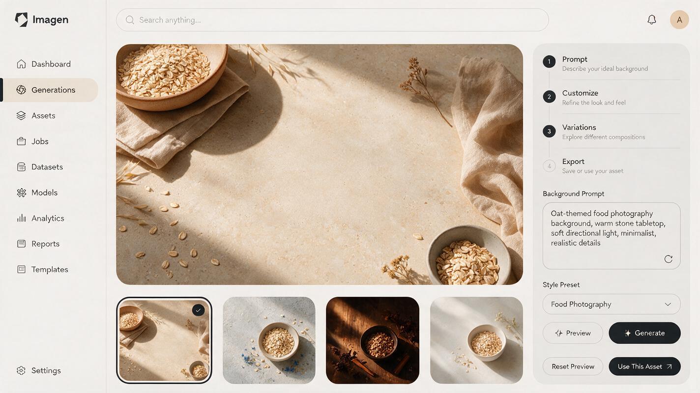
Instead of prompting an ai image generator to create a branded package, ask Imagen for an empty commercial set designed to receive your real product. Specify the camera angle, surface, light direction, product footprint, and reserved negative space.
This prompt creates a neutral premium setup for a snack pouch:
Photorealistic commercial food product photography background, warm pale-stone tabletop, soft cream studio wall, broad diffused key light from upper left, subtle amber bounce from the right, realistic horizontal contact area reserved at center for one upright snack pouch, no package and no text, a few oat grains and one folded beige linen napkin placed near the outer edges, restrained premium grocery advertising style, eye-level camera, 85 mm product-photo perspective, crisp natural materials, vertical 4:5 compositionThe phrase “reserved at center” is important. It tells the model that the hero area should remain open instead of being filled with a bowl, plant, or imaginary package.
For a chilled sauce jar, change the material and lighting language:
Empty photorealistic refrigerated food advertising set, cool light-gray stone shelf with a softly blurred tiled kitchen background, clear open space for one glass sauce jar in the center foreground, large diffused window light from camera right, faint cool rim light on the left, realistic surface reflection kept subtle, basil leaves and sliced tomato positioned only in the background corners, no container, no label, no words, horizontal 3:2 compositionGenerate several plates before compositing. Choose the one whose horizon, light direction, and open footprint best match the source photograph—not simply the most decorative result. At this point, you can test this prompt yourself with different surfaces and brand palettes while leaving the package description out.
Match camera angle before color grading
A perfect cutout still looks pasted on when its perspective disagrees with the generated scene. Compare the package’s visible top, side panels, and base ellipse with the plate.
| Source package view | Suitable background plate | Mismatch to avoid |
|---|---|---|
| Front-on pouch with little top visible | Eye-level tabletop scene | Overhead plate showing a wide surface |
| Jar with visible lid ellipse | Slightly elevated camera | Low-angle scene with an upward horizon |
| Tall bottle photographed near label height | Long-lens vertical product setup | Wide-angle foreground with converging edges |
| Box photographed at a three-quarter angle | Plate with directional side depth | Flat front-facing shelf geometry |
Do not stretch the package to force a fit. If the perspective is substantially wrong, generate another background or reshoot the product. Small positioning changes are less damaging than geometric distortion applied to a printed label.
Create believable contact, shadow, and reflection
The contact point is where most composites fail. A product without a grounded shadow appears to float; a dark generic oval makes it look like a sticker placed over the scene.
Build the grounding in separate layers:
- Contact shadow: a tight, dark, soft-edged shadow immediately below the package.
- Cast shadow: a lighter shadow extending away from the background plate’s key light.
- Ambient color: a subtle tint from the surface reflected onto the package’s lower edge.
- Reflection: only when the plate uses polished stone, glass, metal, or another reflective material.
The shadow should respond to the product’s shape. A flexible pouch may create several uneven contact points, while a jar usually forms a compact shadow following its circular base. Transparent bottles also need restrained transmitted color rather than an opaque black shadow.
If generative editing is available, mask only the narrow area beneath and immediately around the package. Keep the package itself protected, then request:
Add a physically plausible soft contact shadow beneath the existing product, matching the broad key light from upper left. Preserve the product, label, logo, colors, cap, proportions, and all printed text exactly. Modify only the tabletop area inside the mask.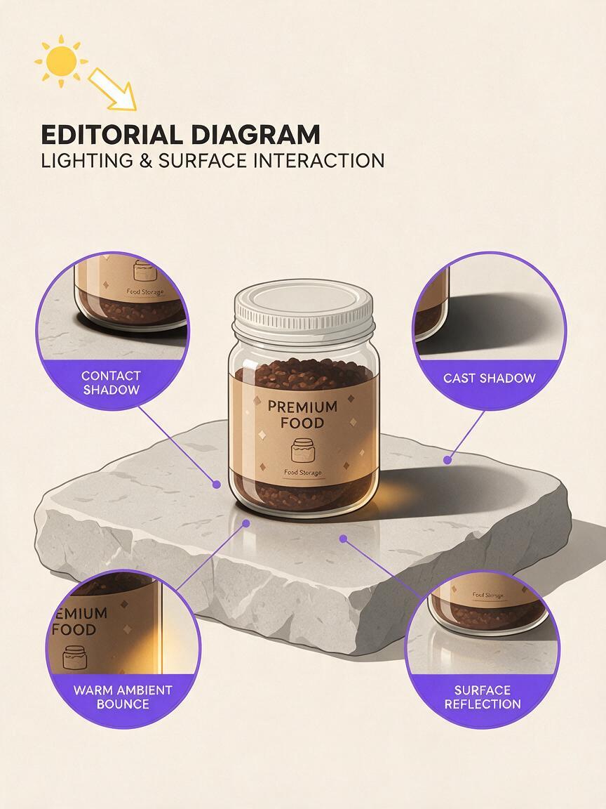
Use props without making unsupported ingredient claims
Props should communicate serving context or flavor accurately. Adding attractive but unrelated ingredients can turn a clean product shot into a misleading advertisement.
Before generating a plate, separate props into three groups:
- Confirmed ingredients: visible or stated on the approved package and product brief.
- Serving suggestions: legitimate pairings that should be presented as context, not ingredients.
- Decorative materials: linens, trays, glassware, utensils, and neutral surfaces.
A tomato sauce can reasonably sit near pasta and basil when the creative brief supports that serving suggestion. It should not be surrounded by truffles, cream, or fresh chili merely because those objects look premium. For allergen-sensitive or regulated campaigns, have the final prop list reviewed before generating any background.
Visual relevance matters more than prop quantity. One accurate ingredient cue is usually stronger than a crowded ring of generic food styling.
Adapt one pack shot to multiple campaign formats
Once the package is isolated, it can be placed into several purpose-built plates without regenerating the label. Create each composition for its final crop rather than resizing one master scene indiscriminately.
| Placement | Recommended composition | Space to reserve |
|---|---|---|
| Online product listing | Clean front-facing hero | Even margin around the full pack |
| Vertical social advertisement | 4:5 or 9:16 lifestyle set | Upper or side area for approved copy |
| Website banner | Wide environmental scene | One clear side for headline and button |
| Retail promotion | Product with restrained ingredient cues | Area for price or promotional badge |
Keep the package scale consistent within a campaign family. If the pouch fills 55 percent of one vertical frame but only 25 percent of the next, the series can feel unrelated even when the colors match.
Inspect the final image as an advertisement, not an artwork
Review the composite at full size and at its actual delivery size. Small mobile previews can hide label mutations, rough masks, repeated props, and strange reflections.
Compare the final image directly with the untouched source photograph. The following elements should remain identical:
- Brand name, product name, flavor, and variant
- Logo shape, spacing, and approved colors
- Nutrition, certification, and dietary claims
- Net quantity and other required statements
- Package dimensions, closure, seams, and transparent windows
- Ingredient illustrations already printed on the pack
Also check whether the generated environment changes the product’s apparent meaning. A shelf-stable item should not look frozen unless the campaign intentionally communicates chilled serving. A small single-serve container should not be scaled beside props in a way that makes it appear family-sized.
Final checklist
- Use a real, approved package photograph as the protected hero asset.
- Ask Imagen to generate an empty background plate, not a replacement package.
- Match camera height, horizon, perspective, and light direction before compositing.
- Reserve clear space in the prompt for the product footprint and campaign copy.
- Build contact shadow, cast shadow, ambient color, and reflection separately.
- Mask edits so generative tools cannot modify the package or label.
- Use only accurate ingredients and defensible serving suggestions as props.
- Compare every final export with the untouched source at full resolution.
Keywords
ai food photography, food product photography, ai packaging photos, Imagen prompts, food advertising, product background generator, restaurant marketing AI