How to Create AI Hero Images With Space for Website Copy
Learn how to generate website hero images with intentional negative space for headlines, buttons, and responsive layouts. This practical workflow covers composition prompts, copy-safe zones, breakpoint variants, troubleshooting, and production-ready exports.

Table of contents
Design the Image Around the Copy
A beautiful AI image can still fail as a website hero when the subject occupies the headline area, the background makes text unreadable, or the composition collapses on mobile.
The solution is to define the layout before generating the artwork. Instead of asking for a generic cinematic scene, describe where the subject belongs, where the interface copy will sit, and which visual details must survive responsive cropping. This tutorial shows how to produce landing-page visuals that behave like design assets rather than standalone illustrations.
Core rule: generate the artwork without embedded headlines, logos, buttons, or interface text. Add those elements later in HTML or your design tool so they remain readable, accessible, and editable.
Step 1 — Draw the Copy-Safe Zone Before You Generate
Start with a simple hero wireframe. Mark the area required for the eyebrow, headline, supporting paragraph, primary button, and any secondary action. This becomes your copy-safe zone.
For a conventional desktop split layout, the safe zone may occupy roughly the left 40 to 50 percent of the canvas while the visual subject sits on the right. A centered layout needs a quieter area behind the copy, often in the upper or middle third. These are starting points rather than fixed rules; the actual space depends on headline length and container width.
- Outline the real text block. Use representative copy, not lorem ipsum, because line breaks change the required space.
- Include interface padding. Leave breathing room around buttons and navigation.
- Mark protected subjects. Identify any face, product, device, or key effect that must not be covered.
- Plan the crop. Note what can safely disappear when the viewport becomes narrower.
Do not rely on a vague request for negative space. Tell the model which side should remain quiet, how large that area should feel, and where the visual weight belongs.
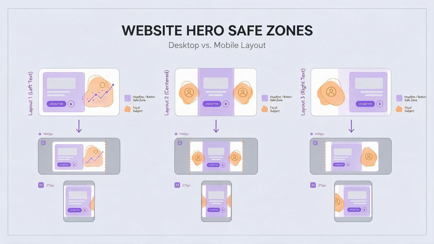
Step 2 — Choose a Composition That Matches the Page
The right composition follows the page hierarchy. A product launch, portfolio, SaaS landing page, and editorial homepage should not all use the same centered subject.
| Hero layout | Recommended composition | Useful for |
|---|---|---|
| Copy left, visual right | Subject in the right third with a calm left background | SaaS pages, product launches, conversion pages |
| Centered copy | Low-contrast center with details around the perimeter | Brand statements, events, portfolio introductions |
| Copy over full-bleed image | Controlled tonal field behind the text area | Editorial pages, travel, hospitality, lifestyle products |
| Product centered | Symmetrical object with clear space above or below | Physical products, app devices, feature announcements |
If the final page includes a navigation bar over the image, reserve a visually quiet top strip as well. Bright highlights, faces, and intricate patterns near navigation links can create contrast problems even when the main headline remains readable.
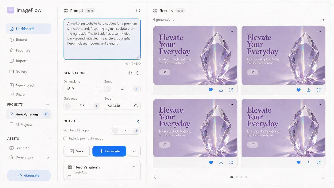
Step 3 — Write a Prompt That Controls Composition
A useful hero prompt describes six things: the subject, its position, the empty copy area, the environment, the lighting, and the visual restrictions. This structure works as a practical starting point in a text to image workflow, regardless of which supported image model you test.
Website hero image for a premium project-management platform.
A translucent sculptural timeline made from layered glass panels,
positioned entirely in the right third of a wide landscape frame.
The left half is spacious and visually quiet for a large headline
and two call-to-action buttons. Soft violet-to-slate background,
subtle studio lighting, restrained reflections, crisp premium finish.
No words, letters, logos, buttons, interface labels, or watermark.
Notice that the prompt does not merely say minimal. It specifies where the subject belongs and how the unused region should behave.
Prompt formula
Website hero image for [product or page type].
[Primary subject], positioned in [precise region of frame].
Leave [specific region] open and low-detail for [copy elements].
[Environment, palette, lighting, depth, and material treatment].
Wide composition with a clear focal hierarchy.
No text, letters, logos, UI labels, buttons, or watermark.
Example for a physical product page
Wide product-page hero photograph of a matte black wireless speaker
on a pale stone pedestal, positioned in the lower-right quadrant.
Keep the left 45 percent uncluttered for a two-line headline,
short description, price, and purchase button. Warm side lighting,
soft beige studio wall, realistic shadow, refined editorial styling.
No text, typography, packaging labels, extra products, or watermark.
Use an AI image generator to create several candidates from the same art direction rather than changing the prompt after every result. A small batch reveals whether the composition is reliable or happened by chance. Test this prompt yourself, then adjust only one variable at a time.
Step 4 — Evaluate Candidates Inside the Real Layout
Do not approve a hero image in isolation. Place every candidate behind the actual navigation, headline, paragraph, and buttons. An image that looks balanced in a gallery may become noisy once the interface is added.
- Insert the unedited image into the intended hero frame.
- Apply the real container width and text styles.
- Check contrast behind every line of copy.
- Preview at desktop, tablet, and mobile widths.
- Temporarily translate or lengthen the headline to test expansion.
- Confirm that the focal subject still reads at normal viewing size.
Look for visual collisions, not just literal overlap. A bright edge touching a button, a face looking away from the headline, or a strong diagonal cutting through the text can weaken the hierarchy.
If a dark overlay must become heavy enough to hide the artwork, reject the image or revise its composition. An overlay should refine contrast, not rescue an unsuitable asset.
Step 5 — Create Separate Crops for Desktop and Mobile
A single panoramic asset rarely produces the best result at every breakpoint. On mobile, a right-aligned subject may disappear outside the crop, while a full desktop scene may become too small to understand.
Create at least two intentional variants:
- Desktop: wide composition with the subject offset from the copy-safe zone.
- Mobile: taller or near-square composition with the subject repositioned above or below the copy.
Use the selected desktop result as a visual reference when generating the mobile version. Preserve the subject, palette, lighting direction, and materials, but explicitly request a new composition. If your editing workflow supports expansion, outpaint the scene rather than stretching it.
Recompose the same glass timeline sculpture for a tall mobile hero.
Preserve its violet glass materials, lighting, and overall identity.
Place the sculpture in the lower half of the frame and leave the
upper 40 percent calm and low-detail for centered website copy.
Extend the background naturally. Do not add text or interface elements.
Use responsive art direction to serve the appropriate asset instead of expecting one crop to solve every layout. This also gives you better control over focal position and downloaded file size.
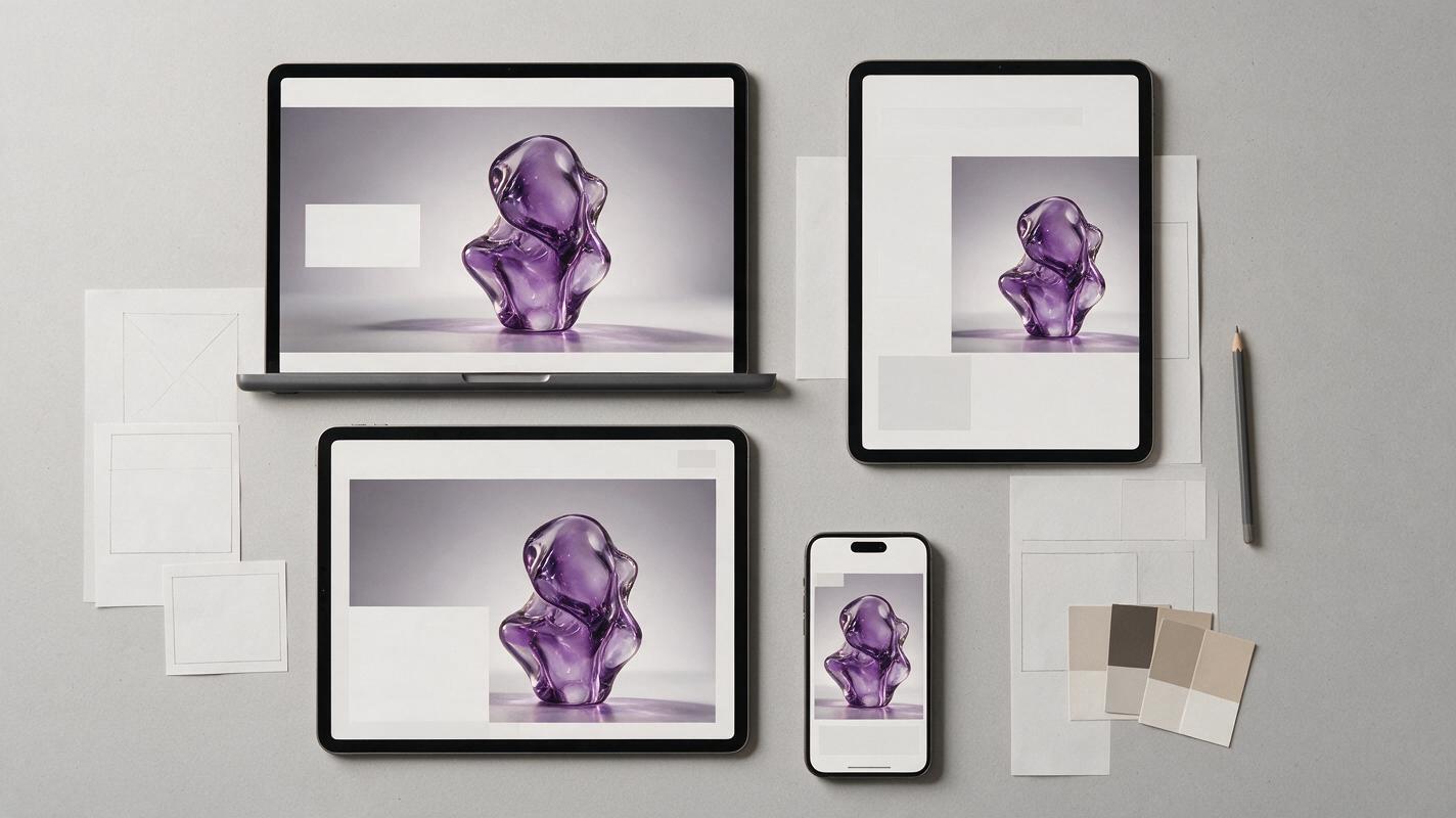
Step 6 — Fix Common Hero Image Failures
| Problem | Likely cause | Prompt or design fix |
|---|---|---|
| The subject keeps moving to the center | The subject description is stronger than the placement instruction | Repeat the requested region and define the opposite side as empty |
| The empty area contains random objects | Negative space was described too loosely | Request a continuous low-detail wall, gradient, sky, or studio backdrop |
| Text lacks contrast | The safe zone has bright highlights or texture | Specify restrained lighting and a narrow tonal range behind copy |
| The model generates fake words | The prompt references signs, packaging, screens, or advertising | Remove text-bearing props and add a no-lettering restriction |
| The mobile crop loses the subject | The desktop asset is being reused without art direction | Generate a dedicated tall variant with a repositioned focal point |
| The result feels generic | The prompt relies on broad style adjectives | Define materials, lighting direction, camera distance, and one distinctive motif |
If repeated generations ignore the layout, simplify the scene. One clear subject on a controlled background is usually more useful than a complex environment containing several focal points. You can also generate a clean base image first and add secondary decorative details in a later editing pass.
Step 7 — Prepare the Final Asset for Production
Once the composition works, complete the asset as part of the page system rather than treating it as an isolated export.
- Remove artifacts. Inspect edges, reflections, repeated objects, malformed product details, and accidental letter-like marks.
- Protect legibility. Apply a subtle gradient or color wash only when needed for stable contrast.
- Export suitable dimensions. Match the expected rendered size and avoid shipping an unnecessarily large master file.
- Choose an efficient format. Use the format and compression settings supported by your publishing stack while checking visible quality.
- Write useful alternative text. Describe meaningful content, or use empty alternative text when the image is purely decorative and conveys no unique information.
- Check loading behavior. Prevent layout shifts by defining the image area before the asset loads.
Finally, test the assembled hero on a real phone and laptop. Confirm that the headline remains dominant, the call to action is easy to find, and the generated image supports the message without competing with it.
Final Checklist
- The copy-safe zone was defined before image generation.
- The prompt states both subject placement and empty-space placement.
- No headline, logo, button, or fake interface text is baked into the image.
- The selected result has been tested behind real website copy.
- Desktop and mobile use deliberate compositions rather than accidental crops.
- Contrast remains reliable without an overly heavy overlay.
- Artifacts and letter-like marks have been removed.
- The final export is appropriately sized and compressed.
Keywords
ai hero images, website hero images, hero image prompts, negative space, landing-page visuals, text to image, responsive hero design