How to Adapt AI Campaign Key Visuals to Any Aspect Ratio (No Brand Drift)
Adapting AI-generated campaign key visuals to different aspect ratios often leads to brand drift, distorted elements, and broken compositions. This guide shows brand and graphic designers how to use Seedream 4.5’s reference locking and targeted prompting to create consistent, on-brand key visuals for every touchpoint—from billboards to social stories—without recreating designs from scratch. It includes reusable prompt templates, setup tips, and a final consistency checklist.
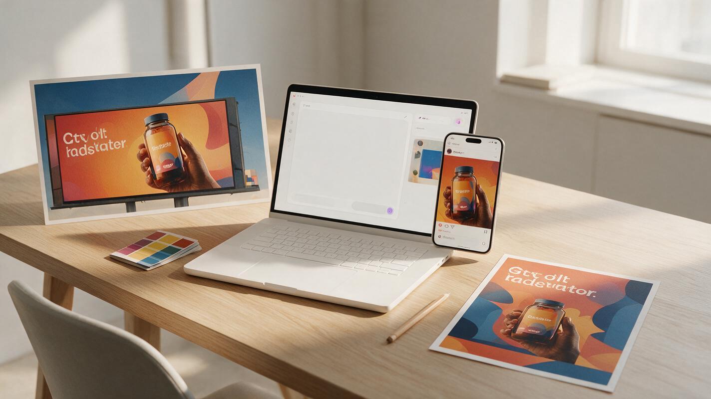
Table of contents
Why AI key visuals break when you change aspect ratio
If you’ve ever generated a perfect AI campaign key visual only to watch it fall apart when you resize it for a billboard, Instagram post, or story ad, you’re not alone. Most AI image tools treat aspect ratio adjustments as a simple crop or stretch, which warps focal points, shifts brand colors, and adds random unapproved elements to fill empty space.
For brand designers, this means hours of manual touch-ups or recreating every format from scratch—wasting time that could be spent on creative strategy. The good news is you don’t have to choose between speed and consistency. With Seedream 4.5’s reference-locked generation and targeted prompting, you can adapt a single base key visual to every campaign touchpoint without brand drift.
If you’re starting from scratch and haven’t finalized your base visual yet, use an ai image generator to explore 3-5 style directions first, then pick the strongest one to build your variation set.
Pick a base key visual built for adaptation
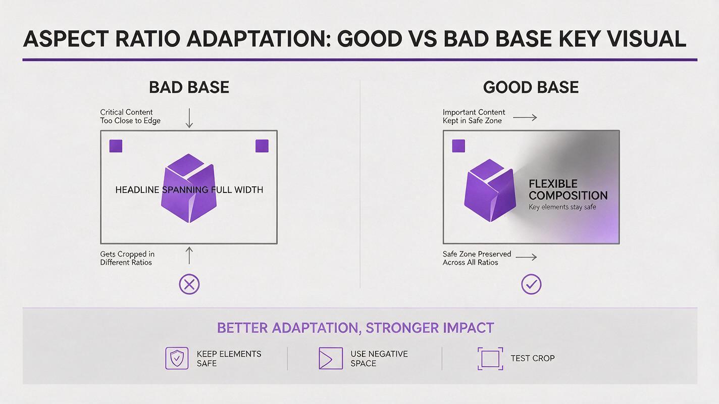
Not every key visual works well for multi-aspect-ratio adaptation. Starting with a flexible base cuts your touch-up time in half and reduces the risk of drift across variations.
- Clear off-center focal point: Place your main subject (product, illustration, hero figure) in one third of the frame, not dead center. This leaves natural negative space to expand or crop on the opposite side.
- Generous negative space: Leave at least one side of the visual with soft, low-detail background (gradients, subtle textures, empty sky) that can be extended or trimmed without breaking the composition.
- Flexible text placement: If your base includes copy, position it in the negative space rather than across the entire width of the frame. This makes it easy to shift or stack text for vertical or wide formats.
- Edge-free critical elements: Keep logos, taglines, and key details away from the edges of the frame, so they don’t get cropped out in tighter aspect ratios.
Lock style and brand rules with a reference sheet
The biggest cause of brand drift across aspect ratio variations is weak style reference. Before generating any variations, build a simple reference package that gives the model clear guardrails for what to preserve.
Your reference sheet should include:
- The final base key visual (high-res, uncropped)
- A small swatch of your brand’s primary and secondary colors (labeled with hex codes for clarity)
- A clean PNG of your brand logo
- A 1-2 line note of your core style direction (e.g., “minimalist 3D render, soft matte finish, warm natural lighting”)
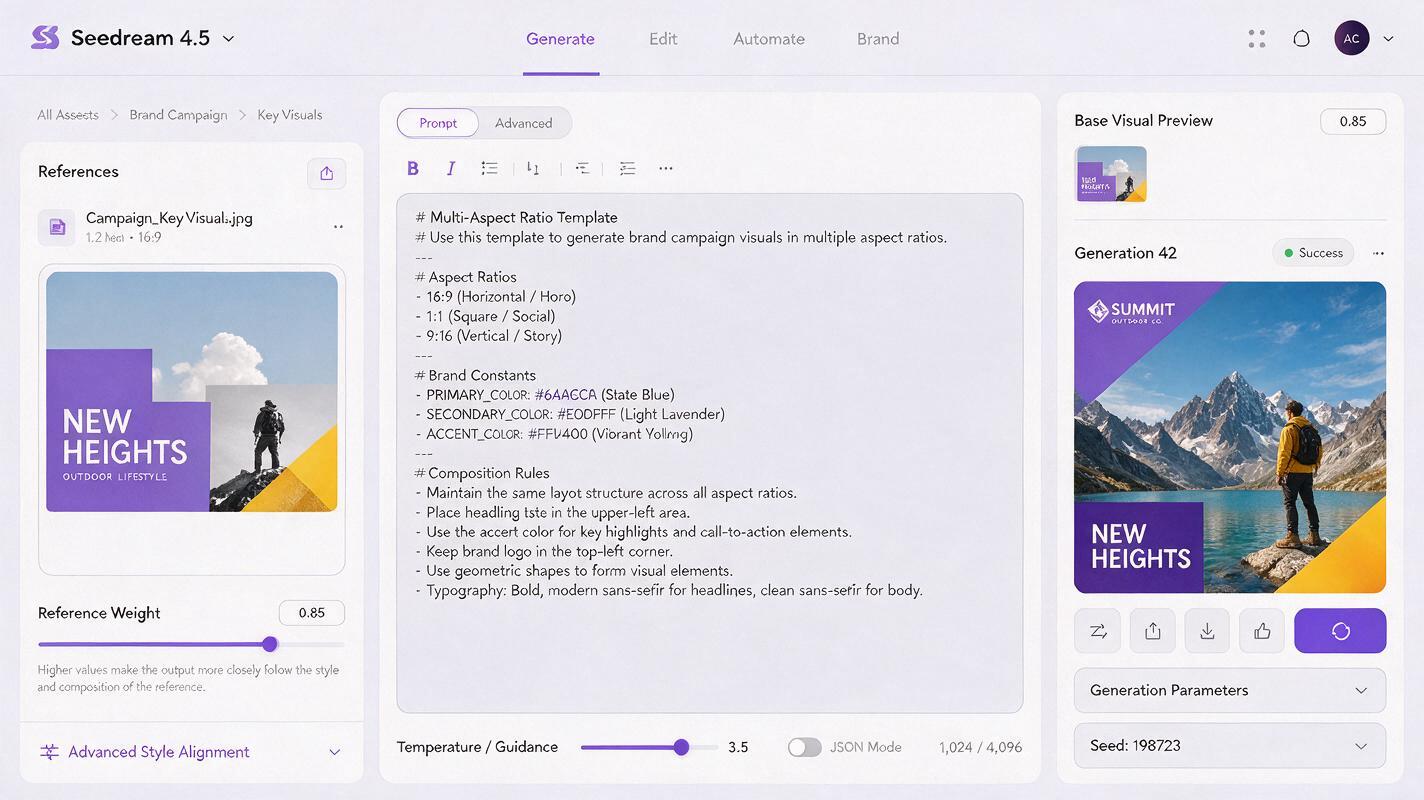
In Seedream 4.5, upload your base key visual as a style reference and set the reference weight to 0.8–0.9. This is high enough to preserve color, texture, and subject identity, but flexible enough to let the model adjust the composition for new aspect ratios.
Use this base prompt template for all variations, swapping only the aspect ratio and composition instructions:
On-brand campaign key visual, [aspect ratio] format,
Style reference: match exact color palette, texture, and main subject from reference image,
Main subject: [describe your focal point, e.g., “matte white ceramic perfume bottle with gold cap”] positioned [placement for this format, e.g., “in left third of frame”],
Background: [describe background adjustment, e.g., “extend soft peach gradient to fill right side of frame”],
Brand rules: use only brand colors #FF6B6B, #4ECDC4, #1A535C, no additional decorative elements, preserve exact logo design from reference,
Quality: high resolution, sharp details, professional campaign photography style
Test this prompt yourself with your own base visual and brand colors to see how consistent the first draft variations are.
Generate variations with composition-specific prompts
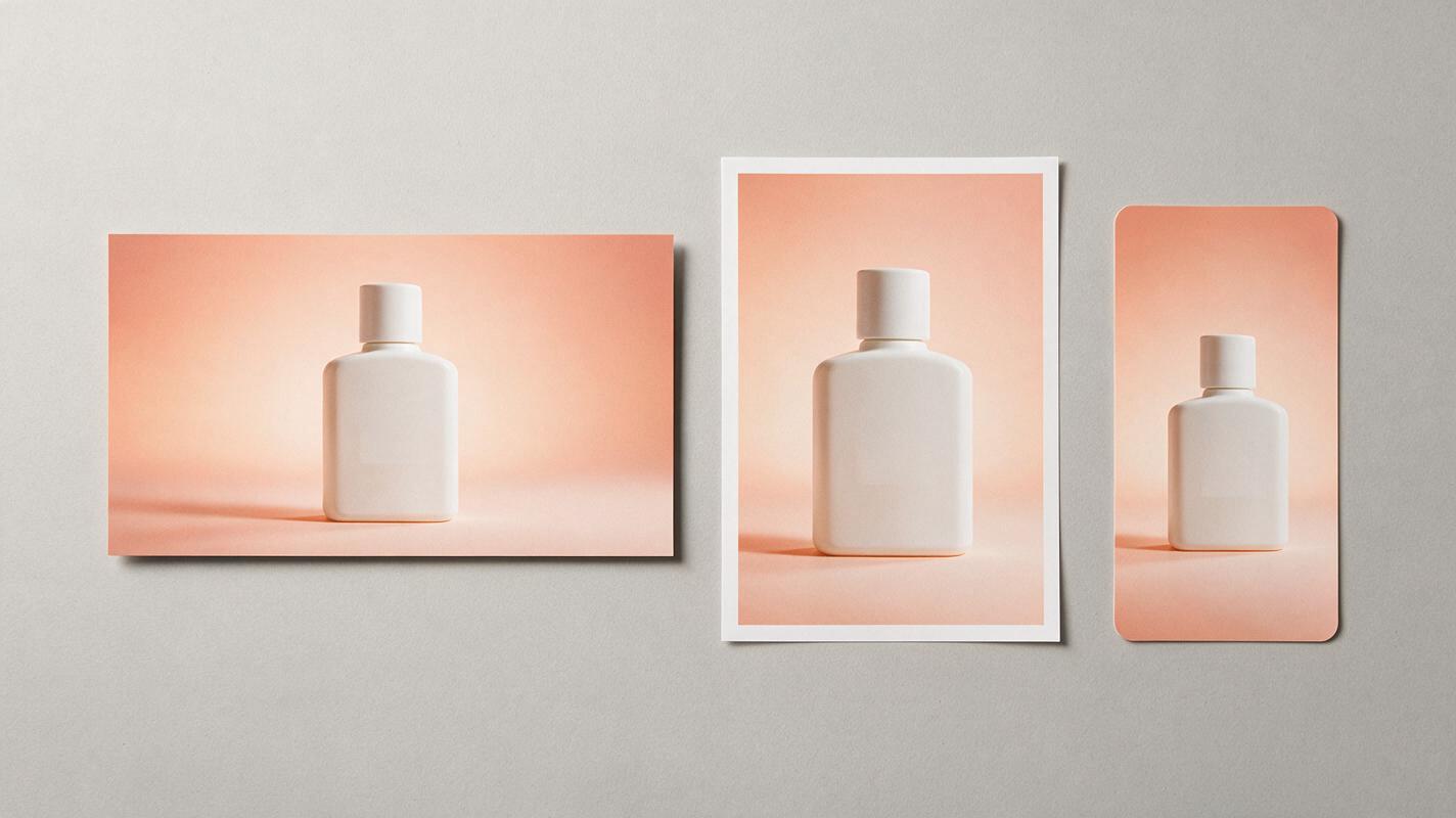
Simply changing the aspect ratio parameter isn’t enough—you need to tell the model exactly how to rearrange the composition for each format. Vague prompts lead to random crops, misplaced subjects, and extra elements you didn’t ask for.
Here’s how to adjust the prompt for the most common campaign touchpoints, using a base 1:1 poster with a left-aligned product and right-side negative space as an example:
16:9 billboard (horizontal wide format)
Add these lines to your base prompt:
Aspect ratio 16:9,
Main subject stays in left third of frame,
Extend background scene to the right to fill wide format,
Tagline stays aligned right in the negative space, same font and size relative to subject
4:5 Instagram post (vertical square-adjacent)
Add these lines to your base prompt:
Aspect ratio 4:5,
Slightly crop left edge of frame, keep main subject fully visible,
Stack tagline vertically in the right side negative space,
Logo stays in top left corner, consistent size relative to frame
9:16 Instagram story / TikTok cover (full vertical)
Add these lines to your base prompt:
Aspect ratio 9:16,
Crop left and right edges, move main subject to upper third of frame,
Shift tagline below main subject, centered,
Logo stays in top left corner, slightly smaller to fit vertical safe zone
If a variation comes back with a changed subject or shifted colors, lower the creativity slider by 10–15% and increase the reference weight by 0.05–0.1. Adding the phrase “exact same main subject as reference image” to the prompt also helps lock in identity.
Fix small inconsistencies with targeted inpainting
Even with perfect prompts, you’ll occasionally run into small issues: a blurry logo, a slightly off brand color, or a missing detail in the extended background. Don’t regenerate the entire image—use Seedream 4.5’s inpainting tool to fix only the problem area.
For most touch-ups, follow this approach:
- Mask only the area that needs fixing (avoid masking surrounding details that are already correct)
- Upload your original base visual as a reference for the inpaint, and set reference weight to 1.0 for the masked area
- Use a specific prompt for the fix, e.g., “exact brand logo from reference, sharp edges, correct #FF6B6B red”
- Run 2-3 inpaint generations and pick the one that matches the base visual most closely
This is far faster than regenerating full variations and ensures every small detail stays on-brand.
Final consistency checklist
Before exporting your full set of variations, run through this checklist to make sure every format stays aligned with your brand guidelines:
- Main subject/illustration is identical in style, color, and core details across all variations
- Brand colors match your official hex codes (verify with a color picker tool)
- Logo is undistorted, properly sized, and placed in a consistent relative position (e.g., top left corner, safe from edge crops)
- Typography matches your brand font, weight, and color, with no warped or misspelled text
- Negative space feels intentional and balanced, not cramped or empty
- No random decorative elements, objects, or textures appear that weren’t in the original base visual
Keywords
campaign key visual, ai key visual, brand consistency, aspect ratio design, seedream 4.5, ai graphic design, brand visual system