Why AI Logo Mockups Distort Your Mark—and How to Fix It
AI-generated logo mockups often bend letterforms, alter spacing, or invent details that weaken the identity being presented. This practical Seedream 4.5 workflow separates scene generation from logo compositing, producing polished presentation visuals without sacrificing the approved mark.
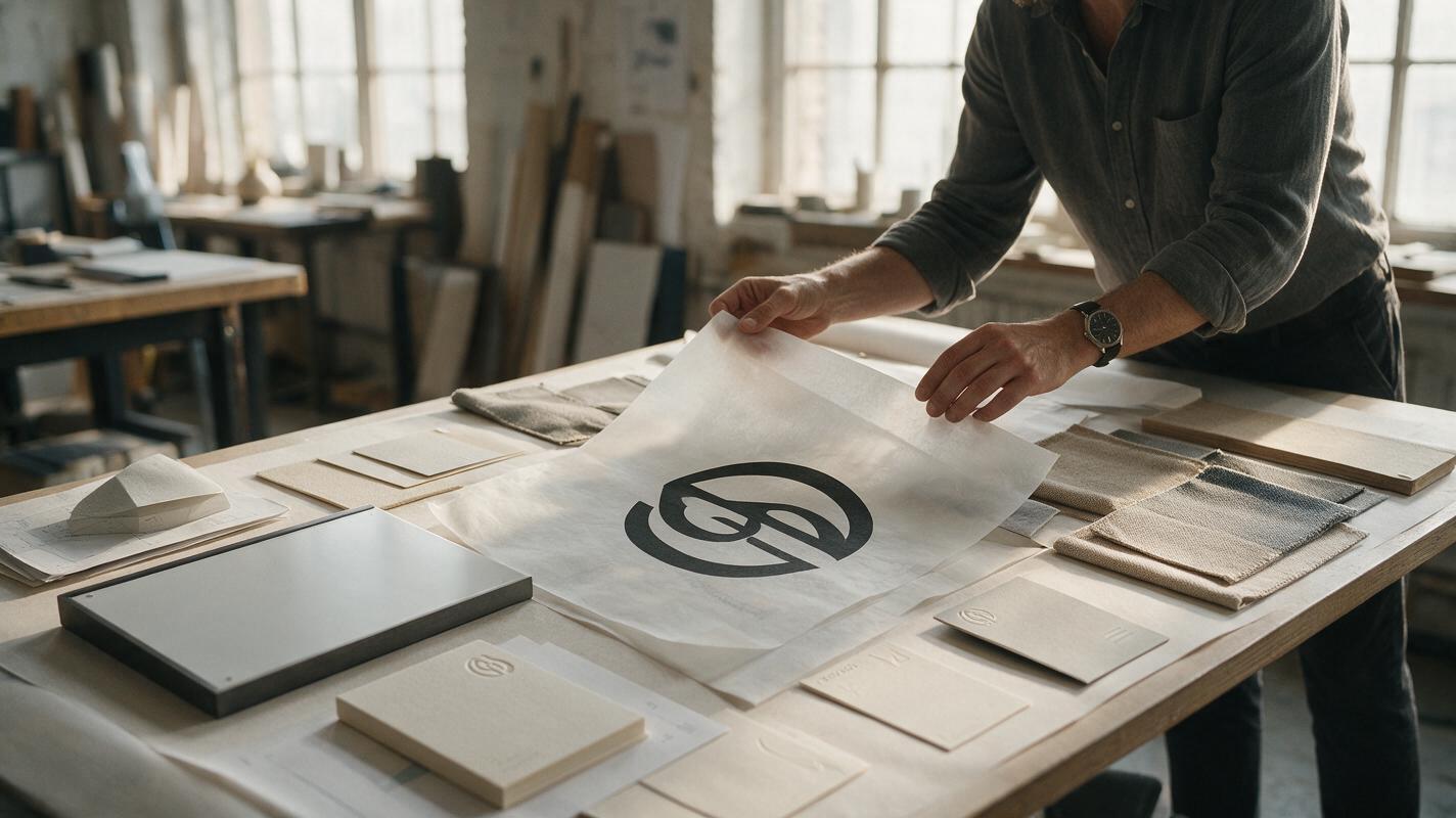
Table of contents
Build logo mockups without redrawing the logo
Your logo is already approved, but the AI mockup keeps changing it. Letters merge, negative spaces close, proportions drift, and a clean vector mark becomes an almost-correct imitation. The reliable fix is not a longer prompt. It is a hybrid workflow: use Seedream 4.5 to generate or edit the branded environment, then place the original logo artwork into that environment with controlled perspective, material, and lighting.
This method gives brand designers the speed of generative visualization while preserving the geometry clients have approved. It works for identity presentations, environmental signage, stationery, merchandise, digital displays, embossed applications, and launch-deck hero images.
Core rule: ask AI to design the scene around the logo, not to recreate the final logo from memory.
Why AI-generated logo mockups become inaccurate
A logo may look simple to a person, but it is an unusually strict image-generation task. Tiny changes to kerning, counters, corner radii, stroke relationships, or symbol alignment can create a different mark. Generative models tend to interpret the reference as visual guidance rather than immutable vector geometry.
Distortion becomes more likely when the prompt combines several difficult requests:
- Reproduce a small or low-resolution logo exactly.
- Apply deep perspective or wrap the mark around a curved object.
- Create reflective, translucent, embroidered, embossed, or illuminated materials.
- Place the logo far from the camera or partly behind another object.
- Generate several branded objects in one image.
- Render a wordmark as if it were ordinary scene text.
Prompt phrases such as preserve the exact logo can improve intent, but they cannot guarantee production-level fidelity. The safest workflow gives the model responsibility for atmosphere and material context while reserving the final mark for deterministic compositing.
Prepare a logo reference that exposes every error
Start with the approved master artwork rather than a screenshot from a presentation. Export a transparent PNG at generous resolution for compositing, and keep the original SVG or vector file available for the final production pass.
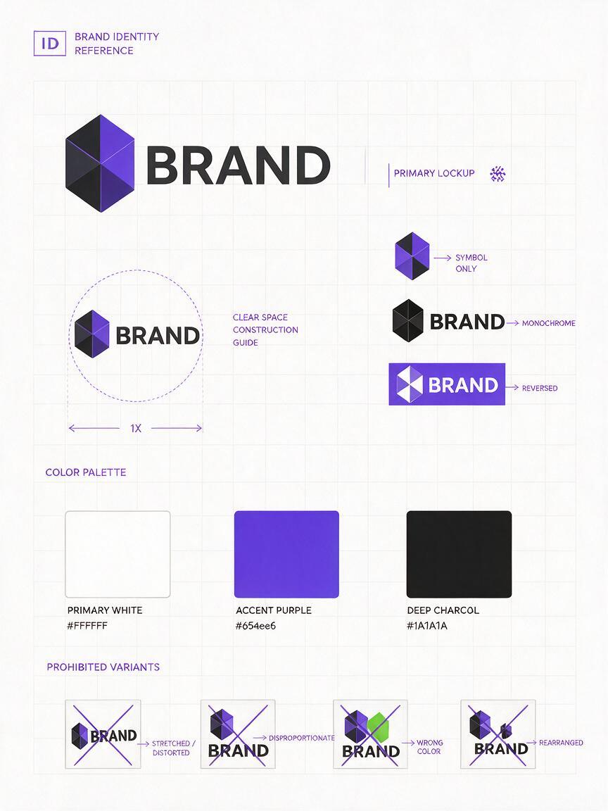
Create a compact reference sheet containing:
- The primary horizontal or vertical lockup.
- The symbol and wordmark as separate assets.
- Approved one-color positive and reversed versions.
- A clear-space guide around the mark.
- Correct brand color values.
- A small group of prohibited transformations, such as stretching or rearranging.
The reference sheet is primarily for your own quality control. If the generation interface accepts references, it can also communicate the identity's silhouette, proportions, and visual weight. Do not crowd the sheet with stationery or unrelated campaign imagery; that can make the intended logo less obvious.
Generate the application scene before adding the mark
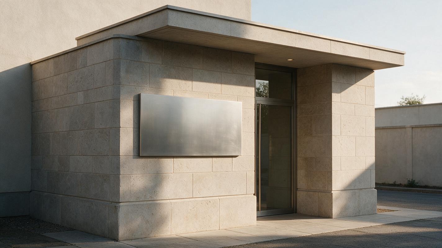
Use Seedream 4.5 to build a scene with a deliberate logo placement zone. Instead of asking it to render the identity, describe the physical surface, camera angle, material behavior, lighting, and amount of empty space required for later compositing.
An ai image generator is most useful here as a scene and material visualizer. It can explore combinations that would be expensive to photograph, while the actual identity remains outside the generative layer.
Photorealistic brand presentation mockup of a premium design studio entrance, warm gray limestone wall, wide blank rectangular signage panel centered at eye level, panel completely empty with no letters or symbols, soft indirect morning light from the left, subtle realistic shadows, straight architectural verticals, restrained neutral palette, frontal three-quarter camera view, generous negative space, editorial identity case-study photographyThe words blank, empty, and no letters or symbols matter because unwanted pseudo-text creates extra cleanup. Generate several scene options and select the one with the clearest surface boundaries, believable scale, and least complicated perspective.
Useful scene variations for a presentation deck
- Facade signage: a flat stone, glass, concrete, or painted-metal panel.
- Reception wall: a calm interior with space for dimensional lettering.
- Mobile interface: a clean splash screen with an empty central area.
- Event environment: a stage fascia, directional sign, or registration wall.
- Material study: close-up paper, foil, embossing, acrylic, or stitched fabric.
Keep the first batch simple. One clear application per image is easier to control than a scene containing six branded objects.
Composite the approved logo with believable perspective
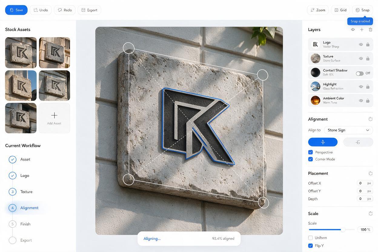
Place the original logo in Photoshop, Affinity Photo, Illustrator, Figma, or another layout tool as a linked smart object or vector layer. Scale it according to the surface rather than filling every available area. Brand presentations usually look more convincing when the mark has realistic breathing room.
For a flat surface, match its four corners with perspective or distortion controls. For a curved object, use a displacement map or a restrained warp while comparing the result with the undeformed master. If the mark becomes difficult to recognize, the application angle is too aggressive for a hero presentation image.
Build the effect in separate layers:
- Base logo: the approved artwork and color.
- Material interaction: texture visible through or over the mark.
- Contact shadow: a subtle shadow for dimensional applications.
- Highlight or edge: used only when the material requires it.
- Ambient integration: localized color, grain, or reflection from the scene.
Avoid applying a dramatic bevel merely to make the mockup look expensive. The effect should communicate a plausible manufacturing method, not decorate the logo.
Choose the right method for each presentation image
| Method | Best use | Logo accuracy | Main limitation |
|---|---|---|---|
| Full AI generation with logo reference | Loose internal exploration | Low to variable | May redraw letters and spacing |
| AI scene plus manual logo composite | Client-facing identity mockups | High | Requires a short finishing pass |
| Traditional stock mockup | Fast standardized applications | High | Less distinctive or campaign-specific |
| 3D render with vector artwork | Complex objects and exact materials | Very high | Longer setup and specialist skills |
For most identity decks, the AI-scene-plus-composite method offers the strongest balance. It creates distinctive environments quickly without treating the logo itself as expendable pixels.
Create embossed, illuminated, and printed effects safely
Material effects should follow the physical surface. An embossed paper mark displaces fibers and catches shallow side light. Illuminated signage creates a controlled halo on the wall. Printed ink absorbs differently on coated paper, recycled stock, and fabric.
Use the generated image as a lighting reference, then reproduce the effect around the real logo. For an embossed application, duplicate the logo mask to create separate highlight and shadow edges. For backlit signage, place a blurred glow behind the mark while retaining a crisp front face. For screen printing, blend subtle substrate texture over the logo without destroying its outline.
Close-up editorial photograph of thick uncoated off-white paper, completely blank debossed presentation area in the center, shallow tactile indentation with no text and no symbol, raking side light revealing paper fibers, restrained premium identity presentation, macro lens realism, natural shadows, no decorative objectsThis prompt creates the physical context. The approved logo mask supplies the exact debossed shape during compositing. When you are ready to explore the scene, test this prompt yourself and compare several lighting directions before committing to a final application.
Fix the logo mockup problems clients notice first
The wordmark looks subtly wrong
Replace it with the master vector rather than attempting repeated regeneration. Check letter spacing, baseline alignment, custom ligatures, and the relationship between the symbol and wordmark.
The logo appears pasted onto the surface
Match perspective first, then add material interaction. Sample the scene's sharpness, grain, contrast, and color temperature. A perfectly clean logo on a softly focused photograph will immediately feel artificial.
The mark is warped beyond recognition
Choose a flatter viewpoint or a less curved application. A branded object can be realistic without displaying every part of the logo. For a hero slide, however, prioritize legibility over dramatic geometry.
The scene competes with the identity
Reduce props, background text, hard highlights, and high-contrast edges near the placement zone. The environment should reinforce the brand's tone while leaving the mark as the focal point.
Several mockups feel like different brands
Define a shared visual system before generating more scenes. Reuse the same palette, lighting direction, lens character, material family, and composition density. Consistency should come from art direction, not from repeating an identical room.
Turn individual mockups into a coherent logo presentation
A strong identity presentation does not need a long sequence of unrelated lifestyle images. Select a small set that demonstrates the logo across meaningful scales and conditions:
- A clear primary lockup on a controlled neutral background.
- A close material application showing craft and detail.
- An environmental application demonstrating scale.
- A digital context showing small-size behavior.
- A restrained campaign or launch image showing expressive potential.
Arrange the deck so that accurate identity rules appear before atmospheric applications. This helps viewers understand which elements are fixed and which parts of the visual world can flex. Label mockups as conceptual when manufacturing, architecture, or production details have not been validated.
Final checklist
- Use the approved SVG or transparent master artwork for the final mark.
- Generate blank application scenes instead of asking AI to redraw the logo.
- Select surfaces with clear boundaries and manageable perspective.
- Composite perspective, texture, shadows, and highlights on separate layers.
- Compare every result against the undeformed master logo.
- Remove pseudo-text and competing visual details from the scene.
- Keep lighting, palette, and material choices consistent across the deck.
- Label speculative applications as concepts before client delivery.
Keywords
ai logo mockup, Seedream 4.5, logo presentation, brand design AI, logo distortion, graphic design prompts, brand image system