Why AI Manga Panels Look Gray—and How to Fix Screentones
AI manga panels often become muddy because the generator treats ink, shadows, and screentones as one continuous gray texture. This practical troubleshooting guide shows how to prompt with Midjourney for clearer tonal roles, rebuild controlled screentones, and test panels at their final reading size.
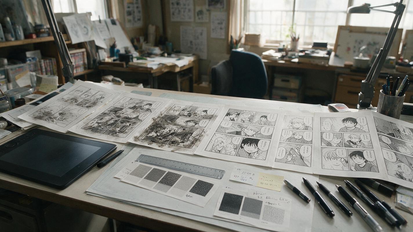
Table of contents
Fix the tonal hierarchy before adding more detail
An AI manga panel can look impressive at full resolution yet collapse into gray mush when placed on a comic page. The usual problem is not a lack of detail. It is that black ink, white space, shadows, and screentones are competing for the same middle-gray range.
The solution is to give every tone a specific storytelling role. This guide uses Midjourney for the initial panel concept, followed by a controlled cleanup pass that turns generated texture into readable black-and-white comic art.
A strong manga panel should remain understandable before the reader notices its textures.
Diagnose the kind of grayness you have
Not every muddy panel fails for the same reason. Before changing the prompt, reduce the image to thumbnail size and identify which visual layer has lost control.
| Visible problem | Likely cause | Best correction |
|---|---|---|
| The character blends into the background | Subject and environment share similar values | Assign white, gray, and black roles by depth |
| Hair and clothing look dusty | Random texture is replacing deliberate ink | Request solid fills and clean edge shapes |
| Every surface has dots or hatching | The prompt asks for manga texture without hierarchy | Reserve screentone for named materials or planes |
| Faces become dirty at small size | Mid-gray shading covers key features | Protect facial whites and simplify cheek shadows |
| The panel looks photographic in grayscale | Continuous lighting was generated instead of graphic values | Prompt for separated ink masses and limited tones |
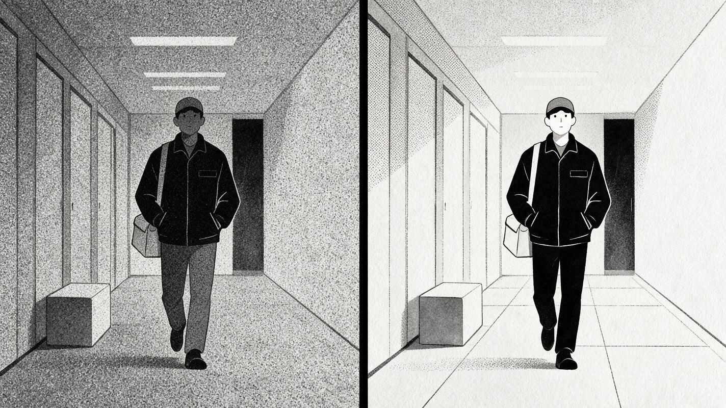
A quick test is to squint at the panel. If the focal character disappears, more detail will not save it. The composition needs stronger value separation.
Build a three-value map before generating
Decide where the panel’s white, gray, and black areas belong before writing a visual prompt. Treat these values as compositional tools rather than literal surface colors.
- White: faces, focal props, open sky, dialogue space, or an illuminated path.
- Gray: secondary clothing, distant architecture, atmosphere, or a controlled screentone plane.
- Black: silhouettes, deep shadows, foreground framing, hair masses, or the principal threat.
For example, a night alley does not need gray texture on every wall. A clearer plan might use a black foreground pipe, a pale character, and one medium-tone wall behind the figure. That arrangement creates depth without rendering every brick.
VALUE MAP
White: face, hands, speech balloon area
Gray: rear wall and distant rain
Black: coat, foreground railing, doorway
Focal contrast: white face against black collar
This small plan also makes it easier to evaluate output from an ai art generator. You are no longer asking whether the image is generally attractive; you are checking whether it follows a readable tonal design.
Prompt for ink roles, not just a manga style
“Black-and-white manga style” describes an appearance, but it does not tell the model how to distribute ink. A better Midjourney prompt defines the shot, focal action, value structure, line behavior, and texture limits.
Black-and-white manga panel, waist-up view of a tired courier
turning toward a sound in a narrow apartment corridor,
face and hands preserved as clean white shapes,
solid black jacket and deep black doorway behind one shoulder,
light screentone only on the corridor walls,
crisp controlled ink contours, simplified background edges,
clear silhouette, strong focal contrast around the eyes,
open uncluttered area above the left shoulder for dialogue,
no painted grayscale, no soft photographic shading,
no texture across the face, no lettering
The useful phrases are structural: solid black jacket, clean white shapes, and light screentone only on the corridor walls. Each one gives a visual element a defined role.
Keep exclusions concrete
Broad instructions such as “avoid bad shading” are difficult to evaluate. Name the artifact instead:
- No gray wash across the entire panel
- No crosshatching on skin
- No tiny texture inside the eyes
- No text, symbols, or sound effects
- No detailed pattern behind the silhouette
Generate a small group of candidates and reject any image that fails the value map, even if its costume details are appealing. If you are ready to compare prompt variations, test this prompt yourself while changing only the black, gray, and white assignments.
Use panel-specific prompts instead of one universal formula
Different panel functions need different tone strategies. A reaction close-up should not receive the same density as an establishing shot or an impact panel.
Reaction close-up with a clean face
Black-and-white manga reaction close-up, young mechanic realizing
that a machine has stopped, eyes in sharp focus, face mostly white,
one compact black shadow beneath the chin, dark hair grouped into
large clean ink shapes, faint screentone only behind the head,
minimal hatching, quiet suspense, empty space on the right for dialogue
Night exterior with readable depth
Vertical manga panel of a lone student crossing a rainy footbridge
at night, foreground railing in solid black, student as a pale middle-distance
silhouette, distant buildings in one light screentone, rain shown with sparse
white streaks, three distinct depth layers, no photographic gradients,
no all-over grain, bold graphic composition
Impact panel with controlled chaos
Dynamic black-and-white manga impact panel, gloved fist striking a metal door,
large white impact burst, fist outlined with thick black contour,
door rendered as one medium screentone plane, speed lines radiating from
a single contact point, debris limited to large readable fragments,
no micro-detail, no gray fog, no typography
Notice that the impact prompt does not ask for “maximum detail.” It limits debris and anchors the action around one contact point. This protects readability when the panel is reduced.
Convert the result into controlled screentones
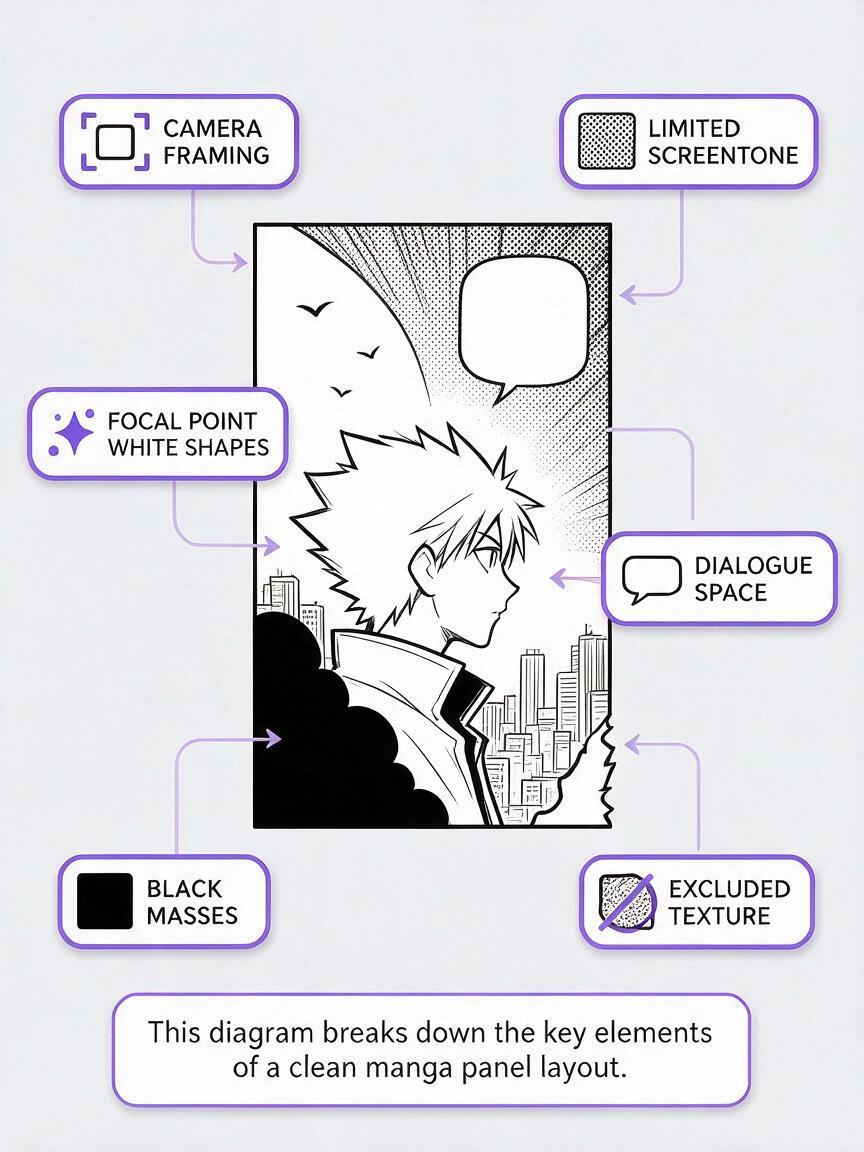
Generated dots and hatching may look convincing at first glance, but they are often irregular. Rather than preserving every synthetic mark, use the output as a drawing base and rebuild important tone regions in your preferred comic editor.
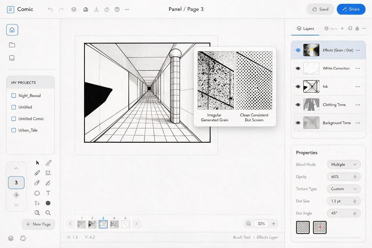
Start by separating the panel into functional layers:
- Ink layer: contours, solid blacks, facial features, and essential object edges.
- White correction layer: facial cleanup, silhouette gaps, highlights, and unwanted texture removal.
- Tone layers: separate patterns for background planes, clothing, weather, or atmosphere.
- Effects layer: speed lines, rain, sparks, impact bursts, and other directional marks.
Apply one consistent screen frequency to a continuous surface. If a jacket changes dot scale from sleeve to torso without a lighting reason, it can look patched together. Use a separate tone only when it communicates a different material, depth plane, or lighting condition.
Do not trace noise. Preserve intentional shapes and replace accidental texture.
For webtoon delivery, inspect the tone after resizing to the actual upload width. Fine dots can merge into gray fields, while thin hatching may vanish. For print, test a sample using the intended page dimensions and output method before processing an entire chapter.
Protect faces and dialogue zones from texture
Readers look at faces and speech balloons first. These areas should not have to fight with decorative tone.
- Keep the whites of the eyes distinct from nearby skin shading.
- Use compact shadows under bangs, noses, or chins instead of soft gray clouds.
- Remove stray dots crossing eyelids, mouths, and expression lines.
- Leave a quiet region behind dialogue rather than placing balloons over dense hatching.
- Check that black hair does not merge with a black coat or background doorway.
If the face still appears dirty after cleanup, flatten a copy of the panel and view it at reading size. Texture that seemed subtle while zoomed in may be sitting directly on the expression.
Know when to edit and when to regenerate
| Edit the current panel | Regenerate the panel |
|---|---|
| The pose, camera, and silhouette already work | The focal character disappears into the composition |
| Only a few surfaces have noisy tones | Every major object occupies the same gray range |
| The face needs minor white correction | The expression or anatomy is structurally unclear |
| The dialogue area can be cleared easily | No usable balloon space exists without covering the action |
| Solid blacks need small edge repairs | The lighting concept conflicts with the desired value map |
A practical cutoff is whether cleanup changes texture or composition. Texture repair is normal production work. Rebuilding the focal hierarchy by hand usually means the source image should be regenerated with a clearer value plan.
Final checklist
- The focal subject remains readable at thumbnail size.
- White, gray, and black each have a deliberate role.
- Solid ink areas are clean rather than dusty.
- Screentone is limited to named surfaces or depth planes.
- Faces, eyes, and mouths are free from random texture.
- Dialogue zones remain visually quiet.
- Effects point toward the action instead of filling empty space.
- The panel has been checked at its final web or print size.
Keywords
ai manga panels, manga screentones, manga panel generator, Midjourney manga prompts, black and white comics, comic prompts, manga line art