Why AI Packaging SKU Variants Lose Brand Consistency (3 Fixes With Imagen)
AI-generated packaging variants for multi-SKU product lines often drift in logo placement, typography, and core layout, failing to read as a cohesive brand family. This article breaks down three key causes of this inconsistency and shares actionable fixes using Imagen, including reference-locked brand systems, controlled variant prompting, and targeted text refinement. It includes reusable prompt templates and a quality checklist to help packaging and brand designers create production-ready SKU sets faster.
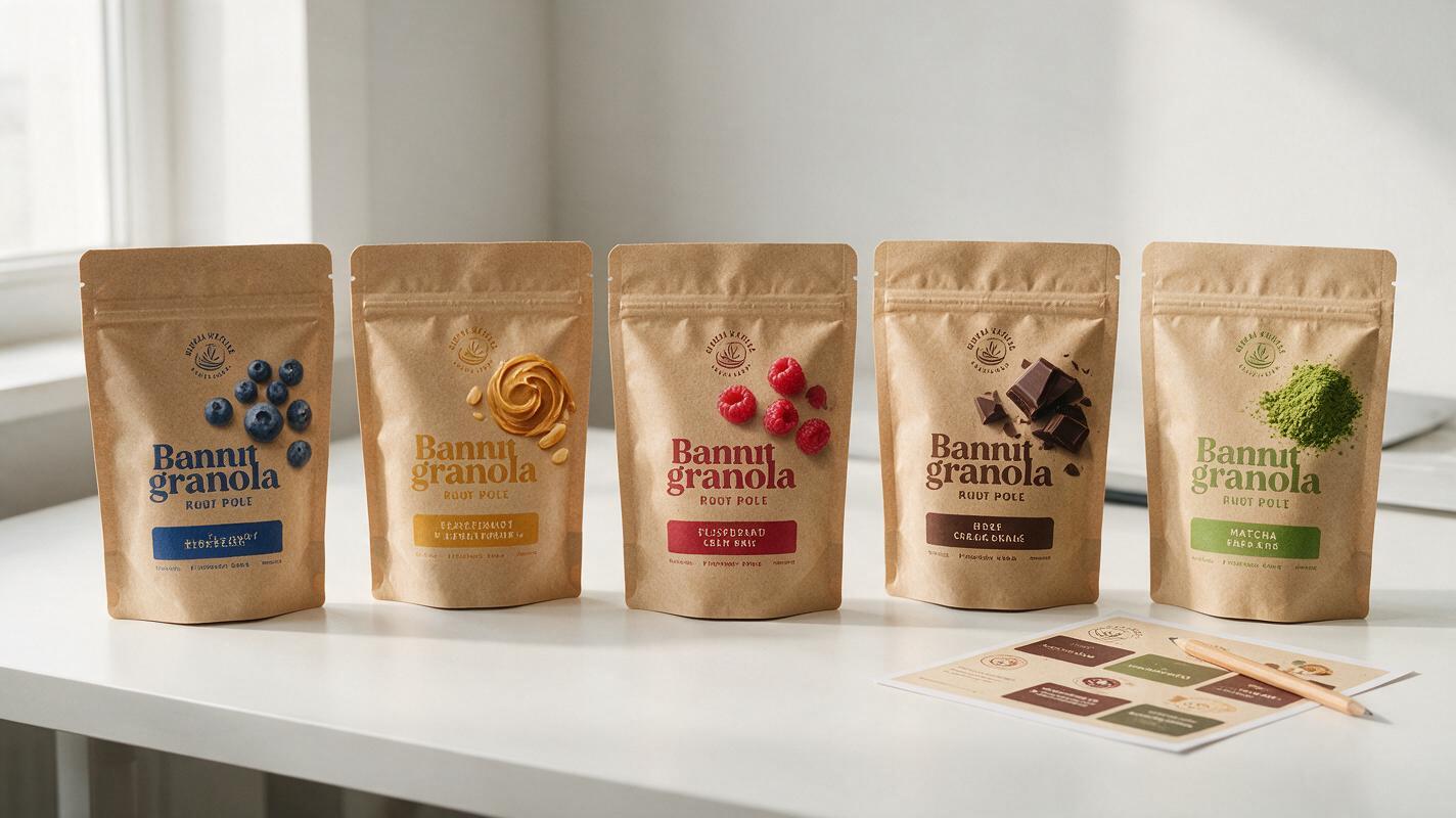
Table of contents
The problem with disjointed AI packaging SKU sets
For packaging designers tasked with creating 5+ SKU variants in a single week, ai image generator platforms can cut concept time by 60% or more — if you can keep brand drift under control. Too often, generating a set of packaging designs for a product line (say, three skincare serums or four chip flavors) results in each variant looking like it belongs to a completely different brand: logo sizes shift by 30%, typography weights change unexpectedly, core layout grids move, and color palettes drift between SKUs. The end result is a set of concepts that require hours of manual retouching to align with the brand system, defeating the time-saving purpose of using AI in the first place.
Imagen stands out for packaging work because of its strong text rendering and layout consistency, but even it will produce disjointed SKU sets without clear guardrails. The issue isn’t the model — it’s how most designers structure their inputs and prompts for variant work. Below are three common causes of SKU-level brand drift, plus actionable fixes tailored to packaging design workflows.
Lock core brand elements with a reference sheet first
The single biggest cause of inconsistent SKU variants is generating each design from a blank text prompt, with no fixed visual reference for the core brand system. AI models don’t inherently know that the logo must sit 12mm from the top edge of the package, that the headline font is a specific bold sans-serif, or that the primary brand red must be used for all SKU borders. Without a reference, it improvises a new system for every generation.
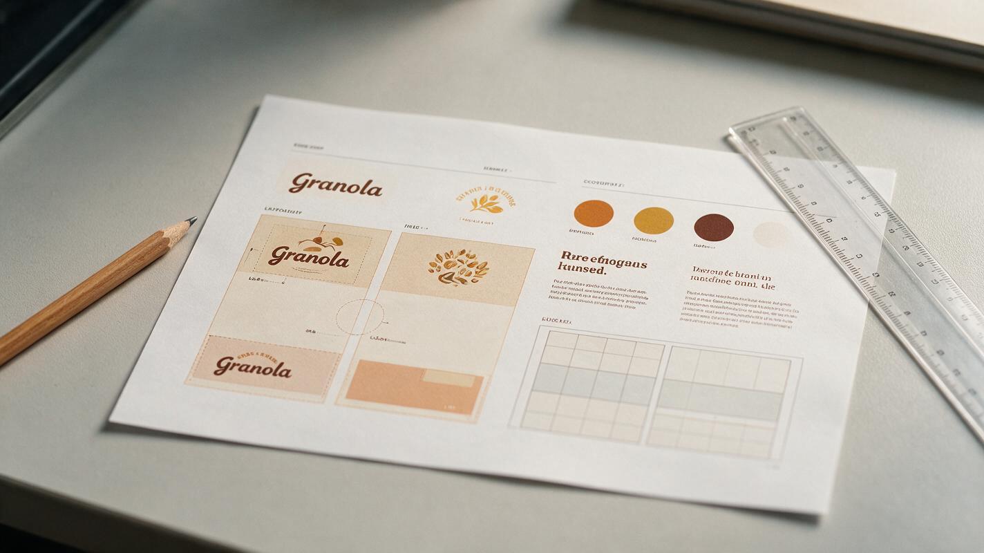
The fix is to create a single-page brand reference sheet for the packaging line before you generate any variants. This sheet doesn’t need to be a final production file — a clean, high-contrast JPG or PNG works perfectly. Include these non-negotiable elements:
- Approved logo placement (e.g., top-left corner, 10% of package width from the edge)
- Core typography samples (headline, subhead, body text, with correct weights and sizes)
- Primary and secondary brand color swatches, labeled by use case
- Base layout grid (e.g., 3-column layout, 20px gutters, bottom info bar)
- One sample SKU design (even a rough draft) to establish the overall visual hierarchy
When generating variants in Imagen, upload this reference sheet as a style and layout reference, and explicitly state in your prompt that all core brand elements must match the reference exactly — only the variant-specific details should change. This locks in 80% of the brand system before you start iterating on individual SKUs.
Pro tip: Label each element on the reference sheet (e.g., “PRIMARY LOGO — DO NOT ALTER”, “HEADLINE FONT — EXACT MATCH”) to reinforce which parts are non-negotiable. Imagen responds well to clear, labeled visual cues.
Use controlled variant prompts to change only what matters
The second most common cause of drift is rewriting the entire prompt for each SKU. Even small changes to prompt wording can lead to big shifts in layout, color, and style. For consistent variants, you need a fixed prompt structure where only the SKU-specific variables change — everything else stays identical across every generation.
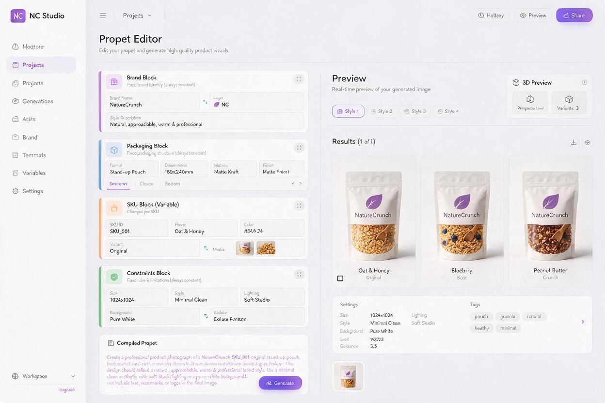
Structure your prompt into three fixed blocks and one variable block: Fixed brand block: References the core brand system and reference sheet, with explicit rules for logo, typography, colors, and layout. Fixed packaging block: Defines the package type, material, shape, and viewing angle (e.g., “front view of a 500ml matte plastic bottle, studio lighting, white background”). Variable SKU block: The only part that changes between variants — includes SKU name, accent color, hero imagery, and variant-specific text. Fixed constraint block: Rules to prevent drift (e.g., “no changes to logo size or placement, no changes to font style, all core layout elements match reference sheet”).
Here’s a complete sample prompt for a 3-SKU organic granola line, showing how only the variable block changes:
# Fixed brand block (same for all SKUs)
Strictly match the uploaded reference sheet for logo placement, headline font, body font, primary brand cream color, and 2-column layout grid. Logo must remain 15% of package width, positioned top-center. All text must be crisp and legible.

# Fixed packaging block (same for all SKUs)
Front view of a 300g matte kraft paper stand-up pouch, studio lighting, plain white background, photorealistic product photography.

# Variable SKU block (changes per SKU)
SKU: Maple Cinnamon Granola
Accent color: warm burnt orange
Hero imagery: close-up of toasted oat clusters with maple syrup drizzle and cinnamon sticks
Headline text: MAPLE CINNAMON
Subhead text: Organic Rolled Oats • 10g Protein

# Fixed constraint block (same for all SKUs)
Do not alter logo, core layout, or font styles. Only change the accent color, hero imagery, and text specified in the SKU block. No extra graphics or decorative elements outside the reference sheet system.
For the next SKU, you only rewrite the variable block — everything else stays word-for-word identical. This ensures the model applies the same brand and packaging rules to every variant, so the only differences are the intentional SKU-specific ones.
Test this prompt yourself with your own brand reference sheet and SKU details to see how consistent the variants feel. Start with 2-3 SKUs first to dial in the fixed blocks, then generate the full line once you’re happy with the baseline.
For best results, keep the variable block focused on 3-4 changes maximum. The more variables you introduce at once, the higher the chance of unintended drift in core brand elements.
Refine text and details with targeted inpainting
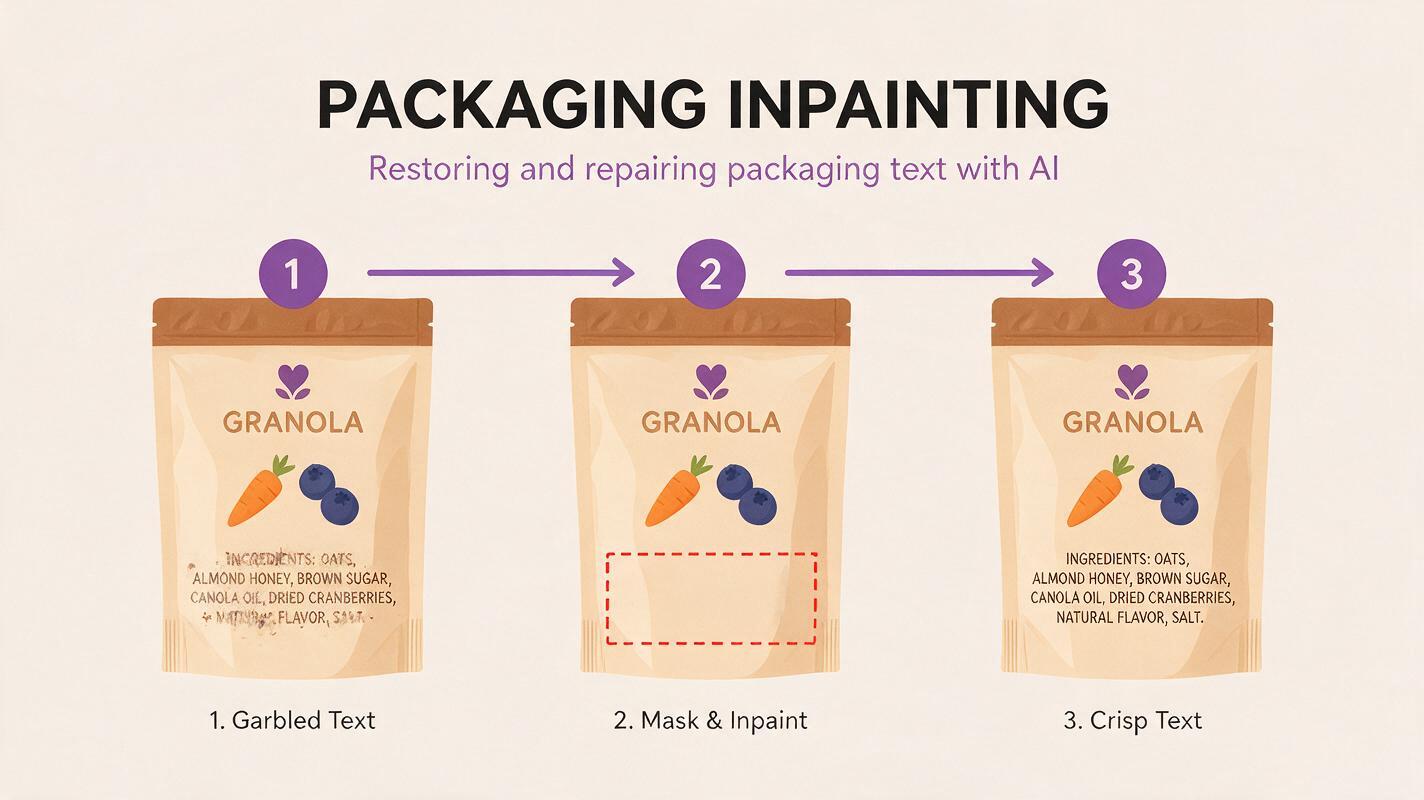
Even with a tight reference sheet and controlled prompts, small details will occasionally drift between SKUs. The most common issues are garbled small text (ingredient lists, net weight, barcodes), slightly misaligned logos, and minor color shifts in accent elements. Trying to fix these by regenerating the entire design often introduces new problems elsewhere.
Imagen’s inpainting tool is ideal for these small, targeted fixes because it only alters the masked area, leaving the rest of the packaging design completely untouched. This lets you correct errors without risking the overall brand consistency you’ve built.
Common inpainting use cases for packaging SKUs:
- Text correction: Mask garbled ingredient lists or net weight text, then prompt with the exact copy, font style, and size to match the reference sheet.
- Logo alignment: If a logo is slightly off-center or the wrong size, mask the logo area and prompt to “replace with exact logo from reference sheet, correct size and placement”.
- Accent color tweaks: Mask the SKU-specific accent area (e.g., a flavor band) and prompt for the exact hex or color name to ensure consistency across the line.
- Hero imagery swaps: If you want to try a different ingredient visual for a SKU, mask only the hero image area and generate a new one without touching the rest of the layout.
When masking for inpainting, expand the mask slightly beyond the target area (10-15% extra) to avoid hard edges between the new and old content. Always reference the original reference sheet in your inpainting prompt to ensure the new element matches the brand system.
Avoid regenerating entire packaging designs to fix small issues. Targeted inpainting is 10x faster and preserves 100% of the consistent brand elements you’ve already locked in.
Final quality checklist for SKU packaging sets
- All SKUs have identical logo size, placement, and color
- Headline, subhead, and body text use the exact same fonts and weights across all variants
- Core layout grid (columns, gutters, margin sizes) is consistent across every SKU
- Primary brand colors match exactly — only approved accent colors change between variants
- All text (including small print like net weight and ingredients) is legible and correct
- Hero imagery follows the same style and placement rules for every SKU
- Package shape, material, and viewing angle are identical across the full set
Keywords
ai packaging design, packaging sku variants, brand consistency, imagen ai, packaging design prompts, product line packaging, brand packaging system