AI Poster Prompts That Leave Clean Space for Headlines
AI poster backgrounds often look impressive until the headline has nowhere to go. This guide shows graphic designers how to use Imagen prompts, spatial instructions, and composition checks to generate campaign visuals with intentional copy space.
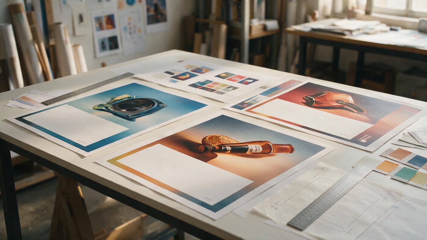
Table of contents
Make the image support the layout
An AI poster background can be visually striking and still fail as graphic design. The subject fills the frame, highlights compete with the headline, and every quiet area contains decorative detail. Once typography is added, the poster becomes crowded rather than composed.
The solution is not simply asking for “more negative space.” Treat copy space as a defined part of the image architecture: specify its location, size, visual value, texture, and relationship to the subject. Imagen is a useful model for exploring these art-directed compositions, while the same prompt method can be adapted to other image models.
The central principle: prompt the poster as a layout with an image inside it, not as an image that will somehow become a layout later.
Why AI poster images crowd out typography
Image models are usually rewarded by visually rich prompts. Words such as “cinematic,” “intricate,” “dynamic,” and “highly detailed” encourage the model to distribute interest throughout the frame. That may produce an attractive standalone image, but it removes the low-information area needed for a headline, logo, date, or call to action.
Three prompt habits make the problem worse:
- Describing only the subject: The model decides where the subject sits and how large it becomes.
- Requesting vague negative space: The model may leave a small empty patch that is too irregular for typography.
- Combining image generation with final typesetting: Generated lettering can influence the composition before the approved type system is applied.
For campaign production, generate the photographic or illustrative layer first. Add final typography, logos, and legal copy in your design software, where alignment and brand specifications remain controllable.
Write copy space as geometry
Starting with text to image is most effective when the prompt describes both the subject zone and the copy zone. A reliable poster prompt contains six pieces of information:
- Format: portrait poster, landscape billboard, square social post, or another target ratio.
- Subject anchor: lower right, centered near the bottom, outer third, or another clear location.
- Subject scale: approximately one-third of the frame, small full-body figure, close crop, or isolated product.
- Reserved copy zone: define its position and approximate proportion.
- Surface quality: smooth gradient, clean wall, soft sky, uninterrupted paper texture, or controlled shadow.
- Exclusions: no objects, faces, highlights, patterns, or generated lettering in the reserved area.
Use this adaptable structure:
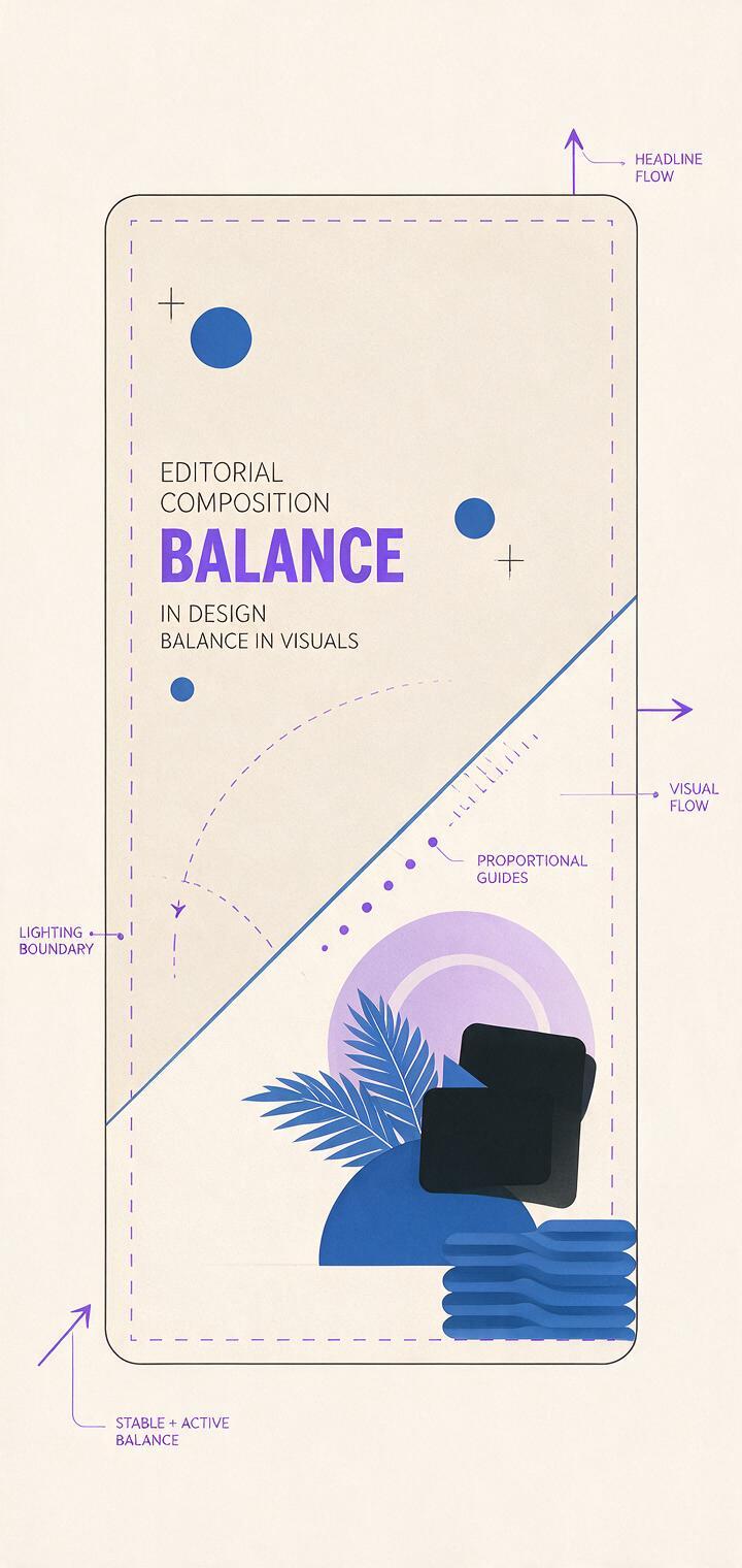
[poster format] campaign key visual for [brand category or concept]. [Main subject] positioned in [subject location], occupying approximately [proportion] of the frame. Reserve [copy-zone location and size] as a calm, uninterrupted area for a headline. The copy zone contains [simple surface or tonal description], with no objects, faces, bright highlights, patterns, or lettering. [Lighting and art direction]. Clear separation between subject zone and typography zone. No text, no logo, no border.“Empty” does not have to mean blank white. It means visually predictable enough to support type. A misty gradient, out-of-focus wall, broad shadow, flat color field, or quiet sky can all function as copy space.
Prompts for three campaign formats
Portrait product-launch poster
This structure protects the upper half for a headline while keeping the product visually important:
Vertical product-launch poster, refined editorial studio photography. A translucent cobalt fragrance bottle stands in the lower-right third, occupying about 30 percent of the frame. Reserve the upper-left half as uninterrupted headline space: a smooth pale-gray background with a subtle cool gradient, low detail and even contrast. A narrow beam of light touches the bottle without entering the copy zone. Precise art direction, premium material detail, controlled shadows, asymmetrical composition. No text, no logo, no extra objects, no border.Landscape billboard with directional movement
A landscape composition needs more than unused sky. The subject should direct attention toward the message area rather than away from it:
Wide outdoor campaign key visual for an urban cycling brand. A cyclist moves from the right edge toward the center, small enough to occupy less than one-third of the frame. Reserve the entire left 45 percent as clean copy space formed by a softly lit concrete wall, consistent midtone surface, no seams behind the headline area. Motion and shadows remain concentrated on the right. Bold contemporary editorial photography, crisp silhouette, limited red and charcoal palette. No text, no logos, no street signs, no visual clutter in the left zone.Square poster series
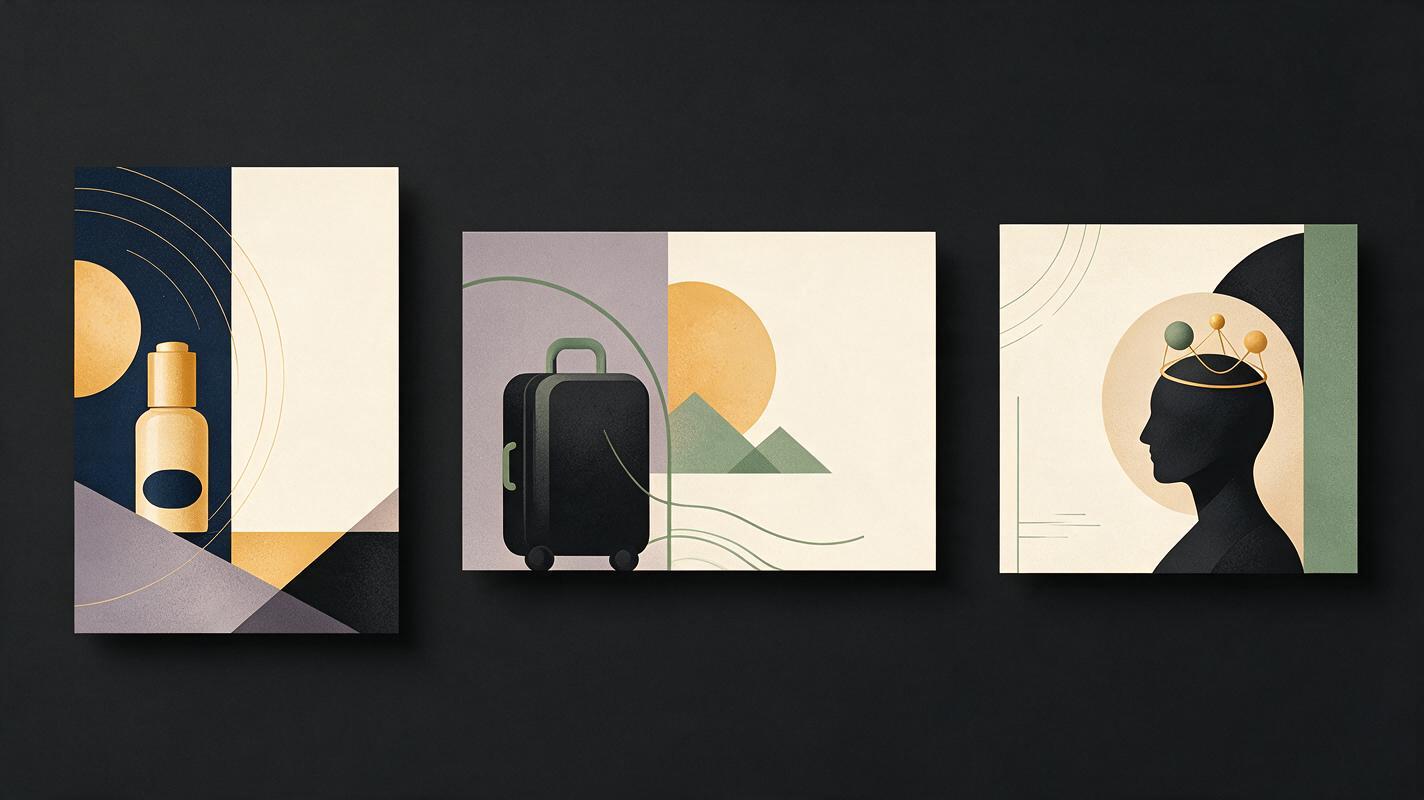
For a social series, repeat the same spatial rule while changing the hero object. This creates rhythm across the campaign without forcing every image to be identical:
Square campaign image from a coordinated poster series. One sculptural object positioned in the bottom third, centered slightly right, occupying 35 percent of the canvas. Preserve the top 40 percent as a uniform warm-cream field for typography, with soft tonal falloff and no intersecting forms. Graphic studio lighting, deep green object, restrained shadow, tactile paper-like background, contemporary museum-poster art direction. Maintain the same camera height, object scale, palette, and copy-space boundary across all variations. No text, no logo, no decorative symbols.When using ai image generator, create several candidates from one spatial prompt before changing the art direction. This reveals whether the composition rule is robust or whether one successful result happened by chance.
Keep a poster series structurally consistent
Campaign consistency comes from repeating compositional constraints, not repeating every visual detail. Establish a short “layout lock” that remains unchanged across prompts:
LAYOUT LOCK: 4:5 portrait composition; hero object in lower-right third; object occupies 28–32 percent of frame; upper-left 45 percent reserved for copy; copy zone is low-detail and one tonal family; light travels diagonally from upper right; no generated text.Place the layout lock at the end of every variation prompt. Change only the variables required by the concept, such as the product color, material, object, environment, or visual metaphor.
| Keep fixed | Allow to change |
|---|---|
| Copy-zone position and proportion | Hero object or product variant |
| Camera angle and subject scale | Accent color |
| Lighting direction | Material or surface treatment |
| Background value range | Supporting visual metaphor |
| Exclusion language | Small secondary details outside the copy zone |
Save the best composition as a visual reference for later generations when the interface supports reference images. A reference can communicate the boundary between image and typography zones more directly than adding increasingly complicated prose.
Diagnose crowded compositions before typesetting
Do not judge only whether the generated image looks attractive. Place a temporary headline block over every candidate and inspect it at the intended delivery size. The test can use a gray rectangle or approved display type; the goal is to expose collisions early.
| Failure | Likely cause | Prompt correction |
|---|---|---|
| Subject expands into the headline | Subject scale was not constrained | Specify frame proportion and anchor position |
| Empty zone contains distracting texture | “Negative space” was too vague | Name a smooth surface and prohibit patterns |
| Bright highlight reduces readability | Lighting was described globally | Confine highlights to the subject zone |
| Background edge cuts through letters | No tonal requirement was defined | Request one continuous value range behind copy |
| Composition feels accidentally empty | Subject and copy zone lack visual tension | Direct gaze, movement, shadow, or form toward the copy area |
| Model inserts fake lettering | Poster language implied finished typography | Add “no text, no logo, no symbols” |
A copy zone is successful when it remains quiet at thumbnail size and still contains enough tone or texture to belong to the image.

Finish the poster without surrendering typographic control
Once the image structure works, bring the selected output into your layout application and build the final system with real type. Start with the approved headline style, then position secondary information, brand marks, and legal copy. Crop only after the core hierarchy is visible.
Check these relationships rather than treating the generated image as untouchable:
- Does the headline align with a meaningful edge in the image?
- Is the type block comfortably inside the quiet zone rather than filling all of it?
- Does the subject direct attention toward the message?
- Can the logo sit in a stable area without becoming a floating afterthought?
- Does the composition survive a mobile crop and a distant billboard view?
If the visual is close but one object enters the copy zone, targeted editing is usually more efficient than regenerating the entire concept. Remove the intrusion, rebuild the simple background surface, and preserve the successful subject and lighting.
Final checklist
- Define the final format before generating the image.
- Give the subject a location and approximate frame proportion.
- Describe the copy zone by position, size, tone, and surface.
- Keep highlights, faces, patterns, and objects outside that zone.
- Generate imagery without final headlines or logos.
- Repeat a layout lock across campaign variations.
- Test every candidate with real typography at delivery size.
- Use targeted edits instead of discarding a strong composition.
Choose one format, paste the matching prompt, and test this prompt yourself. The most useful result is not the busiest image—it is the one that gives the campaign message a deliberate place to live.
Keywords
ai poster prompts, ai poster generator, poster negative space, campaign key visual, Imagen prompts, graphic design prompts, headline layout