Why AI Product Renders Look Like They’re Floating—and How to Fix It
A polished product concept can look weightless when its contact shadow, cast shadow, and surface perspective disagree. This guide shows product designers how to diagnose the mismatch, write a focused image-editing prompt, and check the result without changing the approved design.
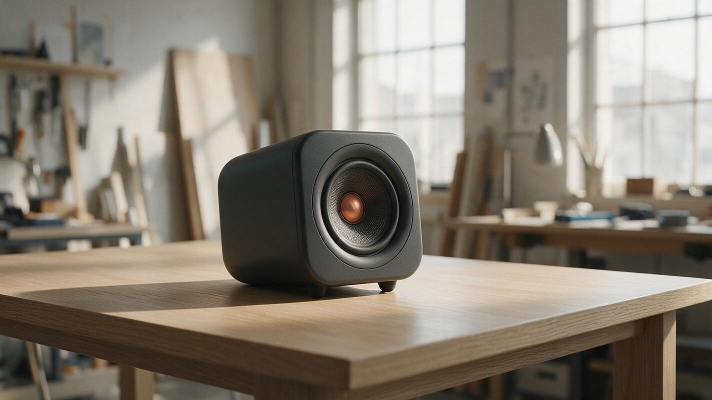
Table of contents
Make the product feel placed, not pasted
A product render can have convincing materials and still look as if it is hovering a few centimeters above the table. The usual culprit is not the object: it is the small, dark contact area where the product meets the surface, or a cast shadow that points in the wrong direction. For a concept presentation, that mismatch can make the product’s size, weight, and placement harder to read. Fix the grounding before adding more styling.
This approach is for approved product concepts placed into a desk, shelf, or studio scene. It focuses on lighting and surface integration—not redesigning the housing.
Diagnose the float before editing the image
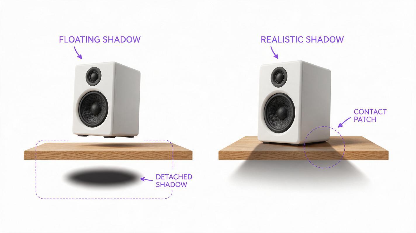
Look at the object and its shadow as separate pieces of evidence. A real object resting on a surface normally has its darkest shadow immediately around its points of contact. Farther from those points, the cast shadow can become softer and lighter. The exact pattern depends on the light and the object’s shape, but a uniformly soft oval beneath the entire product often reads like a graphic effect rather than physical contact.
- Missing contact: There is a bright gap beneath a foot, base, or lower edge that should touch the surface.
- Detached shadow: The darkest patch begins away from the object instead of at a contact point.
- Conflicting direction: Highlights suggest light from one side while the cast shadow extends toward that side.
- Wrong footprint: The shadow is much wider or narrower than the product’s visible base without a lighting reason.
- Flat surface: The shadow looks pasted onto the image and does not follow the table’s perspective or texture.
Check the product first: is it intended to sit on its full base, two feet, or a narrow rim? Mark those contacts on a copy of the image. If the support points are unclear, do not ask a model to invent them; return to the approved design or a side-view reference.
Anchor the product to the actual surface
Start with the cleanest approved image of the product and the intended background. If the object has recognizable seams, controls, vents, or a particular silhouette, keep that image as the reference rather than regenerating the whole design from a text description. Seedream 4.5 is one option for a reference-guided image pass; use an ai image generator only where you can inspect whether the source design survived the edit.
Describe the contact geometry before describing the atmosphere. For example, a compact speaker with two rubber feet needs two tight contact areas, not a dark ellipse floating beneath its center. A cylindrical device resting on a flat end needs a shadow attached to that end’s visible perimeter. Name the surface material as well: light oak, brushed metal, and matte paper reveal shadows differently.
Working rule: Keep the product fixed. Change the lighting relationship between the product and its surroundings.
For a reference-based edit, adapt this prompt to the approved concept:
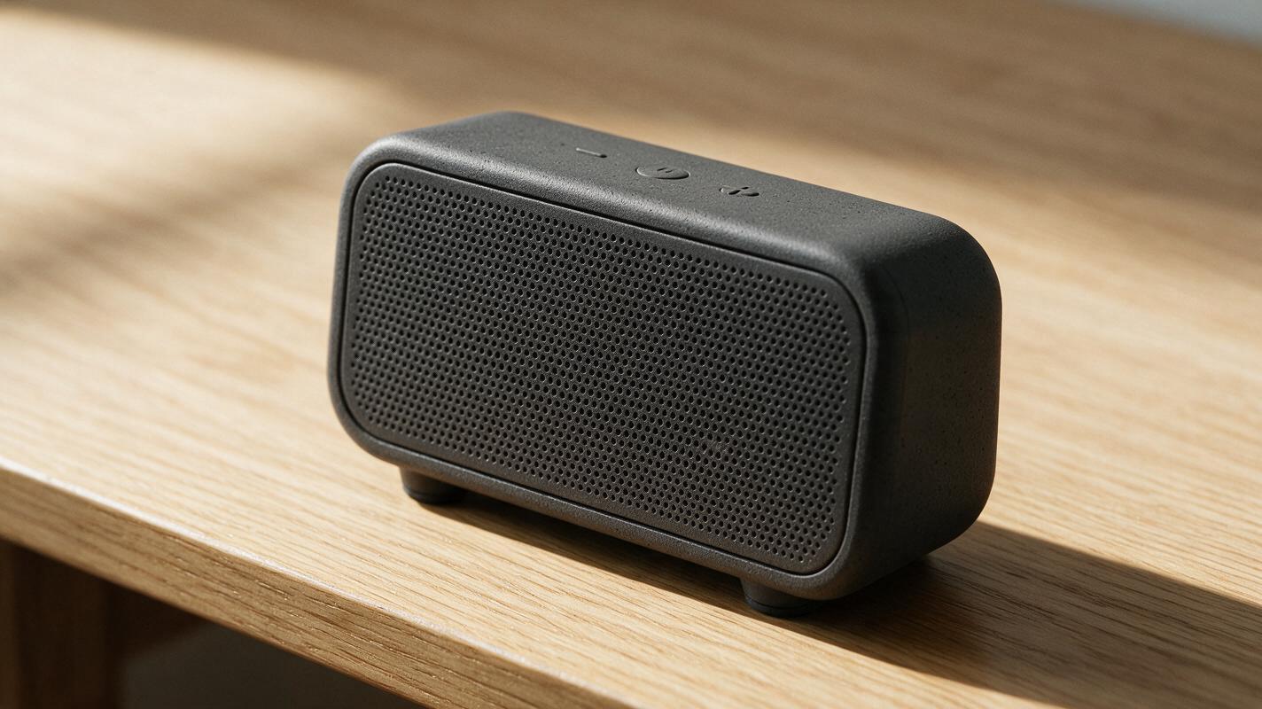
Use the attached approved product image as the design reference. Place the compact tabletop speaker on a light oak desk, resting on its two existing rubber feet. Preserve its silhouette, proportions, controls, seams, finish, and camera angle. Add small, dark contact shadows directly beneath both feet. Add a softer cast shadow extending to the lower right, consistent with a broad light source above left. Let the wood grain remain visible through the lighter edge of the shadow. Do not add feet, openings, logos, or new product details.If the result changes a button or rounds off a designed edge, reject it even if the shadow improves. An attractive image with the wrong product is not a successful correction.
Match the shadow to the scene’s light
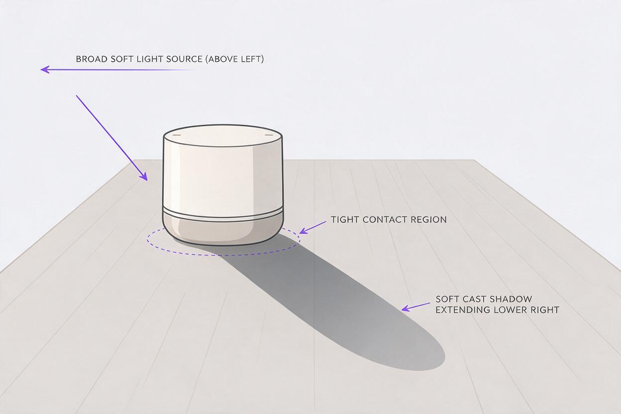
Before generating another variation, identify the scene’s primary light direction. Use the brightest face of the product, the highlight on the table, and any existing shadows from nearby objects. Those cues should tell the same story. If they do not, simplify the scene: a neutral surface and one broad light source are easier to control than mixed window light, overhead spots, and decorative lamps.
Give the model a relationship, not just an adjective. “Realistic shadow” leaves too much open. “Tight contact shadow at the base; soft cast shadow extending back-left from a large window at front-right” specifies where the shadows begin, where they travel, and why their edges are soft.
| What you see | Likely cause | More useful correction |
|---|---|---|
| The object floats above the desk | Bright pixels separate the base from its shadow | Attach a narrow, darker shadow to each actual contact point |
| The object looks cut out | Shadow softness or color differs sharply from the scene | Match the scene’s light size and surface color |
| The product looks unusually small | A large, distant shadow suggests greater height above the surface | Bring the darkest shadow closer to the base |
| The shadow suggests two light sources | Cast direction conflicts with highlights | Choose one dominant light direction and remove the competing shadow |
Reflective products need another check. A convincing contact shadow will not rescue a chrome or glossy housing whose reflections imply a completely different environment. If reflection changes would alter the approved finish, use a simpler background rather than forcing an elaborate scene.
Keep a controlled fallback for difficult edits
Some image edits improve the background while quietly changing product geometry. When that happens, keep the approved product on its own layer and correct the shadow underneath it in an image editor. Use separate layers for the tight contact shadow and the broader cast shadow so you can adjust each without repainting the device.
A practical starting point is a small, dark shape aligned to each known contact point, plus a larger, softer shape that follows the chosen light direction. Reduce opacity until the surface texture remains visible in the soft region. Then inspect the composite at presentation size, not only while zoomed in. The goal is credible support, not a conspicuous black outline.
This fallback is especially valuable for review decks: it lets the team compare concepts against the same background without accepting unintended changes to ports, buttons, or casing edges. If you want to compare a generated pass with a layered correction, test this prompt yourself using the same approved product reference and scene.
Final checklist
- Every visible support point meets the surface without an unexplained bright gap.
- The darkest shadow begins at contact; the broader cast shadow follows the chosen light.
- Shadow softness, color, and perspective fit the surface and setting.
- The approved silhouette, controls, seams, and finish remain unchanged.
- The product still looks grounded when viewed at the size used in the presentation.
Keywords
ai product rendering, contact shadows, product visualization, industrial design ai, product hero images, seedream 4.5, product design prompts