Why AI Product Renders Garble Screen UI—and How to Fix It
AI can make a convincing smart-product render while turning its screen into unreadable interface elements. This article shows product designers how to generate the physical product separately, place approved UI artwork into the display, and check that the finished image remains believable.
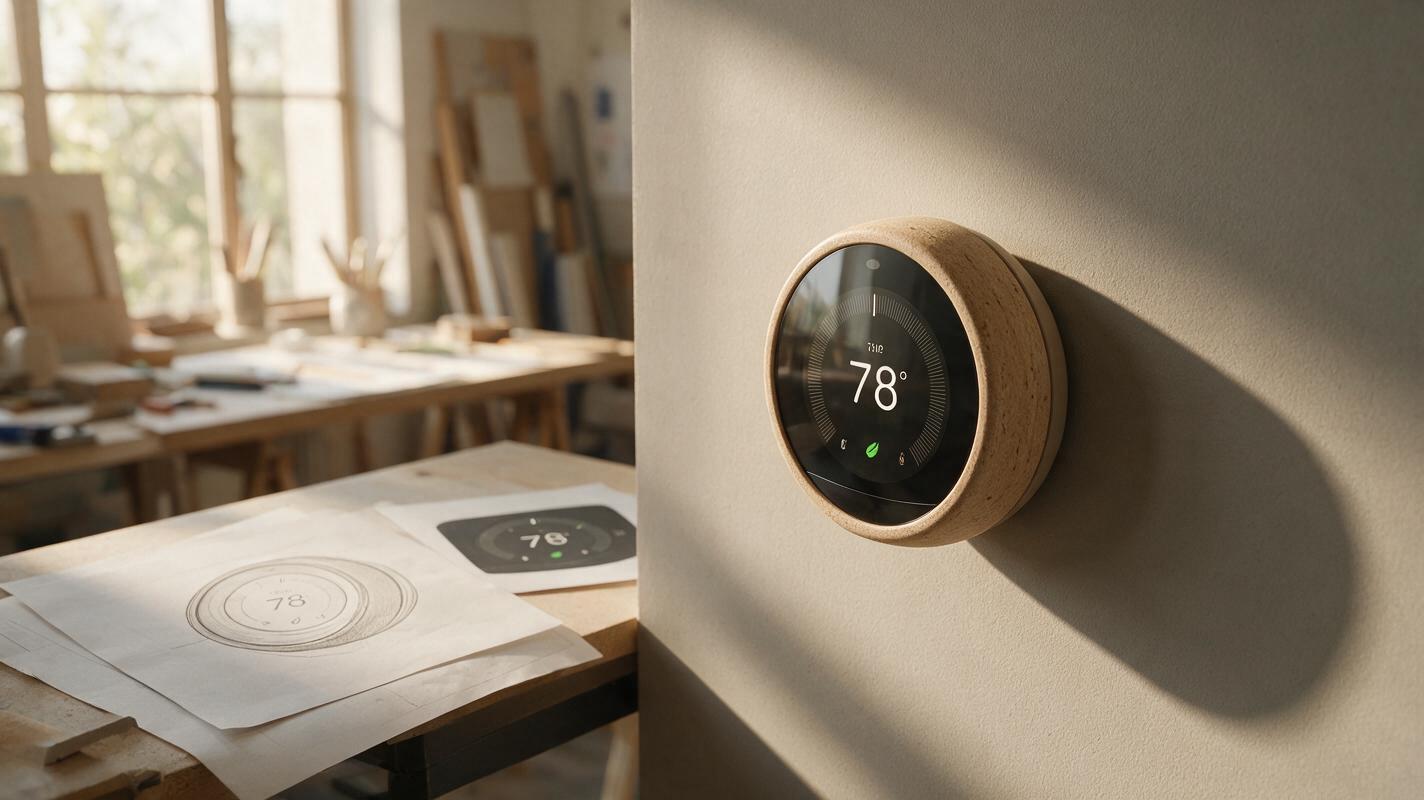
Table of contents
Keep the interface sharp while the product still looks real
A smart thermostat render can look polished until someone zooms in: the temperature is malformed, the icons change meaning, or the screen shows controls that do not exist. If the interface matters to a product review, do not ask an image model to invent and render it in one pass. Generate the housing and lighting first, then place an approved UI design into the screen.
This approach separates two jobs with different success criteria. Seedream 4.5 can help explore the product's physical presentation; your source UI file supplies the exact labels, numbers, hierarchy, and states. The result is still a concept visualization, not evidence that a display or interaction has been built.
Why the screen fails when everything is generated together
A product render needs coherent shape, materials, camera perspective, and lighting. A usable interface also needs precise characters, spacing, alignment, and information architecture. A prompt such as “show a readable 21°C setting with three controls” describes the goal, but it does not provide a dependable layout specification. Even if one output looks plausible at thumbnail size, its labels may fail at presentation size.
The problem becomes more visible when the display is small, angled, reflective, or partly hidden by a bezel. Repeated regeneration may improve the casing while silently changing the UI. Treat screen artwork as an approved design asset rather than another detail for the model to improvise.
Decision rule: If reviewers need to read, compare, or approve what appears on the screen, composite that content from a controlled source file.
Prepare a product render with a clean display area
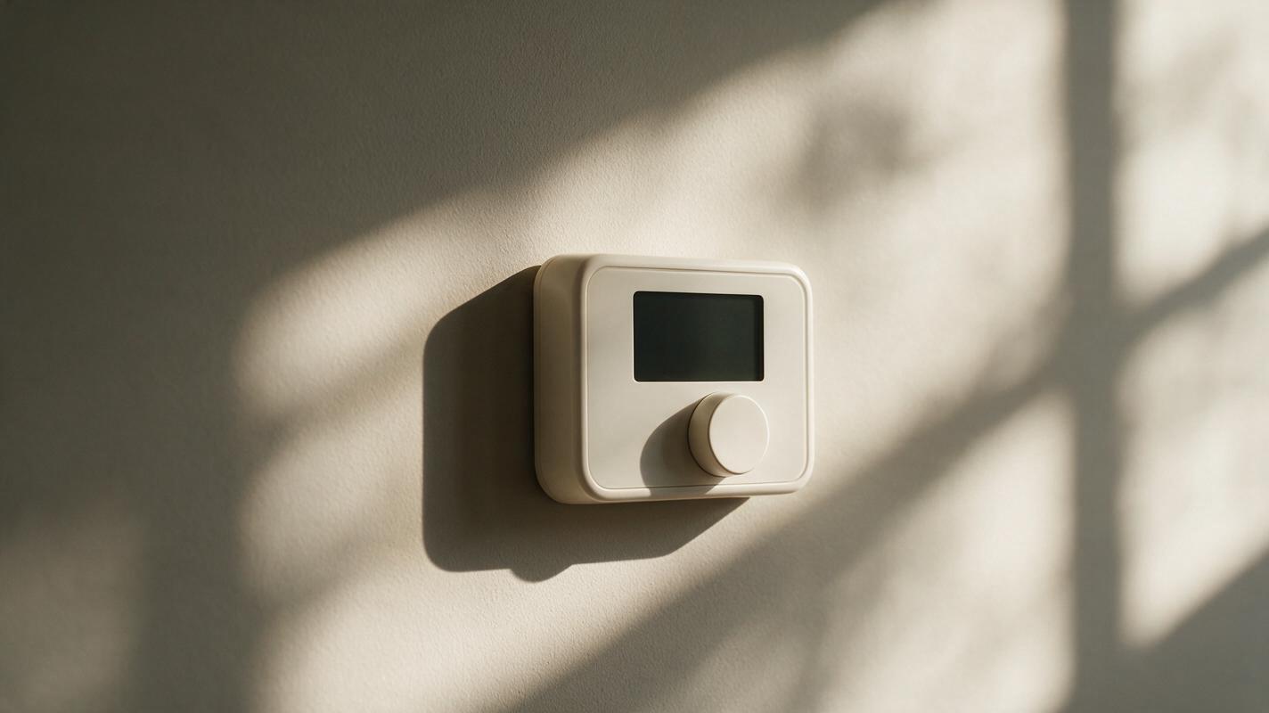
Start with a housing reference if you have one: a sketch, CAD screenshot, or earlier concept render. Identify the silhouette, controls, display opening, and intended camera view. Then use an ai image generator such as Seedream 4.5 to explore a presentation image with the display deliberately blank. Ask for a visible, uninterrupted screen surface rather than simulated text.
Reference: approved front-three-quarter concept of a wall-mounted smart thermostat.
Create a realistic product presentation render that preserves the reference housing silhouette, circular dial, display opening, bezel thickness, and control placement. Warm off-white enclosure, satin finish, soft daylight from camera left, restrained shadows, neutral interior wall.
The display is powered off: a uniform dark screen with no text, numbers, icons, charts, logos, or reflections that obscure its edges. Keep all four screen corners visible. Do not add buttons, seams, ports, or accessories.
Inspect the output before building on it. Reject images with a changed display shape, missing corners, warped dial, or invented hardware. A beautiful render with the wrong opening will be harder to correct than a less dramatic one with accurate geometry. Save the selected image at the resolution you intend to use in the presentation.
Build the UI as its own approved asset
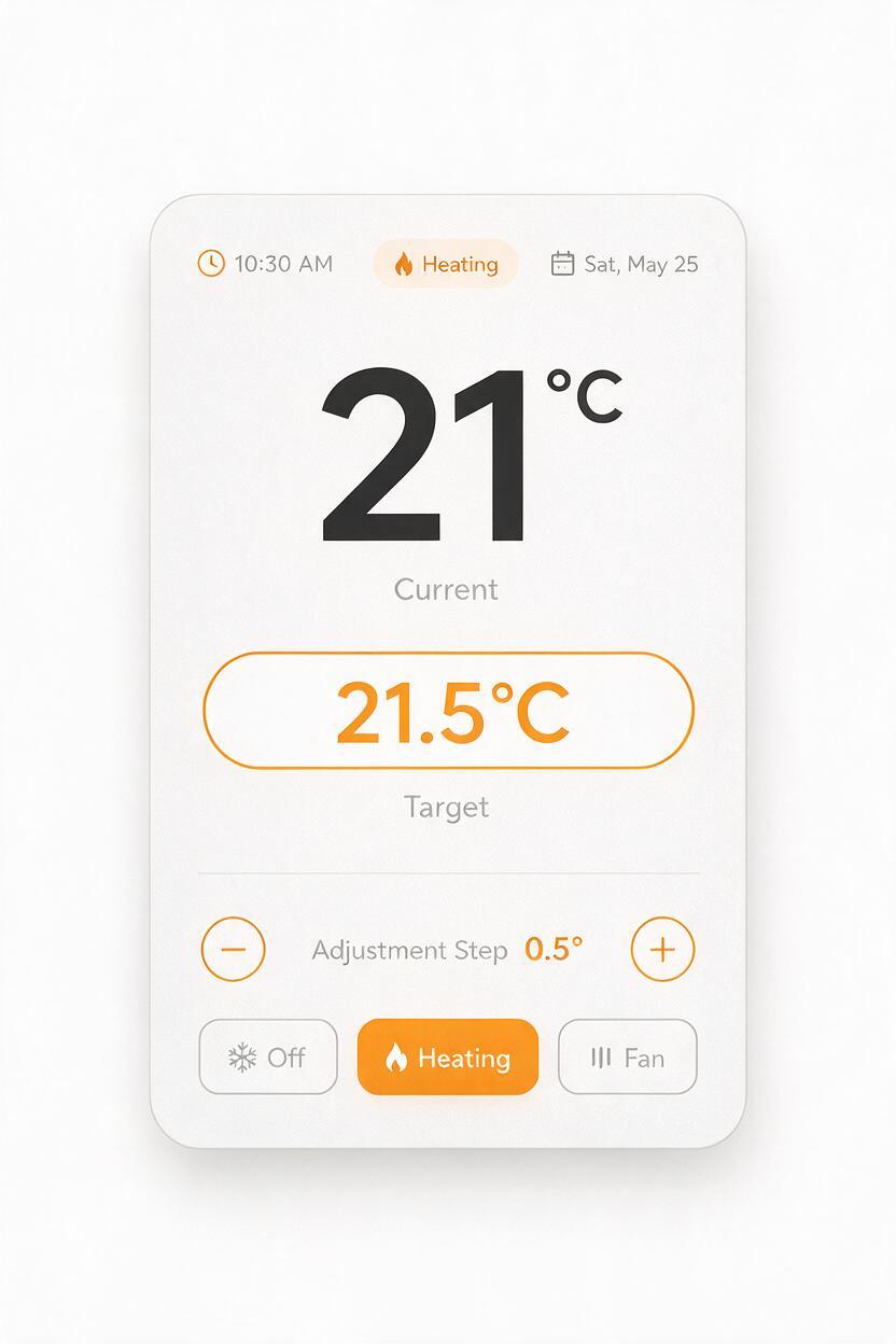
Design the interface in your usual UI tool at the display's intended aspect ratio. Use real copy, units, icons, and states from the concept brief. If those details are undecided, label the screen as illustrative in the review deck rather than filling it with invented product claims.
For a thermostat concept, one restrained state may be enough: current temperature, target temperature, operating mode, and a small status indicator. Check type at the size it will occupy in the final render. If a label cannot be read at that size, simplify the layout; sharpening the render will not solve an overcrowded interface.
- Export a flat master: keep the UI editable, and export a high-resolution image for placement.
- Keep a clear boundary: leave a small safe area so text does not collide with the bezel.
- Record the state: note which controls and values appear, so later views show the same product behavior.
Fit the artwork to the screen, not the other way around
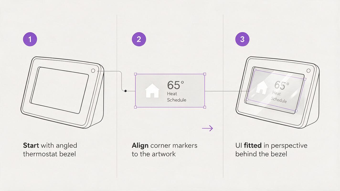
In an image editor, place the UI over the blank render and transform its four corners to match the visible display plane. Mask it to the inner edge of the bezel. For a curved or heavily angled display, a simple four-corner transform may not be sufficient; a more precise warp or a 3D mockup will produce a cleaner result.
Preserve the screen's physical character with restrained adjustments. A slight reduction in brightness, subtle tint from the environment, and a reflection on a separate layer can help the artwork sit behind the cover glass. Keep reflections below the threshold where they obscure essential labels. Do not stretch the UI to disguise an incorrectly shaped opening; return to the base render instead.
| What you see | Likely cause | Better correction |
|---|---|---|
| Text leans differently from the bezel | UI corners do not match the screen plane | Realign the corner transform using the inner bezel edges |
| Interface looks pasted on | No screen tint, depth, or controlled reflection | Add restrained glass treatment above the UI layer |
| Labels become unreadable | UI is too dense at presentation size | Simplify the source layout and export again |
| Screen shape changes between images | Separate renders were generated without a stable reference | Return to one approved housing image or a consistent 3D source |
Review the image at the size people will actually see
Check the composite both at full resolution and at the size it will appear in a slide, portfolio page, or stakeholder document. At full resolution, look for masking halos, jagged bezel edges, doubled reflections, and perspective mismatches. At presentation size, ask whether the screen's primary value and action are understandable without zooming.
If you need several interface states, duplicate the same base render and replace only the screen artwork. That makes differences in the UI easy to compare without introducing new changes to the housing, lighting, or camera. If the next deliverable is an animation, approve the still image first; motion generation can introduce new screen artifacts that require a separate review.
The useful division of labor is simple: generate the physical scene, control the information-bearing pixels, and inspect the combined image. When you have a housing reference and screen design ready, test this prompt yourself using a blank-screen render as the starting point.
Final checklist
- The housing, controls, and screen opening match the approved concept.
- The generated base image contains no invented interface content.
- The UI comes from an editable, approved source file.
- Screen perspective, bezel masking, and reflections hold up at full size.
- Essential labels remain legible at presentation size.
- The image is identified as a concept visualization when appropriate.
Keywords
AI product rendering, product screen UI, industrial design AI, smart product visualization, product render prompts, Seedream 4.5, interface compositing