AI Product Renders With Readable Screens, Not Gibberish UI
AI can produce a convincing hardware render while filling its display with unreadable text, misplaced controls, or features that do not exist. This guide shows product designers how to generate the device image, place approved screen artwork separately, and check the final presentation for visual and functional accuracy.
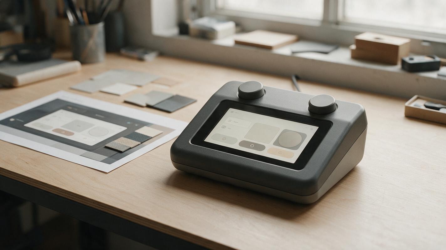
Table of contents
The screen can ruin an otherwise convincing render
A product concept render may get the enclosure, lighting, and camera angle right, then fill the display with misspelled labels or controls your team never designed. For hardware with a screen, treat the interface as approved artwork—not a detail the image model should invent. Generate a clean device render with an empty, clearly bounded display, then place your real UI into that surface. The result is easier to revise and less likely to misrepresent the concept.
This approach is useful for handheld instruments, smart-home controllers, kitchen appliances, and other hardware concepts whose displays carry meaningful information. It is a presentation method, not a substitute for interaction design or a working prototype.
Separate the device image from the interface artwork
The device and its screen have different sources of truth. Your sketch, CAD view, or approved render defines the enclosure: silhouette, bezel, buttons, seams, and display opening. A separate UI file defines the on-screen content. If the interface is unresolved, use a neutral blank display rather than asking a model to invent a plausible menu.
Prepare the UI at a useful resolution with the exact wording, icons, hierarchy, and state you intend to show. Decide whether the screen is on or off before generating the device image. A powered-off screen needs reflections and dark glass; a powered-on screen needs enough visible area for legibility and restrained light spill. Mixing the two usually makes the composite look pasted on.
Presentation boundary: A readable screen demonstrates a proposed visual state. It does not establish that the controls work, the readings are measured, or the interface has passed usability testing.
Generate a device render with a usable display opening
Use a reference-led ai image generator such as Nano Banana Pro to explore lighting and presentation while keeping your approved device reference in view. Choose a camera angle that leaves the display large enough to read. An extreme three-quarter view may look dramatic, but it compresses the interface into a narrow trapezoid and makes small labels useless.
Ask for a blank screen with a clear bezel and stable corners. Avoid requesting sample UI, decorative numbers, or tiny placeholder text: those details can become hard to remove without damaging the glass edge.
Reference: the supplied approved front-view device concept.
Create a photorealistic studio presentation render of the same device.
Preserve the enclosure silhouette, display opening, bezel width,
button count, seams, and visible proportions from the reference.
Show the screen as uniform dark glass with no text, icons, charts,
or invented controls. Keep all four display corners visible.
Use soft, controlled lighting; avoid a bright reflection across
most of the display. Do not add branding or new hardware features.
Inspect the result before adding artwork. Reject images that change the bezel, bend a straight screen edge, hide a display corner, or place a prominent reflection where the interface must remain readable. If you have an approved device render already, use it instead of regenerating the hardware.
Fit the approved UI to the screen plane
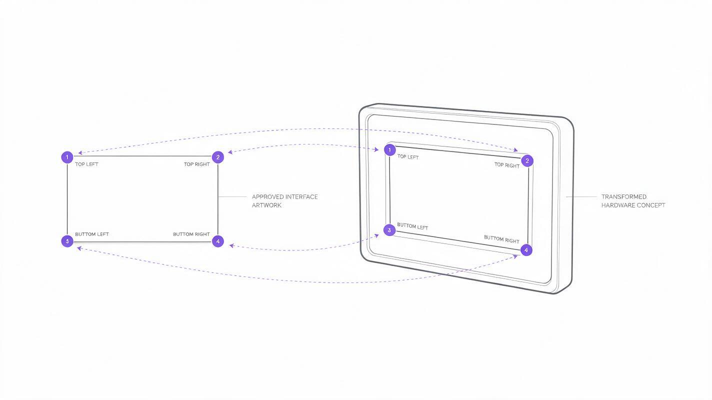
In an image editor, locate the four inner corners of the visible display—not the outer edges of the bezel. Use a perspective or four-corner transform to fit the approved UI artwork to those points. Keep an untouched copy of the device render underneath so you can compare the screen boundary throughout the edit.
The interface should meet the glass in a believable way. Mask it inside the screen opening, retain appropriate corner radii, and preserve a little of the original glass texture or reflection above the UI where it helps establish the surface. Keep that overlay subtle: a reflection that crosses important labels may make a technically accurate composite unreadable.
| Visible problem | Likely cause | Useful correction |
|---|---|---|
| Text stretches toward one corner | Artwork was resized without matching perspective | Fit all four screen corners, then check circles and letterforms |
| UI floats above the bezel | Mask extends beyond the inner display boundary | Rebuild the mask from the screen opening, not the outer frame |
| Screen looks like a paper sticker | Artwork has no relationship to the glass lighting | Restore restrained reflection or surface shading above the artwork |
| Labels are accurate but unreadable | Screen occupies too few pixels in the final image | Use a closer view or simplify the displayed state with design approval |
Do not distort approved UI elements simply to rescue a poor camera angle. If the transformed screen becomes too narrow to read, change the presentation view instead. A more frontal render often communicates the product and interface better than a dramatic hero angle.
Match brightness without inventing functionality
A powered-on screen can be brighter than the housing without casting a large colored halo across it. Adjust the UI brightness for the scene, then compare it with the bezel and nearby surfaces. If the concept has no specified display technology, avoid effects that imply a particular panel type or viewing performance.
Be equally careful with content. A fabricated battery percentage, temperature reading, medical value, or connectivity badge can look like a product claim. Use an approved state, clearly identified placeholder content, or a neutral nonfunctional layout. For stakeholder presentations, a short caption can identify the image as a concept visualization.
If you need several views, keep one approved UI file as the source and composite it into each suitable screen plane. Do not regenerate the interface separately for every angle; small changes in wording or icon placement can make the views appear to show different products.
Check the final render at presentation size
Zoomed-in inspection catches masking errors, but it does not tell you whether the screen works in the slide or page where viewers will see it. Export at the intended presentation dimensions and check both the whole device and the display.
- Hardware: Does the composite preserve the approved bezel, buttons, seams, and overall proportions?
- Content: Is every visible word and icon taken from the approved UI artwork?
- Legibility: Can a viewer understand the important screen state at actual display size?
- Surface: Do reflections and brightness make the UI look integrated without hiding it?
- Claims: Could any reading or status indicator be mistaken for tested product behavior?
Keep the blank-screen render, UI artwork, mask, and final composite as separate editable files. When the interface changes, you can replace the artwork without asking an image model to redraw the device.
Final checklist
- Start from an approved hardware reference and an approved UI state.
- Generate or select a render with a blank, unobstructed display.
- Fit artwork to the inner screen plane and mask it precisely.
- Check readability and product details at final presentation size.
- Label unresolved interface content or performance as conceptual.
Have a device reference ready? test this prompt yourself with a blank display first, then add your approved interface in an editor.
Keywords
ai product rendering, product screen mockup, hardware ui presentation, product visualization, nano banana pro, screen compositing, industrial design ai