AI Product Size Comparisons That Don’t Mislead Design Reviews
A polished comparison board can make a large product look smaller than a competing concept if each render is framed independently. This guide shows industrial designers how to combine measured front-view exports with an AI-generated presentation stage while keeping every concept at a shared scale.
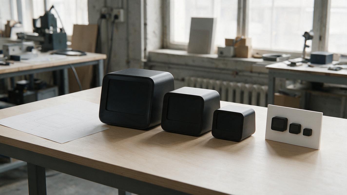
Table of contents
Compare the products, not the crop
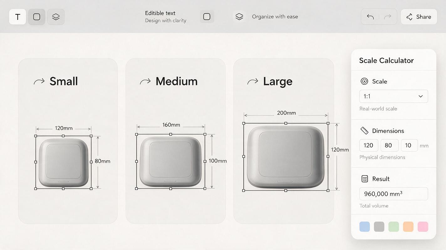
Three product concepts can appear equally compact in a review deck even when one is twice as wide as another. The culprit is often a set of individually framed AI renders: each object fills its own panel, so the layout erases the size difference. For a size comparison, start with measured front-view exports, place them at one shared pixels-per-millimeter scale, and use generative AI only for presentation elements that do not determine apparent dimensions.
The result should let a hardware team judge relative footprint at a glance without mistaking a persuasive image for a dimensional drawing.
Establish one measurable scale
Use approved orthographic front views from CAD when available. If a concept exists only as a sketch, add a known width and treat the result as a provisional illustration rather than a measured comparison. A perspective render is a poor primary source: a wide-angle camera, different yaw, or different distance from the camera can change apparent width before the images reach the board.
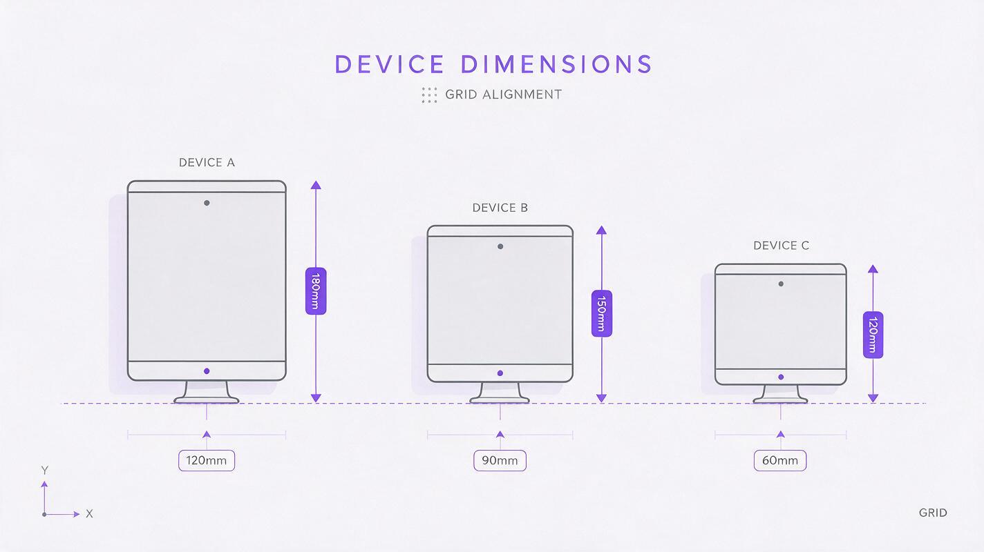
Suppose three desktop-device concepts have approved front-view dimensions of 120 × 180 mm, 90 × 150 mm, and 60 × 120 mm. At 3 pixels per millimeter, their visible front faces should occupy 360 × 540 px, 270 × 450 px, and 180 × 360 px respectively. These values set the object sizes, not the sizes of their surrounding panels.
display width in px = approved width in mm × shared px/mm
display height in px = approved height in mm × shared px/mm
Keep each export's original proportions. Record whether dimensions include feet, handles, or protruding controls; applying different measurement rules across concepts defeats the comparison. If only overall width is known, scale from that width and label the heights as illustrative unless they have also been checked.
Align to a common baseline
Put the concepts on a single board with equal-size panels, a shared ground line, and enough space for the largest object. Position each product so its lowest approved contact point meets the same baseline. Do not enlarge the smaller products to fill empty space.
A simple front-view board is usually more defensible than a lifestyle scene when the review question is Which concept takes up more room? Label each approved overall dimension outside the generated image area, using ordinary layout text. If a measurement is uncertain, say so next to that concept instead of hiding the uncertainty in a footnote.
Review rule: Equal panel sizes make the layout tidy; equal pixels per millimeter make the products comparable. You need both.
For products with substantially different depths, add a separate matched side-view comparison. A single front view cannot establish desk footprint, clearance, or volume.
Build a neutral comparison stage
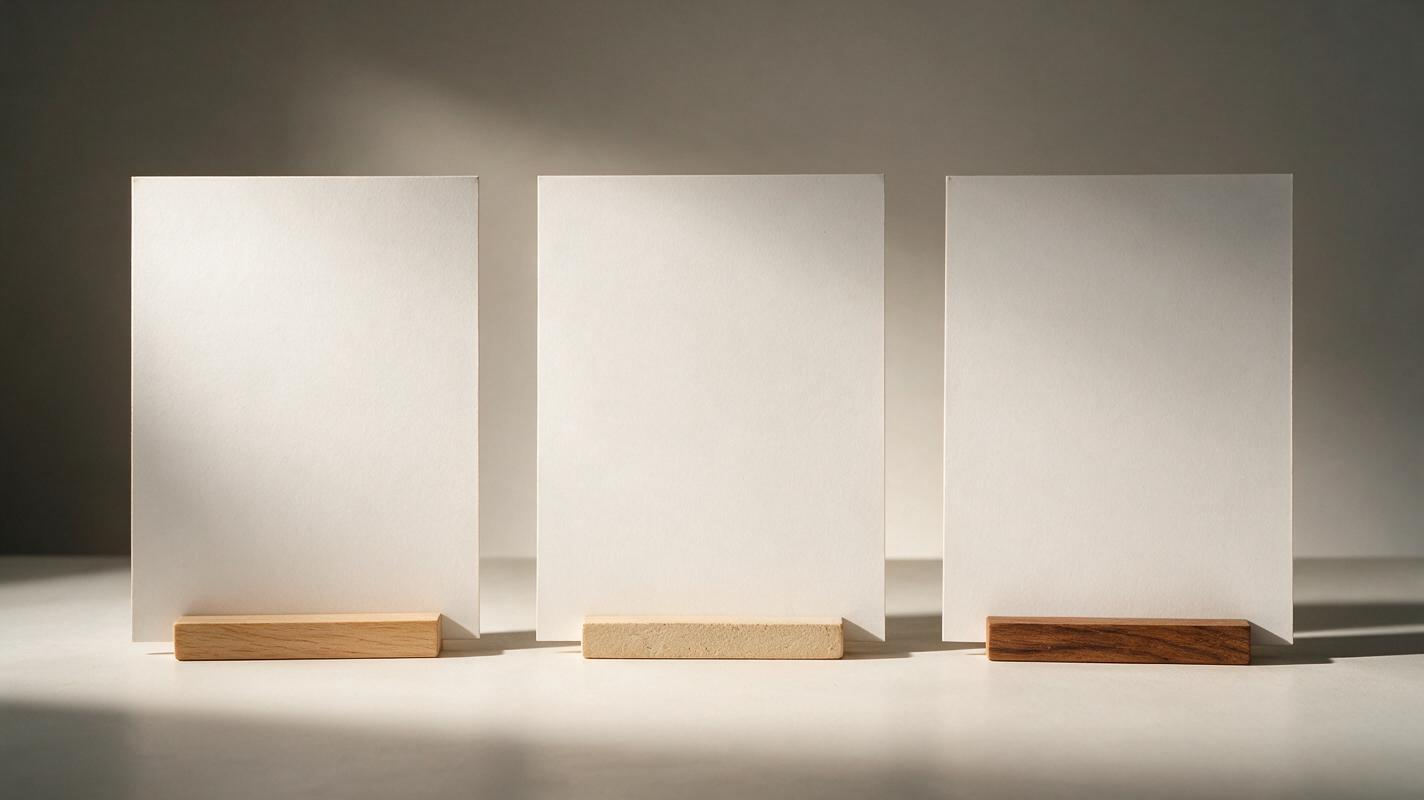
A quiet background can make the board presentation-ready without controlling the scale. Use ai image generator to create an empty set of matched panels: the same tabletop horizon, lighting direction, camera height, and restrained surface texture in every panel. Nano Banana Pro is one option for exploring the stage. Keep the measured product exports out of the generation pass, then composite them onto the approved background yourself.
This separation matters because an image model may resize an object to improve its composition. It may also alter a silhouette, add a support foot, or reinterpret a control. Those changes can be attractive in a standalone concept image and misleading in a comparison board.
Create three equal-width, empty presentation panels for a desktop hardware design review. Straight-on camera, identical pale neutral tabletop and backdrop in every panel, one consistent soft light from upper left, subtle contact-shadow area, no products, no props, no rulers, no text, no perspective distortion. Leave generous vertical and horizontal clearance for separately composited product images.After placing the scaled exports, add contact shadows on a separate layer. Keep them subtle and tied to the actual contact points; a broad shadow beneath a small concept can make it appear heavier or larger than it is. If the board needs a human or furniture reference, use the same reference at a fixed size in every panel and make clear that the comparison remains illustrative.
Audit the board before the review
First, check the object bounds against the pixel sizes you calculated. Cropping transparent margins is fine; scaling each product until it nearly fills its panel is not. Confirm that panel borders, label placement, and shadows are not creating an unintended visual hierarchy.
Then ask someone who has not seen the dimensions to identify the widest and tallest concept. If their reading conflicts with the measurements, inspect the board for unequal crops, inconsistent baselines, or perspective cues. Look especially closely at angled feet and projecting handles: they may need separate overall-dimension markers to distinguish the main body from the full envelope.
| What you see | Likely cause | Correction |
|---|---|---|
| All concepts look the same size | Each was fitted independently to its panel | Reapply one pixels-per-millimeter scale |
| One concept appears taller than its stated height | Different baseline or transparent padding | Align measured bounds to the shared ground line |
| A product looks narrower than its front-view export | Perspective or AI-altered silhouette | Replace it with the approved orthographic export |
| A small concept looks unusually substantial | Oversized shadow or staging prop | Reduce the shadow and remove unequal props |
Retain the dimension source and scale calculation with the working file. The board is a communication artifact, not proof of manufacturability or physical fit; those questions still belong to the underlying engineering data and prototype checks.
Final checklist
- Use approved dimensions and matched orthographic views wherever possible.
- Apply one pixels-per-millimeter value to every concept.
- Align measured contact points to a common baseline.
- Generate the stage separately; composite approved product imagery afterward.
- Label uncertain dimensions and check the board against source files.
If you already have measured exports, test this prompt yourself to develop a neutral stage—then place the products at their calculated sizes before sharing the comparison.
Keywords
ai product design, product size comparison, industrial design ai, product visualization, product rendering ai, design review board