How to Turn Rough Sketches Into On-Brand Campaign Key Visuals With AI
Brand designers often spend hours turning hand-drawn campaign key visual sketches into polished, on-brand assets, slowing down campaign iteration. This guide shares a practical Seedream 4.5 workflow for preserving sketch composition while locking in brand identity, including preparation tips, prompt templates, and troubleshooting for common issues.
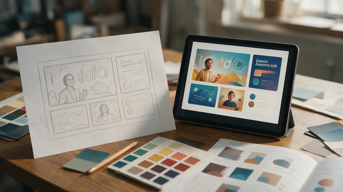
Table of contents
The sketch-to-key-visual bottleneck for brand campaigns
You’ve just mapped out three rough campaign key visual concepts on paper—dynamic compositions, clear focal points, and the exact emotional tone the client wants. But turning those pencil sketches into polished, on-brand visuals that match your color palette, illustration style, and copy space rules means hours of redrawing, color adjusting, and detail work. By the time you finish the first round of revisions, the client’s timeline has already shifted.
AI image generation can cut that iteration time down to minutes—if you know how to preserve your sketch’s composition while locking in brand consistency. This workflow uses Seedream 4.5 to turn hand-drawn sketches into production-ready campaign key visuals, with built-in guardrails to avoid generic results or brand drift.
Prepare your sketch for clean AI reference
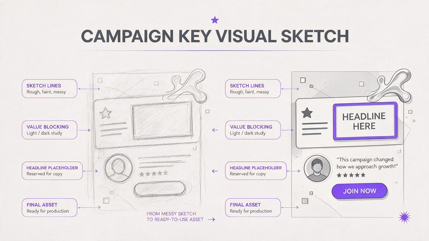
The quality of your sketch reference directly impacts how well the AI preserves your composition. A messy, faint sketch with unclear edges will lead to distorted layouts and lost focal points. You don’t need a polished drawing—just a clear outline of the core elements.
- Use dark, solid lines for major shapes (product placement, focal graphics, headline zones, background layers)
- Block in large areas of value (light/dark) to indicate depth and focal weight
- Mark copy zones with empty rectangles so the AI leaves clean negative space for headlines and logos
- Scan or photograph your sketch in even, soft light to avoid shadows that the AI might interpret as design elements
Pro tip: If your sketch is on paper, run it through a free scanner app to boost contrast and remove paper texture before using it as a reference. This cuts down on unwanted grain in the final result.
Lock brand consistency with a style reference sheet
The biggest risk of sketch-to-AI key visuals is losing your brand’s unique visual identity—generic colors, off-brand illustration style, or mismatched texture. A single style reference sheet gives the AI a clear target to match, so you don’t have to describe every brand rule in text.
Your reference sheet should include 3–4 on-brand assets, arranged in a single image:
- A finished key visual or poster from a previous campaign that matches the desired style
- Your brand’s primary and secondary color palette swatches
- A sample of your brand’s illustration or texture style (if applicable)
- A small example of clean negative space used for copy
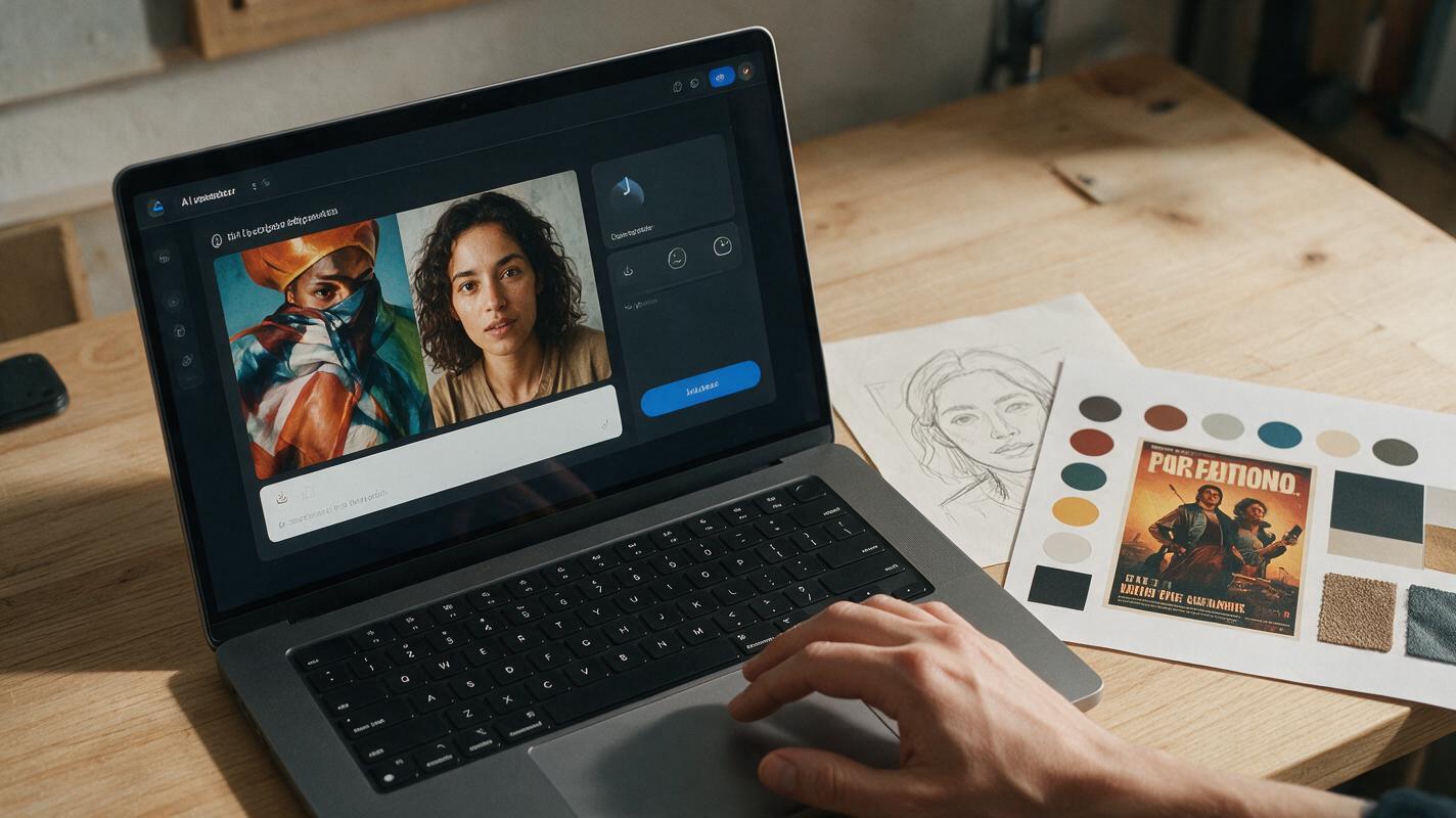
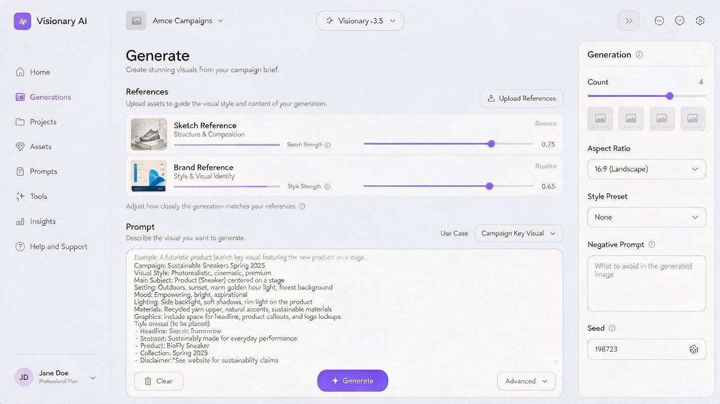
Upload both your sketch and your style reference sheet to ai image generator, using the reference strength slider to balance composition (from the sketch) and style (from the reference sheet). For most brand work, set sketch reference strength to 0.7–0.8 to preserve your layout, and style reference strength to 0.6–0.7 to keep the brand look without overriding your composition.
Prompt structure for polished on-brand results
Even with strong references, your text prompt guides the AI on details the sketch and style sheet can’t communicate: use case, finish level, lighting, and explicit guardrails for brand assets. Use this prompt framework tailored to campaign key visuals:
Campaign key visual for [brand name], [product/campaign theme],
polished professional graphic design,
[lighting direction, e.g. soft warm side lighting, bold high-contrast studio lighting],
[texture/style note, e.g. matte paper texture, minimal vector illustration, gradient mesh style],
clean empty rectangular copy zone at [location, e.g. top third, left side] for headline text,
no text, no logos, no watermarks,
matches the composition of the reference sketch,
matches the color palette and style of the brand reference sheet
The negative prompt is just as important for brand consistency. Use it to eliminate common AI errors that break brand guidelines:
distorted composition, cropped elements, messy edges,
generic stock photo style, cluttered copy zones, text, logos,
wrong colors, unrealistic proportions, watermarks, blurry details
test this prompt yourself with your own sketch and brand reference sheet to see how small adjustments to reference strength change the final result.
Fix common sketch-to-key-visual issues
Even with solid references and a good prompt, you may run into small inconsistencies. Here’s how to fix the most common issues without starting over:
Composition drift (focal points shift, copy zones shrink)
If the AI moves key elements or fills in your designated copy space, increase the sketch reference strength by 0.1 and add a line to your prompt explicitly stating “exact composition matches reference sketch, empty copy zone preserved”. For small adjustments, use inpainting to erase unwanted elements from the copy zone and extend background details.
Off-brand colors or style
If the final result misses your brand palette or illustration style, increase the style reference strength by 0.1 and add specific color names to your prompt (e.g. “primary brand teal #2DD4BF, secondary coral #F97316”). For small color tweaks, use targeted inpainting with color-specific prompts to adjust individual elements.
Unpolished or messy details
If the final image looks too rough or has inconsistent linework, add a line to your prompt like “clean professional finish, sharp details, print-ready graphic design” and set the image quality to high. You can also run a second pass with the first result as a new reference, using a higher style strength to refine details.
Expand one sketch into a full campaign set
Once you have a polished key visual you’re happy with, you can use the same sketch and reference sheet to generate variations for different campaign formats. Adjust the aspect ratio and use the same prompt framework to create social media graphics, poster variations, and digital banner assets—all with consistent composition and brand style.
For motion assets, you can even turn your final static key visual into a subtle loop by using image to video tools to add gentle movement to background elements, keeping text and logos static to avoid warping.
Final checklist
- Sketch has clear dark lines for major shapes and marked copy zones
- Brand reference sheet includes palette, style example, and previous campaign asset
- Sketch reference strength is set to 0.7–0.8 to preserve composition
- Style reference strength is set to 0.6–0.7 to lock in brand identity
- Prompt explicitly mentions empty copy zones and no text/logos
- Negative prompt filters out distorted layouts and off-brand style cues
- Final result matches both your sketch composition and brand guidelines
Keywords
sketch to key visual, ai campaign key visual, brand design ai, seedream 4.5, ai poster generator, graphic design workflow, sketch to poster ai