How to Make Typography-Led AI Campaign Key Visuals (Static + Animated)
Typography is often the weakest part of AI-generated campaign key visuals, with garbled text, wrong fonts, and inconsistent kerning wasting brand designers hours. This tutorial walks through a 4-step workflow to create crisp, on-brand static typography-led key visuals with Flux and GPT Image, then animate them for multi-channel use with Seedance. It includes reusable prompts, a tool comparison for typography animation, and troubleshooting for common AI text issues.
Table of contents
Why AI Typography Fails (And How to Fix It Fast)
Typography is the backbone of any memorable campaign key visual—it carries your brand’s message, sets the tone, and drives audience recall. While a high-quality ai image generator can speed up background concepting, most models struggle with accurate, on-brand typography: think garbled words, misspelled copy, wrong fonts, and wonky kerning that forces hours of manual fixes in Photoshop.
This workflow solves that problem by separating background generation, typography placement, and animation into distinct steps, so you get crisp, brand-aligned static and animated typography-led key visuals in a fraction of the time. It works for campaign posters, social media ads, billboards, and any asset where text is the hero element.
Step 1 — Lock in Your Brand Typography Rules & Core Copy
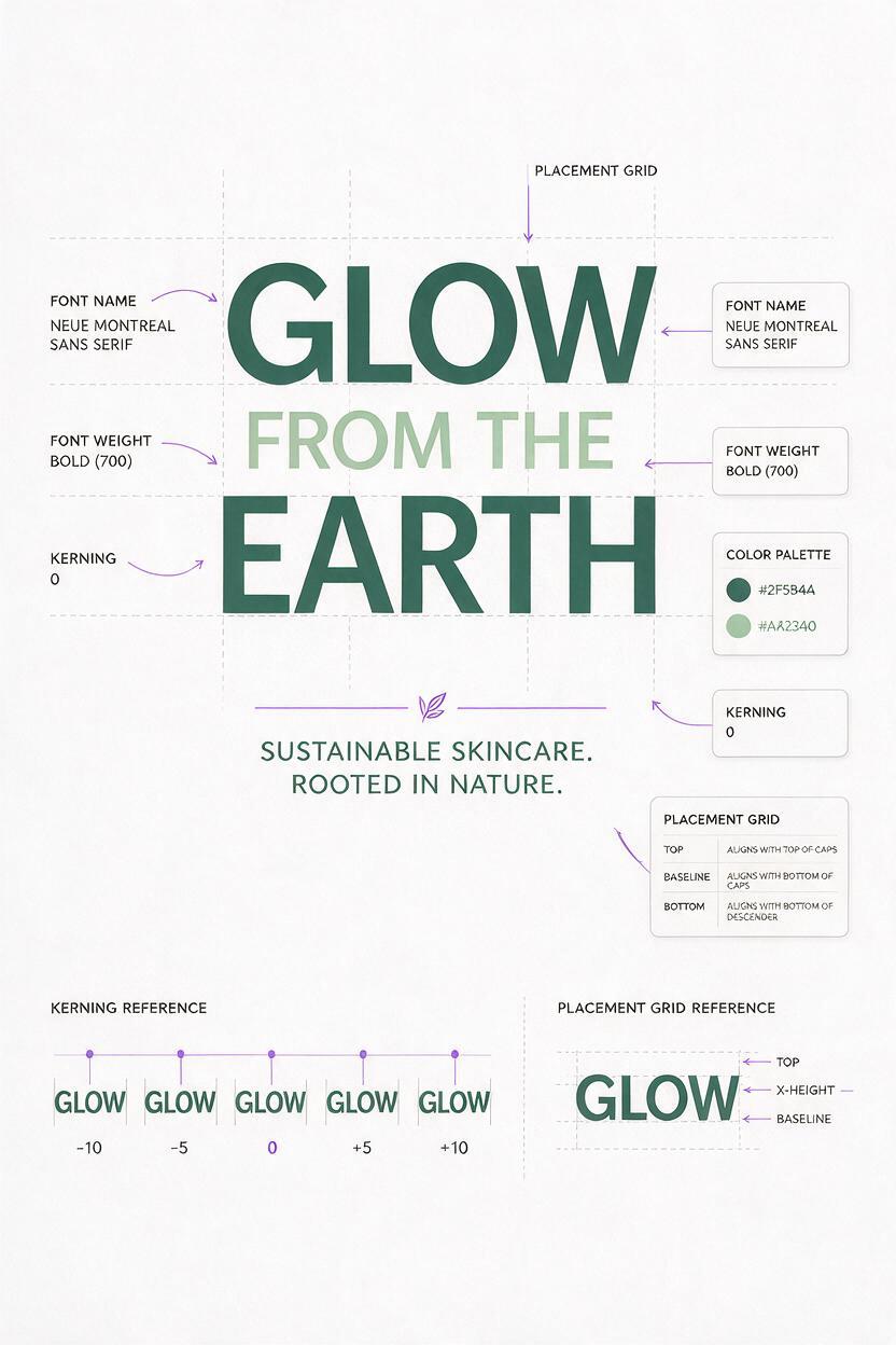
Before you generate any visuals, start with clear, documented typography rules. This eliminates guesswork for AI models and ensures every asset stays on-brand, even when you’re creating dozens of variations.
At minimum, your spec sheet should include:
- Exact copy: Final headline, tagline, and any supporting text (no placeholders—AI struggles with partial or vague text requests)
- Font details: Primary font name, weight, and size ratio relative to the canvas
- Color specs: Exact hex codes for text, tied to your brand palette
- Layout rules: Placement (e.g., left-aligned, 10% from left edge), line height, and kerning values
- Negative space: Clear definition of where text will sit, so the background doesn’t compete with copy
Pro tip: For new brand style explorations, pick 2–3 font pairings upfront and test one per visual variation to compare results faster.
Step 2 — Generate Your Text-Free Key Visual Background with Flux
We’ll generate the visual background first, without any text, so Flux can focus on nailing your brand’s mood, color palette, and composition—no garbled text to crop out later. The key is to explicitly leave empty space for your typography.
Use this reusable prompt template, swapping in your brand details:
Text-free campaign key visual background for [your brand/industry], [mood/lighting description], [core visual elements], empty [placement area] for headline text, brand color palette: [hex codes], [resolution/size], no text, no logos, [style reference]Example prompt for a sustainable skincare campaign:
Text-free campaign key visual background for a zero-waste skincare brand, soft golden hour light through eucalyptus leaves, matte cream base with subtle terracotta clay accents, empty left third of the frame for headline text, brand color palette: #F5F0E6, #D4A373, #606C38, 1920x1080, 300 DPI, photorealistic, minimalist, no text, no logosGenerate 3–4 background variations to pick from, and prioritize images with clean, uncluttered space in your designated text area.

Step 3 — Add Crisp On-Brand Typography with GPT Image
GPT Image’s text rendering is far more accurate than most general-purpose image models, making it ideal for adding typography to your background. Upload your chosen Flux background as a reference image, then use a prompt that specifies every detail of your text layout.
Use this prompt template for consistent results:
Add the following text to the reference image, [placement details]:
Headline: "[exact headline text]"
Tagline: "[exact tagline text]"
Headline style: [font name, weight, size equivalent, color hex code]
Tagline style: [font name, weight, size equivalent, color hex code]
Perfect kerning, sharp edges, no distortion, subtle lighting match to the background, no other text or elements added
Example prompt for the skincare campaign:
Add the following text to the reference image, left-aligned in the empty left third, 10% from left edge, 20% from top:
Headline: "GLOW FROM THE EARTH"
Tagline: "100% Natural Skincare, Zero Waste"
Headline style: bold geometric sans-serif, similar to Helvetica Neue Bold, 72px equivalent, color #606C38
Tagline style: regular geometric sans-serif, similar to Helvetica Neue Regular, 24px equivalent, color #2D3A1F
Perfect kerning, sharp edges, no distortion, soft warm light match to the background, no other text or elements added
If the font isn’t quite right, specify "exact [font name]" or add "no decorative flourishes" to narrow the model’s output. For highly custom brand fonts, you can touch up the final text in a vector editor in 5–10 minutes.
Test this prompt yourself with your own brand background and copy to see how much faster you can get crisp, on-brand typography.
Step 4 — Animate Your Typography Key Visual with Seedance
Static key visuals work for print, but animated versions drive 2–3x higher engagement on social media and digital ads. Once your static key visual is finalized, an image to video tool lets you add subtle motion to both the background and typography without reworking the entire design.
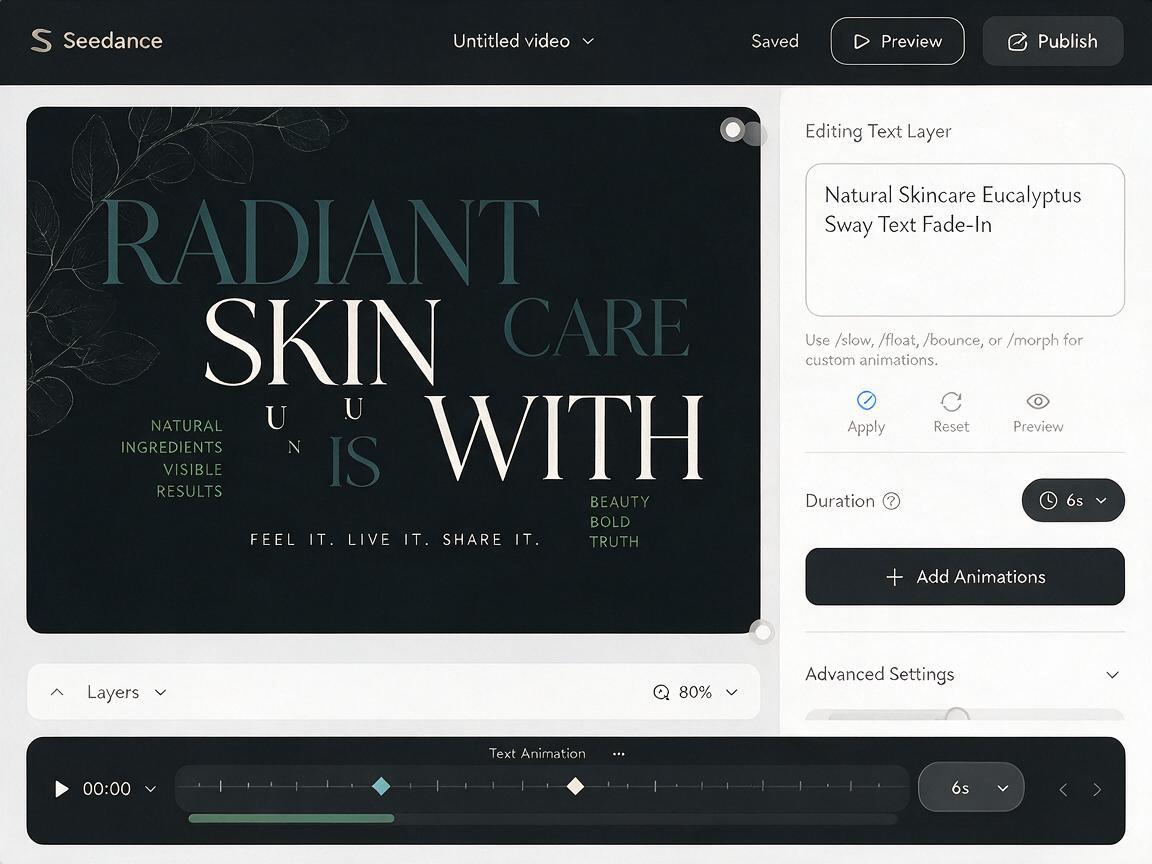
Seedance excels at soft, natural motion that keeps text sharp and legible—perfect for premium or lifestyle brand campaigns. Upload your final static key visual, then use a prompt that defines both background motion and text animation timing.
Example animation prompt for the skincare campaign:
Subtle 6-second animation for a skincare campaign key visual: eucalyptus leaves sway gently in the background, soft golden light shifts slowly across the frame, headline text "GLOW FROM THE EARTH" fades in left to right over 2 seconds, tagline fades in 1 second after the headline finishes, no camera movement, text stays perfectly sharp and legible the entire time, 1080p, 24fps, smooth motionIf you’re creating assets for multiple channels (Reels, TikTok, banners), generate one master animation, then crop variations to fit each aspect ratio—no need to re-animate from scratch.
For reference, here’s how Seedance compares to Kling for typography-focused animation:
| Tool | Best For | Text Sharpness | Motion Style |
|---|---|---|---|
| Seedance | Premium, lifestyle, or natural brand campaigns | Excellent (minimal distortion) | Slow, subtle, organic |
| Kling | High-energy youth, tech, or streetwear campaigns | Good (may need text masking for kinetic motion) | Dynamic, fast-paced, kinetic |
Final Checklist for Typography-Led AI Key Visuals
- Brand typography rules (font, weight, color, placement) are documented before generation
- Background is generated text-free with clear, uncluttered space for copy
- Typography matches brand specs exactly, with no garbled words or misspellings
- Animated versions keep text sharp and legible throughout the entire clip
- All variations align with your brand’s color palette and core mood
- Assets are exported in the correct resolution and aspect ratio for each channel
Keywords
ai typography, campaign key visual, ai poster generator, brand design ai, poster animation, graphic design prompts, static to motion