Why AI Webtoon Panels Look Flat—and Prompts That Add Depth
Flat AI webtoon panels usually lack clear foreground, middle-ground, and background relationships—not more detail. This guide shows how to use Midjourney prompts, occlusion, scale changes, lighting, and vertical composition to create panels with readable depth.
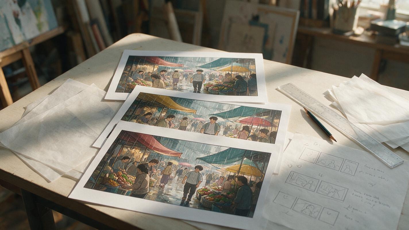
Table of contents
Make Flat Webtoon Panels Read in Depth
A detailed background does not automatically create a deep panel. If the character, props, and environment all occupy the same visual layer, the result still feels like a cardboard stage. The fix is to describe spatial relationships before rendering style.
This guide uses Midjourney as the main example, but the prompt structure works with most illustration models. You will define three depth planes, connect them through overlap and scale, and preserve enough clarity for a phone-sized vertical canvas.
Depth comes from relationships: what overlaps, what recedes, what stays sharp, and what the viewer encounters first.
Why Detailed Panels Can Still Look Flat
Image models often interpret a list of objects as a request to display every object clearly. A prompt such as “hero, market, signs, crowd, lanterns, distant tower” may produce all six elements at similar scale and sharpness. The scene contains information, but it lacks a route for the eye.
Flatness usually comes from one or more of these problems:
- No foreground obstruction: nothing crosses the frame edge or partially hides another object.
- Weak scale progression: nearby and distant figures appear almost equally large.
- Uniform detail: every surface receives the same line weight, contrast, and texture.
- Parallel staging: characters stand side by side against a background instead of occupying different distances.
- Disconnected lighting: foreground, subject, and environment do not share one believable light direction.
- Centered symmetry: the subject, vanishing area, and environmental landmarks all compete near the middle.
Do not begin by adding cinematic adjectives. First decide which object is closest, where the story action occurs, and what should recede.
Build Three Depth Planes Before Adding Style
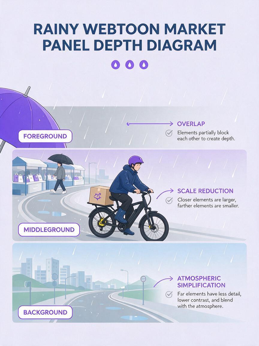
Divide the panel into foreground, middle ground, and background. Each plane needs a different narrative job, not merely a different collection of objects.
| Plane | Visual job | Useful prompt language |
|---|---|---|
| Foreground | Pulls the reader into the frame and establishes proximity | cropped at frame edge, close to camera, partially obscuring |
| Middle ground | Holds the character action and emotional focus | main subject, readable silhouette, strongest focal contrast |
| Background | Provides destination, atmosphere, or story context | receding, smaller figures, simplified detail, atmospheric distance |
Write these roles into the prompt in spatial order. Here is a reusable base:
vertical webtoon panel, deep environmental composition,
foreground: a cropped rain-soaked umbrella entering from the lower left,
partially obscuring the street;
middle ground: a young courier turning toward a glowing shop doorway,
full readable silhouette, face visible in three-quarter view;
background: narrow market street receding uphill,
small pedestrians and layered signs diminishing with distance,
one coherent perspective, foreground darker and sharper,
background simplified by rain haze,
clean expressive comic line art, controlled color shapes
This works better than asking for “extreme depth” because it gives the model visible evidence of depth. When using ai image generator, keep the plane descriptions near the beginning of the prompt so composition is established before costume and surface details.
Use one dominant subject per plane
A plane can contain several objects, but it should have one dominant function. For example, the foreground may frame the action with a door jamb; it should not also contain a detailed secondary character demanding equal attention. Too many focal objects flatten the hierarchy even when the perspective is technically correct.
Add Occlusion Instead of More Background Detail
Occlusion means one form partially covers another. It is among the clearest depth cues available in stylized comic art because it remains readable without photorealistic shading.
Useful foreground occluders include:
- a shoulder or silhouette entering from the side;
- a door frame, curtain, railing, or tree branch;
- a cropped table with one recognizable prop;
- steam, rain, leaves, or fabric crossing part of the subject;
- a close object that creates a frame within the panel.
State both the object and what it overlaps. “Foreground railing” is weaker than “foreground railing crossing the lower quarter of the character’s coat.” The second instruction defines a relationship.
view from behind a close foreground witness,
only the witness's cropped shoulder and hair visible at frame right,
partially overlapping the detective in the middle ground;
the detective stands beneath a station lamp;
railway platforms and signal lights shrink into the foggy background,
clear separation between all three depth planes
Do not place an occluder over the eyes, hands, or story-critical prop unless concealment is part of the scene.
Use the Vertical Canvas as a Depth Tool
A webtoon panel can express depth from top to bottom as well as from front to back. The upper area can hold a destination or reveal, the center can hold the acting character, and the lower edge can contain a cropped foreground object that leads into the scene.
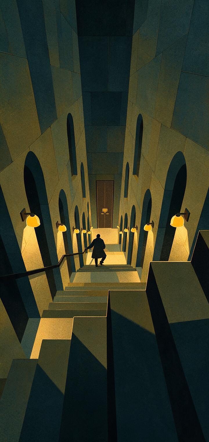
For an upward-looking street, let architectural lines converge toward the upper third. For a descent into a station or alley, place the nearest stairs at the bottom and progressively compress them toward the destination. This creates an eye path that supports the reader’s downward scroll.
Try this prompt for an establishing panel:
tall vertical webtoon establishing panel,
view from the entrance of a steep underground archive,
large cropped stone steps beginning at the bottom edge,
a lone archivist descending in the middle distance,
rows of lamps becoming smaller toward a sealed door far below,
strong scale progression, repeated shapes diminishing with distance,
vertical perspective guiding the eye downward,
restrained graphic-novel colors, crisp focal silhouette
Avoid filling every part of a tall panel. An area of fog, shadow, sky, or untextured wall can separate depth layers and control reading speed.
Separate Planes with Contrast and Line Weight
Perspective alone may not survive reduction to phone size. Reinforce it with a controlled contrast hierarchy:
- Foreground: heavier contour, larger shapes, darker value range.
- Middle ground: clearest facial information and strongest focal contrast.
- Background: thinner lines, fewer internal marks, narrower value range.
This is not a rigid law. A backlit subject may be darker than the foreground, while a bright destination may sit deep in the background. What matters is intentional separation rather than equal treatment everywhere.
Prompt style and spatial rendering separately. Instead of “beautiful detailed neon comic,” specify “detailed focal character, simplified distant storefronts, background signs reduced to graphic color blocks.” This prevents decorative detail from spreading across the entire panel.
Stage Dialogue Without Flattening the Scene
Two-character conversations often collapse into a straight-on lineup. Preserve depth by placing the speakers at different distances or using an over-the-shoulder composition.
vertical comic dialogue panel,
over-the-shoulder view from behind Character A in close foreground,
Character A's shoulder cropped along the left edge;
Character B stands three meters away in the middle ground,
face unobstructed, guarded expression;
open workshop doorway and hanging tools recede behind Character B,
clear depth separation, stable eye line, intentional empty space
above Character B for dialogue lettering
The foreground speaker does not need a fully visible face in every exchange. Alternating a readable reaction shot with a wider depth shot can create stronger rhythm than forcing both expressions into every panel.
Diagnose Flat Results Without Rewriting Everything
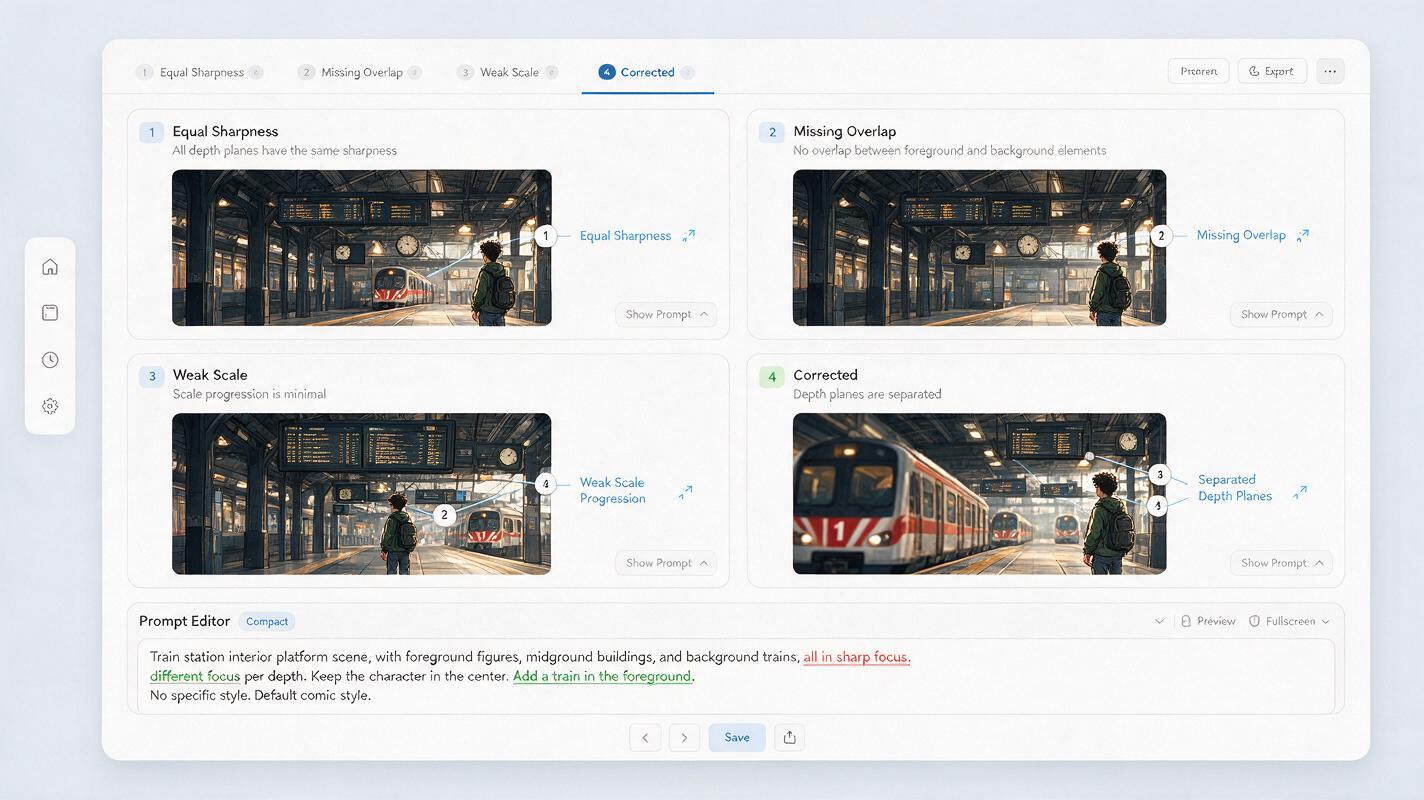
When a generation still looks flat, identify the missing cue and edit only that part of the prompt.
| Visible failure | Likely cause | Targeted correction |
|---|---|---|
| Everything is equally sharp | Uniform rendering language | Add simplified distant detail and restrained atmospheric separation |
| Figures look equally large | No scale progression | State close, middle-distance, and small distant figures explicitly |
| Scene resembles a stage set | Action aligned on one plane | Move one subject closer and overlap the central action |
| Foreground looks pasted on | No shared light or contact | Give all planes one light direction and overlapping cast shadows |
| Character disappears | Environment has equal contrast | Reduce background marks and reserve strongest contrast for the face |
| Tall panel feels empty | No visual route through its height | Add converging architecture, repeated shapes, or descending scale |
Generate a few low-cost composition variations before committing to polished detail. Compare them at actual reading width, not only enlarged on a monitor. If the foreground, subject, and destination cannot be identified quickly, the depth hierarchy needs another pass.
Keep a Reusable Depth Prompt Template
Save a structural template and replace only the story variables. This gives a series recurring visual logic without making every composition identical.
[panel format and viewpoint]
foreground: [cropped object], overlapping [specific area];
middle ground: [main action], [readable pose or expression];
background: [location or destination], receding toward [direction];
scale progression: [large near shape] to [small distant shapes];
plane separation: [line weight, contrast, haze, or color strategy];
lighting: [one source and direction];
lettering space: [location of intentional negative space];
style: [line, color, and finish description]
Change the viewpoint and foreground device between adjacent panels. Repeating the same over-the-shoulder framing can become mechanical, even when each image has convincing depth. Rotate among doorway frames, high-angle views, low foreground props, environmental silhouettes, and unobstructed reaction shots.
When your scene roles are ready, test this prompt yourself with one establishing panel and one dialogue panel before expanding the sequence.
Final Checklist
- Assign a clear story function to the foreground, middle ground, and background.
- Describe which object overlaps which subject.
- Use visible scale reduction rather than relying on “cinematic depth.”
- Reserve the clearest face and strongest focal contrast for the main action.
- Simplify distant line work and texture.
- Use vertical perspective to guide the reader through tall panels.
- Protect dialogue space without centering every composition.
- Judge the result at actual phone-reading size.
Keywords
AI webtoon, webtoon prompts, comic panel depth, Midjourney prompts, manga panel generator, visual storytelling AI, comic composition