Why AI Album Cover Animations Ruin Text Readability (and 4 Fixes That Work)
AI-powered album cover animations often distort, blur, or erase critical text like artist names and album titles, ruining promo assets for social media and streaming platforms. This troubleshooting guide breaks down why text drift happens in image-to-video animations and shares four actionable fixes using PixVerse to keep your cover’s typography sharp and readable through every frame.
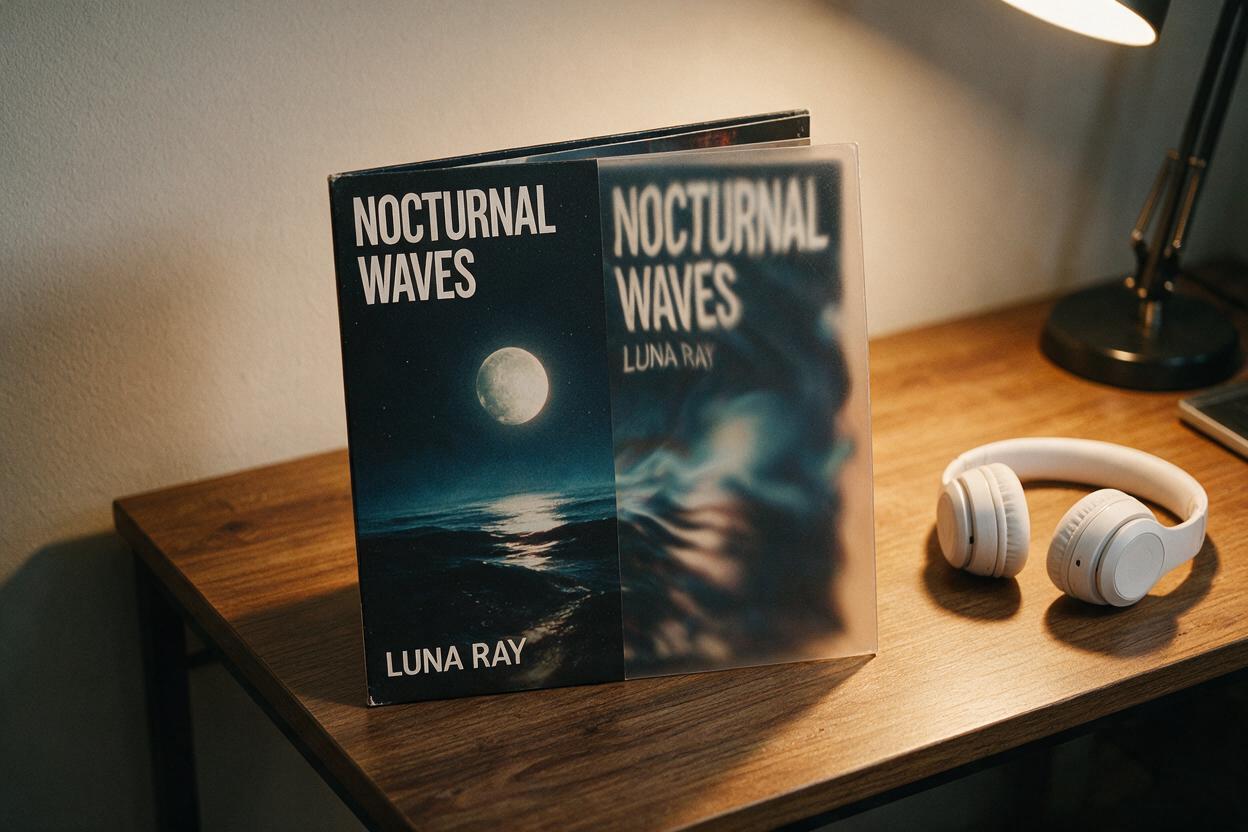
Table of contents
What causes text distortion in animated album covers?
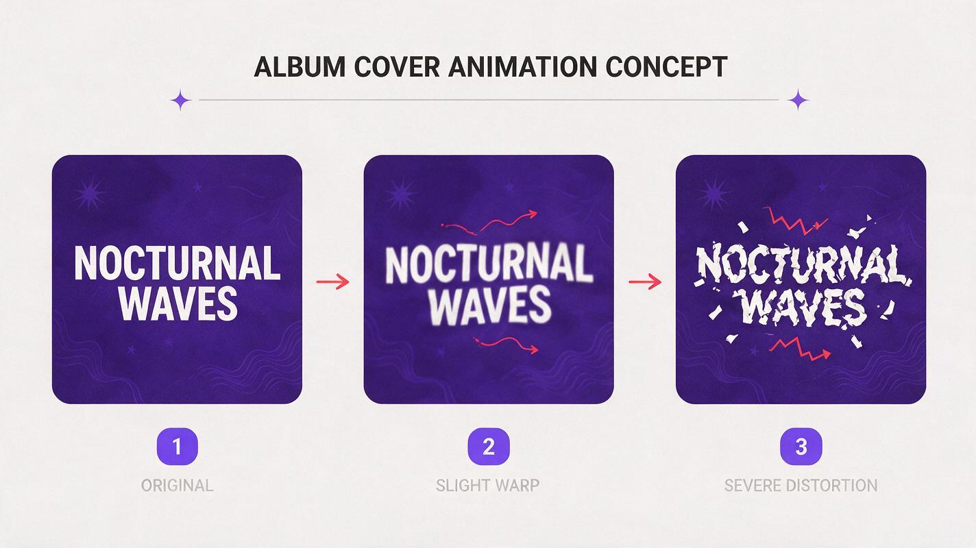
If you’ve ever tried turning your album cover into a short animated promo for Spotify Canvas, TikTok, or Instagram Reels, you’ve probably seen it: the artist name blurs, the album title warps into unrecognizable shapes, or critical text drifts out of alignment by the end of the clip. For independent musicians, this isn’t just a minor glitch — it turns a polished promo asset into something that looks unprofessional and undermines your brand identity.
When you use image to video tools to animate static album cover art, the AI’s primary training goal is to generate believable motion — not to preserve the exact shape of letterforms. Most AI video models treat text as just another visual pattern, not as semantic content that needs to stay readable. A few specific factors make the problem worse: low reference image strength, high motion intensity, low-resolution source files, and thin or decorative fonts that are harder for the AI to track.
The good news is you don’t have to settle for blurry text. Below are four actionable fixes, tested with PixVerse’s reference-based animation tools, that will keep your album’s typography sharp and readable through every frame of your animation.
Prep your cover file before animating
The easiest way to prevent text distortion is to set your source file up for success before you even open an AI animation tool. Small adjustments to your cover art can make a huge difference in how well the AI preserves text.
- Use a high-resolution source file (3000x3000px minimum). The more pixel data the AI has to work with, the better it can track fine details like letter edges.
- Maximize text contrast. If your artist name or album title is low-contrast against the background (e.g., light gray text on a pastel background), the AI will struggle to distinguish it from surrounding visuals. Bump up the contrast or add a subtle text stroke to make it pop.
- Avoid ultra-thin or highly decorative fonts for critical text. Thin serifs or script fonts have tiny, easily distorted details; bold, blocky fonts are far more likely to stay intact through animation.
- Save a text-free backup if you have access to the original design file. This will come in handy for the final fix later on.
Tune reference strength to protect typography
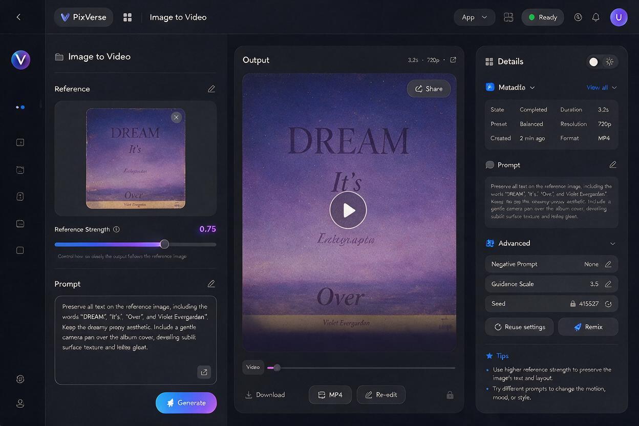
Most image-to-video tools let you adjust a "reference strength" or "image weight" slider, which controls how closely the AI sticks to your original input image. Crank it too low, and the AI will take creative liberties that warp your text. Crank it too high, and you’ll get barely any motion at all — defeating the purpose of an animation.
For PixVerse, the sweet spot for album cover animations with readable text falls between 0.7 and 0.8 on the reference strength scale. This gives the AI enough room to add subtle motion (floating particles, slow zoom, gentle light shifts) while locking in the core composition and text shapes.
Pair that with a prompt that explicitly tells the AI to preserve text. Here’s a reusable prompt template tailored for album cover animations:
subtle slow zoom in, floating ambient particles, soft warm light shifts, preserve all text exactly as it appears in the reference image, no distortion, no warping, cinematic 4k, album cover animationIf you notice text starting to blur around the 3-4 second mark, bump the reference strength up by 0.05 and regenerate. Small adjustments here usually fix mild drift without killing the motion.
If you want to experiment with these settings for your own cover art, test this prompt yourself.
Use motion masking to keep text areas static
For more severe text drift, or if you want more dynamic motion in the background of your cover, use motion masking to lock text areas in place. Most modern AI video tools, including PixVerse, let you draw a mask over specific parts of your image that you want to keep static. The AI will only animate the unmasked areas, leaving your text completely untouched.
This method is ideal if you want dramatic background motion — like swirling nebulae, moving water, or shifting foliage — without risking your artist name or album title getting distorted. It’s also perfect for longer animations (8+ seconds) where text drift is more likely to build up over time.
- Draw your mask slightly larger than the text itself (10-20px of padding around the edges) to avoid any subtle warping right at the text boundary.
- Mask all critical text elements: artist name, album title, featured artist credits, and any release date text you want to keep visible.
- Leave small decorative text (like a record label logo) unmasked if it’s not critical to readability, to keep the animation feeling natural.
The tradeoff here is that masked areas won’t have any motion at all, so if you’re doing a slow zoom effect, the text will stay the same size while the background zooms. For most promo use cases, this is barely noticeable — and it’s a far better option than blurry, unreadable text.
Overlay text post-animation for perfect sharpness
If you need 100% perfect text accuracy — for example, if you’re making a promo clip with a release date or pre-save call to action — the most reliable fix is to animate a text-free version of your cover, then overlay the text in a free video editing tool after generation.
This method completely eliminates text drift, because you’re adding the text as a static layer on top of the animated background. It also lets you add dynamic text effects (like fade-ins, bounces, or lyric sync) that AI video tools can’t yet generate reliably.
To get started, export a text-free version of your album cover from your design tool, animate it in PixVerse with your preferred motion settings, then import the clip into a free tool like CapCut, Canva, or DaVinci Resolve to add your text layers back in using the exact font, color, and placement from your original cover. The whole process takes 5-10 extra minutes, and the result is pixel-perfect brand consistency.
Final troubleshooting checklist
- Source file is at least 3000x3000px with high-contrast critical text
- Reference strength is set between 0.7 and 0.8 for balanced motion and text preservation
- All critical text areas are masked if using dynamic background motion
- Text is overlaid post-animation for official release promos requiring 100% accuracy
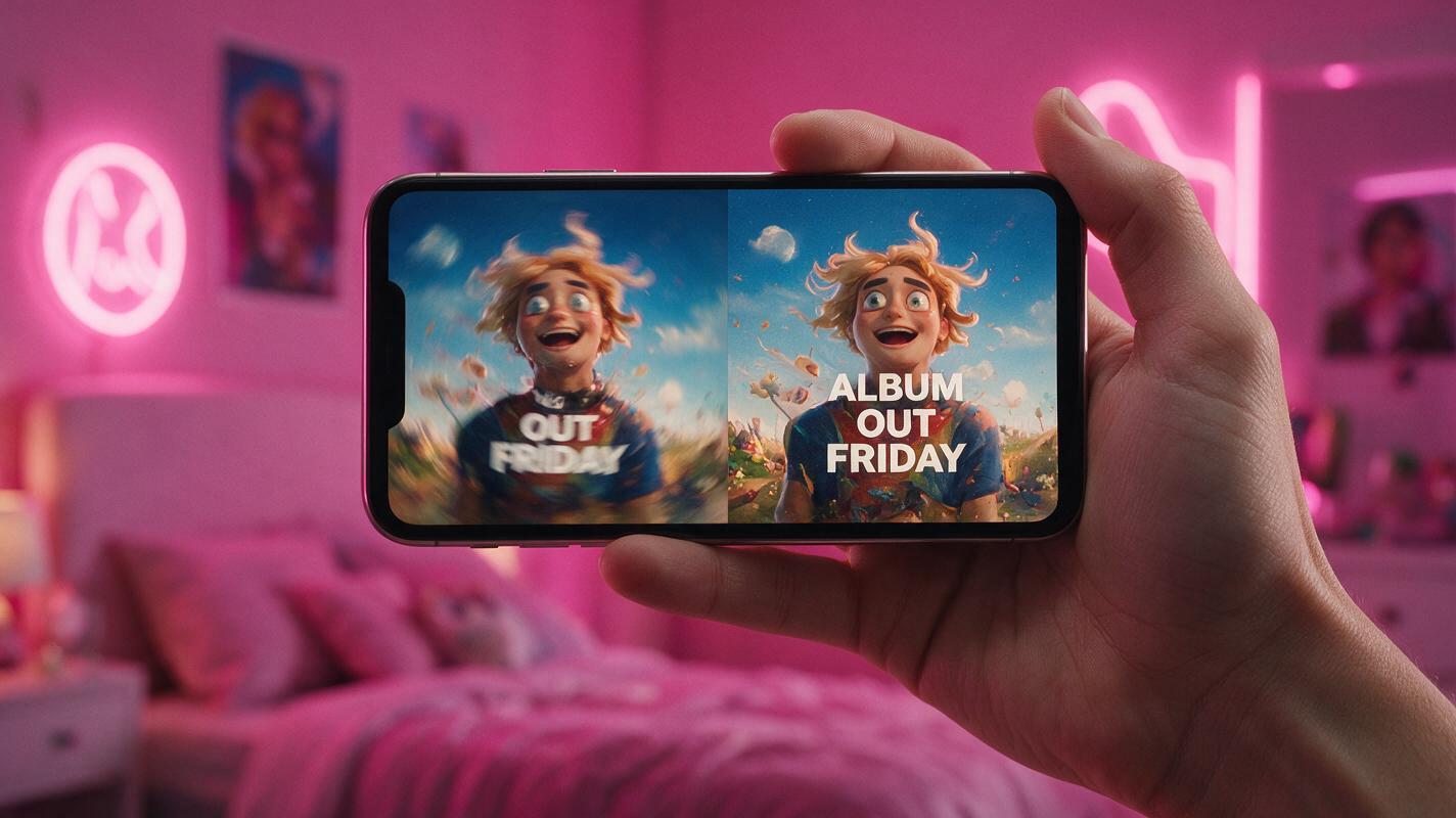
- Exported clip is tested on mobile to confirm text is readable at small sizes
- Clip length and aspect ratio match platform requirements (3-8s 1:1 for Spotify Canvas, 15-30s 9:16 for Reels/TikTok)
Keywords
album cover animation, text readability, ai video troubleshooting, pixverse, animated album art, text drift fix, music promo assets