How to Make Album Cover-Matched Tracklist Reveal Graphics With Imagen
This guide shows independent musicians and MV creators how to use Imagen to generate album cover-matched tracklist reveal graphics for social media and pre-save campaigns. It includes reusable prompt templates for square carousels, vertical Stories, and horizontal banners, plus tips for ensuring error-free, readable track text. Readers will learn to adjust style reference settings and genre-specific tweaks to match any album aesthetic.
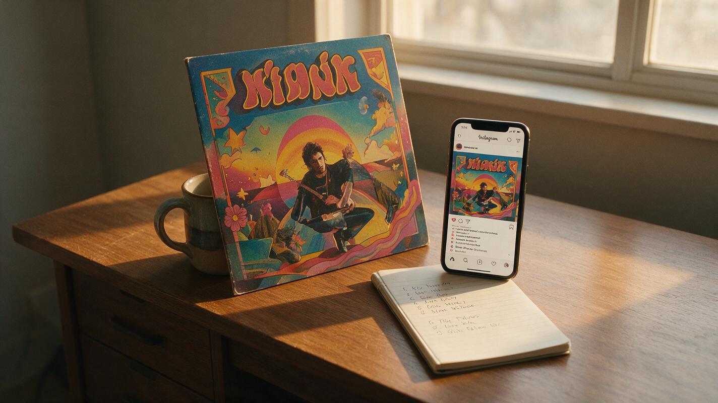
Table of contents
Why album cover-matched tracklist reveals matter
Your tracklist reveal is one of the highest-hype moments of an album campaign. It’s the first time fans see the full scope of your project, and it drives pre-saves, social shares, and release-day momentum. But too many independent artists rely on generic template graphics that clash with their album cover art, or AI-generated designs riddled with misspelled song titles and off-brand visuals.
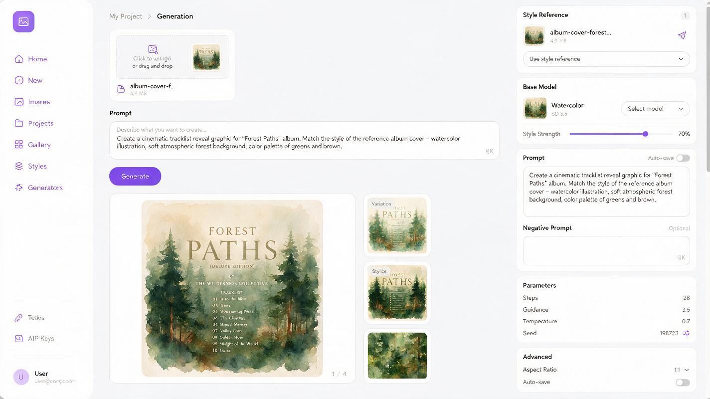
Imagen is an ai image generator built specifically for high-fidelity text rendering and style reference control, which makes it uniquely suited for tracklist assets where both readability and brand consistency are non-negotiable. By feeding it your album cover as a style reference and formatting your tracklist text precisely, you can generate a full set of on-brand reveal assets in minutes — no graphic design skills required.
Prep your assets before generating
A little prep work goes a long way toward avoiding reworks and ensuring your tracklist graphics match your album cover perfectly. Gather these three items before you open Imagen:
- High-res album cover file: Crop out any existing text (like your artist name or album title) if possible, to avoid the model copying old text into your tracklist design. A clean visual reference of the cover’s art, color palette, and texture works best.
- Final, proofread tracklist: Double-check every song title, track number, and feature credit for typos. Imagen renders text exactly as you write it, so any mistakes in your prompt will end up in the final graphic.
- List of required asset sizes: Note which platforms you’re posting to, and their corresponding aspect ratios: 1:1 square for Instagram carousels and feed posts, 9:16 vertical for Instagram Stories and TikTok teases, 16:9 horizontal for pre-save banners and YouTube Community posts.
Pro tip: If you’re making a multi-slide carousel, plan out which tracks go on which slide ahead of time. Most artists put the album title + lead single on the first slide, the full tracklist on the middle slides, and pre-save info + release date on the final slide.
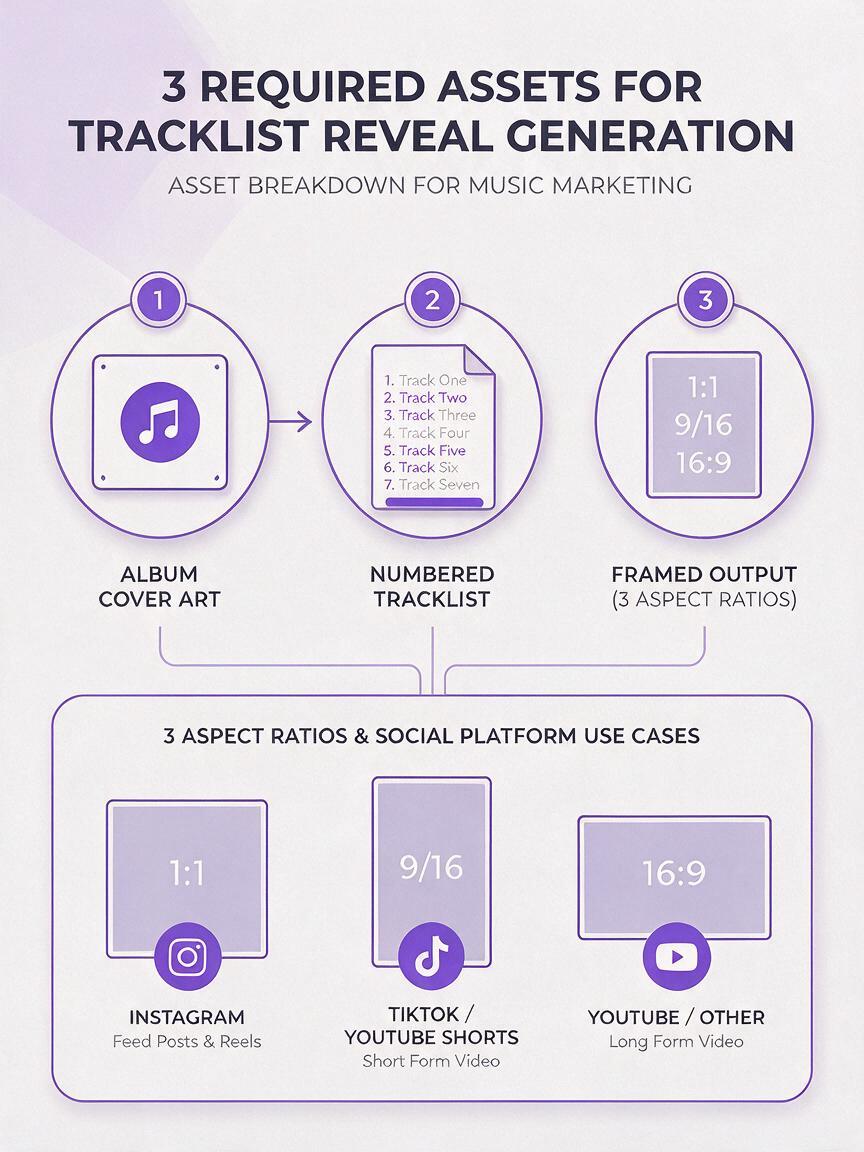
Imagen prompt structure for style-matched tracklist graphics
The best Imagen prompts for tracklist reveals follow a simple, repeatable formula that balances style consistency, text accuracy, and composition. Use this base structure, then swap in your own details:
[Style reference: upload your album cover, set reference weight to 0.75]
1:1 square tracklist reveal graphic for [album name] by [artist name],
matches album cover art style, color palette, and texture exactly,
clean centered layout,
tracklist text:
1. [Track 1 Title]
2. [Track 2 Title]
3. [Track 3 Title]
4. [Track 4 Title]
5. [Track 5 Title]
6. [Track 6 Title]
font style: [describe font from cover, e.g. "bold handwritten script", "minimal thin sans-serif"]
white text with soft drop shadow for readability,
no extra text, no distorted letters, high resolution, sharp text
Test this prompt yourself with your own album cover and first 3 tracks to dial in style and text accuracy before generating the full set. This saves time if you need to adjust the reference weight or font description.
Square carousel main slide prompt
For the first slide of your Instagram carousel, focus on the album title, lead single, and a clear call to action to swipe for the full tracklist. Here’s a genre-specific example for an indie folk album:
[Style reference: watercolor forest album cover, reference weight 0.8]
1:1 square album reveal carousel first slide,
matches watercolor forest album cover art style, soft green and brown palette,
centered text:
"FOREST FLOOR"
[new album out october 24]
lead single: "WILD MOSS"
swipe for full tracklist
font: delicate handwritten brush script,
soft bokeh forest background,
no extra elements, sharp readable text, warm natural tone
Vertical Story tracklist prompt
Vertical Stories assets work best with a condensed tracklist (split into 2-3 slides if you have more than 8 tracks) and plenty of negative space so text doesn’t get cut off by UI elements. Use this template:
[Style reference: neon hyperpop album cover, reference weight 0.7]
9:16 vertical Instagram Story tracklist graphic,
matches neon pink and cyan glitch album cover style,
left-aligned tracklist text:
1. SYSTEM REBOOT
2. GLASS HEART
3. OVERCLOCK
4. DIGITAL TEARS
5. LOW BATTERY
font: bold glitch sans-serif, glowing cyan text,
dark glitch background with subtle static texture,
safe space for UI elements on top and bottom,
no distorted letters, high contrast, sharp text
Horizontal pre-save banner prompt
For pre-save landing pages, YouTube, or Spotify for Artists banners, use a two-column layout to fit more tracks without making text too small. Here’s a template:
[Style reference: moody hip-hop album cover, reference weight 0.75]
16:9 horizontal pre-save banner,
matches grainy black and gold hip-hop album cover style,
two-column tracklist layout,
left column:
1. INTRO
2. STREET LIGHTS
3. GOLD CHAIN
4. LATE NIGHTS
5. INTERLUDE
right column:
6. CITY SKYLINE
7. PAYBACK
8. MILES AWAY
9. LONG WAY HOME
10. OUTRO
font: bold condensed sans-serif, gold text,
dark grainy background with subtle city skyline silhouette,
album title "ASPHALT DREAMS" at top center,
sharp readable text, no typos
Settings to lock in text accuracy and style consistency
Even with a great prompt, wrong settings can lead to style drift or messy text. Adjust these Imagen settings for the best results:
- Style reference weight: Stick between 0.7 and 0.8. Too low, and the graphic won’t match your cover. Too high, and the model may warp text to fit the reference image’s existing shapes.
- Text accuracy slider: Crank this to the maximum setting. Tracklists leave zero room for misspelled words, so prioritizing text accuracy is worth a slight hit to style flexibility.
- Negative prompt: Add a negative prompt to filter out common AI text errors and off-brand elements. Use this base:
misspelled text, distorted letters, extra words, blurry text,
wrong colors, unrelated objects, watermarks, low resolution,
cropped text, messy layout, distorted proportions
Genre-specific tweaks for your album vibe
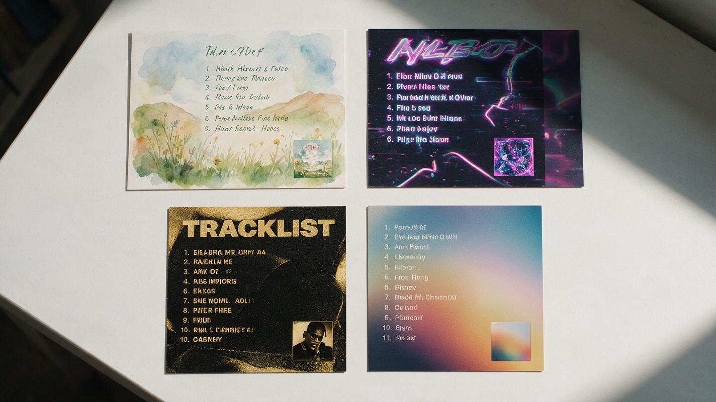
Adjust your prompt’s font, background, and texture details to match your album’s genre and mood. Here are quick tweaks for four common styles:
- Indie folk / acoustic: Use handwritten or serif fonts, add watercolor or paper texture, soft warm lighting, and natural elements like leaves or wood grain that match your cover art.
- Hyperpop / electronic: Use glitch or neon sans-serif fonts, add chromatic aberration, 3D rendered shapes, bright high-contrast colors, and kinetic text effects that pop on mobile.
- Hip-hop / rap: Use bold condensed sans-serif fonts, add film grain or grunge texture, metallic accents (gold, silver), and street/urban visual cues that align with your cover’s theme.
- Ambient / instrumental: Use thin minimal sans-serif fonts, add gradient blurs, floating geometric shapes, soft focus backgrounds, and plenty of negative space to match a calm, atmospheric vibe.
Final checklist for tracklist reveal assets
- All track titles, numbers, and feature credits match your official, proofread tracklist exactly — no swapped order or misspellings
- Color palette, art style, and texture match your album cover closely enough that fans will immediately recognize the campaign
- All text is readable on a mobile phone screen at 50% zoom, with enough contrast between text and background
- Asset fits the correct aspect ratio for its platform, with no important text or visuals cut off by UI elements
- No extra AI-generated text, random objects, or distorted elements that distract from the tracklist
- Your artist name, album title, and release date (if included) are placed in prominent, unobstructed spots
Keywords
tracklist reveal, album cover, imagen, ai image generator, social media promo, music marketing, album campaign, readable ai text