Why Black Product Renders Lose Their Edges—and How to Fix It
Black product concepts can disappear into their backgrounds or acquire bright outlines that misrepresent their shape. This guide shows industrial designers how to preserve a dark finish while making the silhouette, seams, and controls readable in AI-assisted presentation renders.

Table of contents
Black should describe the finish, not hide the design
A black product render can look polished at thumbnail size yet fail in a design review: the housing merges with the background, the parting line vanishes, and a recessed button becomes impossible to locate. The tempting fix—asking AI to make the edges brighter—often creates a glowing outline or changes the apparent curvature.
The better target is controlled separation. Keep the approved shape and dark material, then use restrained lighting, background contrast, and local reflections to reveal the surfaces a reviewer needs to inspect. The example below uses a fictional matte-black desktop speaker concept, but the same checks apply to cameras, accessories, and small appliances.
Why dark finishes lose their shape
When a dark housing sits against a similarly dark background, its silhouette may have too little contrast to read. On the product itself, broad areas of matte black can also look flat because their reflections are weak. A generator may compensate by brightening every edge equally, turning an intended soft radius into a sharp-looking rim.
Those are separate problems. Background separation makes the outer boundary visible; surface modeling makes the volume understandable. Neither requires changing the design to gray or adding a white stroke. Before editing, mark the features that must survive: the silhouette, main radius transitions, grille boundary, control positions, and any visible parting line. An approved CAD view or reference render is more reliable for those details than a descriptive prompt alone.
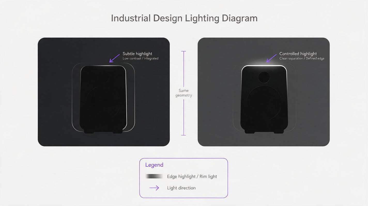
Give each visible edge a reason to appear
For a three-quarter presentation view, imagine a large, soft light source above and slightly behind the product. It can put a narrow highlight on an upper radius without making the entire side panel reflective. A separate, weaker fill can reveal the front face. Keep the background a different value from the housing—even a subdued charcoal-gray backdrop can work—while preserving a contact shadow that grounds the object.
Do not demand equal contrast everywhere. The far-side edge may be quieter than the near-side edge, and a seam should remain subtle if it would be subtle on the proposed material. What matters is whether a reviewer can trace the intended form without mistaking lighting artifacts for new design features.
| If you see… | Likely cause | Better correction |
|---|---|---|
| The outer contour disappears | Housing and backdrop have similar values | Adjust the backdrop or move the soft edge light |
| A bright line surrounds the entire product | Overstated rim lighting | Restrict the highlight to surfaces facing the light |
| The black finish looks gray | Too much frontal fill | Lower fill intensity; retain selective highlights |
| A seam looks like a deep gap | Excessive local contrast | Match its width and darkness to the reference |
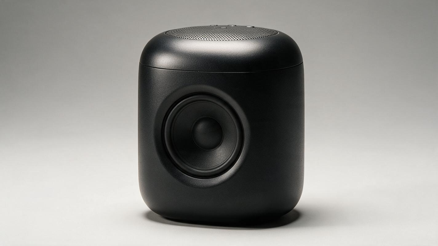
Edit from a geometry reference, not a fresh description
Begin with a clear, approved view of the concept. If available, include a second image that identifies important boundaries, such as a simple line overlay of the housing edge, grille, and button. Use seedream 4.5 for a reference-led lighting or presentation edit rather than relying on a new text-only interpretation of the product. Check the available image-input options in your workspace before starting; the essential requirement is that the approved design remains the reference.
Ask for the smallest useful change first. A restrained lighting edit is easier to judge than a simultaneous change of camera angle, material, environment, and styling. This prompt is a starting point, not a substitute for visual inspection:
Use the supplied product image as the design reference. Create a clean studio presentation render of the same matte-black desktop speaker concept in the same three-quarter view. Preserve the exact outer silhouette, grille boundary, button count and positions, parting line, and camera perspective. Use a charcoal-gray background that separates from the housing, a broad soft highlight along the upper curved surface, gentle front fill, and a believable contact shadow. Keep the finish dark and predominantly matte. Do not add glowing outlines, new ports, extra controls, logos, deepened seams, or visible internal components.If the output still lacks definition, request a narrower revision: “Increase separation only along the upper-left outer contour by adjusting the background and light; do not brighten the front face or alter the housing.” Specific corrections reduce the chance of solving one readability issue by inventing another.
Inspect the render at review size
A dramatic full-screen image can conceal defects that become obvious on a slide. Reduce the render to roughly the size it will occupy in the presentation, then compare it beside the reference. At that size, can you still identify the control, the grille boundary, and the intended side-wall curvature? If not, improve the relevant local contrast rather than lifting exposure across the entire product.
Zoom back in to inspect where highlights terminate. A real lighting cue should follow the surface and change gradually; a thin, uniformly bright line around unrelated edges is more likely an artifact. Check that the contact shadow does not swallow the base, and that the product has not gained a chamfer, seam, or polished strip that was absent from the approved design.
Design-review rule: If a highlight makes a surface appear flatter, sharper, thicker, or more deeply recessed than the reference, it is changing the perceived product—not merely improving the lighting.
For critical reviews, keep the approved geometry view alongside the atmospheric render. The presentation image communicates material and mood; it should not be treated as proof of final surface finish, manufacturing detail, or optical behavior.
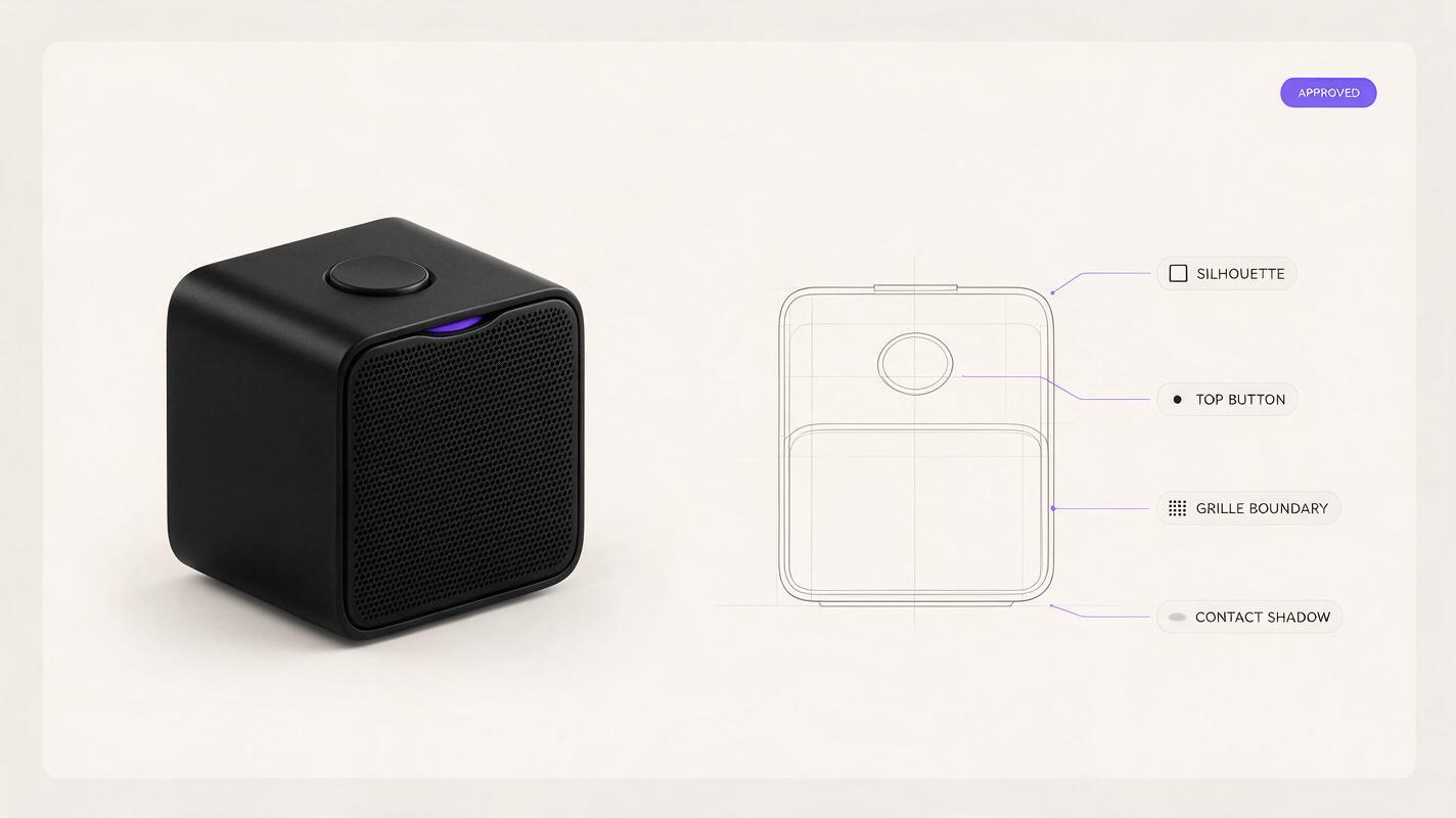
When local compositing is the safer choice
Some images need only a better backdrop or a small adjustment to one reflection. In those cases, preserving the approved product pixels and editing the surrounding background in a conventional image editor may be more dependable than regenerating the object. A masked tonal adjustment can also reveal a specific face without giving the model permission to reinterpret seams and controls.
Reserve broader generation for early concept exploration, when the form itself is still open. Once reviewers are comparing defined details, make fidelity the priority. If you have a reference image ready, test this prompt yourself with a single lighting change, then judge the result against the original before producing variations.
Final checklist
- The housing remains black; it has not been brightened into a different material.
- The silhouette separates from the background without a continuous glowing outline.
- Highlights follow the intended curves and do not imply new chamfers.
- Buttons, seams, grille boundaries, and visible openings match the approved reference.
- The base remains legible against a believable contact shadow.
- The render still communicates the design at its intended presentation size.
Keywords
black product rendering, product visualization, industrial design AI, dark product render, edge lighting, Seedream 4.5, product design prompts