Seedream 4.5 Prompts for Campaign Key Visuals With Clean Copy Space
Learn how to prompt Seedream 4.5 for campaign key visuals that leave intentional, usable space for headlines, logos, and calls to action. This practical workflow covers composition planning, reusable prompt patterns, variation control, and advertising-focused quality checks.
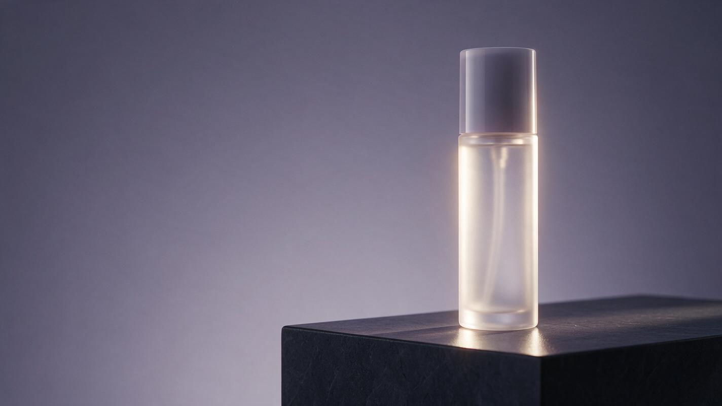
Table of contents
Create the layout before the artwork becomes too beautiful to use
A campaign key visual can look impressive and still fail as an advertisement if there is nowhere to place the headline, logo, legal copy, or call to action. With Seedream 4.5, the practical solution is to describe the intended layout as deliberately as the subject, lighting, and art direction.
This tutorial shows how to generate polished advertising imagery with controlled negative space instead of hoping that an art director can rescue the composition later. The method is designed for creative pitches, social campaigns, display ads, posters, and brand-film title frames.
The central rule: do not ask for an attractive image with “some empty space.” Specify what occupies the frame, what must remain quiet, and how the viewer’s eye should travel between them.
Build the composition around the copy zone
Before opening an AI image generator, decide where the message will live. Treat this area as a functional component of the layout rather than unused background.
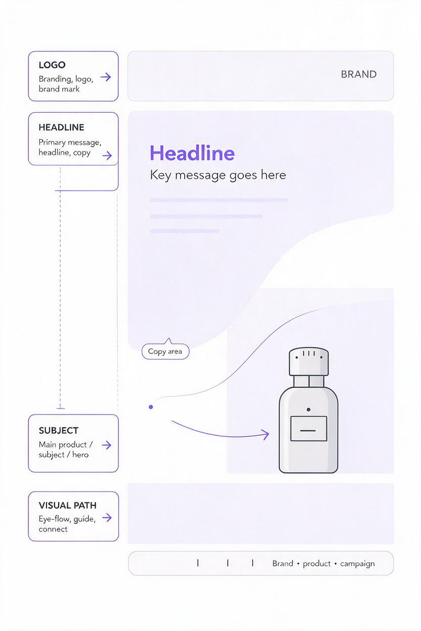
A useful brief identifies four things:
- Subject zone: where the product, person, or campaign object should appear.
- Copy zone: the area reserved for the main headline and supporting text.
- Brand zone: a stable corner or edge for the logo and campaign device.
- Visual path: the direction in which lighting, gaze, movement, or perspective guides attention.
For example, a vertical beauty advertisement might place the model in the lower-right third, reserve the upper-left half for a headline, and use a soft diagonal highlight to connect the two zones. A billboard may need a simpler split: hero product on the right, quiet tonal field on the left.
| Format | Recommended subject placement | Useful copy zone |
|---|---|---|
| Vertical social ad | Lower third or one side | Upper half with low detail |
| Landscape display ad | Left or right third | Opposite half |
| Poster | Lower center or lower corner | Upper third |
| Presentation cover | Off-center focal subject | Broad side margin |
Choose the layout from the final placement, not from personal preference. If the campaign must work across several formats, create a separate composition brief for each aspect ratio rather than relying on one crowded master image.
Write prompts in a layout-first order
Prompt order helps you think clearly even when a model does not interpret every phrase with equal weight. Begin with the commercial purpose and framing, then define the subject, environment, lighting, copy zone, and exclusions.
Advertising campaign key visual for [product or brand category],
[aspect ratio and shot type],
main subject positioned in [specific frame area],
reserved copy space in [specific area],
copy area formed by [plain wall / sky / soft gradient / defocused surface],
[environment and art direction],
[lighting direction and quality],
[materials, palette, and finish],
clear visual hierarchy, premium commercial photography,
no typography, no logos, no decorative objects inside the copy zone
The phrase reserved copy space is more useful when paired with a physical description. “Blank upper-left area” is ambiguous; “upper-left half formed by a softly illuminated pale stone wall with minimal texture” defines what the model should render.
Keep generated typography out of the base image unless it is intentionally part of the visual concept. Campaign headlines, logos, prices, and legal copy are usually easier to control in the design layout after the image has been approved.
Prompt patterns for common campaign layouts
Premium product launch with side copy
This pattern suits fragrance, skincare, drinks, electronics, and other products that need a clean presentation with room for a headline.
Premium product-launch key visual, wide landscape composition,
a single unbranded translucent glass bottle standing on a dark stone pedestal
in the right third of the frame, left half reserved as clean headline space,
copy area formed by a smooth charcoal-to-violet studio gradient with very low detail,
controlled rim lighting around the bottle, soft reflection beneath the pedestal,
precise commercial still-life photography, restrained luxury palette,
clear separation between product and background,
no text, no logo, no extra bottles, no props in the left half
Outdoor lifestyle visual with sky for the headline
Use environmental features such as sky, water, walls, or defocused landscapes to create negative space that still feels connected to the scene.
Vertical outdoor campaign key visual for a performance apparel concept,
athlete running uphill in the lower-right third, photographed from a low angle,
upper-left half reserved for campaign headline,
large uninterrupted overcast sky with subtle tonal variation and no objects,
cool dawn light, realistic fabric movement, energetic but controlled composition,
editorial sports advertising photography, crisp subject silhouette,
no words, no signage, no birds, no trees crossing into the headline area
Graphic color-block visual for campaign variations
A simple graphic environment can make regional and format adaptations easier because the copy zone is not dependent on complex scenery.
Bold studio campaign image for a modern wireless speaker,
speaker positioned in the lower-left quarter on a matte cobalt platform,
right two-thirds reserved for headline and call-to-action layout,
clean coral background with a subtle circular light gradient behind the product,
sharp geometric art direction, soft-edged shadow, saturated controlled color,
commercial product photography with realistic materials,
no typography, no floating accessories, no texture in the right copy area
Generate several interpretations before refining one. The goal of the first batch is not perfect retouching; it is to find a composition whose hierarchy survives the addition of real campaign copy. You can test this prompt yourself with a temporary headline placed over each result.
Protect the copy zone from visual contamination
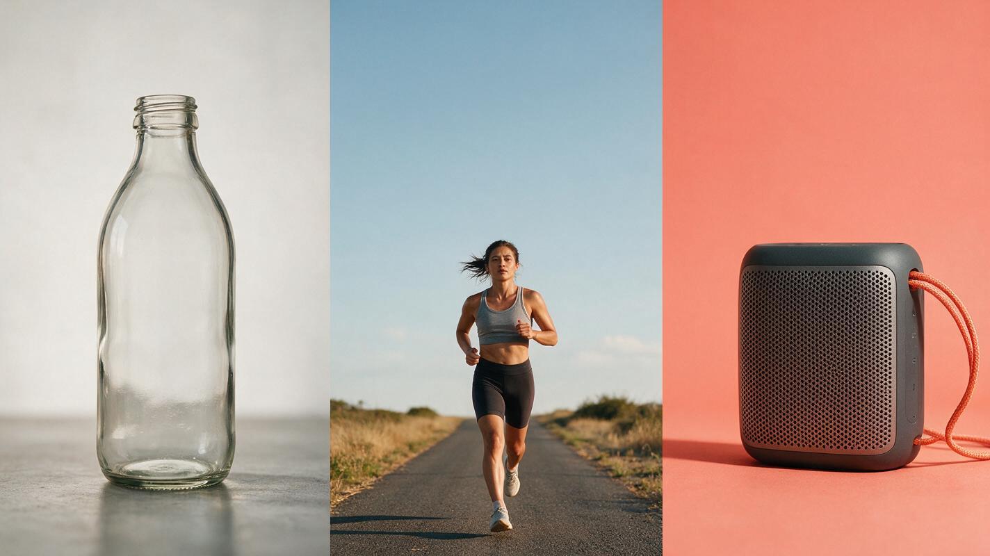
Negative space often deteriorates because the prompt contains competing instructions. Requests for “rich detail,” “cinematic scenery,” “layered depth,” or “dynamic particles” can encourage the model to decorate the exact area that needs to remain quiet.
When the copy zone becomes cluttered, revise the structural language rather than adding a long list of negative terms. Replace “empty space” with a specific low-detail surface, increase the subject’s distance from that area, and remove atmospheric effects that cross the frame.
| Problem | Likely prompt conflict | Better instruction |
|---|---|---|
| Props appear behind the headline | The environment is described as elaborate | Define the copy zone as a plain physical surface |
| Subject drifts toward the center | Placement is vague | Name the third or quarter of the frame it occupies |
| Bright highlights reduce readability | Lighting direction is unspecified | Keep the copy zone evenly lit and low contrast |
| Background feels unfinished | “Blank” is the only description | Use a subtle gradient, haze, wall, sky, or shadow field |
If one result has the right subject but a noisy copy area, use image editing to simplify that region rather than regenerating the entire concept. Describe the intended replacement surface and explicitly ask to preserve the subject, framing, palette, and lighting direction.
Simplify the upper-left background into a smooth warm-gray studio wall
with subtle natural light falloff. Preserve the product, pedestal, camera angle,
shadows, color palette, and every object outside the edited area.
Add no text, symbols, props, or strong highlights.
Create variations without losing the campaign system
A useful campaign is rarely a single image. Once a strong composition is selected, define the visual rules that every variation must retain:
- Subject scale and approximate frame position
- Lighting direction and shadow character
- Background material or gradient behavior
- Core palette and accent color
- Copy-zone location and contrast level
- Lens character and camera height
Change one campaign variable at a time. For a product range, replace the product color while retaining the set. For regional adaptations, adjust environmental cues without moving the copy zone. For format changes, rebuild the composition around the new canvas instead of simply cropping the original.
This approach creates campaign variations that feel related because they share visual grammar, not because they are nearly identical. It also gives designers predictable room for different headline lengths and language expansions.
Judge the image as an ad, not an artwork
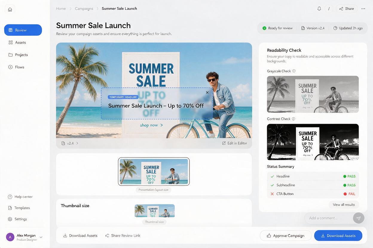
Place realistic copy on the result before approving it. Use the longest expected headline, the actual logo proportions, a call to action, and any mandatory disclaimer. A visually calm area may still be unusable if it has insufficient width, inconsistent contrast, or awkward intersections with the subject.
Review each candidate at three sizes:
- Full size: inspect product details, anatomy, reflections, and unwanted artifacts.
- Layout size: check headline readability and alignment with the visual hierarchy.
- Thumbnail size: confirm that the subject and message remain identifiable immediately.
Also test a quick grayscale version. If the product and copy compete at the same tonal intensity, adjust the background or lighting before investing in retouching. A successful key visual should provide both an arresting focal point and a deliberately quiet communication zone.
Approval test: if adding the real headline makes the image feel crowded, the problem is usually the generated composition—not the typography.
Final checklist
- The intended aspect ratio and placement are stated in the prompt.
- The subject occupies a defined third or quarter of the frame.
- The copy zone is described as a specific low-detail surface.
- No important highlight, prop, or silhouette crosses the headline area.
- Generated text and logos are excluded from the base image.
- The result has been tested with realistic campaign copy.
- Variations preserve the same lighting, palette, and layout logic.
- The image remains legible at full, layout, and thumbnail sizes.
Keywords
Seedream 4.5 prompts, campaign key visuals, advertising creative, copy space, product imagery, AI image generator, creative pitch