How to Create Consistent Product Page Images With GPT Image
Learn how to turn one clean product reference into a coordinated set of lifestyle images without losing its shape, materials, colors, or branding. This practical GPT Image workflow combines reference-based editing, controlled prompts, selective masking, and visual QA for reliable product-page visuals.
Table of contents
Create lifestyle scenes without redesigning the product
A convincing product-page image must do two jobs: establish the right atmosphere and preserve the exact product a customer will receive. The usual AI failure is a beautiful scene containing the wrong object—altered proportions, invented controls, distorted labels, or inconsistent materials. This tutorial shows how to use GPT Image as a reference-based editor, generate the environment separately when necessary, and produce a coordinated visual set that remains credible across a landing page.
The method is suitable for packaging, electronics, furniture, cosmetics, accessories, and other products with a clear physical identity. It focuses on controlled image editing rather than asking an AI image generator to reconstruct the product from words alone.
Step 1 — Build a product identity sheet
Start with the cleanest source image available. A high-resolution packshot photographed from a useful angle is more valuable than a long descriptive prompt. The reference should clearly show the features the model must preserve.
- Silhouette: the complete outer shape without cropped edges.
- Proportions: visible relationships between the body, handle, screen, lid, buttons, or base.
- Materials: distinctions such as matte plastic, polished metal, glass, fabric, or paper.
- Brand elements: logo location, label dimensions, and recognizable color blocks.
- Functional details: ports, seams, controls, openings, hinges, and attachments.
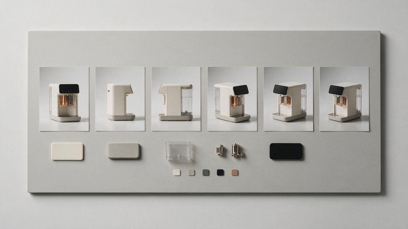
If one image cannot show the important details, assemble a simple identity sheet containing the front, side, and three-quarter views. Keep the background neutral and avoid decorative typography that could be mistaken for part of the product.
Rule: describe what may change and what must not change. “Place this object in a bathroom” leaves too much open to interpretation; “replace only the background and supporting surface” defines a safer edit.
Step 2 — Separate fixed and flexible elements
Before writing a prompt, divide the composition into two groups. Fixed elements define product truth. Flexible elements create the campaign atmosphere.
| Fixed product elements | Flexible scene elements |
|---|---|
| Shape and dimensions | Background color and location |
| Logo placement | Surface material |
| Buttons, openings, and seams | Props and supporting objects |
| Product color and finish | Lighting direction and softness |
| Label structure | Camera crop and negative space |
This distinction makes prompt revisions easier. If the scene looks wrong, adjust the flexible instructions. If the product changes, strengthen the preservation instructions or return to a more controlled edit.
Write a short visual brief before generating:
Product role: premium countertop appliance
Page placement: product feature section
Required crop: wide 4:3 image
Scene: warm limestone kitchen counter
Lighting: soft window light from the left
Fixed details: body shape, dial count, logo, color, handle geometry
Flexible details: background, shadows, props, surface
Copy area: uncluttered upper-right quadrant
Step 3 — Generate the scene in two passes
Trying to solve product fidelity, art direction, typography space, lighting, and props in one generation increases the chance of unwanted changes. A two-pass workflow is more controllable.
Pass one: establish the composition
Upload the reference and ask GPT Image to preserve the product while replacing its surroundings. Keep the first scene simple so that you can evaluate scale, camera angle, and placement without visual noise.
Edit the supplied product photograph into a premium lifestyle image for an ecommerce product page. Preserve the exact product silhouette, proportions, color, material finish, controls, seams, handle geometry, logo position, and label layout. Do not add, remove, relocate, or redesign product features.

Place the unchanged product on a pale warm limestone counter in a minimal contemporary kitchen. Use soft natural window light from the left, realistic contact shadows, restrained reflections, and an eye-level three-quarter camera angle. Keep the upper-right area calm and uncluttered for interface copy. Wide 4:3 composition. No text overlays.
Pass two: refine only the weak area
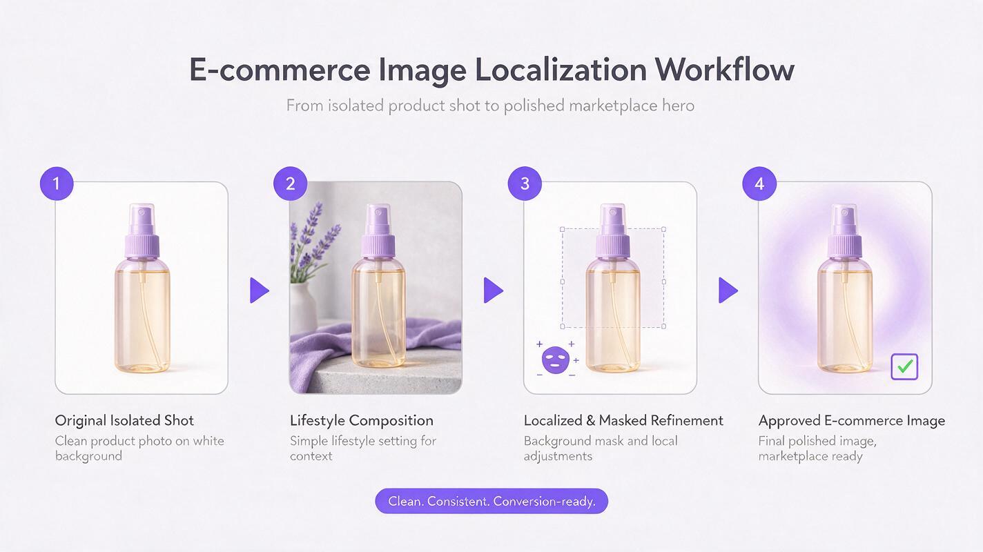
Once the composition works, avoid regenerating the entire image. Select or mask the smallest problematic region and request one correction at a time. For example:
Modify only the selected background area. Add one folded neutral linen cloth behind the product, softly out of focus. Do not alter the product, its shadow, the counter edge, or the camera framing.This local-editing approach protects approved details. It also makes comparison easier because each revision has a single purpose. Available selection and masking controls vary by interface, but the principle remains the same: edit the smallest possible area.
When your source is ready, test this prompt yourself and compare the generated product against the original before adding more scene detail.
Step 4 — Fix the most common consistency failures
Inspect the result at full size rather than judging only the overall mood. Small mutations become highly visible when the image appears beside a packshot, specification diagram, or purchase panel.
| Problem | Likely cause | Better correction |
|---|---|---|
| Logo becomes unreadable | The model is recreating tiny lettering | Preserve the logo region from the original or restore verified artwork during design production |
| Buttons or ports move | The prompt describes the product too loosely | Name the exact feature count and request a background-only edit |
| Material looks wrong | Scene lighting conflicts with the source | Match the direction and hardness of the original light before changing the environment |
| Product scale changes between images | Each scene uses a different camera instruction | Reuse one camera angle, crop ratio, and approximate frame occupancy |
| Contact shadow looks artificial | The product and surface were interpreted separately | Request a physically plausible shadow that follows the visible light direction |
| Extra accessories appear | Creative freedom is too broad | List permitted props and explicitly prohibit additional objects |
Do not rely on a prompt to reproduce legally or commercially important small print. Preserve verified packaging where possible, or composite approved label artwork back into the final image. AI output should support the visual design process, not replace product-accuracy review.
Step 5 — Prepare a consistent product-page set
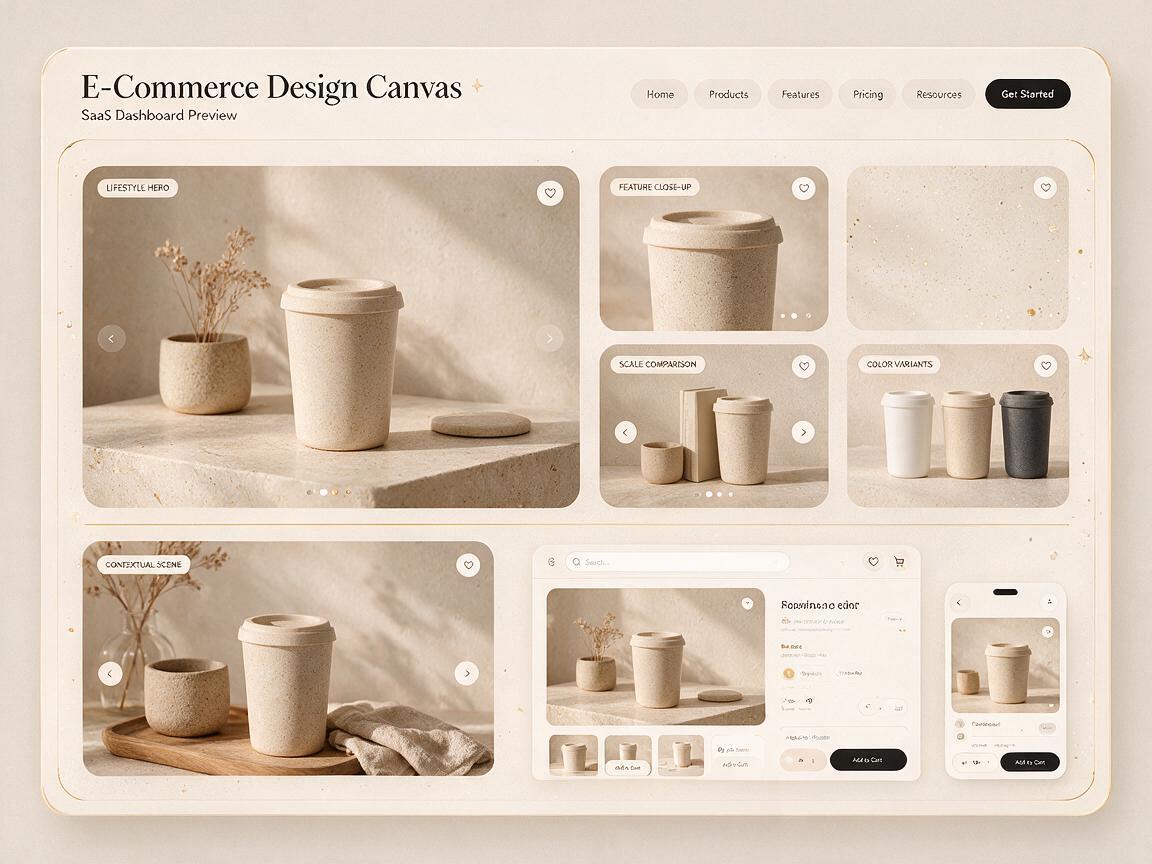
A useful product page needs more than one attractive image. Build a small visual system in which every scene has a distinct communication role but shares the same product identity and art direction.
- Primary lifestyle image: establishes mood and leaves room for the main value proposition.
- Feature close-up: highlights one material, control, texture, or functional detail.
- Scale image: places the product near familiar objects without obscuring it.
- Context image: shows the intended environment or moment of use.
- Variant image: presents verified colors or finishes using identical framing.
Create the primary scene first, then reuse its lighting language, surface family, color palette, and lens description. Change only the variables needed for the next section.
Using the approved product reference and the established visual direction, create a closer feature image focused on the front control area. Preserve all product geometry, markings, materials, and colors. Maintain the same soft left-side window light, warm limestone surface, neutral background palette, and realistic commercial photography style. Do not invent new controls or text. Square composition with the feature centered.For interface showcases, test the images inside the actual design rather than in isolation. A scene may be attractive but fail once navigation, headings, pricing cards, or mobile crops are added.
Step 6 — Export for responsive layouts
Generate or crop around the intended component instead of forcing one image into every placement. At minimum, prepare wide, square, and portrait-safe versions when the design uses substantially different breakpoints.
- Keep the product away from likely crop boundaries.
- Reserve quiet areas for headings and buttons, but add live text in the webpage rather than baking it into the image.
- Check that shadows do not disappear against the page background.
- Compress exported assets while retaining enough detail for high-density screens.
- Use meaningful alternative text that describes the product and context without repeating nearby copy.
For art-directed responsive images, create separate approved compositions instead of relying entirely on center cropping. This is especially important when the desktop version places the product on one side to accommodate copy.
Step 7 — Run a product-truth review
Place the generated image beside the original packshot and compare them systematically. A quick overlay at partial transparency can reveal changes that are difficult to notice from memory.
- Trace the outer silhouette and major internal edges.
- Count all controls, openings, seams, and attachments.
- Compare logo position and packaging structure.
- Check color under neutral viewing conditions.
- Confirm that reflections and shadows match the scene lighting.
- Review the final crop at desktop and mobile sizes.
If a product-defining detail remains unreliable after targeted edits, preserve that part of the original photograph and composite the generated environment around it. The best result is not the image with the most AI-generated pixels; it is the image that communicates the product accurately.
Final checklist
- Use a clean, high-resolution product reference.
- Define fixed product details before describing the scene.
- Generate a simple composition before adding props.
- Edit one masked area at a time.
- Reuse lighting, camera, and palette instructions across the set.
- Restore approved logos or small print when necessary.
- Test every image inside the real responsive layout.
- Compare the final result directly with the source product.
Keywords
GPT Image, product page images, AI product photography, product consistency, lifestyle images, image editing, web design