How to Generate Consistent Secondary Brand Visuals with Nano Banana Pro
Secondary brand visuals like patterns, icons, and decorative graphics are the backbone of a cohesive brand identity, but generating dozens of consistent assets manually takes days, and most AI tools suffer from style drift that requires heavy editing. This guide walks brand designers through a workflow using Nano Banana Pro to build a full library of on-brand secondary visuals, with reusable prompt templates and actionable tips for locking in style consistency. By using a reference sheet and tuning core settings, designers can cut asset creation time by 70% while keeping every element aligned to brand guidelines.
Table of contents
The hidden workload of secondary brand visuals
If you’ve ever spent 10+ hours hand-drawing brand patterns, icons, and decorative graphics only to have the 12th asset feel slightly off-brand, you know how draining secondary visual creation can be. Core elements like logos and color palettes get most of the attention, but secondary visuals—seamless patterns, icon sets, social media frames, decorative dividers, and illustration accents—are what make a brand feel cohesive across every touchpoint, from product packaging to Instagram posts.
Generating these assets manually takes days of repetitive work, and most AI tools struggle with style drift: one icon might have thicker lines than the rest, a pattern might use a slightly off hue, and you end up spending more time fixing AI output than you would have spent creating it from scratch. Nano Banana Pro, with its strong reference-based style control and color lock features, solves this by letting you generate a full library of on-brand secondary assets in a fraction of the time.
Build a brand style reference sheet for AI
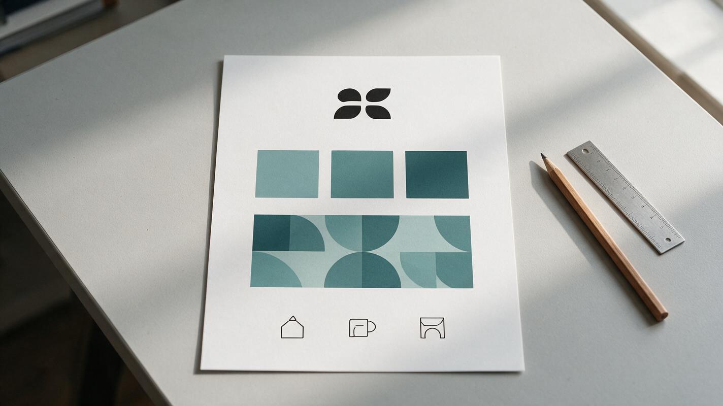
The foundation of consistent AI-generated brand assets is a clear, well-organized style reference sheet. This single image gives Nano Banana Pro a visual benchmark to match across every asset you generate, eliminating the need to describe your brand style in long, vague prompts.
Your reference sheet should include only the most critical brand cues, with no clutter to distract the model. Aim for these elements:
- 1-2 core brand assets (a primary logo, a key campaign visual, or a hand-drawn style sample)
- 2-4 solid core brand color swatches (no gradients or textures)
- 1 small sample of your desired aesthetic (e.g. a single finished icon, a pattern snippet, a typography treatment)
Export the sheet as a 1024x1024 JPG with even white spacing between elements. Skip text labels— the model reads visual cues far more reliably than text on a reference image.
Tune Nano Banana Pro settings for style lock
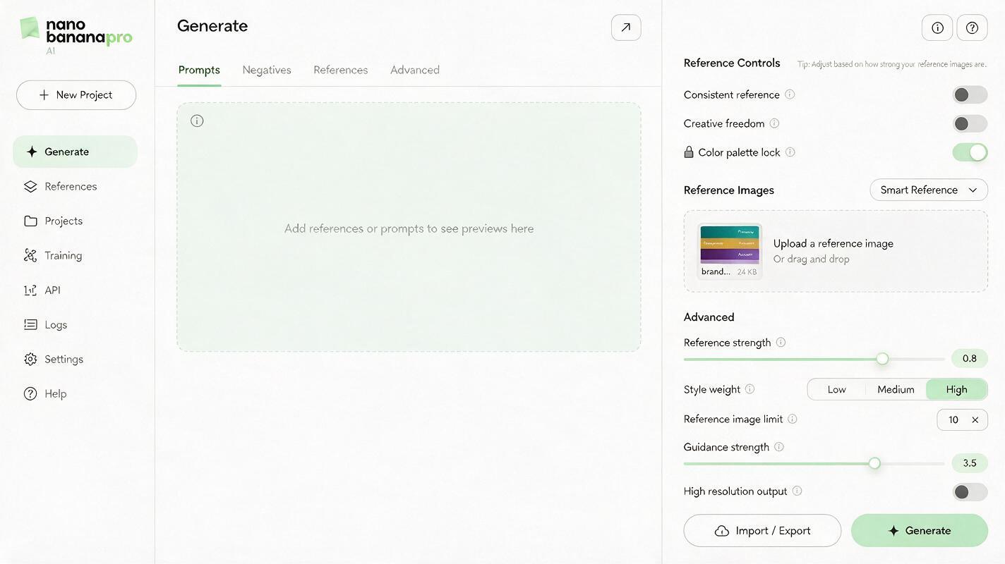
Once your reference sheet is ready, adjust Nano Banana Pro’s core settings to lock in brand style before you generate any assets. Small tweaks to these controls make the difference between a cohesive set and a mismatched collection that needs heavy editing.
A high-quality ai image generator with granular style controls eliminates the need to manually tweak every asset to match, freeing you up to focus on creative direction instead of pixel-perfect adjustments.
- Reference strength: Set between 0.7 and 0.85 for most brand work. 0.85 keeps style very close to the reference, ideal for strict brand guidelines. 0.7 allows more creative variation while retaining core brand cues, great for exploratory work.
- Style weight: Toggle to High for consistent aesthetic alignment. Use Medium only if you’re in the early stages of brand style exploration and want more unexpected results.
- Color palette lock: Enable this to force the model to use only the colors present in your reference sheet. This is the single most effective setting for preventing unwanted hue shifts.
- Aspect ratio: Match the aspect ratio to your asset type: 1:1 for patterns and icons, 9:16 for social media story frames, 16:9 for decorative banners.
For minimalist luxury brands, bump reference strength to 0.85 and enable color lock to keep lines clean and hues exact. For playful, illustrative brands, drop to 0.7 to let the model add small, creative flourishes without straying from the core style.
Reusable prompt templates for every asset type
Prompts work best when they’re specific about the asset type, constraints, and style alignment. Below are templates tailored to the most common secondary brand visuals, designed to work with your reference sheet and locked settings. Swap out the bracketed details for your brand’s specific traits.
Seamless brand patterns
Seamless repeating pattern for [Brand Name], [brand style descriptor: e.g. minimalist geometric, hand-drawn floral, luxury organic], using only approved brand colors from the reference sheet, no text, tileable edges, high resolution, clean lines, matches the aesthetic of the reference image
Monochrome icon sets
Set of 6 matching [category: e.g. e-commerce, wellness, tech] icons, [style: e.g. monoline 2px weight, filled rounded, line art], single brand primary color from reference sheet, transparent background, no text, consistent stroke width, uniform corner radius, matches reference sheet style
Social media frame templates
Instagram post frame template for [Brand Name], [style: e.g. minimalist border, playful decorative corner accents, gradient edge], brand colors from reference sheet, empty center space for content, 1080x1080, no text, clean edges, matches reference aesthetic
Decorative dividers and accents
Horizontal decorative divider for [Brand Name], [style: e.g. geometric line pattern, hand-drawn squiggle, organic leaf motif], brand secondary color from reference sheet, transparent background, no text, scalable, matches reference sheet style
Once you have your reference sheet set up and settings locked, test this prompt yourself to generate a batch of 4 pattern variations in under a minute.
Fix minor style drift without reworking the whole set
Even with locked settings, you may occasionally see small inconsistencies in generated assets. These are usually easy to fix without regenerating your entire library, using built-in Nano Banana Pro tools and small prompt tweaks.
- Color shift: If an asset has a slightly off hue, add the exact hex code to your prompt (e.g. use only #2EC4B6 and #FFFFFF) and re-enable color palette lock. For single-asset fixes, use the inpainting tool to recolor only the off section.
- Line weight variation: Specify exact pixel weight in your prompt (e.g. 2px uniform stroke weight) and bump reference strength by 0.05. For icons that are slightly too thick or thin, use the inpainting brush to adjust just the strokes.
- Style complexity mismatch: If an asset is too busy or too plain for your brand, adjust your prompt to add constraints (minimal, no extra details) or prompts for more detail (subtle texture, hand-drawn feel). You can also tweak reference strength: higher for more simplicity, lower for more detail.
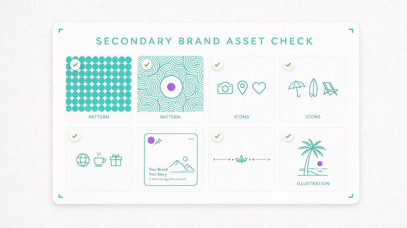
Final checklist for a cohesive asset library
- All assets use only approved brand colors (verify with a color picker tool)
- Line weight and stroke style are consistent across all icons and decorative elements (±0.5px tolerance for digital use)
- Core style cues (rounded corners, geometric precision, hand-drawn texture) match your brand reference sheet
- Patterns tile seamlessly with no visible gaps or hard edges
- Icons and decorative elements have transparent backgrounds where needed
- All assets are high enough resolution for both digital and print use (300 DPI minimum for print)
- No unintended text, watermarks, or random artifacts appear in generated files
Keywords
nano banana pro, brand visual assets, secondary brand visuals, ai image generator, brand consistency, graphic design prompts, brand identity design