Why AI Webtoon Colors Drift—and the Palette Workflow That Fixes It
AI-generated webtoon panels often change hair, costume, prop, and background colors as lighting or composition shifts. This guide presents a scene-palette workflow for Nano Banana Pro that separates fixed identity colors from variable lighting, making episodes easier to generate, edit, and read.
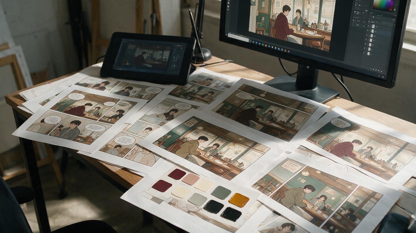
Table of contents
Color continuity is scene continuity
Your protagonist had a burgundy jacket in the establishing shot, but it turns purple in the close-up and bright red under streetlights. The background also changes temperature, making three panels from one conversation look like separate locations. This is AI webtoon color drift: recurring colors mutate because each panel is generated as a new image instead of being treated as part of one controlled scene.
The practical fix is not a longer list of color adjectives. Build a compact scene color key, separate permanent character colors from temporary lighting, and correct individual regions without regenerating the entire panel.
The core rule: identity colors remain stable; illumination may change how those colors appear, but it must not replace them.
Why webtoon colors drift between panels
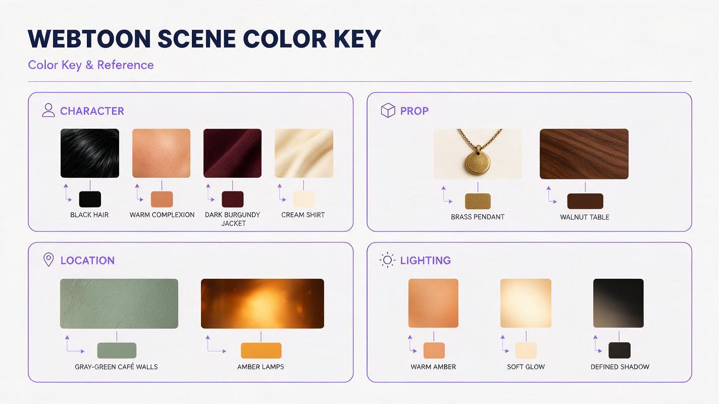
Image models interpret color relative to the complete prompt and composition. A phrase such as neon alley at night may push skin, clothing, and architecture toward saturated blue and magenta. A close-up may omit the environmental context that previously influenced the palette. Even expressive words such as dramatic, romantic, or sinister can produce an unintended color grade.
| Visible problem | Likely cause | Useful correction |
|---|---|---|
| Hair changes from black to blue | Colored rim light is interpreted as base hair color | State black as the local color and blue as edge light only |
| Costume hue changes in close-ups | The garment description was shortened or omitted | Repeat the same compact costume color block |
| Skin tone varies by panel | Mood and lighting terms overpower the reference | Separate complexion from illumination in the prompt |
| Backgrounds feel like different locations | Every panel receives a new atmospheric palette | Define shared wall, floor, furniture, and practical-light colors |
| One correction changes the whole image | The edit request is too broad | Target one region and explicitly preserve everything else |
Build a scene color key before polished panels
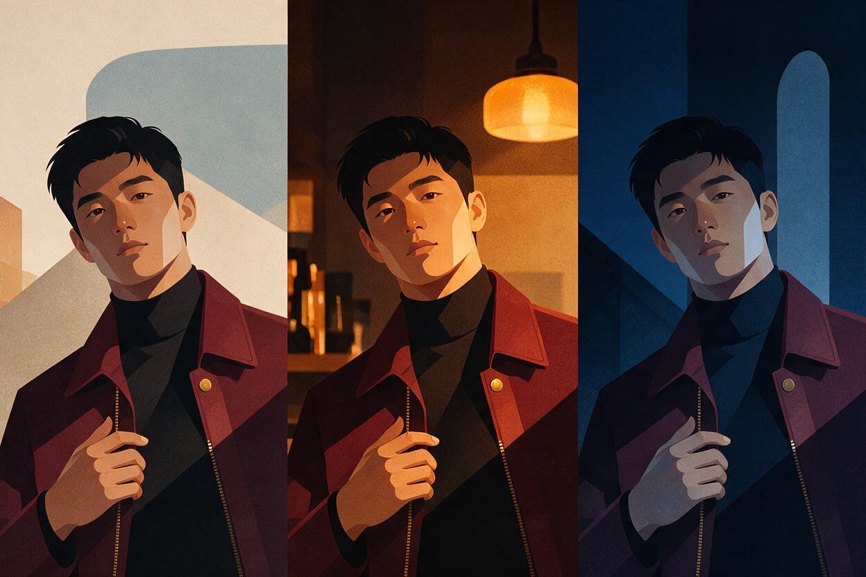
A useful color key is smaller than a full character sheet. It records only the colors that a reader must recognize across the scene. You can prepare it manually or use nano banana pro to create a clean reference board from existing character and location artwork.
Include swatches or labeled crops for:
- Complexion: the character’s neutral skin color without dramatic grading.
- Hair: base color, highlight color, and any dyed section.
- Costume: dominant garment, trim, footwear, and accessories.
- Story props: objects whose color helps readers track ownership or action.
- Location anchors: walls, doors, upholstery, flooring, and major signage.
- Practical lights: lamps, screens, windows, candles, or neon sources.
Use plain labels instead of poetic color names. “Dark burgundy jacket with muted brown-red fabric” is easier to repeat than “a jacket the color of dried roses.” Hex values can help human artists coordinate production, but prompting should still describe the visible hue because a generated image is not guaranteed to reproduce a numerical value precisely.
Create a compact webtoon scene color reference board.
Preserve the supplied character and location designs.
Show labeled swatches and clean cropped details for:
neutral complexion, black hair, dark burgundy jacket,
cream shirt, brass pendant, gray-green walls,
dark walnut table, warm amber ceiling lamps.
Flat neutral illumination, no cinematic color grading,
no redesign, no additional costume details.
Separate identity colors from lighting colors
The most reliable prompt structure treats color as two layers. Local color belongs to the object: black hair, burgundy fabric, cream paper, green wall. Lighting color belongs to the scene: amber overhead light, cool window fill, or a narrow pink neon reflection.
Write both layers explicitly rather than asking for a general mood:
| Weak direction | Controlled direction |
|---|---|
| Blue nighttime mood | Black hair and burgundy jacket retain their local colors under dim blue ambient light |
| Warm romantic café | Gray-green walls remain recognizable beneath warm amber pendant lights |
| Red danger lighting | A narrow red warning light crosses the face; neutral complexion remains visible outside the lit band |
This distinction also improves storytelling. The reader can recognize the character and location while still feeling a deliberate change in atmosphere.
Generate a calibration panel before the episode
Do not discover palette problems halfway through a forty-panel chapter. First create one medium shot containing the lead character, an important prop, and enough of the location to test all major colors together. This calibration panel becomes the scene’s visual standard.
When working with ai image generator, request neutral or moderately expressive lighting first. Extreme sunset, neon, smoke, or magical effects make it harder to judge whether the underlying colors are correct.
Webtoon calibration panel, medium shot.
The same protagonist from the supplied reference stands beside
an open dark walnut table in the gray-green café interior.
Identity colors: black hair, neutral warm complexion,
dark burgundy jacket, cream shirt, brass pendant.
Lighting: soft amber ceiling light with weak cool window fill.
Preserve every identity color; lighting may create highlights
and shadows but must not recolor hair, clothing, or props.
Clean cel shading, readable silhouettes, restrained saturation.
Inspect the result at normal reading size. If the jacket and wall merge, adjust their value or saturation in the color key before producing more panels. Continuity matters, but so does separation between the subject and background.
Lock color roles inside every panel prompt
Reuse a short palette block without rewriting it. Place it after the action and composition description so it functions like a production constraint rather than the main subject of the prompt.
[SHOT AND ACTION]
Close-up of Mara turning toward the doorway, tense expression,
left-facing profile, café wall and pendant lamp behind her.

[FIXED IDENTITY COLORS]
Black hair; neutral warm complexion; dark burgundy jacket;
cream shirt; brass pendant; gray-green wall.

[SCENE LIGHTING]
Warm amber key light from above; weak cool fill from the doorway.
Amber affects highlights only. Cool fill affects shadow edges only.

[PRESERVE]
Same character design, costume construction, line weight,
cel-shading style, and location palette as the reference.
No hue replacement, no multicolored hair, no costume redesign.
Keep this block concise. Repeating ten near-synonyms for burgundy can introduce ambiguity rather than control. It is usually better to name one base color, one material quality, and one permitted lighting effect.
Correct drift with targeted edits
If one element is wrong, avoid regenerating a successful composition. Select or describe the smallest possible region and state what must change, what may respond to light, and what must remain untouched.
Edit only the jacket fabric.
Restore the jacket to dark burgundy matching the reference image.
Keep the existing amber highlight and cool shadow placement,
but do not turn the base fabric red, purple, or brown.
Preserve the face, hair, hands, pendant, background,
pose, framing, line art, and shading exactly as shown.
After the edit, check the boundary around hair, hands, straps, and overlapping props. Color corrections can accidentally alter nearby line art or create a halo. A small manual cleanup is often faster and safer than another broad generation.
Repair one variable at a time. If costume color, facial anatomy, and background lighting all need changes, make separate edits so you can identify which instruction caused a new error.
Test the episode as a continuous strip
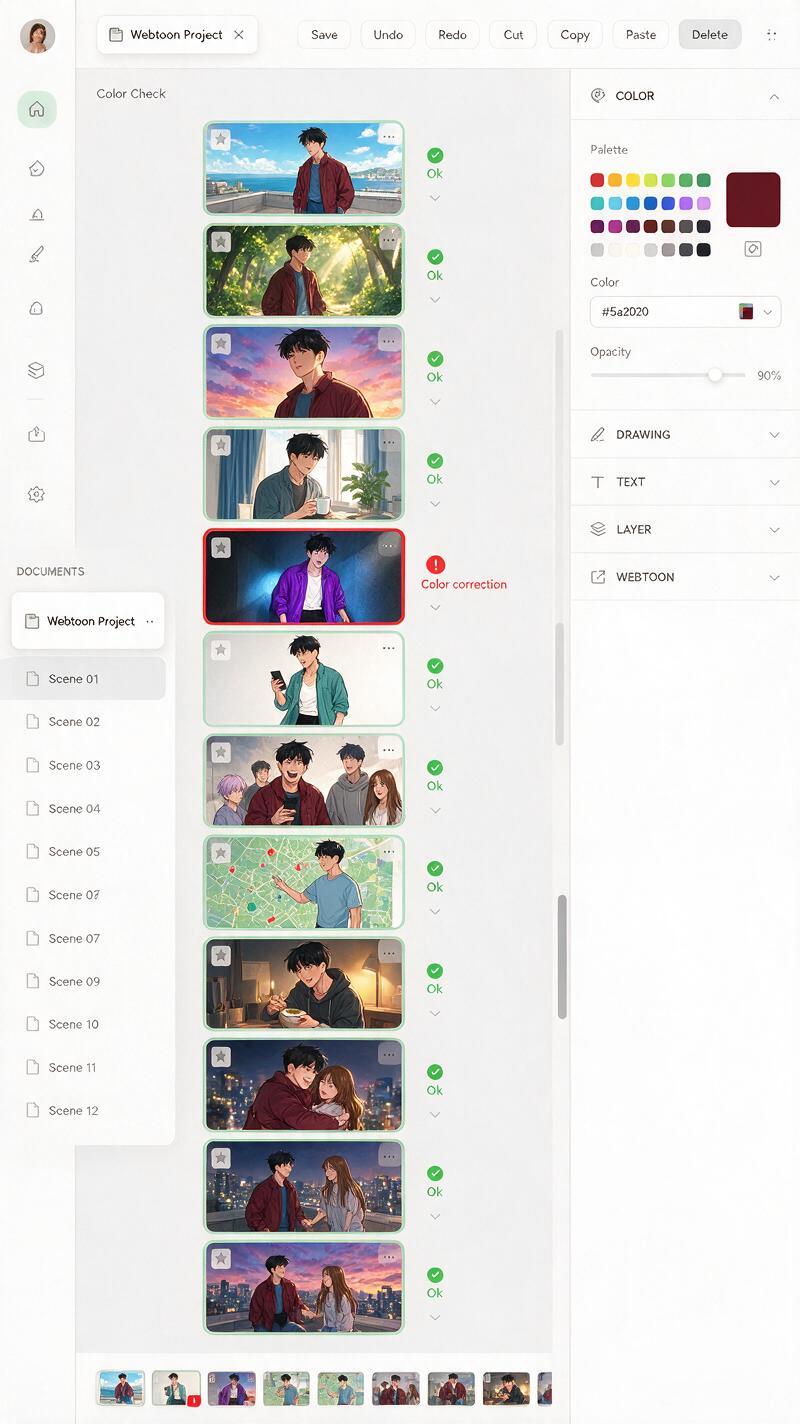
A panel can look attractive alone and still break the episode. Export rough versions of the scene, arrange them in reading order, and inspect the sequence at thumbnail size. Color jumps become much easier to see when adjacent panels share the screen.
- Track the lead character’s hair and costume as one continuous color path.
- Check whether location anchors remain stable across wide shots and close-ups.
- Confirm that the brightest accent belongs to the intended story object.
- Look for one panel that is unexpectedly warmer, cooler, darker, or more saturated.
- Verify that flashbacks, screens, magic, or warning lights have clear narrative motivation.
Also review the strip in grayscale. This does not test hue continuity, but it reveals whether a corrected color has accidentally damaged figure-ground separation or made dialogue areas harder to read.
Use intentional palette changes as story events
Not every color change is an error. A palette shift can mark a flashback, dream, emotional reversal, location transition, or supernatural event. The difference is consistency: an intentional transformation should have a clear trigger and affect a defined range of panels.
For example, a warning light may gradually replace the café’s amber illumination with red. The protagonist’s burgundy jacket should still retain its material identity, even as the red source compresses the visible color range. Establish the normal palette first, show the trigger, and then apply the altered lighting rules consistently until the event ends.
If you already have a character reference and one scene panel, test this prompt yourself with a neutral calibration image before committing to an entire episode.
Final checklist
- Create a compact scene color key for characters, props, and location anchors.
- Describe permanent local colors separately from temporary lighting colors.
- Approve one calibration panel before generating the full scene.
- Reuse the same concise palette block in every related panel prompt.
- Repair isolated drift with targeted edits instead of full regeneration.
- Review adjacent panels as a continuous strip at normal reading size.
- Reserve major palette changes for clear visual storytelling events.
Keywords
AI webtoon color drift, webtoon color palette, Nano Banana Pro, comic color consistency, AI comic maker, comic panel prompts, visual storytelling AI