Fix Cropped Reel Covers With Nano Banana Pro
Turn a 4:5 feed graphic into a 9:16 Reel cover without cutting off the subject or asking AI to redraw your branding. This guide shows how to extend the background with Nano Banana Pro, restore text cleanly, and check the result in the actual cover preview.
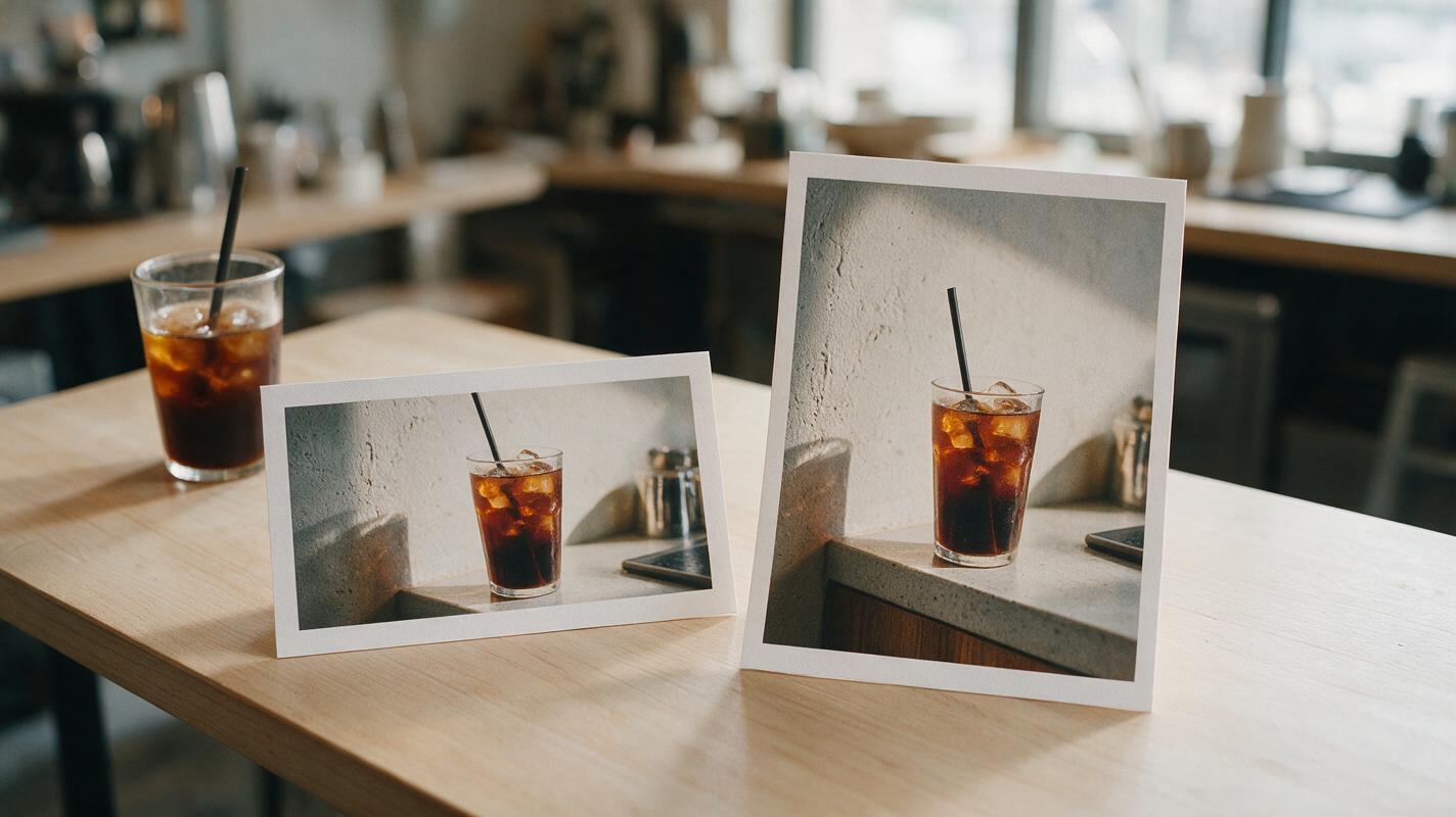
Table of contents
Keep the post you like, not the awkward crop
Your feed graphic looks right at 4:5, but its headline or subject disappears when you use it as a Reel cover. The fix is usually not to stretch the image or regenerate the entire design. Keep the original artwork intact, extend its background into a 9:16 canvas with Nano Banana Pro, and place critical text where it remains readable in the cover preview.
This approach is especially useful when a campaign already has an approved photo, recognizable color treatment, or carefully positioned product. The example below uses a fictional café promotion, but the same checks apply to event announcements, creator series covers, and campaign graphics.
Why a taller canvas needs new background
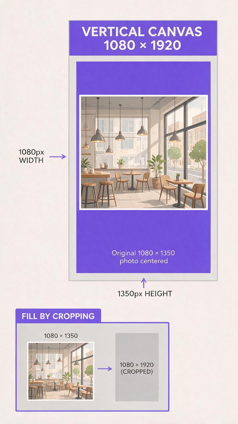
A common feed graphic is 1080 × 1350 pixels, while a full-screen vertical cover is 1080 × 1920. At the same width, that leaves 570 pixels of additional height to fill. Centering the original graphic would add 285 pixels above and below it. Cropping the 4:5 image to fill 9:16 does the opposite: it removes content from the sides.
The useful distinction is between expanding the scene and redesigning the post. If the existing graphic contains approved packaging, a face, or a distinctive prop, preserve those pixels. Ask the model to invent only the surrounding wall, tabletop, sky, or other low-stakes background. If the background is too complex to continue convincingly, use a simple brand-color extension instead.
A taller file is not automatically a better cover. Platform previews can crop vertical artwork differently, so judge the final graphic inside the placement where it will appear.
Protect the content you already have
Start with the highest-quality version of the original, preferably before its headline, logo, and call-to-action were flattened into the image. Save a copy of the approved design and identify what must not change: the subject’s outline, product shape, facial features, color treatment, and any legally required details.
For the café example, imagine a 4:5 photograph of an iced drink on a pale stone counter, with a promotional headline across the top. Separate that headline from the photograph if you can. Generated extensions are much easier to review when the model is continuing background imagery, not trying to preserve letterforms at the boundary of an edit.
- Keep fixed: the drink, glass shape, label, and original counter immediately around them.
- Allow to extend: the out-of-focus wall above and the uncluttered counter below.
- Add later: the headline, logo, offer details, and any platform-specific text.
If all you have is a flattened graphic, protect the area containing text and logos rather than asking the model to repaint it. If those elements sit across the very edge you need to extend, recreating them as editable layers may be faster and cleaner.
Expand the scene with Nano Banana Pro
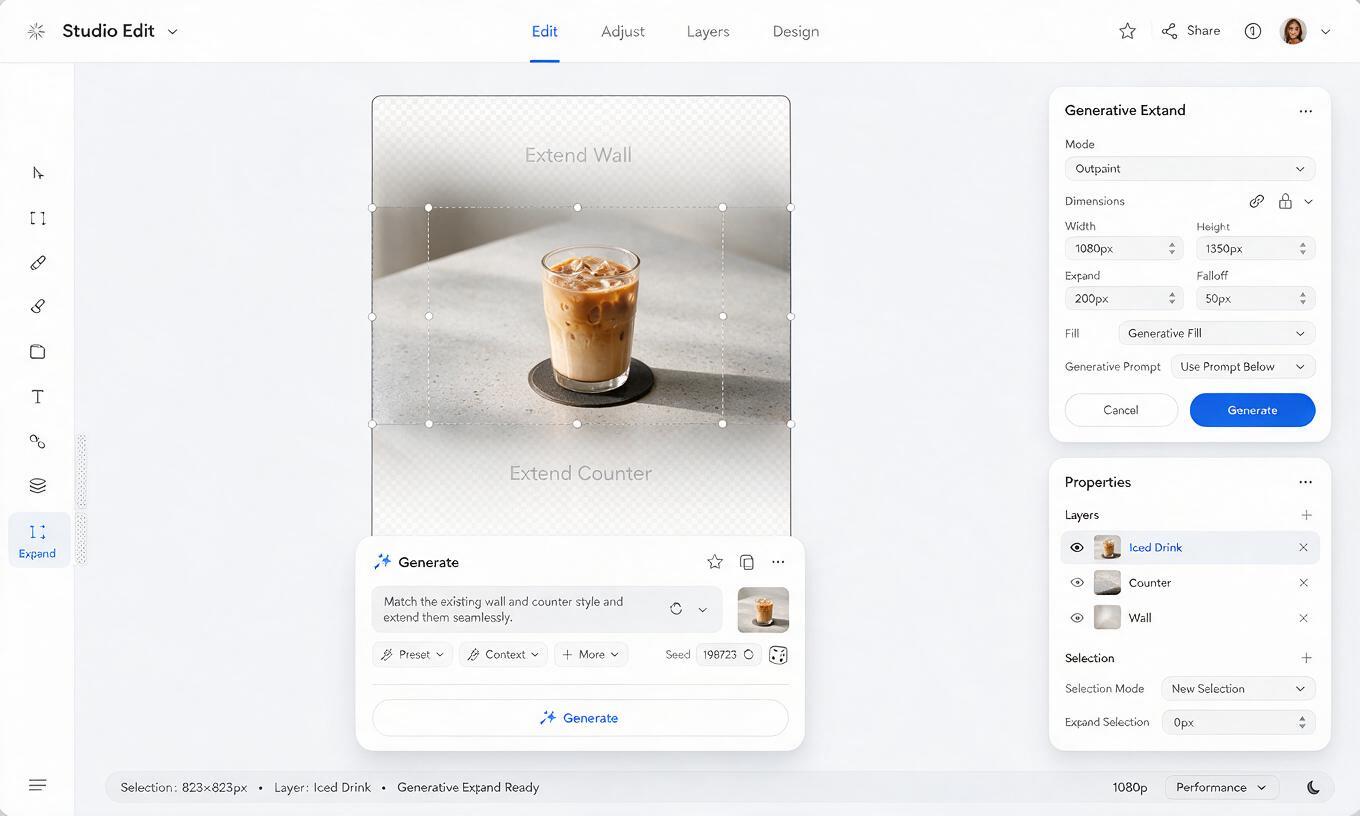
Prepare a 1080 × 1920 working canvas and position the unchanged 4:5 image within it. In an editing workflow that accepts a source image and an expanded canvas, use Nano Banana Pro to fill only the empty areas. If your available interface does not offer selective expansion, create a separate background with an ai image generator and composite the untouched original over it in your editor. Do not assume a prompt alone will preserve every pixel of an uploaded design.
For the café cover, give the new space a job: the upper area should remain quiet enough for a headline, while the lower area should continue the counter naturally. A constrained prompt is more useful than a long description of an entirely new scene.
Extend the supplied café photograph into the empty top and bottom areas of a vertical 9:16 canvas. Preserve the existing central image unchanged, including the iced drink, glass, label, lighting, and counter edge. Above it, continue the softly lit pale plaster wall with subtle natural texture and generous uncluttered space. Below it, continue the stone counter with matching perspective and soft shadows. Do not add people, extra drinks, logos, letters, prices, or decorative objects.Generate a few candidates rather than committing to the first plausible background. Compare the seam where old and new pixels meet. A convincing extension should carry through the wall texture, light direction, and counter perspective without producing a duplicate product or a suspicious halo. Test this prompt yourself with one approved asset before applying the method to an entire campaign.
If the output changes the drink or invents lettering on its label, narrow the editable region or use the simpler brand-color background. That is a practical quality limit, not a reason to keep generating until a near-match looks convincing at thumbnail size.
Place the headline where it survives
Bring the selected background into your design editor and restore the original photograph as an unchanged layer if the generation process affected it. Then rebuild the headline and other type as editable text. This keeps the campaign message sharp and makes late copy changes possible without another image edit.
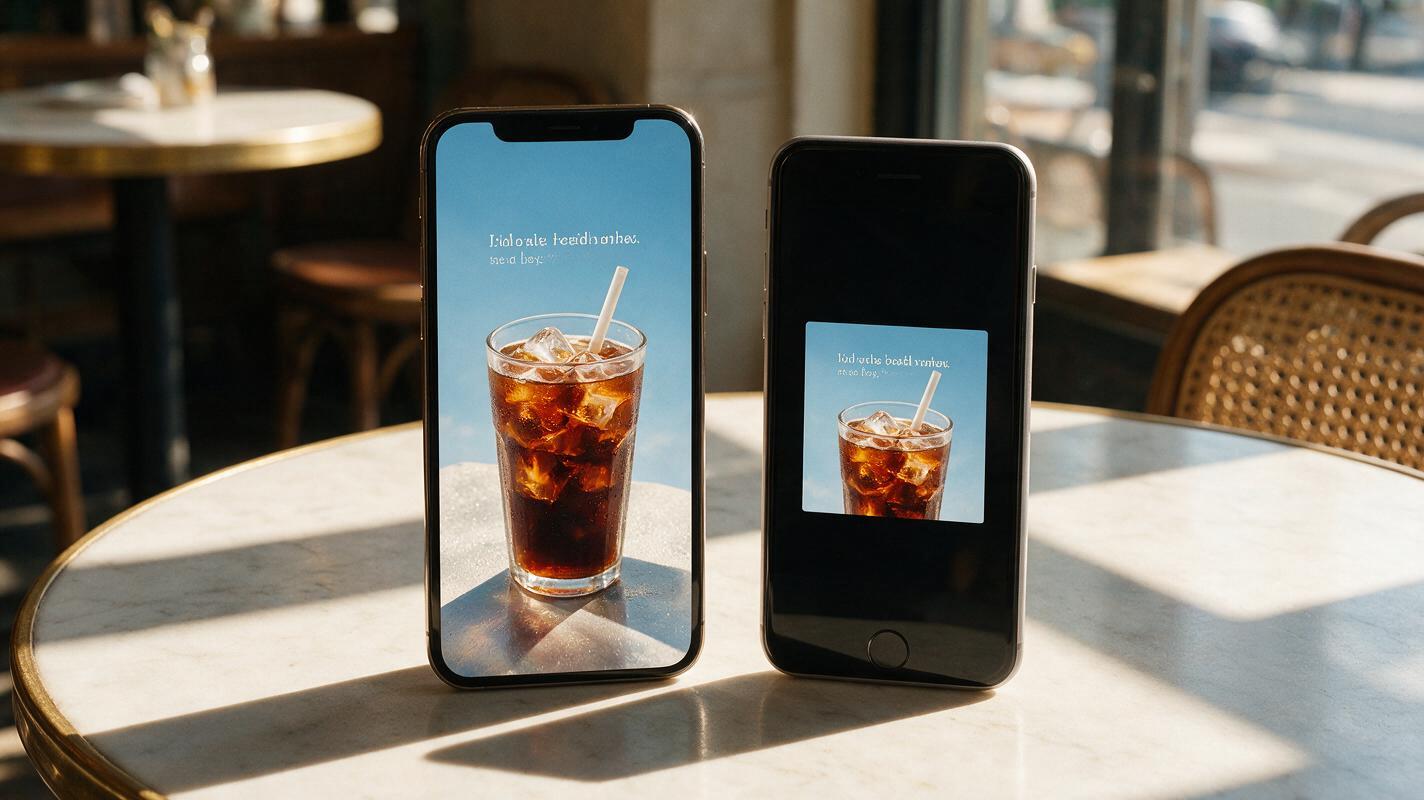
Design for two views: the full-height Reel cover and the smaller preview where someone may first encounter it. Keep the main subject and a short, meaningful headline near the central portion of the canvas, then inspect the actual preview before finalizing. Avoid relying on a fixed universal “safe-zone” measurement; interface overlays and preview crops can change by placement and app version.
| Element | Full-screen cover | Smaller preview |
|---|---|---|
| Main subject | Show its complete shape | Keep it recognizable at a glance |
| Headline | Leave breathing room around it | Keep the essential words visible |
| Logo and offer details | Make them readable where relevant | Check for cropping; do not depend on tiny text |
| Extended background | Check seams and lighting | Check that the subject still stands out |
For the café promotion, “A cooler afternoon” can work as a short cover headline; the date, price, and terms can live in the caption or elsewhere in the campaign creative. The cover should earn the tap, not carry every piece of information from the feed post.
Check the edit at publishing size
Export the cover at 1080 × 1920 pixels, then review it on a phone or in the platform’s cover preview. Look once at full size and once as a small thumbnail. The thumbnail check often reveals problems that were easy to miss while zoomed in: a headline that is too long, a drink that blends into the background, or an important detail near a cropped edge.
Zoom in around the extension seam as well. If the counter line bends, the wall texture repeats conspicuously, or a shadow changes direction, revise the editable area or choose another candidate. Do not cover a visible generation error with a text box unless the layout still makes sense without the cover-up.
Finally, compare the new cover with the original feed post side by side. They should read as the same campaign, even though they use different proportions. That consistency matters more than making the taller version look like a completely new image.
Final checklist
- The approved subject, product details, and branding remain unchanged.
- The added background fills the vertical canvas without obvious seams or duplicate objects.
- The headline is editable text, not generated lettering.
- The main message and subject survive the actual cover preview crop.
- The exported file looks clear at full size and as a small thumbnail.
Keywords
reel cover, Nano Banana Pro, Instagram Reel cover, extend image background, cropped Reel cover, social image repurposing, vertical social graphics