Flux Prompts for Clear Phonics Picture Cards
Create phonics picture cards that show one recognizable word without distracting objects or ambiguous vocabulary. These reusable Flux prompts help teachers control composition, visual style, sound position, consistency, and classroom readability.
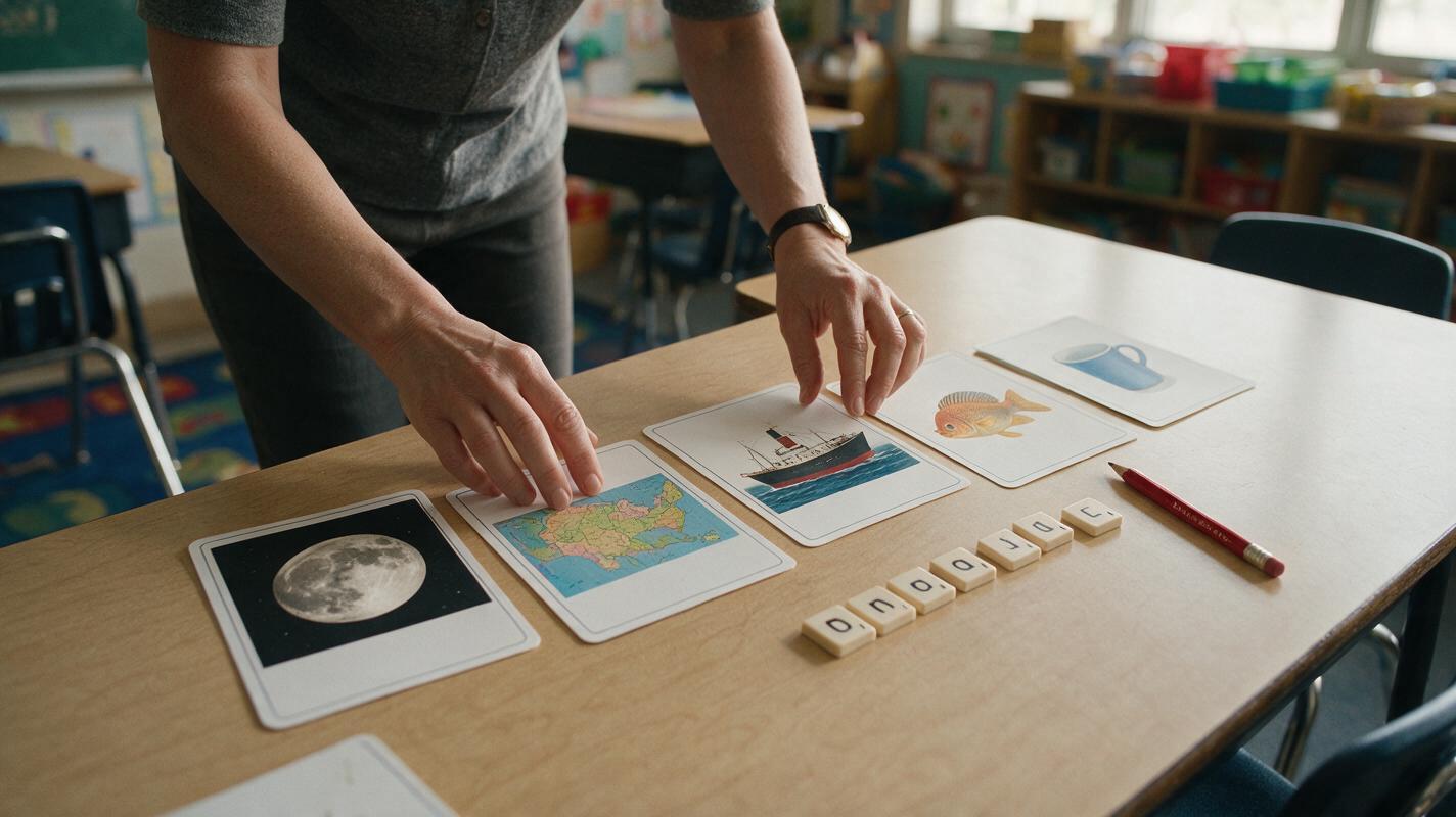
Table of contents
Make the target sound obvious at first glance
A useful phonics picture card should lead learners to one intended word—not three plausible guesses.
When a card for map contains a compass, backpack, mountains, and trail markers, children may name any of those objects instead. The illustration may look attractive, but it no longer provides a clean phonics cue.
Flux can generate focused card artwork when the prompt specifies the target object, viewing angle, background, exclusions, and learner level. The strongest workflow is to generate the picture without letters, inspect its vocabulary cue, and add the grapheme in your slide, worksheet, or page-layout software afterward.
Why phonics images become ambiguous
Image models tend to enrich a scene. For general illustration, that can be helpful. On a phonics card, extra detail creates competing answers.
- Multiple nameable objects: A picture intended as “ship” also contains waves, birds, ropes, and flags.
- Category ambiguity: A learner might call the intended “cup” a mug, drink, or glass.
- Unclear scale: A close-up object can resemble a different item when its defining parts are cropped.
- Decorative characters: Faces, hands, and mascots attract attention away from the target noun.
- Generated lettering: Incorrect or malformed text can contradict the sound being taught.
- Dialect mismatch: A word may not represent the same vowel or pronunciation in every classroom.
Teaching rule: If two reasonable learners could give different names for the picture, revise the image before using it as a decoding cue.
Define one teachable sound-image relationship
Start with the learning target rather than the visual style. Record the grapheme, intended word, sound position, accepted answer, and likely competing answers. This prevents a visually successful image from becoming an instructionally weak card.
| Decision | Example | Why it matters |
|---|---|---|
| Target grapheme | sh | Identifies the spelling pattern being practised. |
| Intended word | ship | Gives the image one naming target. |
| Sound position | Initial | Determines how the card fits the lesson sequence. |
| Accepted answer | ship | Provides a clear teacher key. |
| Competing answers | boat, ocean, sailboat | Reveals details that should be removed or clarified. |
Choose concrete words with a familiar visual form. Verbs, abstract nouns, homographs, and culturally specific objects usually need more context, but context also introduces more things to name. When a word cannot be represented unambiguously, use a different example rather than forcing the illustration.
Use a constraint-first Flux prompt
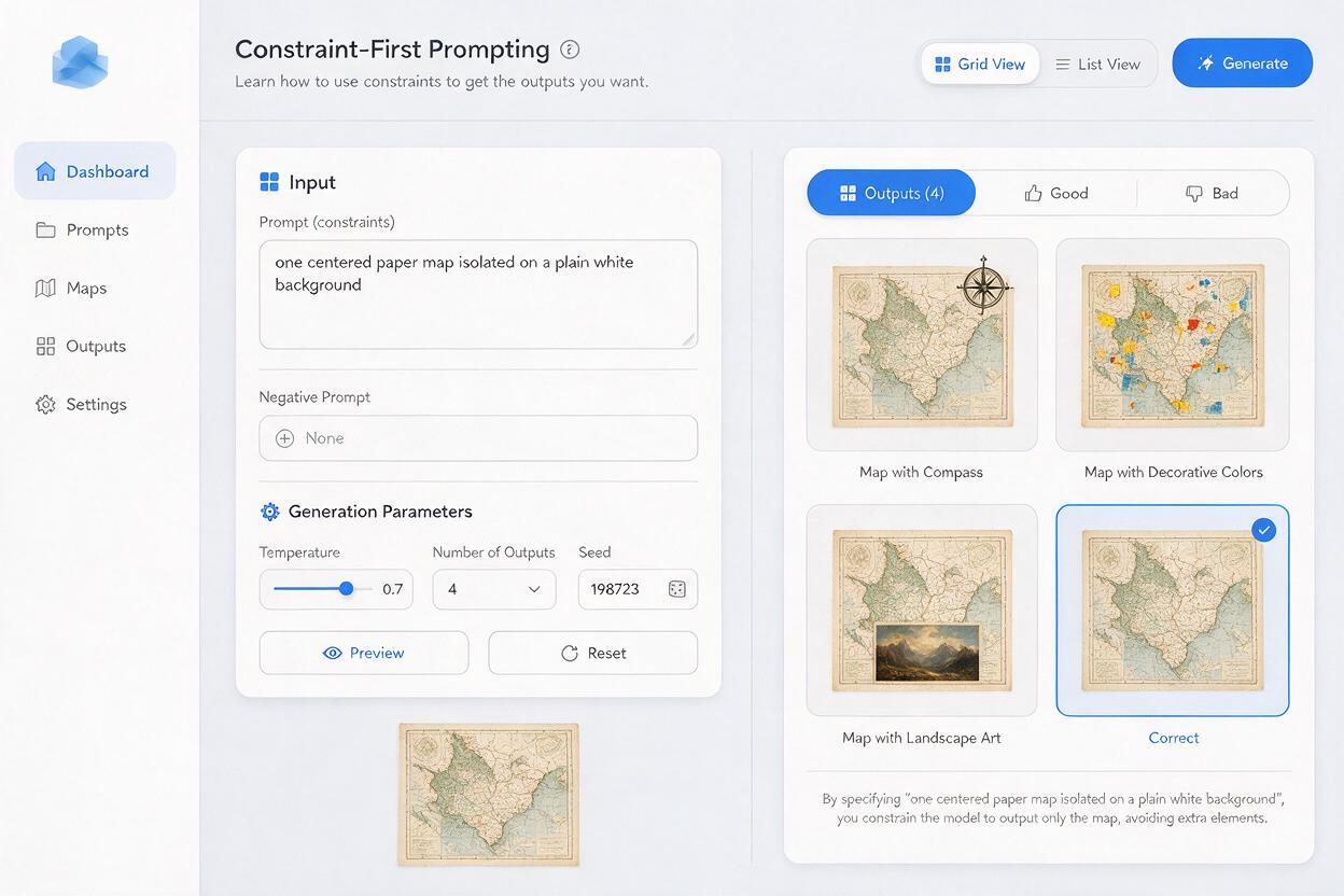
A text to image prompt for phonics materials should behave like an art brief. Put the target object first, define its recognizable features, and explicitly remove competing cues.
Single [TARGET OBJECT], fully visible and centered, clearly recognizable as “[TARGET WORD]” for beginning readers aged [AGE RANGE]. Show [DEFINING FEATURES]. Front or three-quarter view. Plain warm-white background. Simple classroom picture-card illustration, solid shapes, crisp edges, natural proportions, limited color palette. No people, no hands, no scenery, no decorative objects, no border, no letters, no words, no labels, no watermark. One object only.The phrase one object only is important, but it is not always sufficient. Name the unwanted elements when they are predictable. For a ship card, exclude docks, sailors, birds, islands, text, and additional boats. For a moon card, exclude stars, rockets, clouds, faces, and night landscapes.
Do not ask Flux to place the target letter on the illustration. Keeping typography separate gives you control over font choice, letter formation, spacing, and later corrections.
Prompt examples for common phonics targets
Initial sound: m as in moon
Single crescent moon, fully visible and centered, unmistakably a moon for beginning readers aged 5–7, smooth pale yellow crescent with clear outer and inner curves. Plain deep blue circular card background with no other objects. Simple flat educational illustration, crisp edges, high contrast. No stars, no clouds, no face, no rocket, no landscape, no letters, no words, no watermark.This card needs a dark field for contrast, so the background exception is purposeful. It still removes the objects that could produce competing words.
Short vowel: a as in map
Single unfolded paper map, fully visible and centered, clearly recognizable as a map for beginning readers aged 5–7. Rectangular folded paper with two visible fold lines, one simple winding route, and one location marker. Three-quarter overhead view. Plain warm-white background. Clean flat classroom illustration with solid colors and crisp edges. No compass, no backpack, no mountains, no person, no hands, no readable place names, no letters, no border, no watermark.The route and marker distinguish a map from an ordinary sheet of paper, while the exclusions prevent a crowded travel scene.
Digraph: sh as in ship
Single large ocean ship, fully visible from bow to stern, centered in side view, clearly recognizable as a ship rather than a small boat. Strong hull, several deck levels, bridge, and two simple funnels. Minimal narrow strip of calm water beneath the hull. Plain pale background. Bold educational picture-card illustration, natural structure, crisp silhouette. No sails, no dock, no people, no birds, no island, no other vessels, no flags, no text, no letters, no watermark.The prompt uses structural features to distinguish “ship” from “boat.” Review the result with speakers of the classroom’s language variety before assigning it a fixed pronunciation target.
Keep the whole card set visually coherent
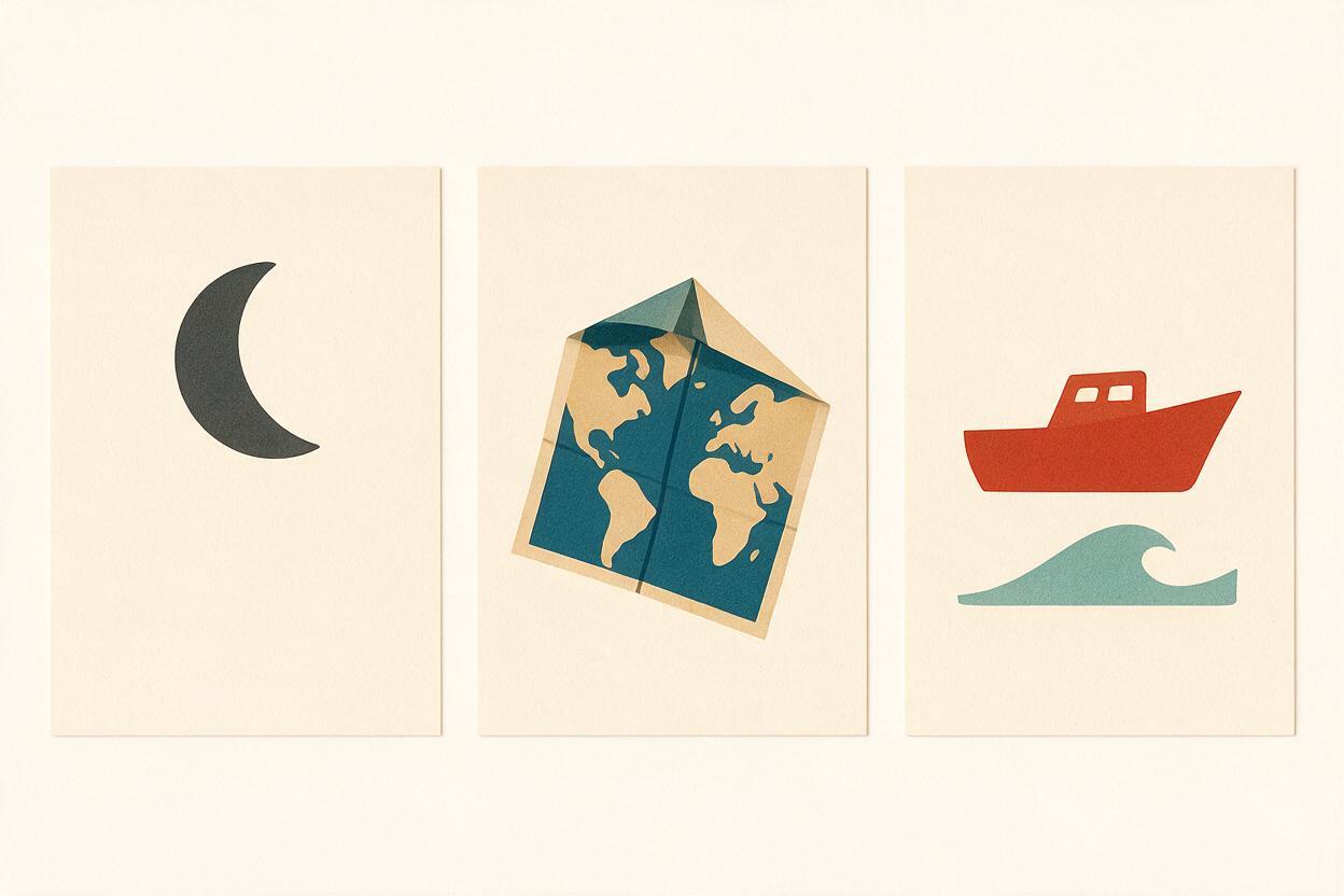
Children should notice the sound contrast, not a change in illustration style. Reuse a compact style block across the set:
Flat educational picture-card illustration, centered composition, full object visible, crisp silhouette, consistent line weight, limited palette, soft warm-white background, no cast shadow, no decorative elements.Generate a small pilot set before making the full deck. Compare object scale, margins, line thickness, camera angle, and background color. If one object is tiny while another fills the frame, revise the composition language rather than resizing everything indiscriminately.
For print cards, leave generous empty space around the object. This provides room for trimming and keeps the artwork clear when cards are viewed from across a table. Add the grapheme, word label, card number, and accessibility information only after the illustrations have passed review.
Review each image with a fast ambiguity test
Do not evaluate only whether the artwork looks polished. Test whether it functions as a learning cue.
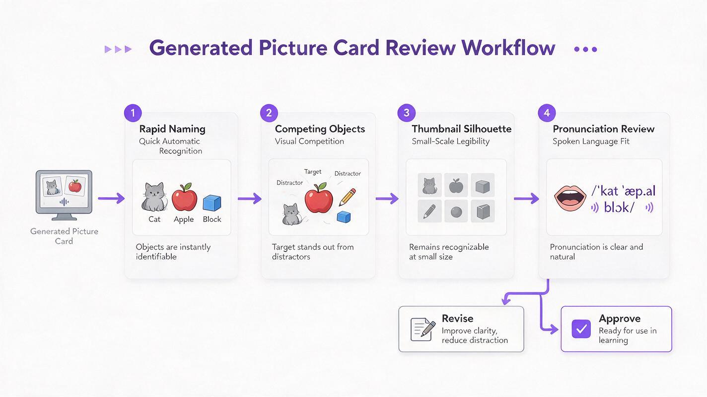
- Three-second naming test: Show the image without its label and ask what it depicts.
- Competing-object test: List every visible item a learner could reasonably name.
- Silhouette test: Check whether the object remains identifiable at thumbnail size.
- Sound test: Confirm that the intended word contains the target sound in the correct position.
- Dialect test: Ask a teacher or speaker familiar with the learners’ pronunciation.
- Print test: Print one page at actual size and inspect contrast, line clarity, and margins.
A simple classroom trial is more useful than prolonged aesthetic refinement. If several learners supply the same unintended word, change the picture or select a more concrete vocabulary item.
Fix predictable generation failures
| Problem | Prompt correction | Editorial correction |
|---|---|---|
| Too many objects | Add “one isolated object only” and list unwanted props. | Crop only when the complete target remains visible. |
| Object has the wrong identity | Add defining structural features and a clearer viewpoint. | Reject the image rather than relabeling it. |
| Style changes between cards | Reuse the same style, palette, background, and framing block. | Adjust color and dimensions consistently during layout. |
| Unwanted text appears | Add “no letters, words, labels, signs, or watermark.” | Regenerate if text overlaps the object. |
| Card suggests another word | Remove the competing feature or choose a different object. | Run the naming test again with fresh reviewers. |
| Image is unclear when printed | Request a crisp silhouette, solid shapes, and high contrast. | Test at the smallest intended output size. |
Targeted regeneration is usually better than adding more instructions to an already overloaded prompt. Change one variable at a time so you can identify what improved the result.
Prepare cards for real classroom use
Place the reviewed image into a consistent card template, then add the target grapheme using a school-approved typeface. Keep picture cards unlabeled when learners are practising oral segmentation or sound identification. Add words only when the activity requires grapheme-to-word mapping or independent checking.
Create separate teacher and learner versions when useful. The teacher deck can include the accepted word, phoneme position, alternate pronunciations, and notes about likely confusions. The learner deck can remain visually simple.
Save an editable master before exporting printable PDF pages, slide-deck versions, or learning-management-system images. When you are ready to test a small set, create your own version using three words from the same phonics pattern.
Final checklist
- The card depicts one intended word with no equally prominent alternative.
- The target sound occurs in the planned initial, medial, or final position.
- The object is complete, recognizable, and readable at the final size.
- Unnecessary scenery, characters, labels, and decorative props are absent.
- All cards share consistent framing, scale, palette, and line treatment.
- Generated lettering has been excluded and typography added separately.
- A teacher has checked vocabulary, pronunciation, and cultural familiarity.
- Learners or fresh reviewers can name the image quickly and consistently.
Keywords
Flux prompts, phonics picture cards, phonics illustrations, lesson visuals, text to image, literacy resources, classroom flashcards