Flux Poster Prompts for Spot-Color Screen Print Concepts
AI poster concepts often become difficult to screen-print because they depend on gradients, excessive colors, and inseparable details. This guide provides Flux prompts and a production-minded workflow for exploring bold spot-color posters that can be rebuilt as practical print artwork.
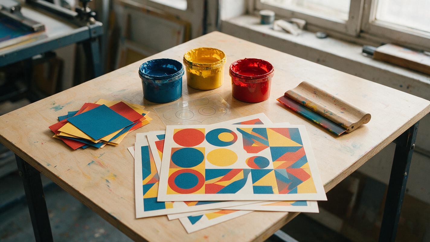
Table of contents
Design the poster as ink, not light
A visually striking AI poster can still be a poor screen-print concept. Soft glows, translucent gradients, tiny textures, and dozens of blended colors may look convincing on a monitor but become expensive or impossible to separate into physical inks.
The solution is not to ask Flux for a finished print file. Use it to explore compositions that already respect a limited palette, bold silhouettes, controlled overlaps, and intentional halftones. Once a direction works, rebuild it with real typography and production-controlled color separations.
Treat every generation as a visual sketch for a printing system—not as artwork ready to send directly to the press.
Define the print constraint before prompting
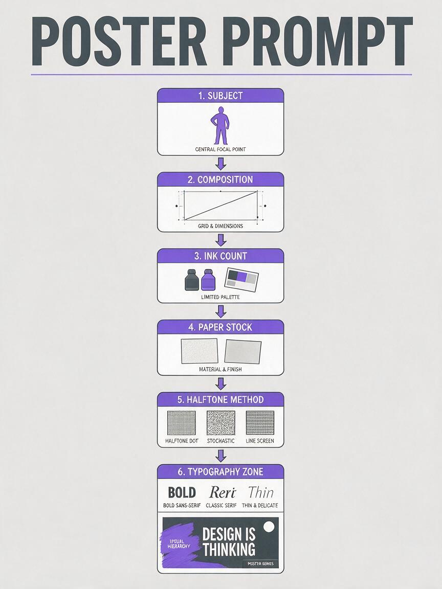
Start by writing a compact production brief. Without one, the model will usually optimize for visual richness rather than separability. The most important decision is the number of inks available.
| Constraint | Useful direction | What it prevents |
|---|---|---|
| Ink count | Two, three, or four spot colors | Uncontrolled rainbow palettes |
| Paper | Uncoated cream, bright white, black, or recycled stock | Colors that depend on a glowing screen |
| Image structure | Large flat shapes and closed silhouettes | Fragile micro-details |
| Tonal method | One consistent halftone language | Airbrushed gradients and muddy shading |
| Typography zone | Reserved area for manually typeset copy | AI-generated lettering embedded in the image |
| Registration behavior | Clean alignment or deliberate misregistration | Accidental fuzzy edges |
A useful brief might be: three inks on warm-white uncoated stock, one dominant silhouette, coarse circular halftones, no continuous gradients, and a clear top-left area for an event title. This gives the generation a visual system rather than a vague style adjective.
Use a prompt structure that behaves like print design
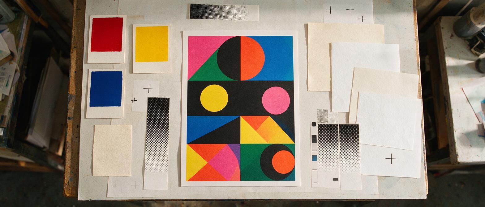
Flux can be used through ai image generator to explore the image layer of a poster. Keep the prompt organized around production variables so that decorative style does not overpower the underlying composition.
[poster subject and message], [dominant composition], designed as a [ink count]-color screen print, [named color roles] printed on [paper stock], large flat closed shapes, [halftone method], hard-edged color separations, [registration behavior], reserved blank area for typography, no readable text, no smooth gradients, no glow, no photographic depth of field, vertical posterThe phrase named color roles is more useful than a long list of hex codes. For example, describe “dark structural ink,” “warm highlight ink,” and “acid accent ink.” The generated image may not reproduce exact production colors, but the hierarchy can still survive when you rebuild it.
Likewise, “reserved blank area for typography” is safer than asking for a complete headline. Generate the image system first; typeset approved copy later in Illustrator, Affinity Designer, Photoshop, or another production tool.
Prompt a bold event poster with three inks
This direction suits music, arts, fashion, and cultural events where the image should feel immediate from across a street. The prompt emphasizes one recognizable shape and allows texture only inside controlled regions.
Experimental music festival poster concept, a monumental speaker cone expanding into angular sound waves, asymmetrical vertical composition with strong diagonal movement, designed as a three-color screen print, dense black structural ink, vivid orange focal ink, electric blue accent ink on warm-white uncoated paper, large flat closed shapes, coarse circular halftone only inside the speaker cone, crisp separable color regions, subtle intentional misregistration at selected edges, generous empty band across the bottom for manually typeset event information, no readable text, no gradients, no glow, no metallic effects, no photorealismIf the result becomes too chaotic, remove adjectives such as “experimental” and “energetic.” Replace them with spatial instructions: one central object, three large wave shapes, and at least 25 percent open paper.
Prompt a graphic product campaign without fake photography
A screen-printed product poster works best when the object becomes an icon rather than a simulated studio photograph. This reduces the need for smooth reflections and makes the concept easier to translate into flat separations.
Graphic campaign poster for a cylindrical beverage can, simplified iconic can silhouette occupying the lower-right third, oversized abstract citrus slice behind the product, designed as a four-color screen print, deep navy outline ink, saturated yellow base ink, coral-red flavor ink, pale blue highlight ink on bright white paper, hard-edged shapes, two-tone shadow made from parallel-line halftones, no realistic reflections, no transparent liquid, no continuous gradients, clean upper-left copy zone, no logo, no readable text, bold contemporary editorial compositionFor real client work, do not rely on the generated can as an approved product representation. Replace it with a controlled vector drawing, pack shot, or supplied render while retaining the surrounding composition.
Prompt expressive portraiture with controlled halftones
Portrait concepts commonly fail because the model adds soft skin shading everywhere. Ask for a small number of explicit tonal bands and confine the halftone to one function.
Cultural exhibition poster featuring an expressive side-profile portrait, face cropped dramatically by the left and top edges, designed as a two-color screen print, dark burgundy shadow ink and bright vermilion highlight ink on pale pink paper, portrait reduced to three clear tonal bands using paper as the lightest value, coarse 45-degree line halftone used only for the middle tone, solid closed shadow shapes, crisp facial silhouette, large untouched paper area on the right for typography, no readable text, no photographic skin texture, no smooth gradient, no extra colorsIf facial detail keeps returning, specify “features defined by silhouette and two interior shapes.” That describes a construction rule instead of merely asking for simplicity.
Assign color roles instead of trusting generated swatches
A generated palette is a visual proposal, not an ink specification. Evaluate whether each color has a distinct job:
- Structural ink: establishes outlines, shadows, and the main reading order.
- Subject ink: carries the dominant object or portrait.
- Accent ink: creates a focal interruption or campaign signature.
- Paper color: functions as an active fourth or fifth visual value.
Look for concepts that remain understandable when viewed in grayscale. If two adjacent colors have nearly the same value, they may collapse even when their hues differ. Adjust the palette during the rebuild rather than repeatedly prompting for an exact digital swatch.
Judge concepts by separability, not surface polish
The most polished generation is not automatically the strongest candidate. Before developing a concept, inspect it against practical questions:
- Can the dominant image be described as a small set of closed shapes?
- Does each ink appear to perform a clear visual role?
- Would the poster still work without its simulated paper texture?
- Are halftones used consistently rather than as random decoration?
- Is there enough quiet space for real typography and partner marks?
- Can fragile details be removed without changing the central idea?
A useful test is to blur the image slightly or view it as a small thumbnail. If the concept loses its subject immediately, it probably depends on detail that will not carry the campaign from poster to social crop, merchandise, or signage.
Rebuild the selected concept as production artwork
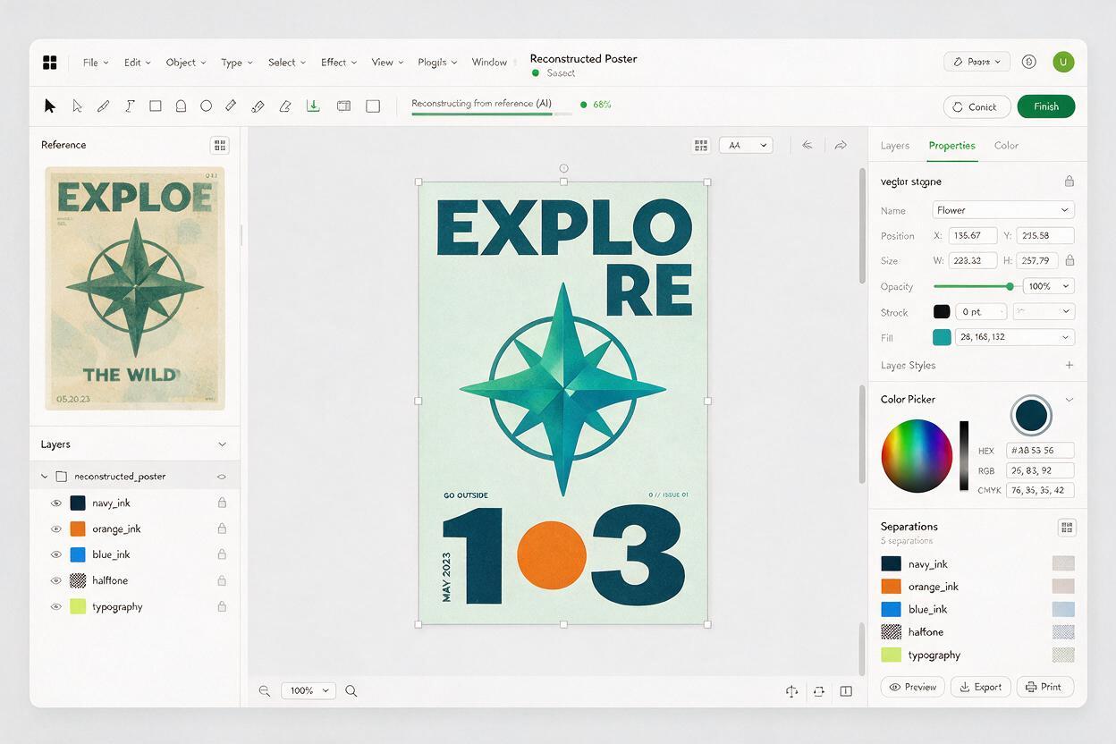
Once a generation passes the separability test, stop asking the model for minor refinements. Reconstruct the design in layers you control.
- Place the chosen generation as a locked composition reference.
- Redraw the largest silhouettes with clean vector paths or hard-edged masks.
- Create one clearly named layer for every intended ink.
- Replace generated halftones with a consistent production-controlled screen.
- Typeset all headlines, dates, URLs, and legal copy manually.
- Replace generated products, logos, and brand assets with approved source files.
- Confirm trapping, overprint behavior, minimum line weight, mesh requirements, and ink choices with the printer.
Do not auto-trace every visible artifact. Automatic tracing often converts paper grain and generation noise into thousands of unusable paths. Trace the composition’s logic: silhouette, focal shape, secondary shape, shadow field, and texture mask.
AI should accelerate art direction and composition discovery. Your rebuilt file should still meet the same prepress standards as any other screen-print project.
Fix the failures that make a poster unprintable
The colors blend into unexpected intermediate shades
Add “hard-edged color separations” and “no translucent overlays.” If overlap is essential, define it intentionally: two solid inks overprint to create one controlled darker region.
The poster looks like a digital painting
Remove cinematic lighting, volumetric light, detailed shading, and realistic rendering from the prompt. Replace them with flat silhouette, cut-paper geometry, solid shadow shape, and limited tonal bands.
The halftone appears everywhere
Assign it one location and one purpose, such as “coarse dot halftone only in the background shadow.” A global request for vintage print texture often produces inconsistent dots, scratches, and fake distress.
The model fills the copy zone with symbols
Describe the area as untouched paper rather than an empty text box. Try “upper third remains plain cream paper with no marks, symbols, frames, or lettering.”
The concept needs too many separations
Reduce it manually to color roles. Merge decorative shades into the nearest functional ink, preserve the paper as a visible color, and remove details that do not affect recognition or hierarchy.
Final checklist
- The prompt specifies an ink count and paper stock.
- The composition uses large, separable shapes.
- Every color has a defined visual role.
- Halftones follow one controlled pattern and purpose.
- Real typography and logos will be added outside the generation.
- The concept remains readable at thumbnail size.
- The selected image will be rebuilt rather than sent directly to print.
- Final separations and technical settings will be confirmed with the printer.
When your print constraints are ready, create your own version and compare several compositions before committing time to production artwork.
Keywords
Flux poster prompts, spot color poster, screen print design, AI poster generator, poster prompts, AI graphic design, print-ready poster