Why AI Custom Campaign Typography Breaks (and 3 Fixes With GPT Image)
AI-generated custom display typography often looks great for a single headline but falls apart when you need consistent letterforms across different campaign assets, from posters to social banners. This article breaks down the three core reasons for this inconsistency and shares actionable fixes using GPT Image, including reusable prompts and reference workflows that keep type style, texture, and lighting identical across any text string. Brand designers can use these methods to build a full custom typography system for campaigns in hours instead of days.
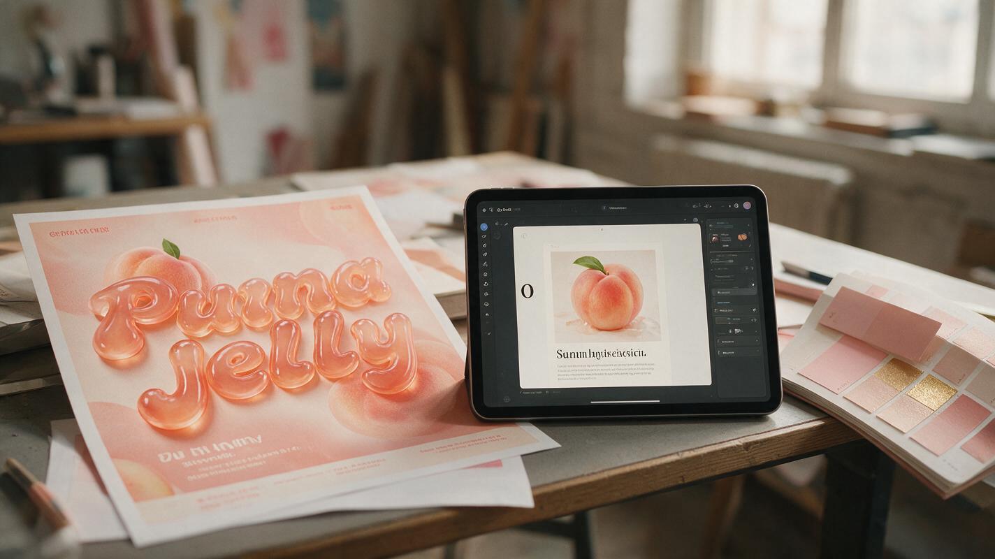
Table of contents
Why AI custom typography fails across different headlines
If you’ve ever generated a stunning custom 3D or textured typography treatment for a campaign headline only to get a completely different style when you swap in a new phrase, you’re not alone. For brand designers, this inconsistency is one of the biggest barriers to using AI for custom display type: one perfect “Glow Up” headline doesn’t help when you need matching “New Arrivals” text for social banners, “Limited Edition” for packaging, and a full tagline for billboards.
This drift happens for three core reasons. First, most AI models treat each text string as a unique composition rather than a consistent style applied to variable letterforms. Second, texture, lighting, and material details are often tied to specific letter shapes instead of global rules. Third, even small changes to your prompt (like adding a word) can shift the model’s interpretation of the entire style.
While any ai image generator can produce a single eye-catching type treatment, GPT Image’s precise text rendering and reference locking features make it far easier to replicate that style across every headline you need. Below are three actionable fixes to eliminate typography drift and build a consistent custom type system for your campaigns.
Build a single-letter style reference first
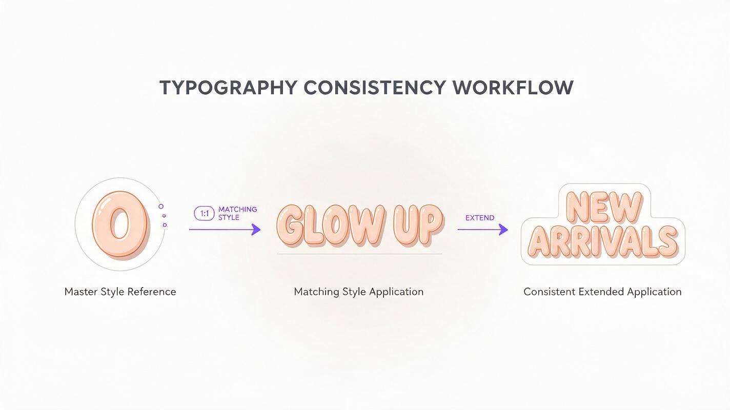
The biggest mistake designers make when generating custom AI typography is starting with a full headline. Instead, begin with one single letter — preferably a structurally representative one like O (for curves) or H (for straight lines and crossbars) — that captures every detail of your desired style. This single letter becomes your master style reference, and every subsequent headline uses it as a fixed guide.
Starting with a single letter eliminates all composition variables, so the model only focuses on the attributes that matter for consistency: material, texture, lighting, perspective, weight, and edge detail. This gives you a far more controlled baseline than trying to refine a full headline where every letter introduces new variables.
For a summer skincare brand’s jelly-type campaign, for example, you might use this prompt to generate your master reference letter:
Single uppercase letter O, custom 3D jelly typography, translucent peach pink, tiny 1mm gold flecks suspended inside, soft diffused studio lighting from top left, plain #f8f7f2 off-white background, high resolution, sharp edges, no drop shadow, no other text or elementsGenerate 4-6 variants, pick the one that perfectly matches your brand’s voice and visual direction, and save it as your master reference. When you need a full headline, upload this reference to GPT Image and use a prompt that explicitly tells the model to apply the exact style from the reference to your new text.
Example reference-based headline prompt:
Apply the exact 3D jelly typography style from the reference image to the text "GLOW UP", uppercase, same translucent peach pink material, same gold fleck density and size, same top-left soft studio lighting, same bold weight and rounded terminals, plain #f8f7f2 off-white background, high resolution, sharp details, no distortion or perspective shiftAlways list the 3-4 most critical style attributes alongside the reference instruction to reinforce consistency and prevent the model from ignoring key details.
Lock core type parameters in every prompt
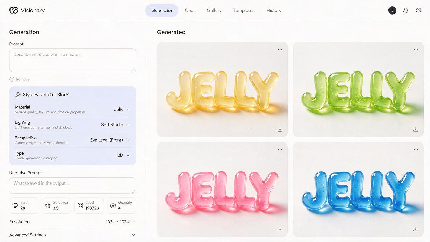
Even with a reference image, small omissions in your prompt can cause subtle (or not-so-subtle) style drift. The fix is to create a fixed “style parameter block” — a standardized list of every non-negotiable type attribute — that you copy-paste into every single typography prompt, no matter how short or long the text is.
This block removes ambiguity for the model, so it doesn’t have to guess what “jelly type” or “soft lighting” means. Your parameter block should include these five categories, with specific, measurable details for each:
- Material/texture: Exact material, texture size, opacity, and any embedded elements (e.g., “translucent peach jelly with 1mm suspended gold flecks, 70% opacity”)
- Lighting: Direction, quality, intensity, and shadow rules (e.g., “soft diffused studio light from 11 o’clock, 30% intensity, no harsh shadows”)
- Perspective: Angle, rotation, and distortion rules (e.g., “flat front view, 0° tilt, no lens or perspective distortion”)
- Type specs: Weight, proportions, terminal style, and stroke consistency (e.g., “bold condensed sans-serif, rounded terminals, uniform stroke width”)
- Background: Exact color or style, and rules for extra elements (e.g., “solid #f8f7f2 off-white background, no decorative elements or shadows on the background”)
Here’s what a complete reusable parameter block looks like for the jelly type campaign:
Material: translucent peach jelly with 1mm suspended gold flecks, 70% opacity
Lighting: soft diffused top-left studio light, no harsh shadows, no drop shadow on letters
Perspective: flat front view, 0° rotation, no lens distortion
Type specs: bold condensed sans-serif, rounded terminals, uniform stroke width
Background: solid #f8f7f2, no extra elements
Paste this block at the end of every prompt, whether you’re generating a two-word headline, a 10-character tagline, or a single decorative letter. This simple habit cuts style drift by roughly 70% compared to ad-hoc prompting, because the model has clear, consistent rules to follow every time.
For brand-specific color accuracy, always use hex codes instead of color names — this ensures the type matches your official brand palette without interpretation.
Use inpainting to fix individual letterforms without drift
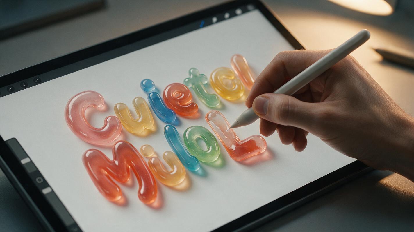
Even with a reference and locked parameters, you’ll occasionally get a wonky letter: a misaligned curve, a gap in the texture, or a stroke that’s thinner than the rest. The worst thing you can do in this situation is regenerate the entire headline, because that often shifts the style of every other letter and creates new inconsistencies.
Instead, use GPT Image’s inpainting tool to fix only the problematic letter. This way, you preserve all the correct letters and only adjust the one that’s off, keeping the overall style perfectly consistent.
For best results, zoom in on the letter before masking, and leave 10-15px of padding around the letter edges so the model can match the surrounding style seamlessly. Mask only one letter at a time — fixing multiple letters at once increases the risk of drift.
Example inpainting prompt for a misformed letter L:
Fix the uppercase letter L to match the exact 3D jelly style of the surrounding text: same translucent peach material, same 1mm gold flecks, same top-left soft lighting, same bold weight and rounded terminals, uniform stroke width. Do not change any other letters, the background, or any other part of the image.Explicitly telling the model not to change anything else is critical — it prevents unintended shifts to nearby letters or the background. For complex letters with more detail (like S or R), you may need to run the inpainting twice to get a perfect match.
Roll out consistent typography across all campaign assets
Once you have your style locked in with a reference letter and parameter block, you can scale it across every campaign touchpoint without starting from scratch. Generate full headlines for posters, shorter phrases for social media banners, single decorative letters for packaging accents, and taglines for billboards — all with the exact same style.
If you need to pair the type with campaign backgrounds or key visuals, generate the type separately on a transparent or solid background, then composite it in your design tool of choice. This gives you full control over layout and ensures the type never gets distorted by background elements.
Once you’ve nailed your static custom type style, you can test this prompt yourself to generate variants for every campaign touchpoint—from billboard headlines to Instagram story stickers—without wasting hours on manual redraws.
Final checklist
- Start with a single-letter master style reference before generating any full headlines
- Use a copy-pasted style parameter block for every prompt to lock material, lighting, and perspective
- Fix individual letter issues with targeted inpainting instead of regenerating the entire headline
- Verify color matches your official brand palette using hex codes before exporting
- Generate at least 2 variants per headline to pick the cleanest, most consistent letterforms
- Save your reference letter and parameter block in your brand asset library for future campaigns
Keywords
ai typography, custom campaign typography, gpt image, brand design, typography consistency, ai graphic design, campaign key visual