How to Make Matching Single Covers With GPT Image
Build a cohesive series of single covers without making every release look identical. This tutorial shows how to create a visual system, generate a master cover with GPT Image, preserve recurring elements through reference-based editing, and troubleshoot consistency problems.
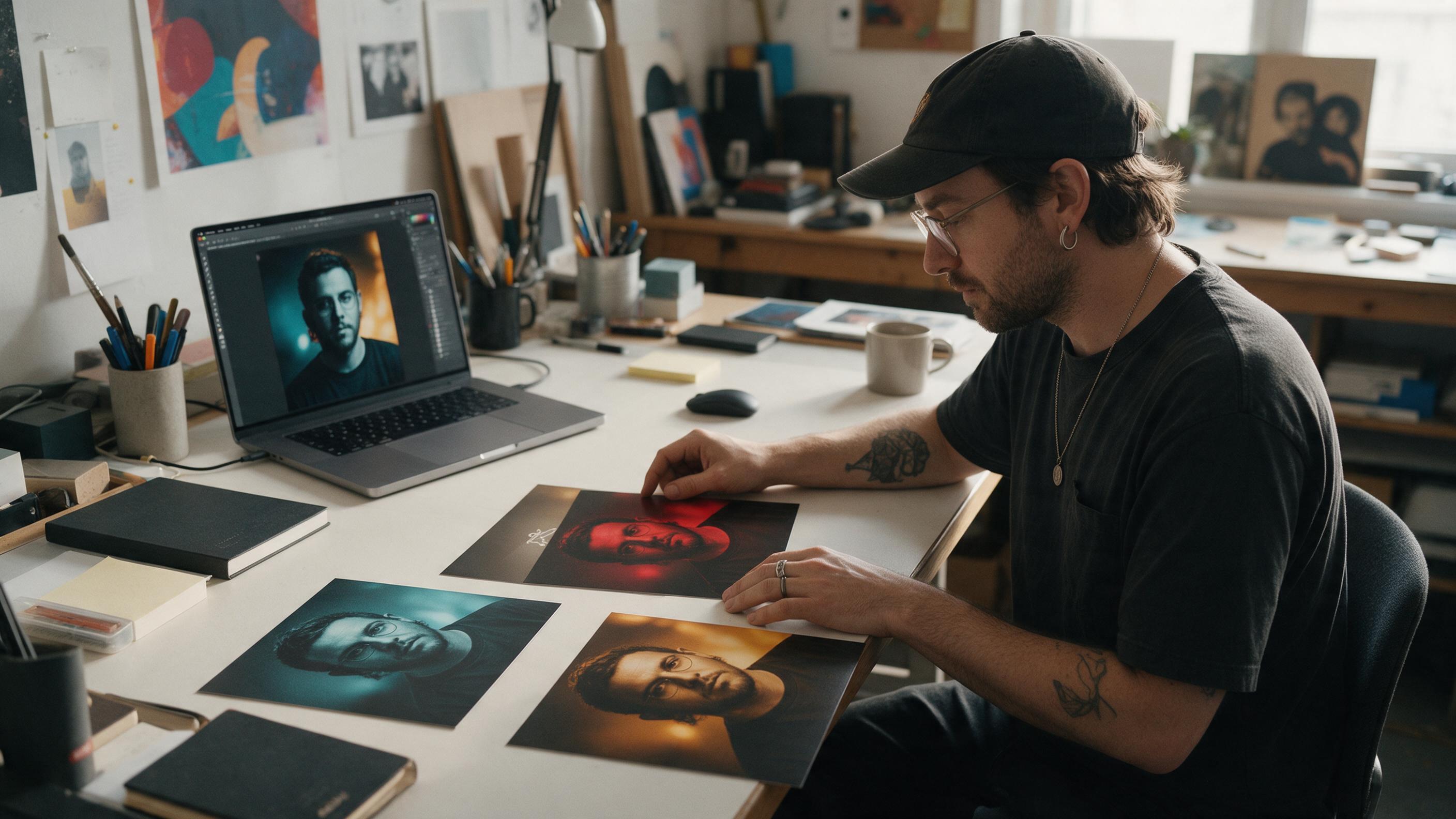
Table of contents
Create a recognizable cover series without repeating one design
The fastest way to make several singles feel like one campaign is to preserve a small set of visual anchors while changing the subject, color, or setting for each release.
Generating every cover from a fresh prompt often causes visual drift: the lighting changes, the artist looks different, typography moves, and the collection loses its identity. A better approach is to create one strong master image with GPT Image, then use it as the reference for controlled variations.
This workflow works for a three-single rollout, alternate song versions, remix covers, or a sequence of releases leading into an EP. It focuses on the artwork itself rather than cover animation, so every exported image can stand on its own in streaming libraries, social posts, and press materials.
Step 1 — Define the visual rules for the cover series
Before opening an AI image generator, decide which details must remain constant and which may change. Consistency does not mean copying the same image. It means giving the viewer enough repeated signals to recognize the campaign.
| Design element | Keep consistent | Change between singles |
|---|---|---|
| Composition | Subject position, camera distance, empty text area | Pose or viewing angle |
| Lighting | Direction, contrast, softness | Accent-light color |
| Environment | Location type and visual era | Props, weather, or time of day |
| Color | Base palette and black level | One identifying color per track |
| Graphic system | Border, label position, type family | Song title and catalog number |
Write a one-sentence art direction rule that can survive across the whole campaign. For example:
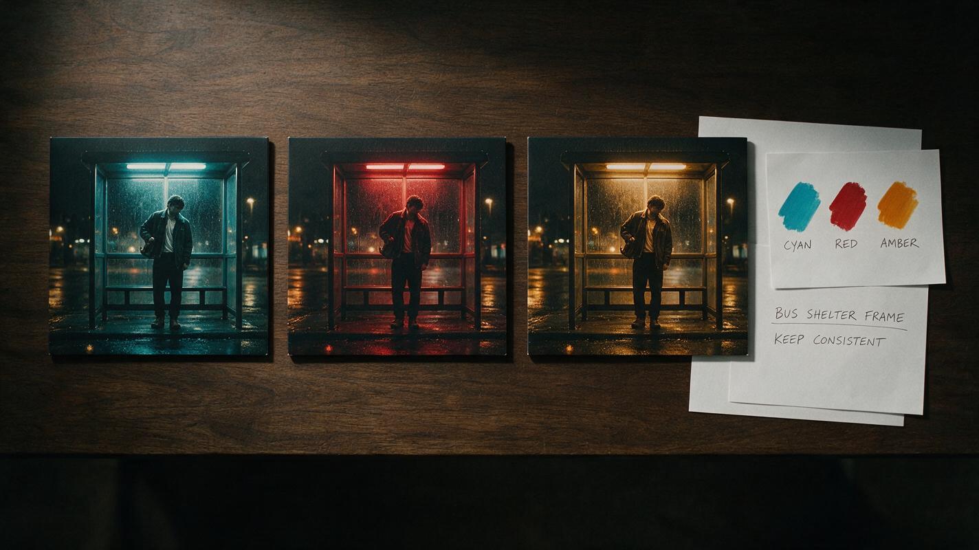
Every cover is a waist-up nighttime portrait beside a rain-covered bus shelter, photographed with hard frontal flash, deep shadows, and one different fluorescent accent color.
Limit the system to three or four anchors. Too many locked details make each release feel like a minor color edit; too few cause the set to drift.
Step 2 — Build a master cover with a modular prompt
Create the first image through text to image, but structure the prompt so individual components can be replaced later. Separate the subject, composition, environment, lighting, palette, and exclusions instead of writing a loose paragraph of adjectives.
Square album-cover photograph.

SUBJECT: solitary alternative pop performer in a structured black coat
COMPOSITION: waist-up portrait, centered slightly left, direct eye contact,
clean negative space in the upper-right corner
ENVIRONMENT: empty glass bus shelter at night, wet pavement, restrained props
LIGHTING: hard frontal flash with a cyan fluorescent light behind the subject
TEXTURE: realistic skin, subtle analog grain, crisp fabric detail
PALETTE: black, cold gray, cyan
MOOD: isolated, controlled, nocturnal
EXCLUDE: logos, readable text, microphones, crowds, extra people,
collage layout, decorative border
Generate several candidates and judge them as covers, not merely attractive pictures. The strongest master should remain readable at thumbnail size, leave a predictable area for type, and contain a silhouette that can be recognized quickly.
Avoid asking the model to solve the entire layout at once. Although image models can produce lettering, release-ready titles require exact spelling, repeatable placement, and reliable alignment. It is usually safer to generate the photographic foundation first and add final typography in a design editor.
Test this prompt yourself, then replace only the subject styling, location, and accent color needed for your own campaign.
Step 3 — Turn the master image into controlled variations
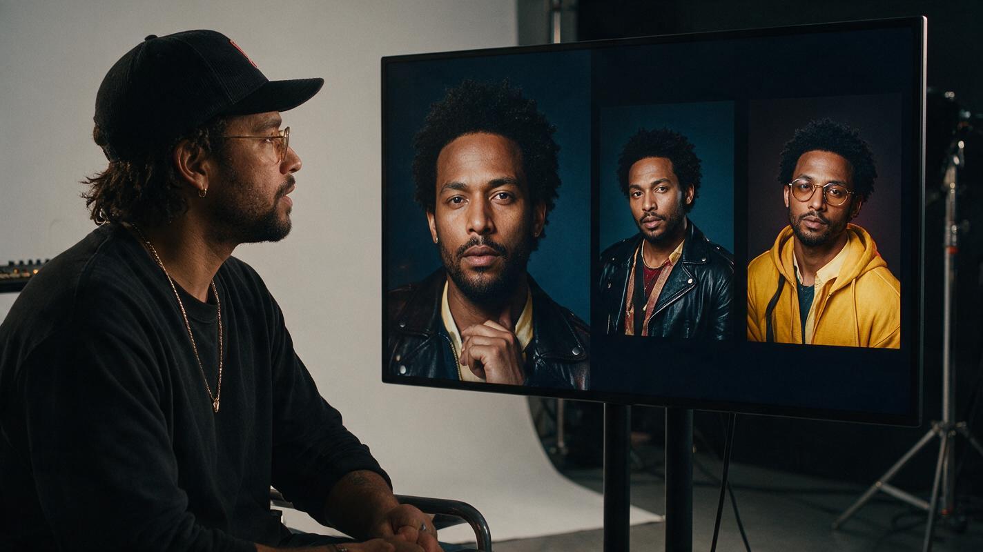
Use the selected master cover as the visual reference for the next image. Ask for an edit or variation rather than starting another unrelated generation. The instruction should explicitly identify what must stay unchanged.
Create a second cover in the same visual series as the reference image.
Preserve the square framing, camera distance, subject placement, hard frontal
flash, wet nighttime environment, realistic photographic texture, and empty
upper-right title area.

Change only these elements:
- turn the subject's shoulders slightly away from the camera
- replace the cyan fluorescent accent with deep red
- add one folded paper ticket on the bench

Do not add text, logos, borders, extra people, or new background structures.
For the third cover, return to the original master rather than using the second variation as the new source. Repeatedly editing an edit can gradually alter facial details, framing, contrast, and wardrobe. Treat the master as the visual source of truth.
Practical rule: branch every new cover from the approved master, then compare all results side by side before accepting them.
Step 4 — Protect the artist’s identity and recurring details
If the campaign includes the artist’s face, consistency requires more than repeating a name in the prompt. Begin with a clear, authorized reference image that shows the intended hairstyle, makeup, and facial proportions. Avoid references with heavy filters, extreme wide-angle distortion, or obscured features.
Use precise preservation language without requesting a completely frozen portrait:
Preserve the same recognizable person, facial proportions, hairstyle,
eyebrow shape, and makeup design from the reference. Keep natural skin texture.
Allow a new pose and expression, but do not reinterpret the person's identity.
Inspect eyes, teeth, earrings, fingers, garment closures, and reflections at full size. These small details may disappear in a social thumbnail but become obvious in press images or physical artwork.
When identity still drifts, reduce the number of simultaneous changes. First create a version with only the new pose. Once the face is stable, make a separate edit for the accent color or prop. Smaller edits are easier to evaluate and reverse.
Step 5 — Add typography as a reusable overlay
Build one type template outside the generated image so the title system remains exact across every single. Keep the artist name, song title, margins, and optional catalog marker on separate layers.
- Choose one anchor: align every title to the same corner, center line, or border.
- Set a safe margin: prevent lettering from feeling accidentally cropped in square and vertical adaptations.
- Use hierarchy: the song title should not compete with the performer’s face unless oversized type is the campaign concept.
- Test small: shrink the cover until it resembles a streaming thumbnail and check whether the main shape and title still register.
- Keep an editable master: export finished covers only after checking spelling, capitalization, and version labels.
If you want generated lettering to be part of the image—such as painted words on a wall—treat it as an illustrative element, then verify every character carefully. Do not rely on embedded generated text for legal credits or essential release information.
Step 6 — Troubleshoot visual drift before exporting
| Problem | Likely cause | Fix |
|---|---|---|
| The artist looks different | Weak reference or too many requested changes | Use a clearer portrait and edit pose, wardrobe, and color separately |
| Framing changes every time | Composition described too vaguely | Repeat camera distance, crop, subject position, and negative-space location |
| Every cover feels identical | All visual elements were locked | Change one story element, one gesture, and one accent color |
| The set looks unrelated | Too many variables changed together | Restore the same lighting, environment type, texture, and type grid |
| Artwork looks synthetic | Excessive polish or conflicting style words | Request natural texture, simplify the prompt, and remove redundant adjectives |
| Titles are inconsistent | Typography generated separately in each image | Apply one editable overlay template after image generation |
Place all covers in a single row and look away for a few seconds. When you return, ask two questions: do they clearly belong together, and can you distinguish each song immediately? If only one answer is yes, adjust the balance between repetition and variation.
Step 7 — Export a complete campaign kit
Save the artwork in layers before preparing delivery files. Distributor and platform specifications can vary, so confirm the current requirements for each destination rather than assuming one export fits everything.
A practical campaign folder can include:
- A high-resolution square cover with final typography
- A text-free square artwork master
- A vertical crop for Stories, Shorts, and artist promos
- A landscape crop for banners or video thumbnails
- A reusable title overlay and color reference
- The approved master prompt and reference image
Keeping the text-free version gives you more freedom to create tour announcements, lyric cards, and motion assets later without rebuilding the image. Once the full row feels cohesive, create your own version for each track and archive the exact prompt beside every approved file.
Final checklist
- Define three or four visual anchors before generating.
- Create one approved master cover with deliberate negative space.
- Branch every variation from the original master image.
- Change only a few controlled elements per single.
- Check facial identity and small physical details at full size.
- Add exact typography in a reusable external template.
- Compare the complete series at full size and thumbnail size.
- Confirm each platform’s current export requirements.
Keywords
matching single covers, GPT Image, album cover art, AI image generator, cover art prompts, album visuals, artist branding