Imagen Prompts for Product-in-Hand Ads Without Broken Fingers
Create convincing product-in-hand advertising images with Imagen by defining the grip, visible fingers, product geometry, and camera angle before adding campaign styling. This practical prompt method helps creative teams reduce broken anatomy, floating products, hidden labels, and inconsistent pack scale.
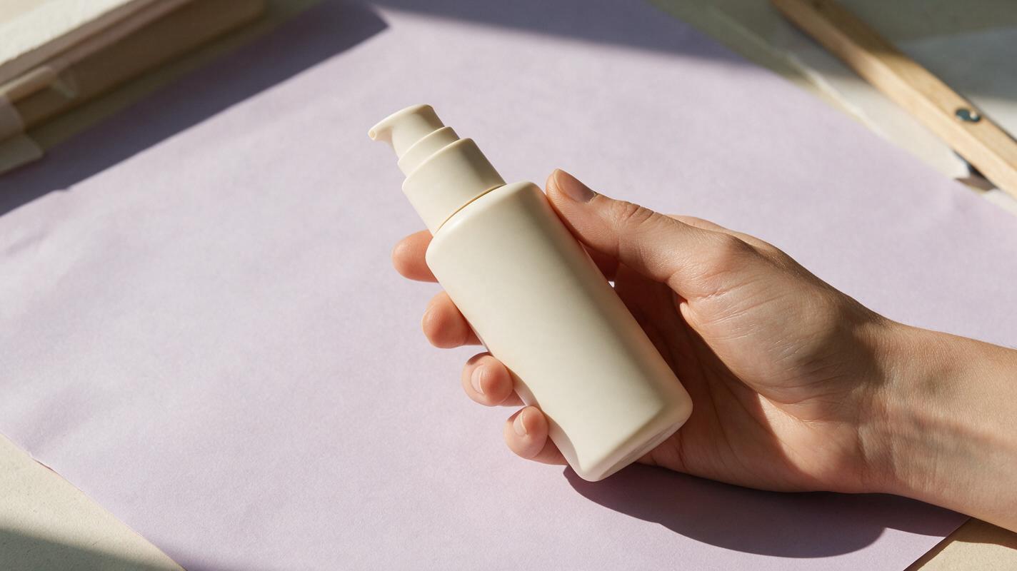
Table of contents
Make the Hand Support the Product, Not Distract From It
A convincing product-in-hand ad depends on believable contact: the fingers must wrap around the correct surfaces, the pack must retain its shape, and the label must remain visible enough to sell the idea. Imagen can produce polished lifestyle imagery, but a vague request such as “a hand holding the product” leaves too many anatomical and compositional decisions unresolved.
The solution is to design the grip before describing the campaign world. Start with product geometry, specify where each visible finger belongs, choose a camera angle that does not create impossible overlaps, and only then add lighting, wardrobe, environment, and art direction.
Why Product-in-Hand Images Commonly Fail
Hands and branded objects create a difficult visual relationship. The hand must appear natural while obeying the rigid dimensions of a bottle, carton, tube, jar, or device. At the same time, the composition often needs clean packaging, deliberate copy space, and a commercially flattering angle.
Four failures appear repeatedly:
- Ambiguous grip: the prompt says “holding” but does not define which surface the palm or fingers touch.
- Hidden selling face: fingers cover the label, logo area, cap, or distinctive product feature.
- Incorrect scale: the package becomes too small for the hand or changes size between campaign variations.
- Conflicting camera logic: the prompt asks for a frontal label, dramatic three-quarter perspective, and a hand wrapped around the same visible face.
Treat the hand as part of the product rig. It has a contact point, a pressure direction, a visible silhouette, and a specific job in the composition.
Define the Product Before Describing the Grip
Begin with a compact product specification. Include the object category, proportions, material, rigid features, and the face that must remain visible. If your Imagen interface accepts a product reference, use the cleanest approved packshot available. A front or three-quarter image with neutral illumination is usually easier to interpret than a heavily retouched campaign visual.
A useful product definition might read:
Rigid rectangular skincare bottle, approximately palm height, flat front label panel, rounded vertical edges, matte ivory surface, short cylindrical pump, product proportions unchanged, front panel facing the camera.Avoid relying on subjective words such as “premium” or “beautiful” at this stage. Those terms can influence styling, but they do not tell the model where the cap sits or which plane contains the label.
When working without a reference, an ai image generator needs enough physical information to separate the pack from the hand. Describe the package as an industrial object before describing it as a brand asset.
Build a Grip That Can Exist in the Real World
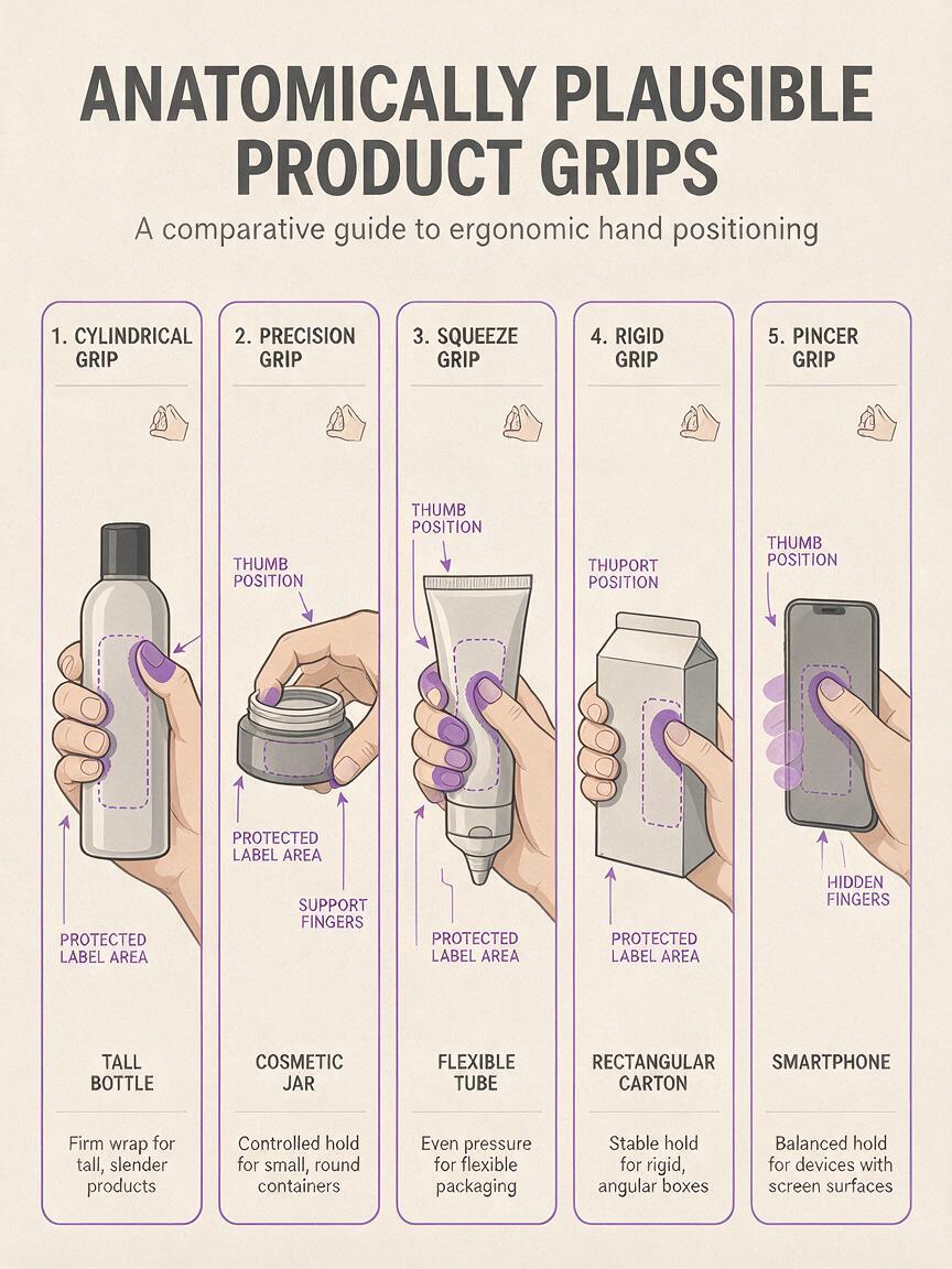
Choose a grip based on the product shape and the part of the package that must remain readable. Do not ask the model to invent an expressive gesture and solve label visibility simultaneously.
| Product shape | Useful grip | Prompt instruction | Main risk |
|---|---|---|---|
| Tall bottle | Lower-body side grip | Thumb behind the bottle, three fingers visible along one side, index finger relaxed below the shoulder | Fingers crossing the label |
| Small jar | Under-support grip | Jar resting on curled fingers, thumb lightly stabilizing the side | Floating jar or oversized hand |
| Tube | Light pinch near the sealed end | Thumb and index finger holding the lower corners without squeezing the tube | Crushed packaging |
| Carton | Edge grip | Fingers placed behind one vertical edge, thumb touching the side panel | Extra fingers around corners |
| Phone or device | Rear support grip | Palm behind the device, fingertips visible on one edge, screen unobstructed | Impossible wrist angle |
Use plain anatomical language. “Three fingers visible” is more useful than “an elegant hand pose.” If fingers should remain hidden behind the object, say so explicitly. Reducing the number of visible joints often reduces the opportunities for visual errors.
Use a Contact-First Imagen Prompt
The prompt should move from fixed geometry to contact, then to composition and campaign styling. This order keeps the creative treatment from overwhelming the physical relationship between hand and product.
Commercial product photograph of [PRODUCT].

PRODUCT GEOMETRY:
[shape, proportions, material, cap or closure, visible front face]

HAND AND CONTACT:
One anatomically natural [left/right] hand enters from [direction].
The palm is [behind/below/beside] the product.
The thumb touches [specific surface].
[Number] fingers are visible along [specific edge or surface].
The hand supports the product without squeezing or deforming it.
The front label panel remains unobstructed.

CAMERA AND COMPOSITION:
[close-up/medium close-up], [lens character], camera at [height],
product held upright, believable scale, clean silhouette,
negative space on [side] for campaign copy.

LIGHT AND ART DIRECTION:
[lighting], [background], [wardrobe or skin detail], [campaign mood].

PROTECT:
Rigid package geometry, correct cap placement, natural wrist,
five-finger anatomy, readable label area, realistic contact shadows.
For a practical starting point, test this prompt yourself with a plain background and simple wardrobe before adding props, movement cues, liquids, reflective surfaces, or dramatic environmental lighting.
Example for a skincare bottle
Photorealistic commercial close-up of a rigid rectangular skincare pump bottle with rounded edges, matte ivory finish, and a flat front label panel.

One natural right hand enters from the lower right. The palm stays behind the bottle. The thumb rests on the narrow right side panel. Three fingertips are subtly visible along the left rear edge. The index finger remains below the pump. No finger crosses the front label panel. The grip is light and physically plausible, with no package deformation.

Camera level with the bottle, restrained three-quarter angle, bottle upright and palm-height, soft contact shadows, generous pale-lilac copy space on the left. Diffused studio daylight, clean beauty-campaign styling, realistic skin texture, short neutral nails, no jewelry.

Preserve the rectangular silhouette, pump alignment, front-panel proportions, natural wrist anatomy, and believable product scale.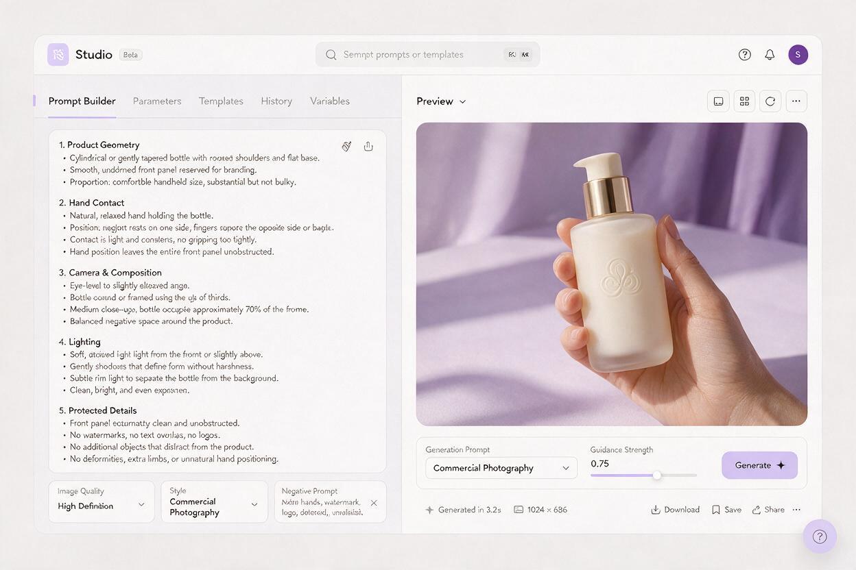
Choose a Camera Angle That Protects Anatomy and Branding
A front-facing package is ideal for label visibility, but it gives the hand fewer places to hide. A strong side angle may make the grip easier, yet it can reduce the label to a narrow sliver. The most practical compromise is often a restrained three-quarter product view with the hand contacting the rear edge.
- Front view: strongest for packaging communication, hardest for an unobstructed wraparound grip.
- Three-quarter view: gives the thumb or fingertips a believable side surface while keeping most of the selling face visible.
- Top-down view: useful for jars, cosmetics, and tabletop scenes, but wrist foreshortening needs careful control.
- Low angle: can make the product feel heroic, although fingers under the pack may merge with its base.
Keep the first generation conservative. Extreme wide-angle language, dynamic foreshortening, and dramatic diagonal poses increase the number of spatial problems Imagen must resolve at once.
Separate Anatomy Tests From Campaign Styling
Generate the grip against a simple studio background before introducing the final location. Evaluate the product-hand relationship at thumbnail size and full resolution. Look for contact shadows, finger count, knuckle direction, wrist alignment, and packaging deformation.
Once the contact works, preserve the physical instructions and change only the styling block:
KEEP UNCHANGED:
Product proportions, grip, finger placement, camera height,
front label visibility, negative-space allocation.

CHANGE ONLY:
Background to a sunlit bathroom in pale stone,
warmer morning light, soft cream robe sleeve,
subtle condensation on the surrounding surface but not on the label.
This creates a clearer revision request than rewriting the complete prompt. It also helps agencies identify whether a failed variation came from the grip, the environment, or a new camera instruction.
Troubleshoot the Failure, Not the Entire Image
Extra or fused fingers
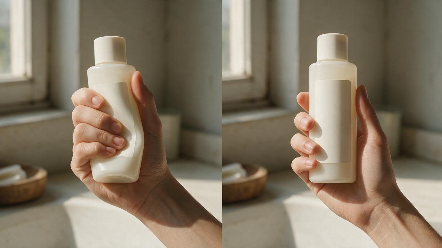
Reduce the number of visible fingers and place the rest behind the package. Replace “hand wrapped around the bottle” with a precise arrangement such as “thumb visible on the side panel; fingertips hidden behind the rear edge.” Also remove unnecessary jewelry or overlapping props during anatomy tests.
The label is covered
Move contact to a narrow side panel, the lower third, or the rear edge. State that the front face is unobstructed, but also provide the hand with another physically plausible support surface. A prohibition alone does not design the grip.
The product looks too small
Add a scale relationship such as “the bottle is approximately the height of the palm” or “the jar spans the width of four fingers.” Keep that phrase unchanged across variations.
The package bends or dents
Describe it as rigid and specify a light support grip with no squeezing. Avoid action verbs such as clutching, crushing, or gripping tightly unless deformation is genuinely intended.
The wrist looks painful
Simplify the entry direction. Ask the forearm to continue naturally beyond the frame rather than bending sharply to present the product. A slightly wider crop can also provide enough room for believable wrist alignment.
Review the Image Like a Production Asset
A visually attractive result is not automatically usable advertising imagery. Inspect each candidate according to what the next department needs.
- Creative: Does the gesture communicate the intended mood without becoming theatrical?
- Brand: Are the silhouette, closure, label zone, and signature proportions protected?
- Retouching: Can small label or skin issues be repaired without rebuilding the entire hand?
- Design: Is there genuine copy space rather than an empty area interrupted by fingers or props?
- Motion team: Would the hand-product relationship remain understandable if this frame became an animation reference?
If the product must be exact, treat the generated image as concept development until it has been compared with approved brand assets. For a pitch or spec ad, clearly label generated packaging and avoid implying final product accuracy that has not been reviewed.
Final Checklist
- Define the product as a physical object before adding campaign adjectives.
- Choose one grip that matches the package shape.
- Specify the palm, thumb, visible fingers, and hidden fingers.
- Give the hand a real support surface away from the label.
- Use a conservative camera angle for the first anatomy test.
- Lock grip and scale instructions before creating campaign variations.
- Check contact shadows, wrist direction, finger count, and pack deformation.
- Compare branded details with approved references before production use.
Keywords
Imagen prompts, product-in-hand ads, product photography, AI image generator, hand anatomy prompts, lifestyle advertising, spec ads