Midjourney Prompts for Clear Anime Ensemble Key Visuals
Anime ensemble posters often fail because every character competes for attention, faces merge, and the cast loses its visual hierarchy. This guide provides reusable Midjourney prompts and composition methods for creating readable anime key visuals with distinct silhouettes, intentional placement, and room for titles.
Table of contents
Create an anime cast poster that reads at a glance
An anime ensemble key visual needs more than attractive characters. The protagonist must dominate, supporting characters must remain recognizable, and the composition must leave usable space for a logo or title. Without that hierarchy, Midjourney may produce a crowded collage, merge costumes, duplicate faces, or give every cast member the same importance.
The solution is to describe the image as a designed promotional composition rather than a group portrait. The prompts below control cast roles, silhouette separation, depth, lighting, and negative space while leaving final typography for your editing software.
Core principle: assign every character one visual job. If two characters have the same scale, position, pose, color emphasis, and lighting, they will compete instead of supporting the composition.
Why anime ensemble posters become confusing
Group key visuals create several simultaneous generation problems. The model must interpret the number of characters, preserve individual attributes, arrange overlapping bodies, and establish a focal point within one image. Long character descriptions alone do not solve these conflicts.
The most common failure is equal emphasis. A prompt may describe one hero and four companions, but the generated image presents five similarly sized faces in a horizontal row. Other predictable failures include:
- Face merging: overlapping heads or hair shapes create hybrid characters.
- Costume leakage: colors, armor, and accessories migrate between cast members.
- Duplicate casting: the protagonist appears twice while a secondary character disappears.
- Weak poster shape: figures fill every corner, leaving nowhere for a title.
- Generic posing: every character faces forward with the same expression.
A better prompt specifies the composition first, then introduces the cast in order of importance.
Build the cast hierarchy before writing the prompt
Reduce the cast to functional roles before opening the ai image generator. A five-character poster rarely needs five equally detailed prompt paragraphs. It needs a lead figure, visual counterweights, and background support.
| Cast role | Recommended treatment | Visual purpose |
|---|---|---|
| Protagonist | Largest figure, central or slightly off-center, strongest contrast | Creates the immediate focal point |
| Rival or co-lead | Second-largest figure, opposing angle or color temperature | Creates tension and balance |
| Supporting pair | Smaller figures on different depth planes | Expands the story without competing |
| Mentor, villain, or mystery figure | Background portrait, silhouette, or atmospheric presence | Adds narrative scale |
| Title area | Quiet sky, wall, smoke, or dark gradient | Provides clean typography space |
Give each important character a compact visual signature. Use one hairstyle, one dominant costume color, one silhouette feature, and one prop. For example: “short silver hair, navy military coat, narrow red scarf, broken spear.” Avoid assigning multiple necklaces, layered patterns, tiny badges, and elaborate weapon mechanics in the first composition draft.
Use a simple cast map
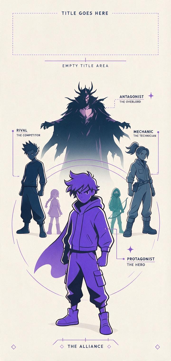
Write a one-line layout before writing prose:
Foreground center: heroine
Midground left: rival
Midground right: mechanic
Background upper right: masked antagonist
Upper left: clear title space
This map gives you an objective way to inspect the result. If the generated poster reverses left and right but preserves hierarchy, it may still work. If it gives every character the same scale, the composition has failed even when the artwork looks polished.
Use one composition prompt before adding character detail
Start with the poster structure and broad cast contrast. Midjourney can explore the visual arrangement without being overloaded by facial details, fabric ornaments, or lore.
vertical anime series key visual, five-character ensemble cast arranged in a strong triangular composition, determined teenage heroine as the largest foreground figure, rival swordsman behind her on the left, cheerful mechanic on the right, two smaller supporting figures separated across the background, enormous masked antagonist suggested through clouds above them, distinct silhouettes, varied body angles, dramatic diagonal light, controlled overlap, clear negative space in the upper left for a title, polished theatrical anime promotional illustration, crisp linework, restrained color palette, no lettering, no logoGenerate several composition candidates and judge them as small thumbnails. At thumbnail size, you should immediately recognize one lead figure, one secondary figure, and a stable overall shape. Facial quality is not yet the deciding factor.
Once a layout works, add only the protagonist’s most important design anchors:
keep the same triangular promotional composition; foreground heroine has a chin-length black bob, one gold hair clip, white flight jacket with cobalt shoulders, orange utility belt, fingerless gloves; preserve distinct cast separation and empty title spaceDo not ask the model to render actual title typography during the composition pass. Reserve an intentionally quiet area and add the final logo later so spelling and placement remain editable.
Adapt the prompt to the story’s central relationship
The same cast can support several poster structures. Choose the structure that communicates the season’s conflict rather than defaulting to a symmetrical lineup.
Hero versus rival split
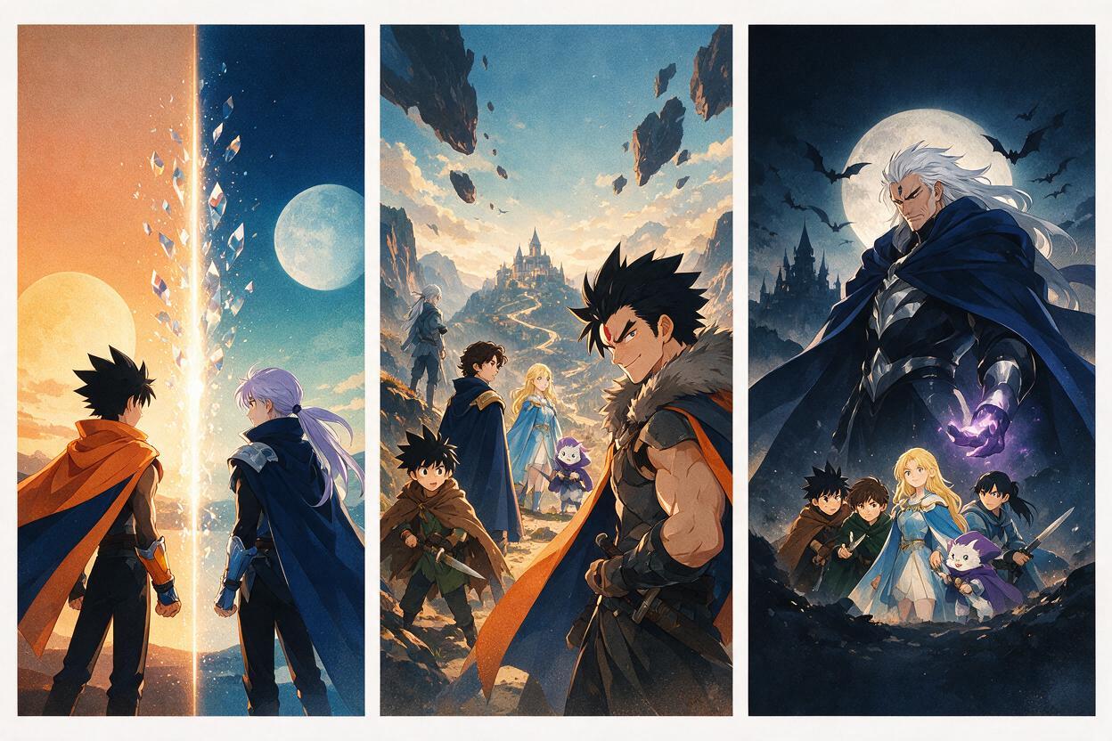
anime key visual built around a hero-versus-rival split composition, heroine in warm sunset light on the left, rival in cold moonlight on the right, both shown in three-quarter profile facing inward, supporting cast reduced to smaller silhouettes below, a narrow empty band across the top for the series title, wind-driven clothing and hair, cinematic tension, clean separation between faces, no textThis layout works when the relationship between two characters is more important than the wider team. Keep the supporting cast small enough that they do not form a third focal point.
Adventure team depth stack
vertical anime adventure poster, charismatic young captain in the foreground looking upward, four companions staggered behind at different depths rather than standing in a row, each character with a unique silhouette and gaze direction, distant floating city framed between the cast, sweeping clouds leading toward open title space, luminous morning palette, energetic theatrical key visual, no typographyDepth stacking makes a large team feel connected without forcing every face onto the same horizontal line. Ask for staggered planes and different gaze directions to prevent the cast from resembling a school photograph.
Villain-dominant season poster
dark fantasy anime season key visual, small group of four heroes forming a compact wedge in the lower third, colossal elegant antagonist portrait emerging from storm clouds behind them, protagonist illuminated by one sharp crimson rim light, supporting characters readable through distinct weapons and silhouettes, spacious darkness at the top center for a title, ominous but uncluttered composition, no wordsThe antagonist can be physically larger because the heroes remain grouped into one readable unit. This establishes threat without requiring additional action effects.
Keep every cast member visually distinct
Character separation depends more on contrast than descriptive length. Give adjacent characters different silhouette families: long coat versus cropped jacket, straight hair versus high ponytail, spear versus circular shield. If two neighboring characters both have long dark hair and black uniforms, the model has little reason to keep their designs separate.
- Limit each character to one dominant color and one accent.
- Place similar hairstyles on opposite sides of the composition.
- Use props with clearly different outer shapes.
- Vary pose direction instead of making everyone face the viewer.
- Separate overlapping heads with sky, light, or contrasting costume areas.
When reference inputs are available, introduce them selectively. Use the protagonist reference during layout refinement, then inspect whether it overwhelms the other designs. A visual reference can guide identity, but it does not replace explicit instructions about scale and placement.
For recurring promotional art, maintain a short identity card for each cast member. Reuse the same wording for immutable features such as hair shape, eye color, signature garment, and prop. Change expressions and staging separately.
Repair the poster without restarting the entire cast
A nearly successful key visual should be repaired locally. Regenerating the complete poster to fix one hand or face risks losing the hierarchy, lighting, and negative space that already work.
Use a targeted editing pass for:
- a duplicated face or missing cast member;
- a hand fused to a weapon;
- costume colors transferred to the wrong character;
- an accessory that changes the protagonist’s silhouette;
- background effects covering the title area.
Keep the correction prompt narrow:
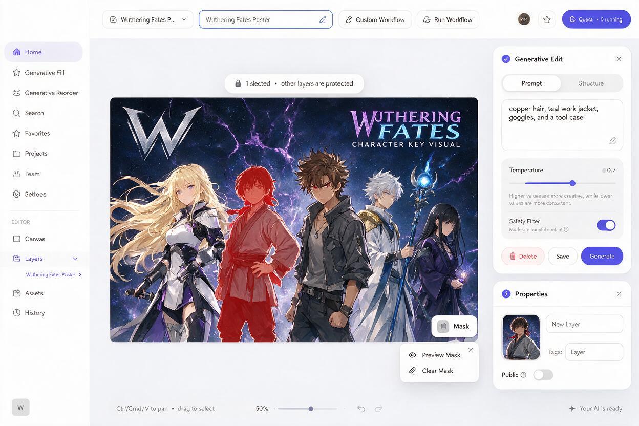
replace only the selected character; restore the supporting mechanic with short copper hair, teal work jacket, round goggles resting on the head, compact tool case held at the side; match the existing anime linework, perspective, lighting, scale, and pose direction; do not alter the surrounding castIf multiple characters are wrong, fix them one at a time. This makes it easier to identify whether the failure comes from the reference, the character description, or excessive overlap.
For the final delivery, enlarge the chosen image, clean critical faces and hands, and place the title in a separate graphics layer. If you want to test the composition with your own cast, create your own version using the base prompt and replace only the four role descriptions.
Reject attractive images that fail as key visuals
A beautiful illustration is not automatically a usable promotional poster. Evaluate each candidate against production requirements rather than surface polish.
| Check | Accept when | Reject when |
|---|---|---|
| Focal hierarchy | The protagonist is identifiable immediately | Your eye jumps randomly between equal faces |
| Cast count | Every required role appears once | A character is missing or duplicated |
| Silhouette clarity | Characters remain distinct at thumbnail size | Hair, limbs, or costumes merge |
| Narrative signal | The layout communicates conflict or teamwork | The cast merely poses for the camera |
| Title space | One area is calm enough for readable type | Effects and faces fill the entire frame |
| Editing potential | Small defects can be repaired locally | The entire spatial arrangement is confused |
Final checklist
- Assign one protagonist, one secondary focal point, and supporting roles.
- Write a cast map before expanding the visual prompt.
- Test the hierarchy at thumbnail size before refining faces.
- Give adjacent characters different silhouettes, colors, props, and pose directions.
- Reserve clean negative space instead of generating finished typography.
- Use references for identity while keeping composition instructions explicit.
- Repair individual characters rather than regenerating a successful layout.
- Reject posters that look polished but lack a clear story or focal point.
Keywords
Midjourney anime prompts, anime key visual, anime ensemble poster, AI anime generator, anime poster composition, consistent anime characters, anime promotional art