Midjourney Prompts for Cohesive Brand Style Exploration (No Generic Mood Boards)
Tired of generic, disjointed AI mood boards for brand pitches? This collection of Midjourney prompts for brand style exploration helps you generate distinct, cohesive visual directions—each with aligned color palettes, typography vibes, and texture systems—ready for client presentation in under an hour. You’ll also learn a structured formula to keep every output in a style direction feeling like part of the same brand system.
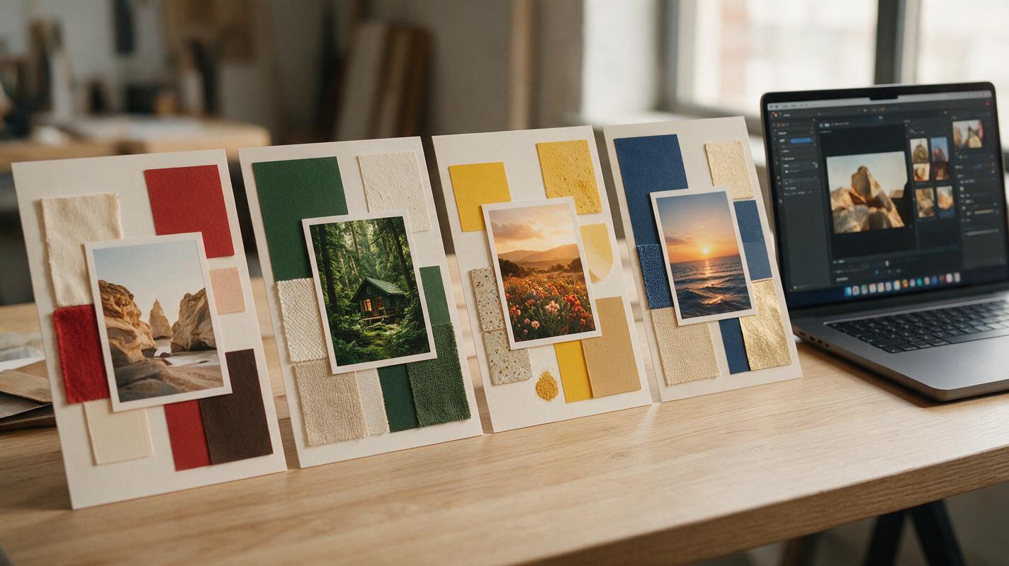
Table of contents
Why AI brand style explorations feel generic (and what to do about it)
If you’ve ever spent 3+ hours curating Pinterest boards for a brand pitch only to get feedback that the direction “feels disjointed,” you know how frustrating early-stage style exploration can be. AI tools promise to speed this up, but most outputs feel like random pretty images—not cohesive brand systems that clients can actually visualize their brand inside.
The issue isn’t the tool—it’s the way most prompts are written. Generic prompts like “minimalist brand mood board” produce generic, disconnected results because they don’t define the rules that hold a brand’s visual system together. With a structured prompt formula, you can generate entire style directions that feel intentional, cohesive, and ready to present to clients in a fraction of the time.
The 4-part prompt formula for cohesive brand style directions
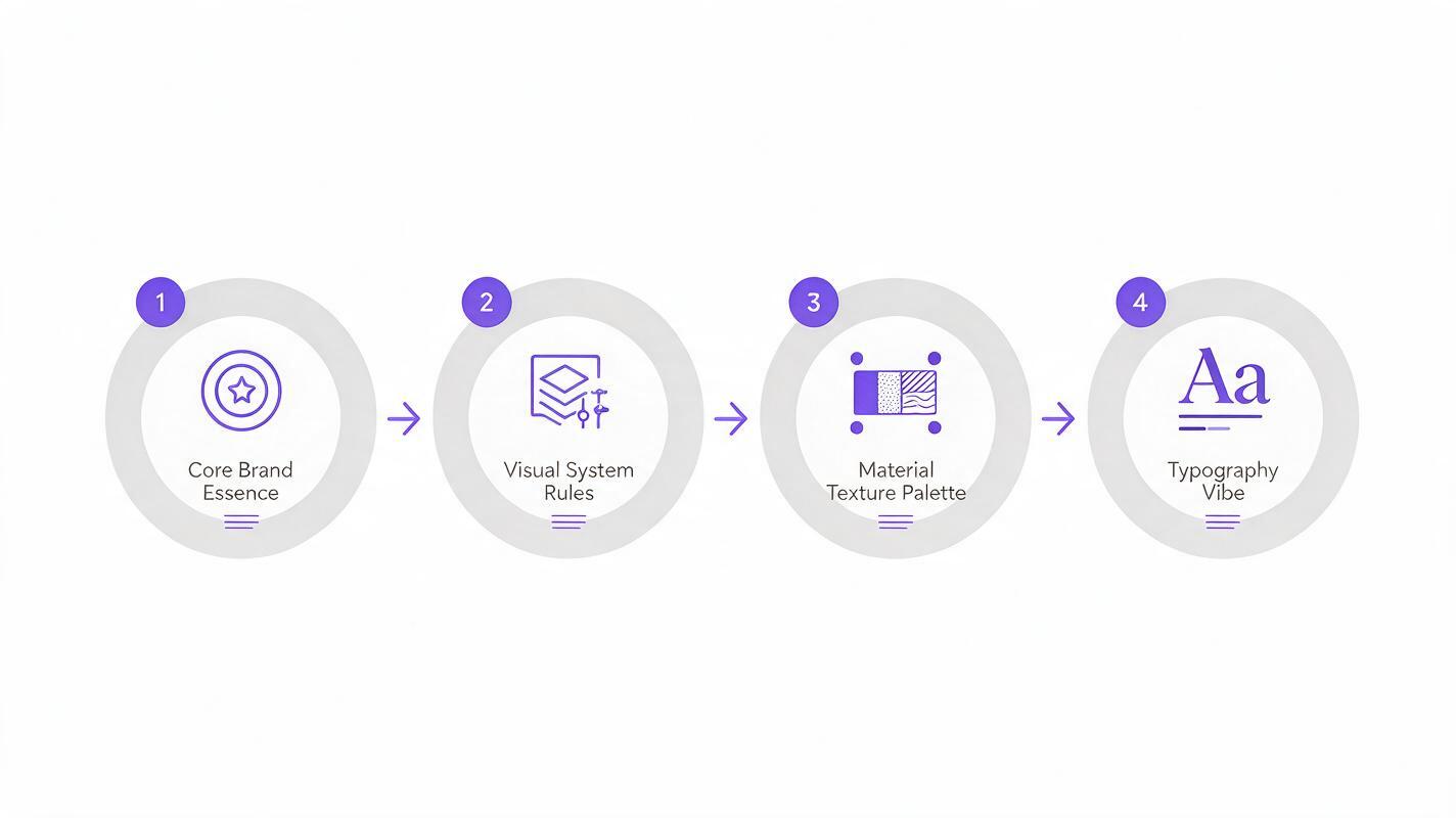
Every cohesive brand style direction is built on four core pillars that work together to feel intentional, not random. When you define all four in your prompt, you eliminate the AI’s tendency to fill gaps with generic design choices, and every output will feel like it belongs to the same brand system.
- Core brand essence + industry: The emotional heart of the brand, its target audience, and what it sells. This grounds every visual choice in the client’s actual brief, not just aesthetic trends.
- Visual system rules: Explicit constraints for color palette, lighting, composition, and negative space. These act as the “brand guidelines” for the AI to follow.
- Material + texture palette: The physical materials that define the brand’s tactile feel (e.g., recycled paper, frosted glass, brushed metal). This adds depth and consistency across all assets.
- Typography vibe + placement: The style of typography and where it appears in the frame. This ensures your style direction includes clear typography guidance, not just pretty imagery.
Each prompt is tuned to generate a single hero style frame that acts as the north star for the entire direction. Once you have a hero frame you love, you can use it as a reference to generate all the supporting assets you need for a client presentation.
4 ready-to-use brand style direction prompts
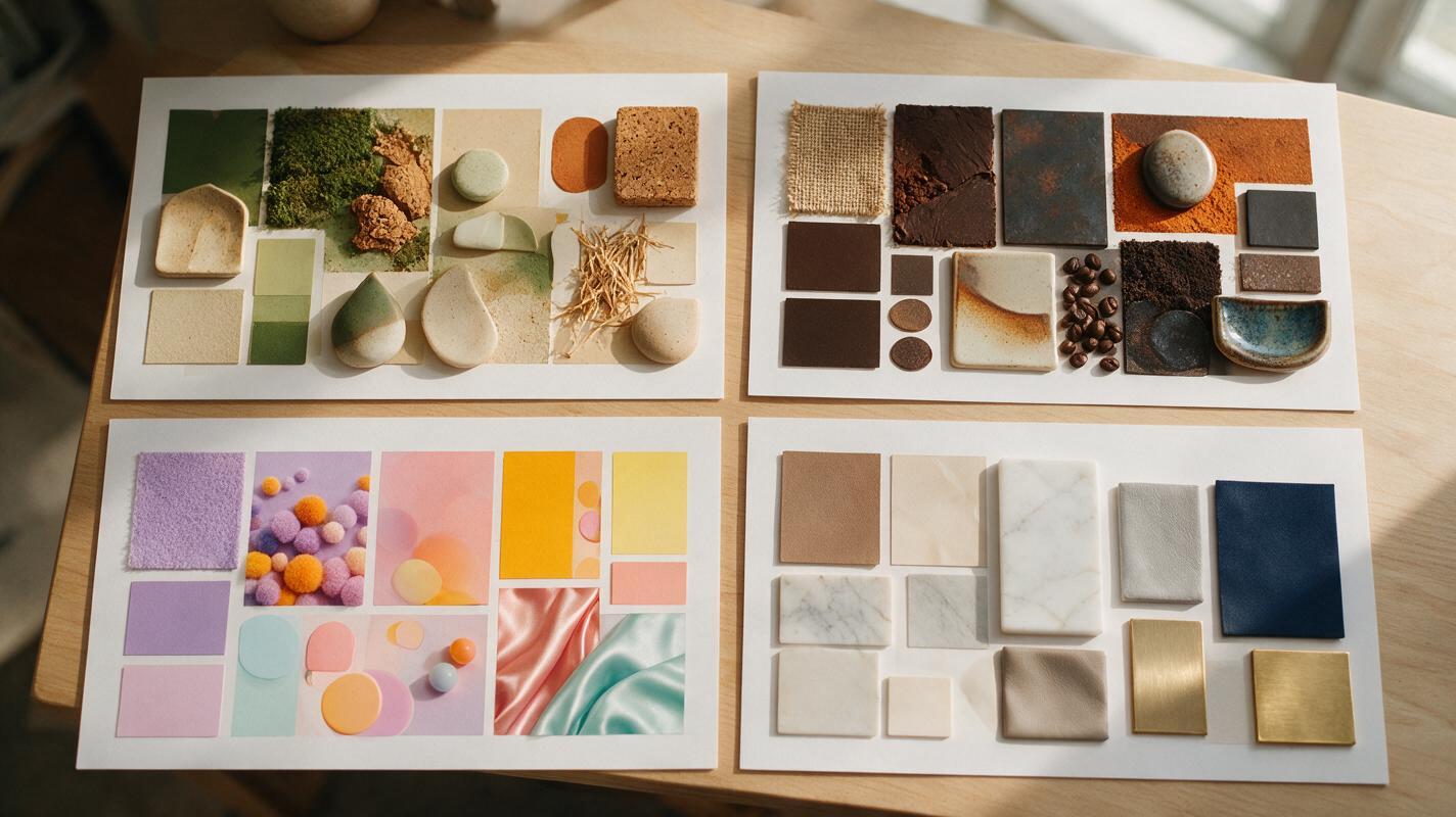
These pre-built prompts are tailored to four common brand types, each with a distinct voice and audience. Swap out the core essence, color palette, and material list to match your client’s specific brief.
Sustainable organic skincare (warm, earthy, minimalist)
Best for clean beauty, wellness, or eco-friendly lifestyle brands targeting mindful, eco-conscious consumers. The soft, grounded palette and natural materials communicate transparency and gentleness.
Cohesive brand style direction for a sustainable organic skincare brand, core essence: gentle, grounded, transparent, for 25-35 year old eco-conscious women. Visual system rules: warm earthy color palette of terracotta, soft sage, cream, and muted terracotta, soft diffused natural light, 60% negative space, minimalist flat lay composition. Material palette: recycled kraft paper, frosted glass jars, dried lavender, raw cotton, wooden spatulas. Typography vibe: soft rounded sans-serif, all lowercase, minimal text placed in the top left corner. Photorealistic, high resolution, no text artifacts --ar 4:5 --style rawIndie specialty coffee roaster (bold, warm, community-focused)
Ideal for small-batch food and beverage brands, local cafes, or artisanal product lines targeting creative, community-focused audiences. The high-contrast palette and handcrafted details feel approachable and full of personality.
Cohesive brand style direction for an indie specialty coffee roaster, core essence: bold, warm, community-driven, for 20-40 year old creative professionals. Visual system rules: rich warm color palette of burnt orange, deep brown, cream, and forest green, high contrast soft lighting, dynamic diagonal composition, 30% negative space. Material palette: matte black coffee bags, vintage ceramic mugs, burlap sacks, handwritten paper notes, wooden coffee beans. Typography vibe: bold condensed serif, mixed case, hand-drawn accent details, text placed along the bottom edge. Photorealistic, high resolution, no distorted text --ar 4:5 --style rawCreator-focused SaaS tool (playful, modern, approachable)
Perfect for tech startups, productivity tools, or creator platforms targeting young, digital-native audiences. The bright, geometric palette and playful details feel empowering and easy to use.
Cohesive brand style direction for a creator-focused SaaS tool, core essence: playful, empowering, intuitive, for 18-35 year old content creators and freelancers. Visual system rules: bright vibrant color palette of electric purple, tangerine, mint green, and off-white, soft even studio lighting, geometric layered composition, 40% negative space. Material palette: frosted acrylic shapes, glossy phone screens, neon sticker sheets, woven desk mats, pastel stationery. Typography vibe: bold geometric sans-serif, mixed case, playful kerning, text placed centrally at the top. Photorealistic, high resolution, no garish colors --ar 4:5 --style rawLuxury home goods (elegant, timeless, understated)
Designed for high-end home decor, fashion, or lifestyle brands targeting affluent, quality-focused consumers. The muted neutral palette and symmetrical composition feel sophisticated and timeless.
Cohesive brand style direction for a luxury home goods brand, core essence: elegant, timeless, understated, for 35-65 year old affluent homeowners. Visual system rules: muted neutral color palette of warm ivory, soft taupe, charcoal gray, and brushed gold, soft directional natural light, symmetrical minimalist composition, 50% negative space. Material palette: linen cushions, marble coasters, brushed brass candle holders, oak wood bowls, silk throw blankets. Typography vibe: thin elegant serif, all uppercase, wide letter spacing, text placed in the bottom right corner. Photorealistic, high resolution, no clutter --ar 4:5 --style rawTest this prompt yourself by swapping out the core essence, color palette, and material list to match your client’s specific brief. Start with one hero frame per direction, then refine the prompt based on what works before generating supporting assets.
Expand a single style frame into a full presentation set
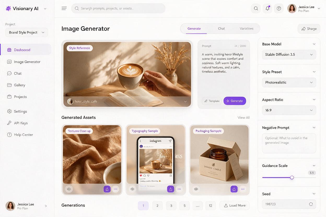
A single hero frame is a great starting point, but clients need to see how the style translates across multiple touchpoints to buy into the direction. Once you have a hero frame you’re happy with, use it as a style reference to generate supporting assets for your pitch deck.
For Midjourney, add --sref [your hero image URL] to the end of your prompt to lock in the style, color palette, and overall vibe. For even tighter brand consistency, you can use an ai image generator with reference locking capabilities to generate supporting assets that match your hero frame’s style down to the exact color and texture.
For each style direction, generate these 4 supporting assets to build a complete presentation:
- 3-4 texture close-ups to showcase the material palette in detail
- 2 typography-focused frames to demonstrate headline and body text styles
- 1 social media mockup to show how the style works for digital touchpoints
- 1 packaging or product snippet for physical product brands
Curate 8-10 total assets per direction for a balanced, easy-to-follow presentation that helps clients visualize exactly what their brand could look like.
Final checklist
- Start every prompt with a clear core brand essence tied directly to your client’s brief
- Define explicit visual system rules (color palette, composition, lighting, negative space) to avoid generic outputs
- Include a material + texture palette to give the direction a consistent, tactile feel
- Add a typography vibe and placement rule to ensure your direction includes clear type guidance
- Use your hero style frame as a reference for all supporting assets to prevent style drift
- Curate 8-10 assets per direction for a clear, compelling client presentation
Keywords
midjourney brand prompts, brand style exploration, ai brand design, brand mood board prompts, ai style direction, graphic design prompts, brand visual system