Midjourney Prompts for Readable Game Item Icons
Use these Midjourney prompt structures to design readable weapons, consumables, quest items, and crafting materials for game interfaces. The guide focuses on silhouette, visual hierarchy, set consistency, gameplay-scale testing, and practical cleanup.
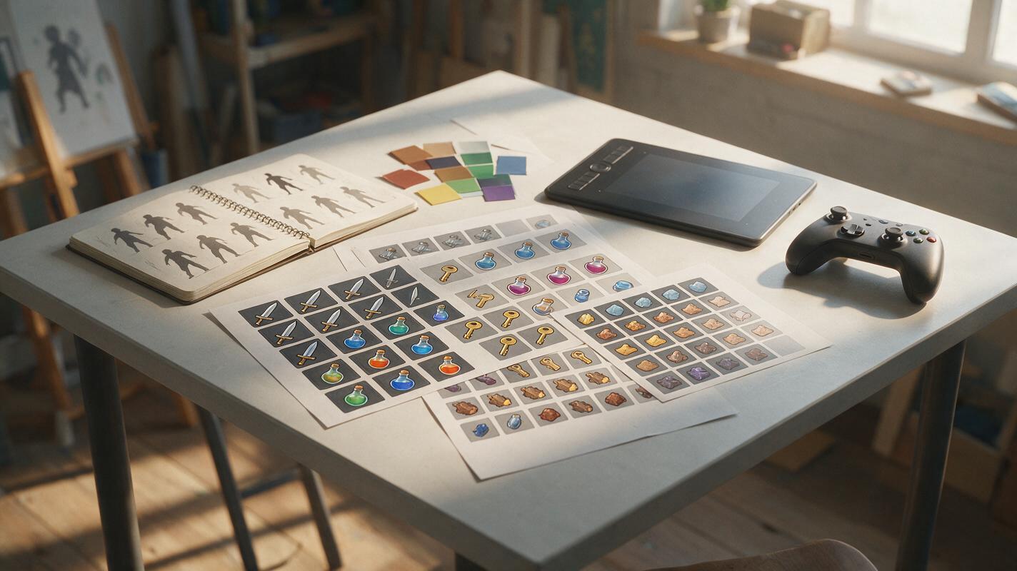
Table of contents
Design icons that stay readable at gameplay size
A beautiful inventory icon can still fail if players cannot identify it at 48 pixels.
Midjourney can quickly explore shapes, materials, colors, and rarity treatments for game item concepts, but an attractive render is not automatically a usable icon. Small props often become muddy, weapon silhouettes overlap their frames, and decorative effects hide the object that players need to recognize.
The prompts below prioritize readable silhouettes and controlled visual hierarchy. Use them to explore an icon family, select strong concepts, and create a paintover base—not as a substitute for final UI testing or production cleanup.
Define the icon grammar before prompting
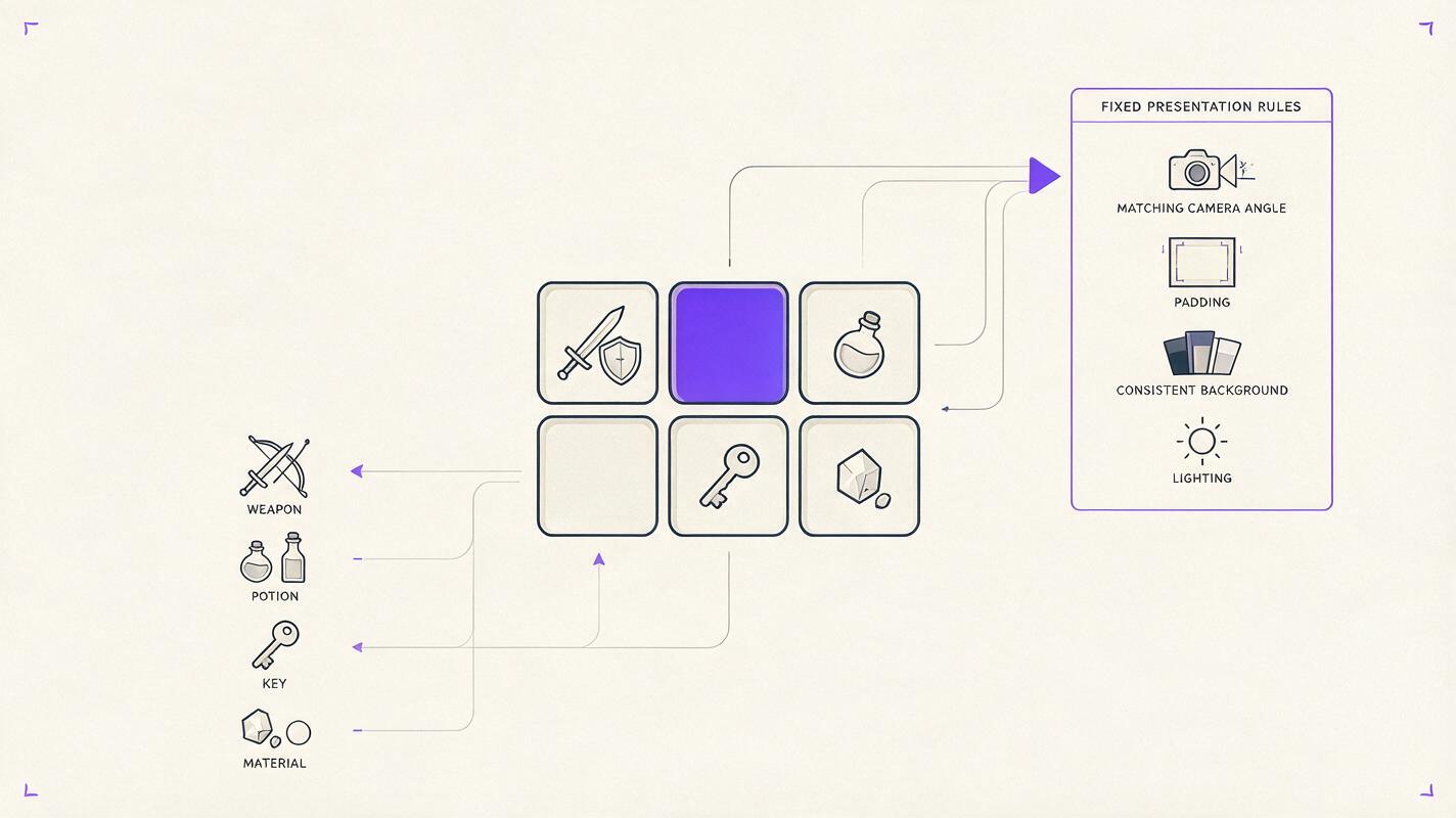
An icon set needs shared rules. Without them, Midjourney may produce a sword as a dramatic scene, a potion as a product photograph, and a quest key as an ornate illustration. Each image can look polished while the inventory grid feels unrelated.
Write a compact art direction brief before opening an ai image generator. Lock the camera, framing, background, lighting, and rendering family. Allow the object shape and gameplay color to change.
| Design variable | Lock across the set | Change by item |
|---|---|---|
| Camera | Front three-quarter or flat orthographic view | Only when silhouette demands it |
| Framing | Centered object with consistent padding | Object scale for unusually long items |
| Background | Plain neutral field | Subtle rarity halo if required |
| Lighting | Same direction and contrast | Small material-specific highlights |
| Gameplay cue | One dominant cue per icon | Color, shape, material, or contained effect |
Keep the prompt focused on a single object. Words such as environment, scene, cinematic battlefield, or character holding can encourage unwanted narrative backgrounds.
Prompts for weapons with clear silhouettes
Weapon icons become difficult to read when the blade, guard, handle, particles, and border compete for attention. Start with the weapon class and its dominant silhouette. Add lore details only after the shape is recognizable.
Readable fantasy sword
Single game inventory icon of a frost knight longsword, broad asymmetrical blade with one chipped edge, short wing-shaped guard, dark wrapped grip, pale blue ice concentrated near the blade tip, strong uninterrupted outer silhouette, centered diagonal presentation, generous empty space around the weapon, neutral charcoal background, controlled studio lighting, crisp painted concept art, no hands, no character, no text, no border, no sceneryHeavy science-fiction weapon
Single game inventory icon of a compact industrial plasma hammer, oversized rectangular striking head, short reinforced handle, one visible orange energy chamber, functional hard-surface construction, bold top-heavy silhouette, centered three-quarter view, consistent margin on all sides, simple muted background, high-contrast game concept rendering, no operator, no interface text, no action sceneIf a generated weapon is too detailed, remove lore adjectives and reduce the design to three components: primary mass, grip, and gameplay accent. Restore secondary detail only after the thumbnail reads correctly.
Prompts for potions and consumables
Consumables often share the same bottle shape, leaving color as the only identifier. That creates accessibility and localization problems. Give each effect its own container silhouette, closure, fill behavior, and label shape.
Healing potion with shape-based recognition
Single game inventory icon of a healing potion, squat round glass bottle with wide shoulders, thick cork stopper wrapped by one white bandage strip, luminous crimson liquid filling the lower two thirds, simple heart-shaped negative space in the glass embossing, clean centered composition, isolated on a desaturated navy background, readable at small scale, polished hand-painted game icon, no letters, no hands, no table, no environmentTemporary stealth consumable
Single game inventory icon of a stealth elixir, narrow crescent-shaped smoked-glass vial, silver cap, translucent violet liquid appearing to vanish toward the top, one restrained wisp contained close to the bottle, distinct curved silhouette, centered with generous padding, neutral dark background, crisp fantasy game UI concept art, no text, no character, no decorative frameGenerate the healing, defense, speed, and stealth items together as a contact sheet during exploration. You are more likely to catch duplicated silhouettes when the whole consumable family is visible at once.
Prompts for quest items and crafting materials
Quest objects need narrative character, but miniature storytelling must not overwhelm identification. Build the story into one physical anomaly: a broken seal, an impossible glow, a recognizable crest, or a material that does not belong.
Quest key with a narrative hook
Single game inventory icon of an ancient observatory key, long bronze stem ending in a circular astrolabe bow, one missing gear tooth, small turquoise mineral embedded at the center, oxidized edges, unmistakable key silhouette, centered diagonal orientation, plain warm-gray background, focused directional light, detailed but readable game concept art, no treasure chest, no hand, no text, no roomCrafting material for an upgrade system
Single game inventory icon of a thunder beetle carapace used for armor crafting, two overlapping cobalt shell plates with jagged ivory edges, one thin lightning vein crossing the larger plate, compact triangular silhouette, top-down three-quarter view, isolated centered composition, matte neutral background, clean RPG inventory art, no living insect, no landscape, no text, no borderFor stackable materials, avoid a random pile. Ask for two or three deliberately arranged units with a clean combined contour. A scattered heap creates tiny gaps that collapse into noise when reduced.
Keep a set consistent without making every icon identical
Consistency comes from repeated presentation rules, not repeated object shapes. Preserve the same camera family, background value, lighting direction, edge treatment, and amount of empty space. Vary silhouettes aggressively so players can scan the inventory without reading labels.
A reusable prompt shell makes those fixed and variable parts easier to control:
Single game inventory icon of [ITEM NAME AND FUNCTION], [PRIMARY SILHOUETTE], [TWO DEFINING COMPONENTS], [ONE GAMEPLAY COLOR OR EFFECT], centered [CAMERA ANGLE], generous consistent padding, isolated on [BACKGROUND], light from [DIRECTION], [RENDERING FAMILY], readable at small scale, no hands, no character, no environment, no text, no decorative frameKeep one approved icon beside new generations as a visual benchmark. If the current Midjourney workflow available to you accepts image or style references, use the approved icon to reinforce presentation rather than copying its object design. The new item still needs an independent contour.
Change one variable per iteration. If you alter the camera, background, material, silhouette, and lighting simultaneously, you will not know which change improved—or damaged—the set.
Test readability at the size players will see
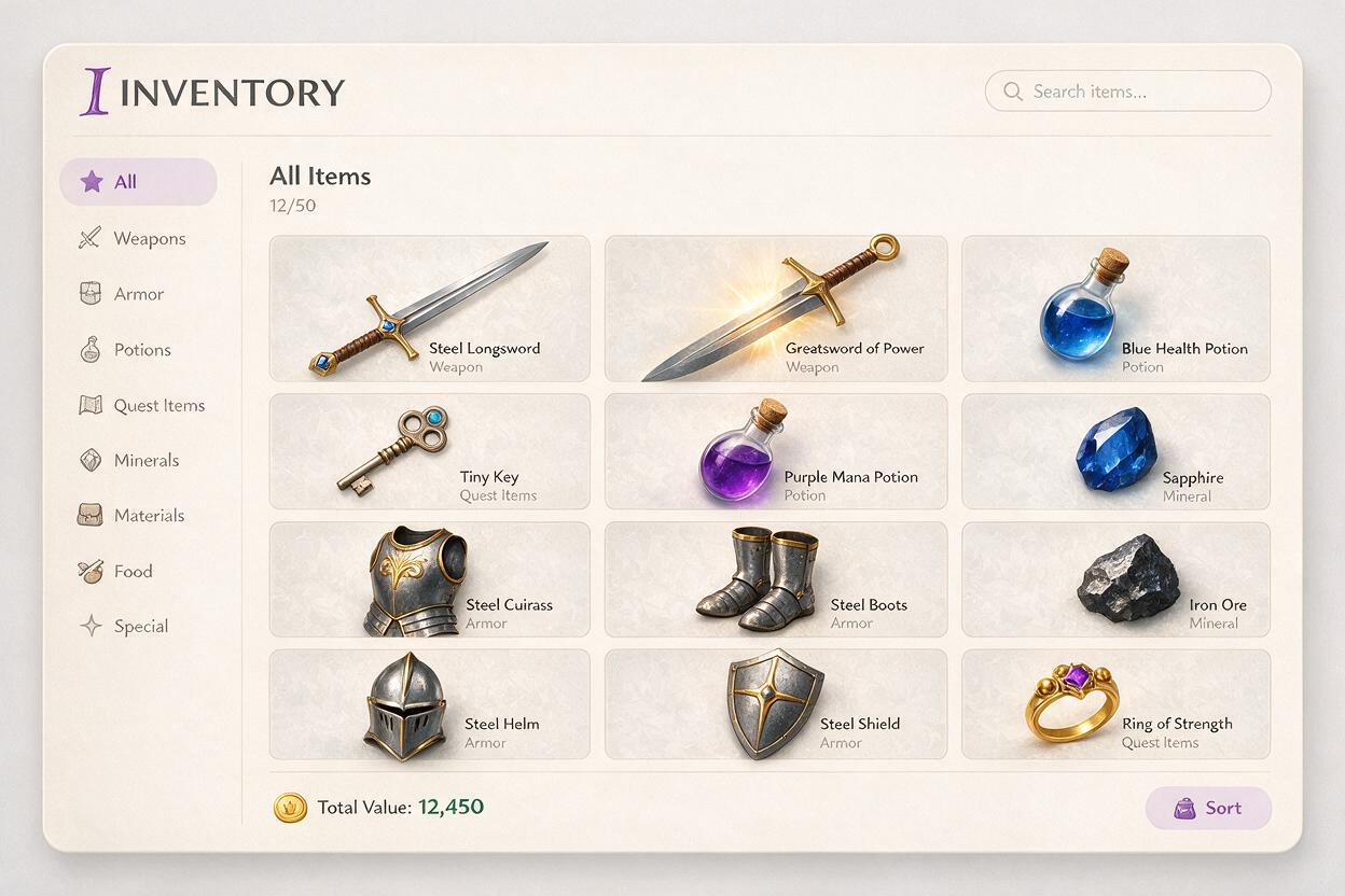
Do not evaluate icons only in a large generation gallery. Place candidates inside a mock inventory slot at the smallest intended display size. Test them against the actual UI background and beside neighboring item classes.
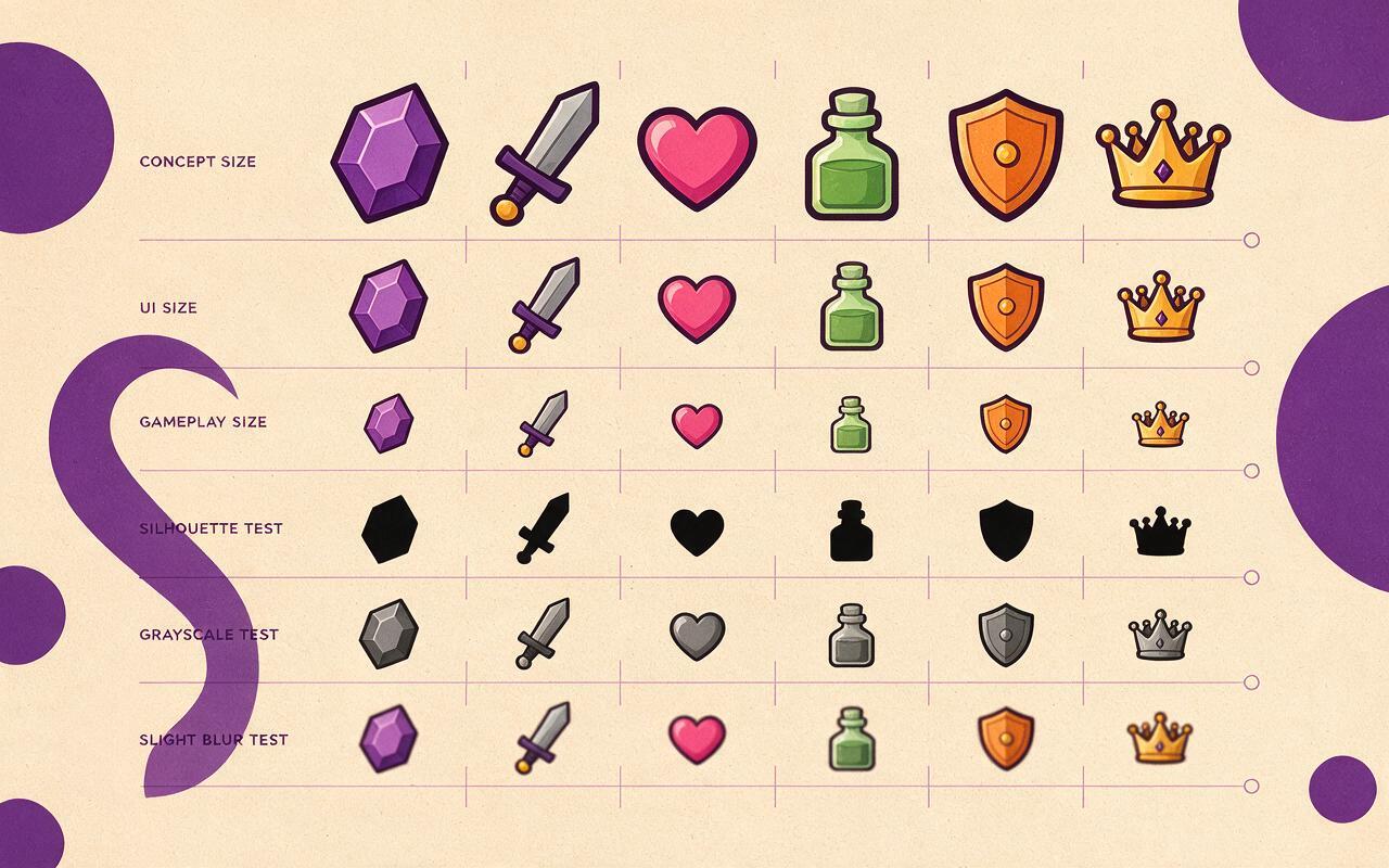
- Silhouette test: Fill the object with solid black. Its class should remain plausible.
- Blur test: Apply a slight blur. The dominant mass and gameplay color should survive.
- Grayscale test: Remove color. Important items should not become identical in value.
- Neighbor test: Compare the icon with five adjacent items, not in isolation.
- Scale test: Inspect the image at intended gameplay size rather than zooming in.
If two items collide visually, change their shape before adding stronger glow. Effects can emphasize a useful distinction, but they rarely repair a weak silhouette.
Fix the failures that make generated icons unusable
| Failure | Likely cause | Prompt correction |
|---|---|---|
| Object is cropped | Insufficient framing instructions | Add generous padding and fully visible object |
| Icon becomes a scene | Narrative language dominates | Specify single isolated inventory object and plain background |
| Silhouette is noisy | Too many ornaments or particles | Request one uninterrupted outer contour and one restrained effect |
| Set changes style | Presentation rules vary between prompts | Reuse camera, light, background, and rendering phrases verbatim |
| Item class is unclear | Lore detail replaces functional anatomy | Name the object class and its essential components first |
| Small icon looks muddy | Low-value contrast and excessive texture | Request distinct large value groups and simplified material detail |
Negative instructions help, but the positive description should carry most of the design. Instead of listing twenty unwanted elements, state the exact object, contour, composition, and visual priority you need.
Choose what to keep, repaint, and export
Treat generated results as concept candidates. Select an icon for its silhouette and gameplay communication before judging surface polish. A clear, slightly plain design is easier to finish than an elaborate image with confused anatomy.
During cleanup, redraw malformed handles and fasteners, remove accidental symbols, normalize margins, simplify tiny texture, and verify transparency around the object. Check that any emblem is an intentional design rather than pseudo-lettering. Export sizes should follow the game’s UI pipeline, with final review performed in-engine whenever possible.
Use the shared prompt shell to build a small class set first—such as three weapons and three consumables—then test this prompt yourself with your own visual rules before expanding to dozens of assets.
Final checklist
- The object class is identifiable without reading its name.
- Each item has one dominant silhouette and one primary gameplay cue.
- Camera, padding, lighting, and background remain consistent across the set.
- Consumables differ by shape as well as color.
- Particles and glow stay close to the object contour.
- Icons remain distinct in grayscale and at intended gameplay size.
- Malformed details, accidental symbols, and pseudo-text are repainted.
- Final assets are reviewed inside the actual inventory UI.
Keywords
midjourney prompts, game item icons, game UI design, concept art, weapon icons, potion icons, inventory art