Midjourney Prompts for Packaging Moodboards That Don’t Look Generic
Generic packaging moodboards collect attractive references without defining a usable design direction. This guide provides a practical Midjourney prompt framework, four reusable prompt templates, and a review method for turning image exploration into a coherent packaging concept system.
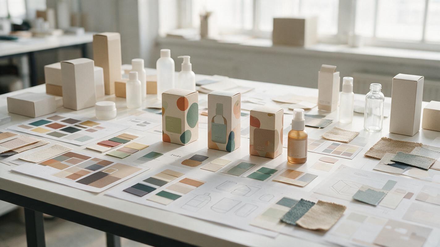
Table of contents
Build a packaging direction, not a collage of trends
A packaging moodboard should help a design team decide what to make. Yet AI-generated boards often combine fashionable bottles, dramatic lighting, random materials, and unreadable labels without establishing a distinctive brand idea.
The solution is to stop prompting for a finished moodboard. Use Midjourney to explore controlled visual ingredients—material, form, color, image language, typography character, and retail context—then curate those ingredients into a direction that can survive across multiple SKUs.
The key distinction: inspiration shows what looks appealing; art direction defines which visual rules should be repeated.
Define the decisions your moodboard must support
Before generating images, clarify what the packaging concept needs to resolve. A useful moodboard should provide evidence for several connected decisions rather than merely communicating an atmosphere.
- Brand position: accessible, specialist, rebellious, clinical, artisanal, luxurious, playful, or another specific territory.
- Structural character: compact and geometric, tall and elegant, soft and tactile, modular, refillable, or visibly functional.
- Material language: uncoated paper, translucent polymer, brushed metal, molded fiber, glossy film, ceramic, or combinations with a clear reason.
- Graphic behavior: restrained grids, oversized typography, dense information, symbolic illustration, photographic crops, or pattern systems.
- Color logic: one dominant brand field, coded SKU accents, tonal neutrals, high-contrast pairs, or material-led color.
- Presentation context: shelf blocking, direct-to-consumer unboxing, pharmacy display, boutique counter, or editorial campaign imagery.
Write one sentence that connects these decisions. For example: “A refillable body-care range that makes laboratory precision feel warm through molded fiber, mineral colors, and compact editorial typography.” This sentence becomes the strategic core of every prompt.
Build the art-direction input before prompting
Prepare a small input sheet containing the approved brand palette, existing logo, target consumer, packaging formats, competitor category, and two or three material references. Do not fill it with dozens of stylistically unrelated images. Excessive references make it harder to identify which visual property produced a useful result.
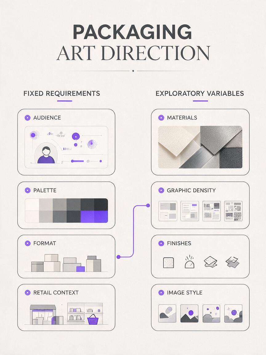
When using an ai image generator, separate fixed requirements from exploratory variables:
| Keep fixed | Explore deliberately |
|---|---|
| Brand position and audience | Material combinations |
| Required packaging formats | Graphic scale and density |
| Core color boundaries | Photography or illustration language |
| Retail environment | Finishes, closures, and secondary details |
| Accessibility requirements | Composition and presentation style |
This distinction prevents each generation from becoming a completely new brand. Change one exploratory variable at a time and label the output accordingly: “material study,” “graphic density study,” or “shelf-presence study.”
Use a prompt structure that produces design evidence
A productive packaging prompt describes a strategic proposition before describing aesthetics. It also asks for a study of related artifacts rather than one isolated hero pack.
[category and packaging formats], designed for [specific audience and position], art direction based on [clear brand idea], [structural character], [material system], [color logic], [graphic behavior], [image or illustration language], shown as a curated packaging design study with material swatches, structural details, close crops and retail context, coherent visual system, realistic production-aware finishes, no copied brands, no legible logos, no decorative trend collageTerms such as “premium,” “modern,” and “minimal” are too broad on their own. Replace them with visible choices. Instead of “premium minimalist skincare,” describe “low-profile amber glass, warm gray labels, narrow typographic columns, blind embossing, and one vermilion batch marker.”
Packaging moodboard prompts for four distinct directions
Quiet technical skincare
A facial skincare packaging family for design-conscious urban consumers, art direction balancing dermatological precision with domestic warmth, compact cylindrical bottles and low jars, frosted glass with warm off-white labels, charcoal micro-typography, one rust-red coded marker per formula, restrained information grid, soft daylight product photography, curated design study showing material swatches, closure details, label hierarchy and pharmacy shelf grouping, coherent across five SKUs, realistic finishes, no existing brand names, no readable logoThis direction works when the brand needs credibility without adopting the cold blue-and-white visual conventions associated with generic clinical packaging.
Bold pantry staples
A family of pantry staple packages for young shared households, energetic and highly recognizable from across a supermarket aisle, sturdy cartons and flexible pouches, saturated cobalt base color with SKU-coded citrus accents, oversized geometric symbols, short typographic blocks, matte surfaces with selective gloss details, curated packaging art-direction study showing front panels, side-panel rhythm, shelf blocking and macro print texture, consistent system across grains, pasta and spices, no existing brands, no legible textThe prompt defines how the range behaves on a shelf, not just how an individual package looks in a studio render.
Material-led specialty tea
A specialty loose-leaf tea packaging system positioned as contemporary craft rather than nostalgic luxury, stackable paper canisters and refill envelopes, visible recycled fibers, mineral black ink, muted clay and moss color coding, abstract botanical linework derived from growing regions, generous blank space, small foil-free seals, curated design study with paper samples, illustration fragments, canister proportions, refill relationship and boutique counter display, tactile natural daylight, coherent and production-aware, no calligraphy clichés, no existing logosNegative instructions are most effective when they reject a category cliché and the positive description supplies a replacement.
Playful confectionery without childish clichés
A modular confectionery packaging family for adults who enjoy playful gifting, compact boxes with unexpected opening structures, deep plum and apricot palette, bold cropped letterforms used as abstract shapes, small surreal fruit illustrations, contrasting matte and glossy print areas, sophisticated humor without cartoon mascots, curated art-direction study showing box structures, pattern fragments, gift-stack composition and point-of-sale display, consistent across six flavors, realistic paper construction, no existing brand identity, no readable product namesHere, “sophisticated humor” is supported by concrete devices—cropped type, surreal fruit, and unusual openings—rather than left as an ambiguous mood word.
Generate components instead of one giant moodboard
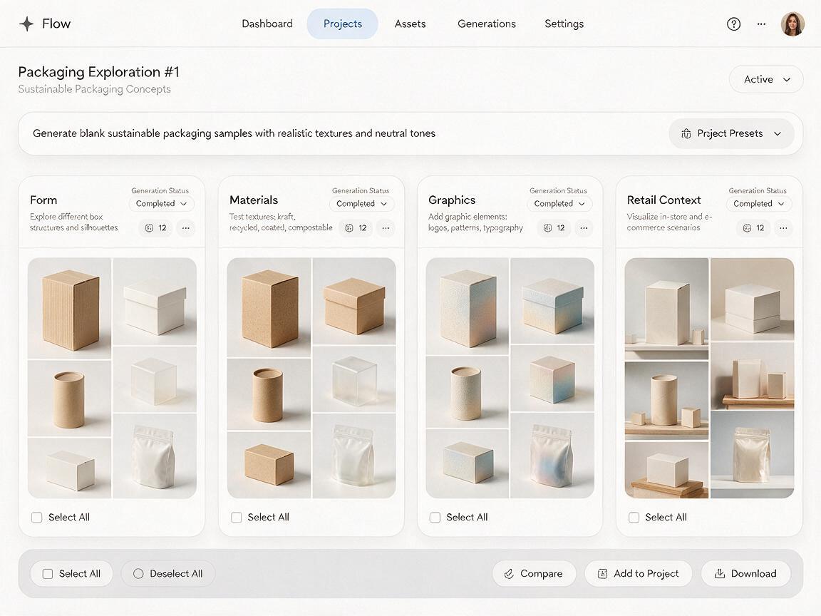
AI tends to make all-in-one moodboards visually busy and strategically vague. Generate separate batches for the components you need to evaluate:
- Form batch: silhouettes, proportions, closures, and pack-family relationships.
- Material batch: paper grain, transparency, metallic effects, embossing, and finish contrast.
- Graphic batch: label architecture, pattern scale, illustration behavior, and typographic massing.
- Context batch: shelf blocking, unboxing, retail display, and campaign crops.
Keep the strategic sentence and core palette unchanged across the batches. Only replace the final clause to request the relevant study. This creates comparable evidence and makes curation faster.
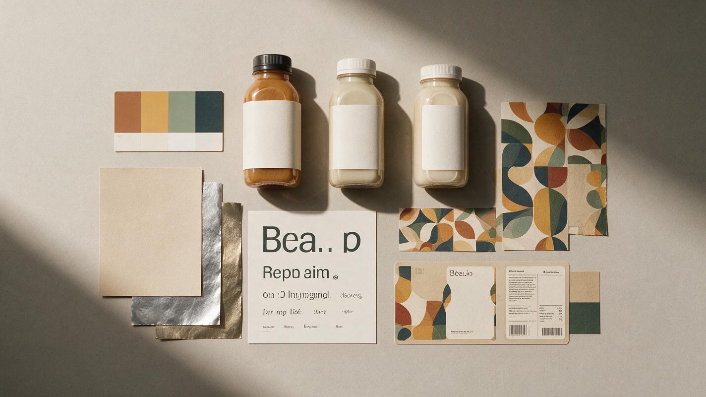
Do not judge AI-generated letterforms as finished typography. Treat them as indicators of scale, rhythm, density, and placement. Rebuild all naming, claims, regulatory information, barcodes, and final typography in professional layout software.
Score directions before polishing them
A visually impressive route can still be weak brand design. Review each direction against the same criteria before investing in mockups.
| Criterion | Question to ask | Warning sign |
|---|---|---|
| Distinctiveness | Could this be recognized without the logo? | It resembles a category trend collage. |
| Extendability | Can the idea support ten or more SKUs? | Every variant requires a new visual trick. |
| Hierarchy | Is there a repeatable place for brand, product, variant, and claims? | The composition only works with fictional text. |
| Production realism | Can the finishes and structures plausibly be made? | Effects depend on impossible folds or materials. |
| Context fit | Does the direction work in its real sales environment? | It only looks convincing in a dramatic studio scene. |
| Brand relevance | Does every visual choice support the proposition? | The rationale is limited to “it feels premium.” |
Score each category from weak to strong, then write one sentence explaining the result. A direction with slightly less visual spectacle but stronger extendability and hierarchy is usually the better foundation for a brand system.
Turn the selected direction into a brand image system
Once a route is selected, extract rules instead of copying the generated package literally. Define a limited system covering color proportions, material combinations, image treatment, pattern behavior, typographic scale, and composition.
- Color: specify dominant, supporting, and SKU-code proportions.
- Materials: define which substrate is primary and where accent finishes are permitted.
- Typography: translate the generated visual character into licensed typefaces and a real hierarchy.
- Images: document crop, light, background, lens character, and subject behavior.
- Layout: establish alignment, margins, information zones, and rules for different pack sizes.
Then test the system on the least glamorous requirements: a back panel, a small format, a multilingual label, and a low-cost SKU. If the idea survives those applications, it is becoming a design system rather than remaining a moodboard.
Fix the patterns that make AI packaging feel generic
Every result looks like the same luxury concept
Remove abstract status terms and describe category-specific behavior. State the sales channel, price position, package structure, print limitations, and information density. “Uncoated carton with one ink and a stamped batch code” produces a clearer territory than “timeless premium packaging.”
The board contains too many unrelated ideas
Reduce the number of variables in each generation. Hold form and palette constant while exploring materials, or hold materials and structure constant while exploring graphic scale. Do not explore everything simultaneously.
The package looks attractive but cannot carry real information
Add hierarchy requirements to the prompt: a stable brand zone, a product-name zone, a visible SKU marker, and a secondary information area. Use the output only to assess architecture; rebuild all text manually.
The concept collapses across a product range
Request a family of distinct formats and variants in the same study. Look for a transferable principle—such as a color bar, illustration crop, structural notch, or typographic ratio—rather than identical decoration on every pack.
Final checklist
- Write one strategic art-direction sentence before generating images.
- Separate fixed brand requirements from exploratory variables.
- Describe visible design choices instead of relying on vague style labels.
- Generate form, material, graphic, and context studies as separate batches.
- Evaluate distinctiveness, hierarchy, extendability, feasibility, and context fit.
- Rebuild typography, regulatory content, logos, and final layouts manually.
- Test the selected system on multiple SKUs and difficult packaging formats.
When your direction is specific enough to evaluate, try these models for free and compare several controlled variations before committing to detailed mockups.
Keywords
Midjourney packaging prompts, AI packaging design, packaging moodboard, graphic design prompts, brand design AI, packaging concept, AI brand image