Midjourney Prompts for Seamless Website Background Textures
Create seamless Midjourney textures that can repeat across large website sections without visible borders, distracting motifs, or poor text contrast. This guide includes reusable prompts, layout testing methods, and export recommendations for production-ready landing-page backgrounds.
Table of contents
Create a repeatable background without visible seams
A seamless website texture must do more than look attractive as a single square. It needs to repeat across wide screens without forming obvious borders, dark clusters, accidental focal points, or patterns that compete with headings and buttons. Midjourney can produce a strong starting tile, but the prompt must describe repetition, visual density, contrast, and scale—not just the desired style.
This method is designed for subtle hero backdrops, feature-section textures, pricing-page bands, product-page backgrounds, and other landing-page visuals that need more character than a flat color without becoming decorative noise.
Why AI textures show seams on real pages
A generated square may appear balanced in isolation yet fail as soon as it is repeated. The most common problem is not a literal line at the tile boundary. It is a rhythm break: a bright shape, heavy shadow, or unusually empty area repeats at predictable intervals and reveals the grid.
Website backgrounds also expose problems that are easy to miss in an image preview:
- Edge mismatch: forms reaching one edge do not continue naturally from the opposite edge.
- Center bias: the model creates a central composition rather than an evenly distributed surface.
- Contrast spikes: isolated light or dark patches reduce text readability.
- Wrong motif scale: large objects become repetitive wallpaper instead of subtle texture.
- False interface elements: accidental cards, buttons, letters, or icons make the background look like a broken UI.
A useful web texture should become less noticeable when repeated, not more noticeable.
Build a tile that survives repetition
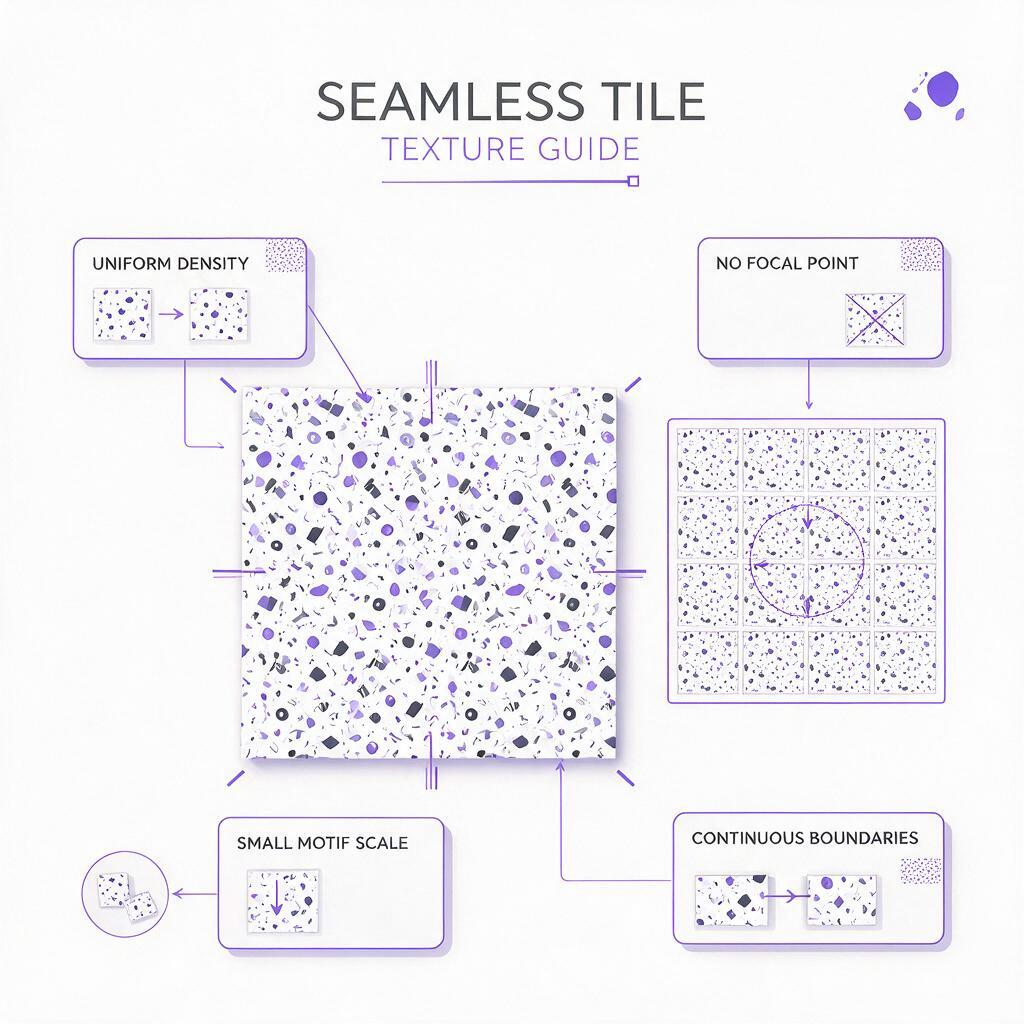
Start with a square composition and describe the image as an evenly distributed surface. Avoid cinematic language such as “dramatic lighting,” “central subject,” or “hero composition.” Those instructions encourage focal points, while a tile needs consistent visual weight from edge to edge.
A dependable prompt structure is:
[surface or material], seamless repeating pattern, evenly distributed details,
small motif scale, uniform visual density, restrained contrast,
soft diffuse lighting, flat front-facing view, no central focal point,
no border, no frame, no text, no symbols, website background texture
--ar 1:1 --tile
If the Midjourney version or interface you use offers tile mode, enable it. Parameter availability can vary, so verify the current generation settings before creating a large batch. When tile mode is unavailable, generate the most uniform square possible and repair the boundaries in an image editor with an offset preview.
For dark pages, define the approximate brightness rather than requesting a generic “dark background.” For example, ask for charcoal and muted indigo with low-contrast highlights. This reduces the chance of receiving black voids beside bright neon patches.
Midjourney prompts for four website styles
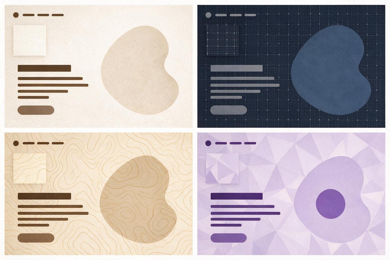
These prompts are deliberately restrained. Each one specifies a small motif scale, even density, and low contrast so the result can support interface content rather than dominate it. Use an ai image generator to create several square candidates, then judge them as repeated surfaces instead of standalone artwork.
Soft grain for minimalist SaaS pages
subtle warm-gray paper grain with extremely fine fibers and faint tonal variation,
seamless repeating surface, evenly distributed micro texture, low contrast,
matte finish, soft diffuse light, flat front-facing view, sophisticated minimalist
SaaS website background, no stains, no folds, no objects, no border, no text
--ar 1:1 --tile
This style works behind product statements, customer logos, and quiet feature sections. Keep the grain fine enough that it does not shimmer when the page is scaled.
Dark mesh for an analytics landing page
deep charcoal and muted indigo technical mesh, tiny connected points and delicate
lines, seamless repeating pattern, uniform spacing, very low contrast, subtle depth,
no glowing center, no bright nodes, no charts, no numbers, no interface panels,
premium analytics platform website background
--ar 1:1 --tile
The negative instructions matter here. Without them, technical textures often turn into dashboards or produce bright network nodes directly behind the copy.
Topographic lines for an outdoor product page
fine topographic contour lines on a muted sand background, seamless repeating map-like
texture, organic line spacing, small motif scale, calm balanced density, understated
outdoor brand aesthetic, flat vector-like surface, no labels, no compass, no landmarks,
no border, no large empty region
--ar 1:1 --tile
Use this behind specifications, material details, or editorial product storytelling. Avoid prominent contour rings that become obvious repeated targets.
Soft geometric texture for fintech
subtle tessellated geometry made from tiny translucent polygons, cool off-white and
pale lavender palette, seamless repeating surface, evenly distributed shapes,
minimal contrast, clean premium fintech website background, no central emblem,
no currency symbols, no typography, no mockup, no hard shadows
--ar 1:1 --tile
Fintech textures benefit from precise geometry, but the pattern should not resemble a logo or security badge. Generate multiple variations and reject any tile with a recognizable central mark.
Choose one prompt, replace the palette and material language with your design tokens, and test this prompt yourself before adding more decorative detail.
Keep text contrast under control
A seamless boundary does not guarantee a usable background. Place the texture behind a realistic content block containing a heading, paragraph, primary button, secondary action, and any important status labels. Test the brightest and darkest portions of the repeated surface—not only its average color.
There are three practical ways to improve readability:
- Reduce texture contrast: compress highlights and shadows before export.
- Add a controlled overlay: place a translucent brand-color layer between the texture and the content.
- Fade the content zone: use a subtle gradient that calms the texture behind copy while preserving detail elsewhere.
Do not rely on text shadows to rescue a busy background. Shadows often make type look softer without solving inconsistent contrast around letterforms.
Test the texture in a real responsive layout
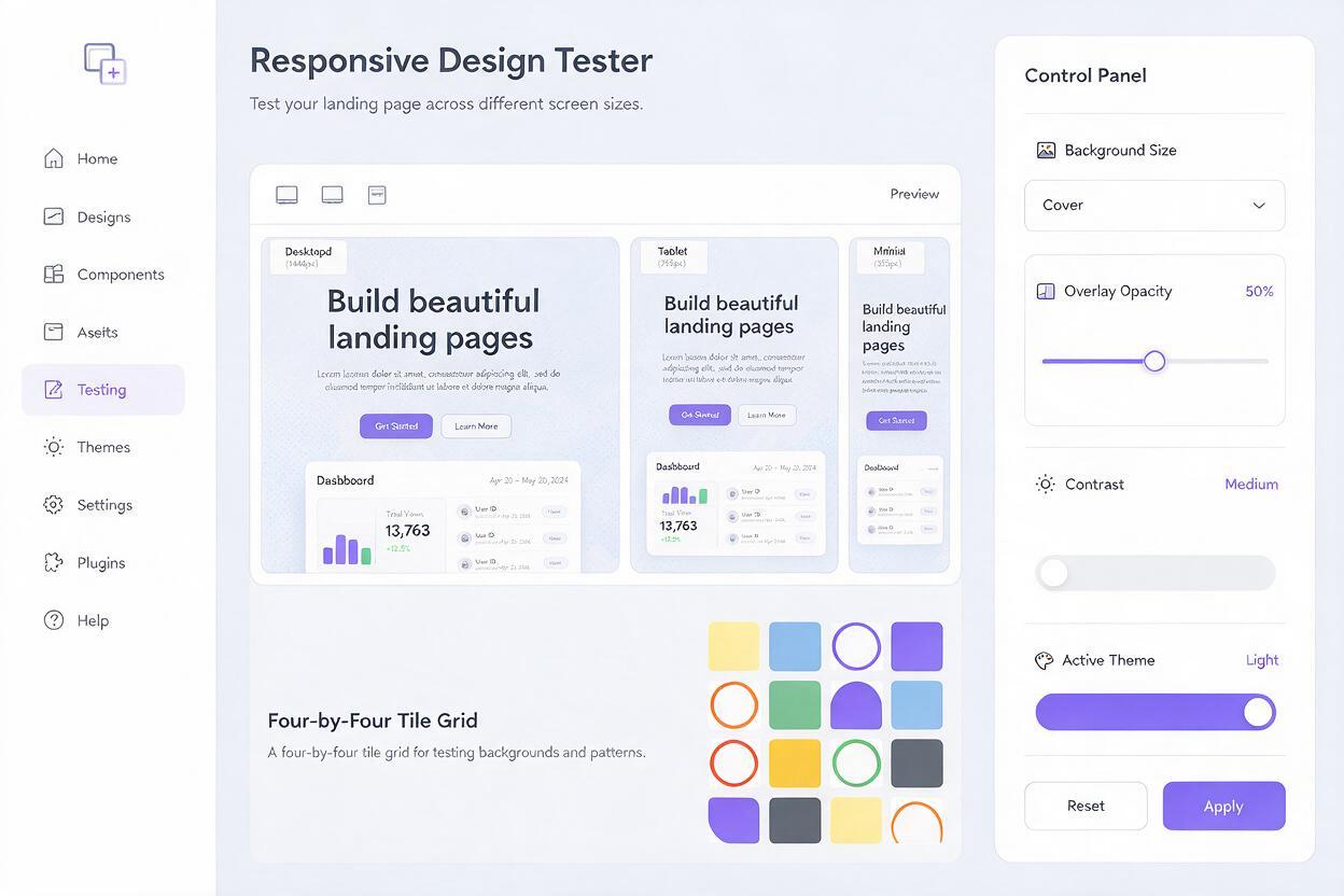
Preview the tile at several viewport widths and at least two background sizes. A pattern that looks seamless on a desktop monitor can reveal obvious repetition on a narrow mobile screen because the same motif appears more frequently around the content.
| Test | What to inspect | Likely fix |
|---|---|---|
| Four-by-four tile grid | Cross-shaped seams and repeated bright clusters | Repair edges or choose a more uniform variation |
| Desktop hero | Texture competing with the headline and CTA | Lower contrast or add a localized overlay |
| Mobile crop | Motifs becoming too large or too frequent | Adjust background size at a breakpoint |
| High-density display | Fine lines flickering or appearing overly sharp | Simplify detail and export at an appropriate resolution |
| Long page section | Visible horizontal bands caused by repetition | Use a larger tile or introduce a gentle page-level gradient |
A basic implementation might use the generated tile as a repeating background with an explicit display size:
.feature-section {
  background-color: #171522;
  background-image: url('texture.webp');
  background-repeat: repeat;
  background-size: 420px 420px;
}
Change the rendered background size rather than exporting many nearly identical files. However, inspect the result for moiré and softened details after browser scaling.
Repair a promising tile instead of regenerating forever
If the visual style is right but a seam remains, open the square in an editor and offset it by half its width and height with wrapping enabled. The original outer edges will move into the center, where discontinuities are easier to see and repair. Use cloning, healing, or restrained generative fill to connect interrupted forms.
Then repeat the corrected image in a grid and look away from the individual tile boundaries. If your eye is drawn to evenly spaced spots, the problem is probably motif distribution rather than edge continuity. Remove or soften the repeated feature and test again.
Do not ask Midjourney to generate readable headings, logos, or UI controls inside the texture. Add branded elements separately in the page layout, where they remain editable, accessible, and responsive.
Export without making the page unnecessarily heavy
Crop the final asset to an exact square, remove unused metadata, and compare modern compressed formats with PNG when transparency is required. A subtle opaque texture usually does not need a large lossless file. Check compression at actual browser size because delicate grain can become blocky even when the full-resolution image looks acceptable.
Keep the original high-quality tile as a source file. Export a production derivative for the site, document its intended CSS background size, and store the overlay values alongside the design tokens. That makes the visual easier to reproduce across additional landing-page sections.
Final checklist
- The tile has no obvious border, frame, or center-focused composition.
- Motifs remain small and evenly distributed across a repeated grid.
- There are no accidental letters, icons, controls, or branded symbols.
- Headings, body text, and buttons remain readable over every part of the texture.
- The background has been tested on desktop and mobile viewports.
- Fine details do not flicker, blur, or create moiré after browser scaling.
- The production file is compressed without visible banding or artifacts.
- The background size and overlay settings are documented with the asset.
Keywords
Midjourney prompts, seamless website textures, website backgrounds, landing-page visuals, tileable patterns, web design