Nano Banana Pro Prompts for Resizing Album Art Without Bad Crops
Turn one square album cover into vertical stories, landscape banners, and social posts without stretching faces or sacrificing the original composition. This guide uses Nano Banana Pro reference-led prompts, protected visual zones, and typography-safe checks to build a coherent release kit.
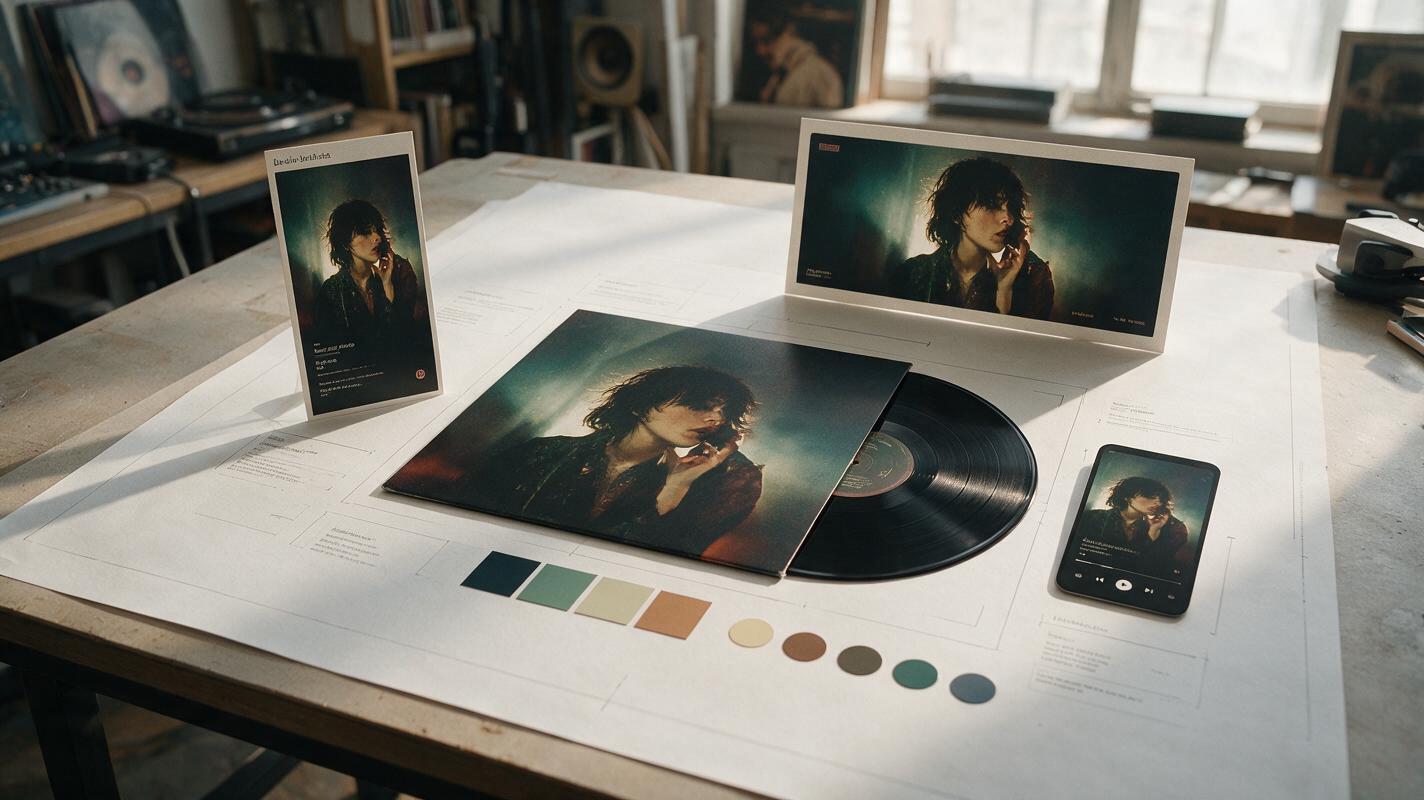
Table of contents
Resize One Album Cover for Every Platform
A strong square album cover can fall apart when it is cropped into a vertical story or stretched across a landscape banner. Faces get pushed against edges, titles disappear, and newly generated scenery no longer matches the original artwork. The solution is not ordinary resizing. It is reference-led recomposition: preserve the cover’s visual identity while creating believable new space around its important elements.
This workflow uses nano banana pro to adapt one approved cover into a coordinated release kit. It is designed for musicians who need multiple formats but do not want every asset to look like a separate campaign.
Why Simple Cropping Fails
A square cover and a vertical promo do not merely have different dimensions. They guide the eye differently. A centered portrait that feels balanced at 1:1 may leave no room for a release date at 9:16. A wide banner may cut off a costume, instrument, or visual motif that makes the cover recognizable.
Three common shortcuts create most of the damage:
- Center cropping preserves pixels but removes useful context near the edges.
- Stretching changes faces, typography, logos, and circular objects.
- Uncontrolled generative expansion adds space but may invent a new location, lighting direction, outfit, or art style.
Treat each aspect ratio as a new composition from the same visual world, not as a larger or smaller copy of the square cover.
Build a Safe Master Before Reframing
Start with the highest-resolution approved cover available. If possible, prepare a version without baked-in text as well as the final release cover. Generative tools can use the clean artwork to extend backgrounds without trying to redraw letters.
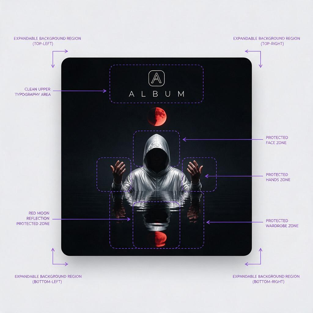
Identify the elements that must remain stable:
- The artist’s face, hair, pose, skin tone, and signature wardrobe details
- The main object, symbol, vehicle, instrument, or creature
- The established palette and contrast level
- The direction, softness, and color of the light
- Distinctive texture such as film grain, collage paper, paint, chrome, or fog
- Empty regions reserved for titles, dates, calls to action, or platform controls
Do not ask the model to preserve everything equally. Choose one primary subject, two or three identity cues, and the environmental logic. This concise hierarchy gives the model a clearer target than a long inventory of every visible pixel.
Create a reference note
Write a short visual note before generating. For example:
Primary subject: singer in a silver hood, centered, direct gaze
Identity cues: blue rim light, black water, red moon reflection
Must not change: face, hood shape, hand position, jewelry
Expandable area: water, mist, distant dark horizon
Text zone: upper third, low detail, strong contrast
This note becomes the control layer for every format. Keep it beside the original cover so that prompt revisions do not accidentally replace the approved concept.
Write Prompts That Recompose Instead of Stretching
Open ai image generator with the original cover as the visual reference. Describe the destination format, the protected subject, the space that should be created, and what the model must not redesign.
Use this reusable prompt:
Recompose the supplied square album artwork as a [ASPECT RATIO] music release visual.
Preserve the same artist identity, facial features, pose, wardrobe, lighting direction,
color palette, materials, and photographic or illustrated style.
Keep [PRIMARY SUBJECT] at [PLACEMENT].
Create believable additional space by extending [BACKGROUND ELEMENTS].
Reserve a clean, low-detail area at [TEXT ZONE] for typography added later.
Do not stretch the original image. Do not duplicate the subject, alter the hands,
redesign the clothing, add lettering, or introduce unrelated objects.
The result should feel like an alternate composition from the same album campaign.
The phrase alternate composition is important. It encourages the output to redistribute visual weight rather than merely fill blank margins.
Vertical story variation
Recompose the supplied square dream-pop cover as a 9:16 vertical release announcement.
Preserve the singer's face, silver hood, direct gaze, blue rim light, black water,
and red moon reflection. Keep the singer in the lower-middle area at the same apparent scale.
Extend the misty night sky upward and the reflective water downward.
Leave the upper third calm and low-detail for the song title and release date.
No added text, extra people, duplicated reflections, new jewelry, or stretched anatomy.
Landscape banner variation
Recompose the supplied square dream-pop cover as a wide landscape artist banner.
Keep the singer slightly left of center with unchanged identity, pose, hood, jewelry,
and lighting. Extend the dark water and mist toward the right, continuing the red moon
reflection with physically consistent perspective. Reserve the right third for profile text.
Do not crop the face, enlarge the head, mirror the subject, or add typography.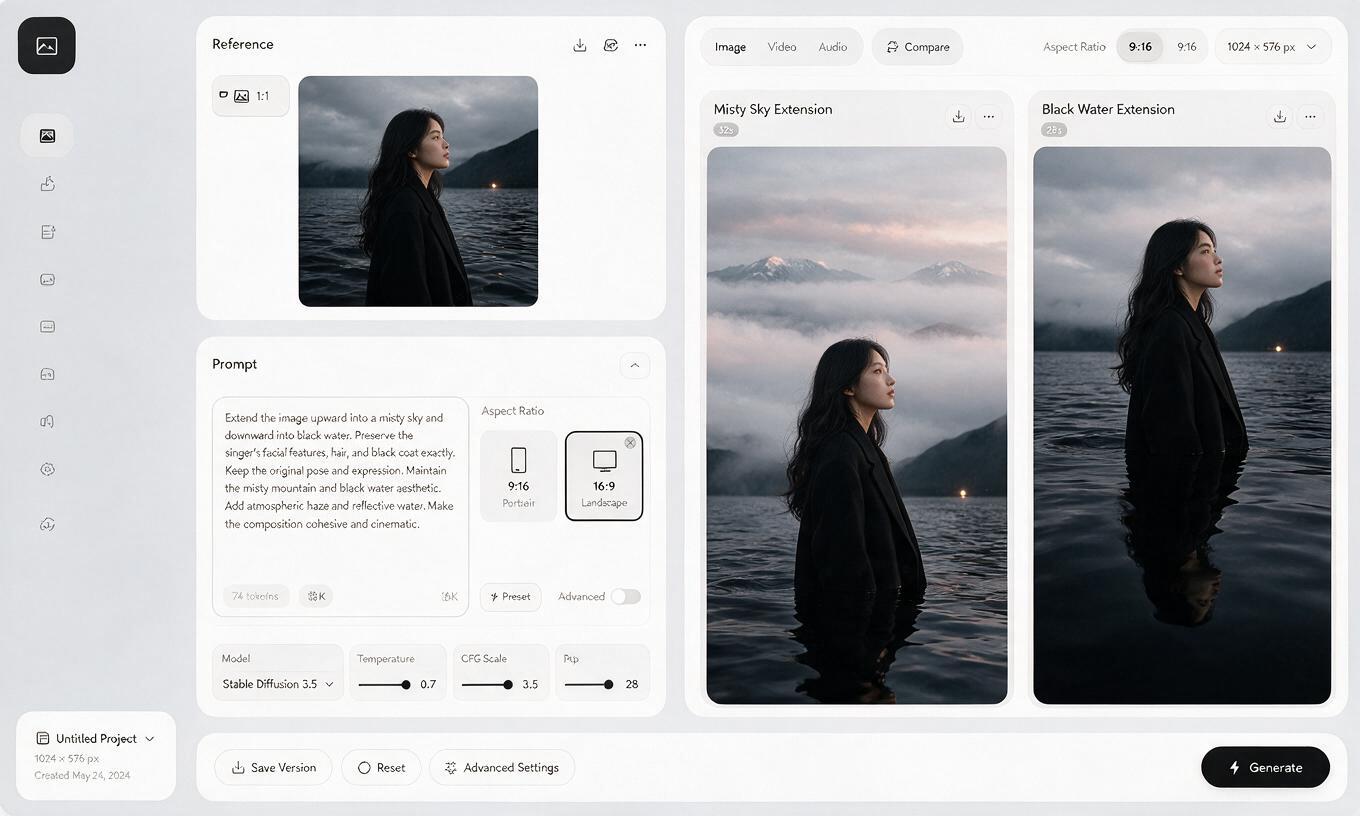
Match the Prompt to the Destination
Every output needs a different balance of subject and negative space. Use the campaign master as a reference, but make the layout serve its final placement.
| Format | Best composition | Space to protect | Main risk |
|---|---|---|---|
| 1:1 social post | Balanced subject with moderate breathing room | Top or lower corner for a short announcement | Looking too similar to the original cover |
| 4:5 feed post | Subject near the middle with vertical context | Upper quarter for title or release date | Cutting off hands or wardrobe details |
| 9:16 story or reel cover | Subject in the middle or lower-middle | Top and bottom interface-safe regions | Invented body details below the original crop |
| Wide profile banner | Subject offset to one side | Opposite side for profile information | Duplicated scenery or mirrored faces |
Generate the artwork without final typography whenever possible. Once the composition is approved, restore the exact artist name, title, logo, advisory mark, and release information in a layout tool. This protects spelling, font choice, tracking, and brand consistency.
Control Identity Drift Across the Release Kit
Do not generate every format from the previous AI result. That creates a chain of small changes: the vertical version modifies the face, the banner inherits that modification, and the next graphic drifts even further.
Instead, return to the same approved square master for each aspect ratio. Reuse the same identity sentence and change only the composition instructions. If the face still changes, reduce the amount of requested action and expansion. A static portrait with environmental extension is easier to control than a new pose in a newly invented location.
When reviewing candidates, compare them at thumbnail size and at full resolution. Check:
- Eye shape, jawline, hairstyle, and expression
- Finger count, hand position, jewelry, and microphone geometry
- Repeated background objects or cloned reflections
- Lighting that changes direction outside the original frame
- Texture transitions where original and generated areas meet
- Enough quiet space for readable campaign text
Reject a visually impressive result if it no longer looks like the same artist or release. Campaign continuity matters more than extra spectacle.
Fix the Most Common Reframing Problems
The subject becomes too small
Specify that the subject must remain at the same apparent scale. Ask for environmental extension around the subject rather than a zoomed-out scene. If the model still pulls back, generate less new space at once or create a closer target crop before submitting the reference.
The background changes into another location
Name the existing surfaces and atmospheric features precisely. Replace vague phrases such as extend the scene with instructions like continue the black reflective water, low silver mist, and empty night horizon.
The model duplicates the artist
Add a direct restriction: one person only, no reflections shaped like another person, no duplicated face. Duplication is especially common when the original includes mirrors, water, screens, or collage fragments.
The typography becomes distorted
Use a clean artwork reference without lettering, request no text, and add the approved typography afterward. If the original lettering is a physical part of the artwork, protect it as a fixed graphic element and inspect every character before export.
The new edges look softer than the center
Describe the original texture and focus behavior. A useful correction might request consistent film grain, lens sharpness, paper texture, or brush scale across the entire frame. Avoid aggressive sharpening until the composition is final.
Inspect the Full Release Kit
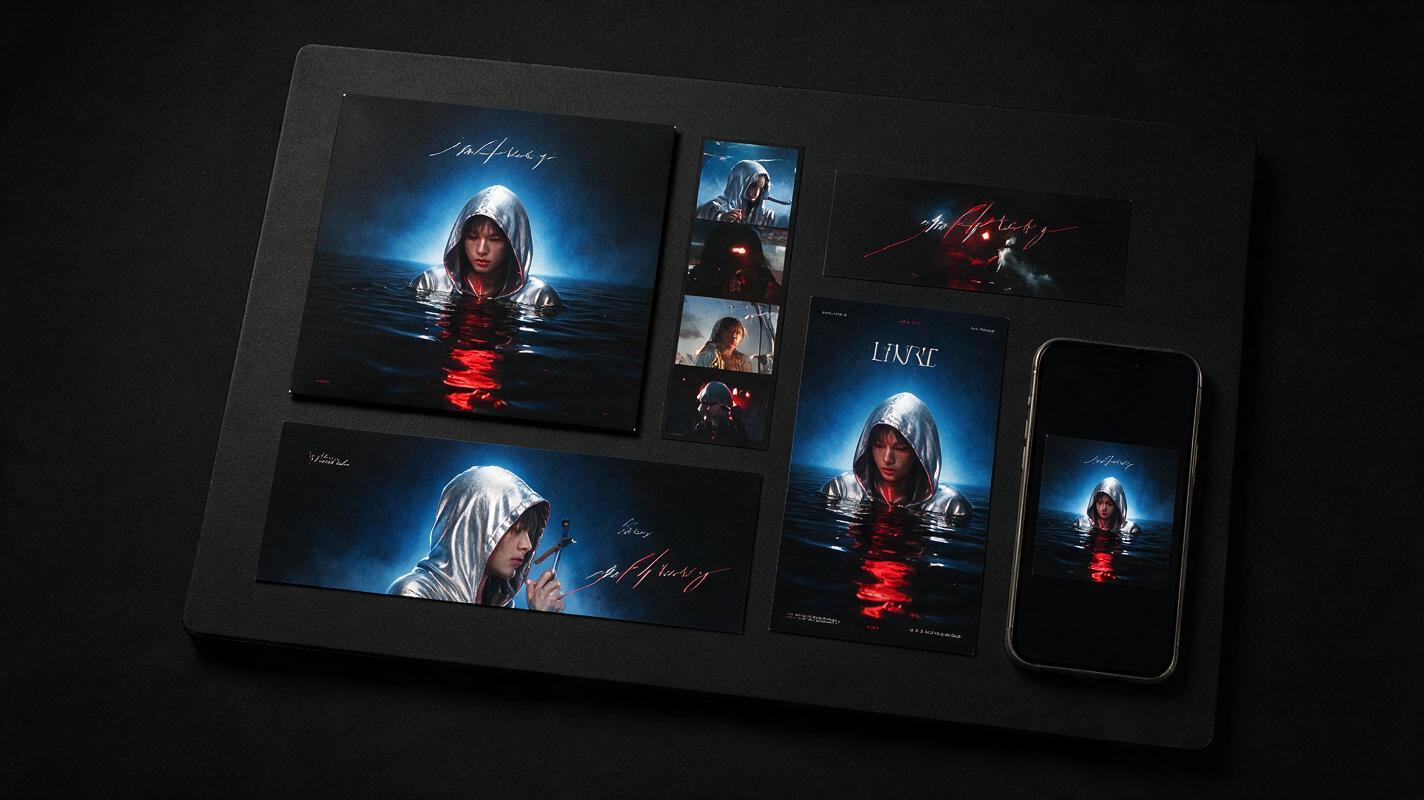
Place all finished formats on one review board before publishing. The set should look related even when the subject moves to accommodate different layouts.
Ask four practical questions:
- Would a listener recognize every asset as part of the same release within one second?
- Does the artist remain recognizable across all crops?
- Are title and date zones readable without covering the focal subject?
- Do the generated areas support the original idea rather than adding a second concept?
Finally, test the graphics on a phone at realistic display sizes. A subtle texture mismatch may not matter, while a tiny title or face pushed beneath interface controls will. Export clean masters first, then make compressed platform copies so future revisions do not depend on already compressed files.
Final Checklist
- Use the highest-resolution approved square cover as the master reference.
- Define protected identity cues before changing the aspect ratio.
- Generate each format directly from the same master, not from another adaptation.
- Request recomposition and environmental extension instead of stretching.
- Reserve low-detail negative space for campaign typography.
- Add final titles and logos after the artwork is approved.
- Review faces, hands, textures, reflections, and lighting at full resolution.
- Compare the entire release kit together before exporting.
Ready to adapt your cover? test this prompt yourself with one vertical format first, approve the visual rules, and then build the rest of the campaign from the same master.
Keywords
nano banana pro, album art resizing, album cover prompts, generative expand, artist promo graphics, cover art adaptation, ai image generator