Nano Banana Pro Prompts for Polished Landing Page Mockups
Turn a basic landing-page wireframe into polished visual concepts without letting AI redesign the entire layout. This guide provides reusable Nano Banana Pro prompts, constraint techniques, and troubleshooting fixes for producing presentation-ready UI mockups.
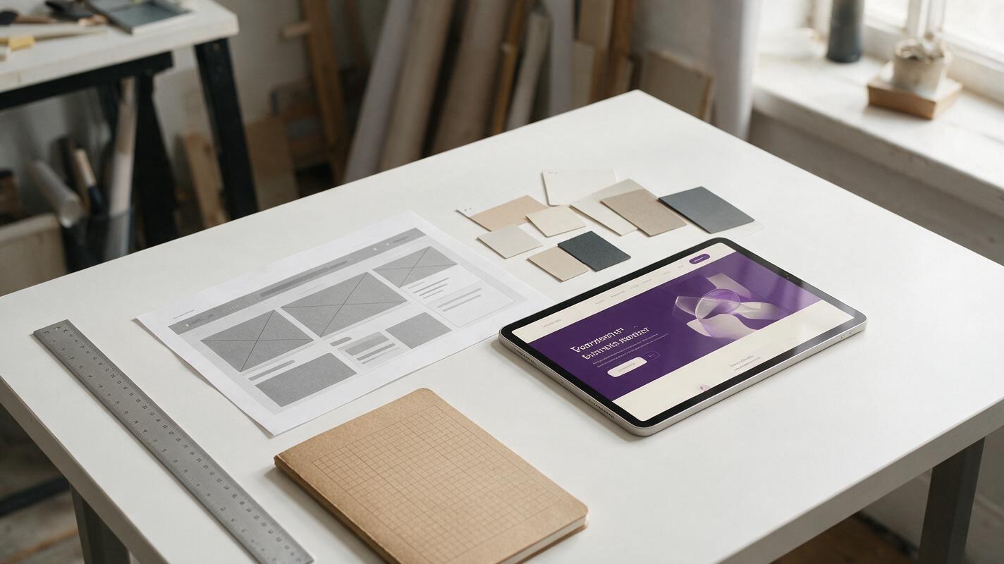
Table of contents
Turn a rough wireframe into a polished visual direction
A wireframe gives you the right layout, but clients and stakeholders often need a polished visual before they can evaluate the idea. Nano Banana Pro can help transform that low-fidelity structure into presentation-ready landing-page concepts. The challenge is preventing the model from moving sections, replacing the interface with decorative art, or inventing an impractical layout.
The most reliable approach is to treat your wireframe as a structural constraint rather than loose inspiration. You decide the hierarchy, content zones, and conversion path first. The model then explores color, materials, imagery, lighting, and interface styling without becoming the product designer.
Use AI-generated mockups for visual direction and stakeholder review. Rebuild the selected direction in Figma or production code instead of treating generated pixels as a finished interface.
Decide what the model can change
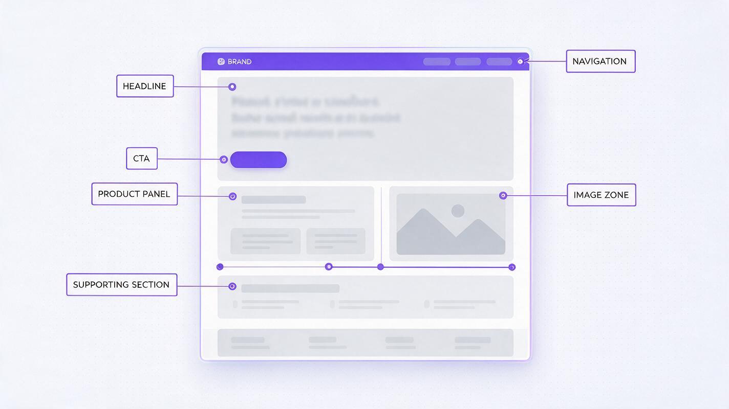
Before prompting, divide the page into fixed decisions and creative decisions. This simple boundary makes the difference between a useful design variation and a completely unrelated landing page.
| Keep fixed | Allow the model to explore |
|---|---|
| Section order and approximate dimensions | Color palette and surface treatment |
| Headline, CTA, navigation, and product position | Background imagery and lighting |
| Column structure and alignment | Card style, borders, shadows, and depth |
| Required product features | Illustration or photography direction |
| Desktop or mobile viewport | Atmosphere and brand personality |
If you ask for a “better landing page” without defining these boundaries, the model has permission to reinterpret everything. Instead, specify exactly which geometry must survive and which visual attributes may change.
Prepare the wireframe as a visual constraint
Start with a clean wireframe that communicates hierarchy at a glance. It does not need to be beautiful, but it should remove ambiguity. Use one strong outline per component and avoid temporary notes floating over the design.
- Export the wireframe at the intended viewport ratio.
- Show the complete navigation, hero, CTA, and first supporting section.
- Use realistic headline lengths rather than generic blocks when copy length matters.
- Mark image zones with simple neutral placeholders.
- Remove cursors, annotations, selection boxes, and prototyping controls.
- Use sufficiently large component spacing so adjacent regions remain distinct.
For critical text, consider using simple labels such as “HEADLINE,” “PRIMARY CTA,” and “PRODUCT UI” during concept generation. You can replace them with precise typography after choosing the direction. This keeps the visual hierarchy visible without making the concept dependent on perfectly rendered copy.
Use a prompt structure that separates layout from art direction
Upload the wireframe as the visual reference, then describe the transformation in four parts: preservation rules, page purpose, art direction, and exclusions. This structure works better than a long stream of design adjectives because each instruction has a clear role.
Transform the supplied wireframe into a polished desktop landing-page mockup.

PRESERVE:
Keep the original section order, navigation position, two-column hero layout,
headline block dimensions, CTA position, product panel size, and overall spacing.

PURPOSE:
A landing page for [product and target user]. The primary action is [CTA goal].

ART DIRECTION:
Use [palette], [surface style], [image treatment], and [brand mood].
Maintain clear contrast and a practical interface hierarchy.

AVOID:
Do not add new sections, move the CTA, crop the product panel, replace the UI
with abstract artwork, use illegible microtext, or alter the viewport ratio.
This is a reference-led use of an ai image generator: the input image supplies the composition, while the prompt defines how that composition should be rendered. Keep the first generation conservative. Once the structure is stable, increase the visual ambition in later variations.
Prompt recipes for common landing-page directions
These recipes are designed to preserve the same wireframe while testing distinct brand expressions. Replace the bracketed details with your product, audience, and existing brand constraints.
Minimal SaaS product page
Restyle the supplied wireframe as a refined SaaS landing page for [product].
Preserve every content region, the left-aligned hero copy, the primary CTA,
and the right-side product dashboard. Use a warm off-white background,
charcoal typography, restrained violet accents, thin neutral borders,
and subtle depth. Make the dashboard the visual focal point. Keep the design
credible, spacious, accessible, and feasible to rebuild with standard web UI.
Do not introduce glass spheres, floating icons, extra cards, or new sections.
Premium dark product launch
Apply a premium dark launch-page direction to the supplied wireframe without
changing its layout. Preserve navigation, text alignment, CTA location,
product scale, and section boundaries. Use deep graphite surfaces, controlled
indigo illumination, crisp white typography, subtle metallic details, and one
focused glow behind the product. Maintain readable contrast and quiet negative
space. Avoid neon overload, gaming aesthetics, excessive reflections, and
unrealistic floating interface fragments.
Friendly consumer app
Turn the supplied wireframe into a friendly consumer-app landing-page concept.
Keep the original hero geometry, content order, CTA placement, and phone mockup
position. Use soft daylight, a pale sky-and-coral palette, rounded but mature
components, natural lifestyle photography, and clear visual hierarchy.
The result should feel trustworthy and optimistic rather than childish.
Do not add mascots, decorative stickers, handwritten fonts, or extra buttons.
Editorial portfolio landing page
Restyle the supplied wireframe as an editorial portfolio landing page for a
[digital studio or independent designer]. Preserve the grid, navigation,
headline width, project-image locations, and lower content preview. Use an
asymmetric editorial rhythm inside the existing grid, strong typographic scale,
muted paper tones, precise hairline rules, and art-directed project imagery.
Avoid generic agency gradients, fake awards, unreadable type, and added modules.
Run one recipe at a time rather than combining all four styles. When a direction fits the project, create your own version by changing only one art-direction variable per generation.
Generate coherent variants without losing the layout
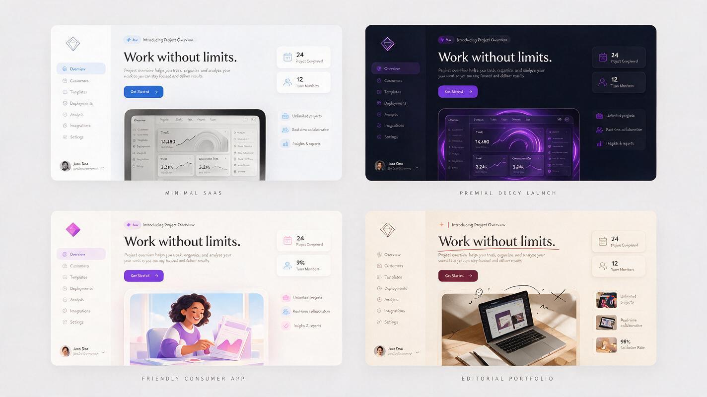
A useful variant should answer a design question. “Make it different” is too broad; “compare a cool neutral palette with a warm editorial palette while preserving every component” produces a more actionable result.
Keep the original wireframe attached for every major variation. Then change one controlled category:
- Palette: warm neutral versus cool neutral.
- Surface: flat panels versus softly elevated cards.
- Hero media: product screenshot versus contextual photograph.
- Brand tone: technical precision versus approachable simplicity.
- Density: spacious premium composition versus compact utility-led composition.
Avoid changing typography, palette, imagery, component shape, and spacing simultaneously. You may get a dramatic picture, but you will not know which decision improved the design.
Repair the failures that make AI mockups unusable
| Failure | Likely cause | Prompt correction |
|---|---|---|
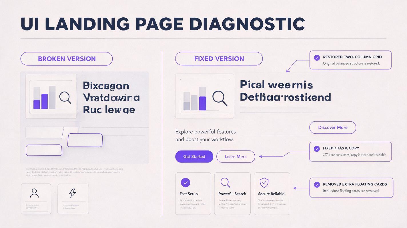
| The hero changes from two columns to one | The art direction outweighed the preservation rule | Lead with “preserve the exact two-column hero geometry” and repeat the fixed positions |
| The product screenshot becomes decorative art | The prompt describes mood but not product function | Name the panel as a functional dashboard and prohibit abstract replacement |
| Extra cards appear around the interface | The model is filling negative space | State that empty space is intentional and prohibit additional floating elements |
| Copy becomes garbled or overly small | Too much detailed text is being rendered at once | Use short placeholder labels and add final copy during reconstruction |
| The result looks impressive but cannot be built | No implementation boundary was provided | Request standard web layout, practical CSS surfaces, and realistic component depth |
| Every variation looks unrelated | Too many variables changed together | Lock layout and brand constants, then vary one visual category |
When only one region is wrong, do not regenerate the entire concept immediately. Describe the local correction while explicitly protecting the successful areas: “Keep the navigation, hero copy, background, and dashboard unchanged; simplify only the testimonial cards.”
Turn the chosen concept into a design-ready mockup
Once a concept is approved, treat it as an art-direction reference. Reconstruct the page on a proper layout grid and translate visual effects into reusable tokens.
- Sample the palette, then adjust colors to meet contrast requirements.
- Replace generated text with actual type styles and production copy.
- Rebuild cards, controls, and navigation as editable components.
- Replace synthetic product screens with accurate UI captures.
- Test the hierarchy at laptop, tablet, and mobile widths.
- Check that imagery can be licensed, recreated, or generated consistently.
The final interface does not need to reproduce every generated pixel. Preserve the concept’s useful decisions—contrast, atmosphere, hierarchy, and visual rhythm—while correcting anything that fails accessibility, responsiveness, or implementation reality.
Final checklist
- The wireframe clearly defines the required layout before generation.
- The prompt separates fixed geometry from flexible visual styling.
- The CTA, product panel, and section order remain in their intended positions.
- Each variant tests one meaningful visual decision.
- Negative prompts target specific failure modes rather than vague “bad quality.”
- Generated text and product UI will be replaced during reconstruction.
- The selected concept is feasible to rebuild as a responsive interface.
Keywords
nano banana pro, landing page mockups, UI mockup prompts, wireframe to mockup, AI image generator, landing page design, UI concept generation