Nano Banana Pro Prompts for Product Hero Images With Room for Copy
A strong product hero image has to show the design clearly while leaving usable space for a headline. These Nano Banana Pro prompts help product designers develop catalog, lifestyle, and campaign compositions from an approved reference without asking the image model to invent a new product.
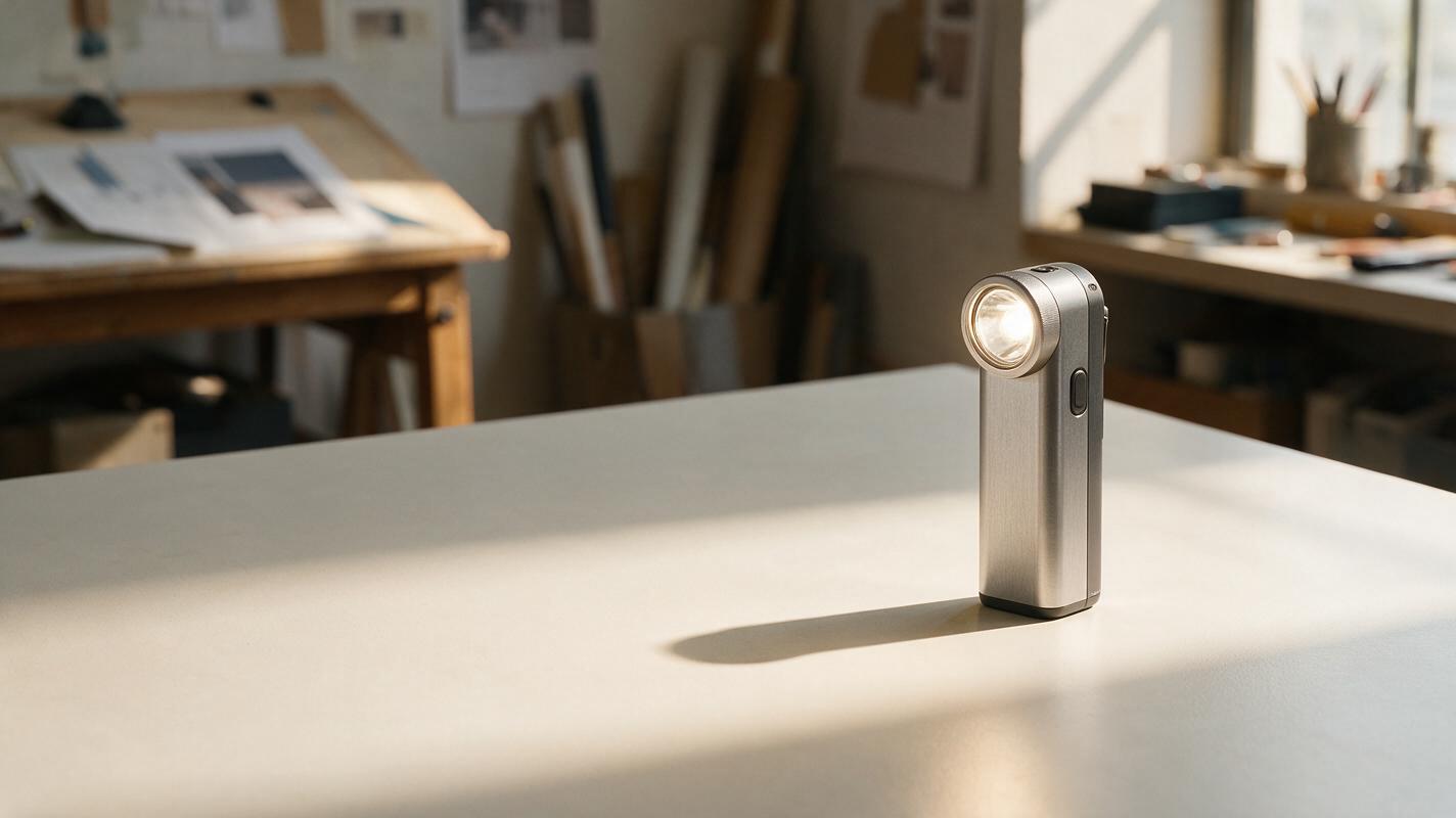
Table of contents
Product hero images need space for a message
A product render can look polished and still fail as a hero image: the product fills the frame, the background competes with it, or there is nowhere to place a headline. For a launch page or presentation cover, the useful result is not simply a prettier render. It is a composition that keeps the approved design recognizable and reserves clean, intentional space for copy.
The prompts below use Nano Banana Pro with an approved product image as a visual reference. They explore three presentation directions—catalog, lifestyle, and campaign—without treating the generated image as a substitute for the design file. The running example is a compact rechargeable task light, but the prompt structure works for other small consumer products.
The input: a product you can identify at a glance
Start with a clear image of the actual concept, preferably a three-quarter view with little perspective distortion. Note the features that would make an accidental redesign obvious. For the example light, those are its cylindrical aluminum body, angled lamp head, single circular side button, and visible seam where the head meets the body.
Use that image as the reference in the ai image generator, then name the features in the prompt. A reference helps communicate appearance; a written feature list tells you what to inspect afterward. If a port, logo, or seam is not visible in the supplied view, do not ask the model to invent its exact appearance.
Working rule: Generate the scene around the product. Do not ask the model to redesign the product to suit the scene.
For every direction, decide the intended crop before generating: a wide website banner, a square presentation tile, or a tall campaign panel. Leave more empty space than the final text seems to need. Cropping and responsive layouts will consume some of it.
The quiet catalog hero
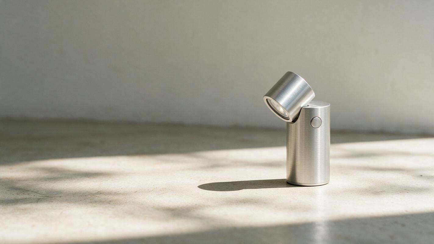
Use this direction when the product itself should carry the message. A restrained background, soft contact shadow, and generous open area make it suitable for a product overview page or the opening slide of a design review.
Use the attached approved product image as the sole reference for the product. Create a photorealistic editorial hero image of this compact rechargeable task light. Preserve its cylindrical aluminum body, angled lamp head, circular side button, proportions, seams, and visible finish. Place the complete product on a matte warm-white surface in the right third of a wide horizontal frame. Use soft daylight from the upper left and a plausible contact shadow. Keep the left half calm, evenly lit, and free of objects so a headline can be added later. No generated words, labels, extra controls, duplicate products, or changed product geometry.The phrase right third establishes the layout; complete product reduces the chance of an awkward crop. Ask for a contact shadow rather than a dramatic floating effect if the image needs to read as credible product photography. Keep the headline out of the generated image and add it in your layout tool, where typography remains editable.
The lifestyle hero with a believable surface
A contextual hero should answer a practical question: where does this object live? For the task light, a desk is useful context, but a crowded workspace can make the product hard to find. Choose one surface and a small number of supporting objects that establish scale without implying an unapproved feature or use.
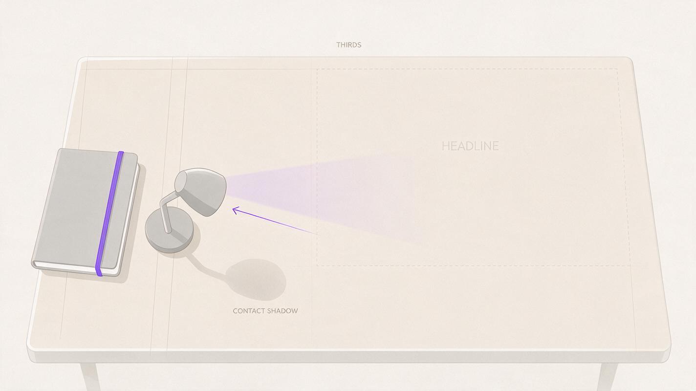
Use the attached approved task-light image as the product reference. Show the same light standing on a pale oak desk beside one closed notebook, photographed in soft morning window light. Keep the light's silhouette, angled head, circular button, body seams, and finish consistent with the reference. Position the product in the left third of a wide frame; leave the upper-right area uncluttered for a short headline. Give the product a realistic point of contact with the desk and a shadow consistent with the window light. The notebook is secondary and must not obscure the product. No people, invented branding, generated text, extra lamps, or new product details.Check scale against the notebook, not just the overall attractiveness of the scene. If the light appears implausibly large or small, provide a better size cue or remove the prop. A generated lifestyle image can communicate a presentation idea, but it should not be used to establish dimensions or prove performance.
The cropped campaign hero
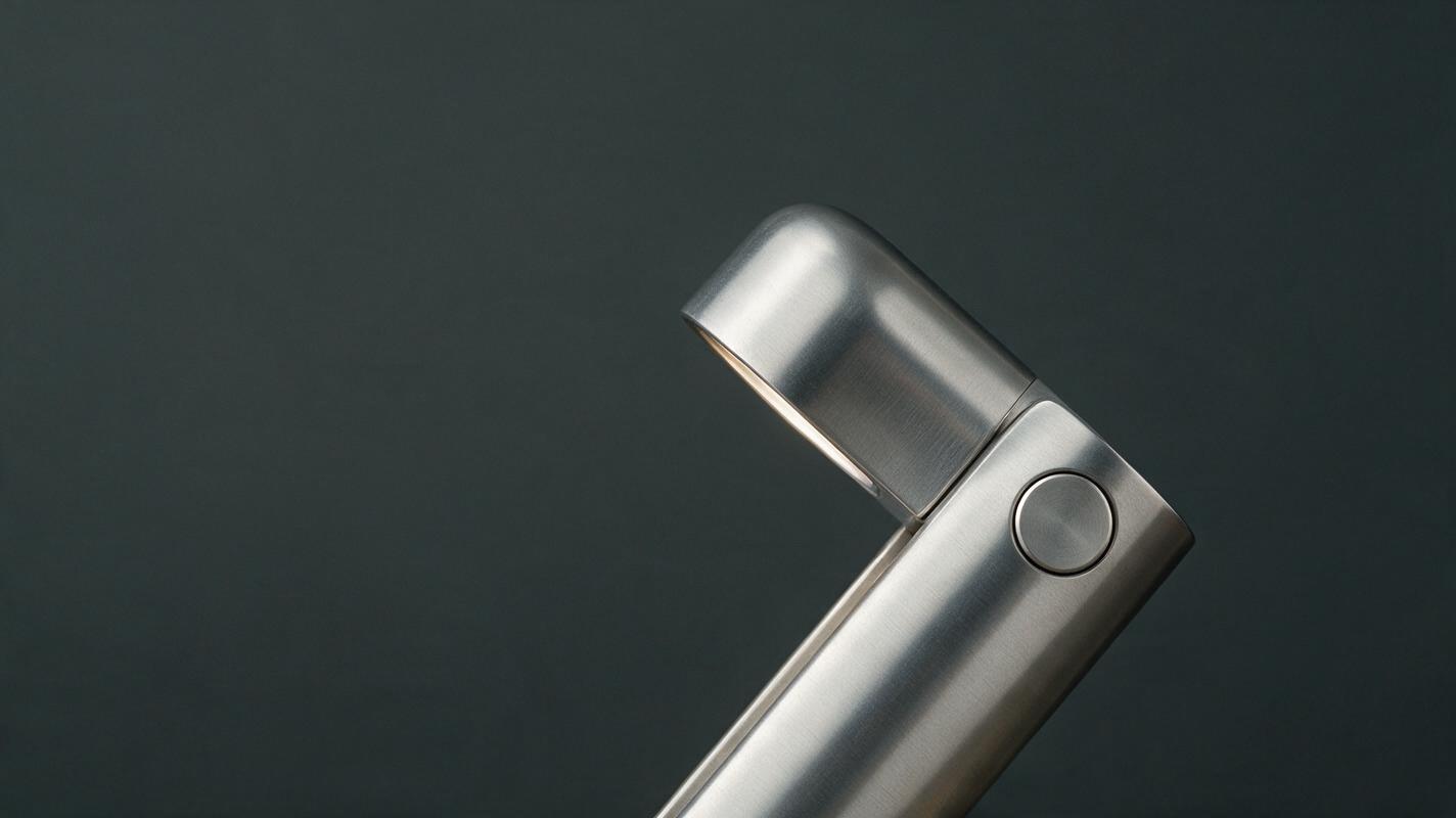
For a campaign panel, a closer crop can make a familiar product feel more tactile. The risk is that the crop hides the design features reviewers need to recognize. Keep at least two distinctive landmarks visible and specify which edge may cut through the object.
Use the attached approved product image as the only reference for the task light. Create a close, photorealistic campaign composition emphasizing the aluminum body, angled lamp head, and circular side button. Place the product diagonally across the lower-right portion of a wide horizontal frame; the bottom edge may crop the base, but the head and side button must remain visible and recognizable. Use a muted charcoal background with a gentle gradient and controlled softbox reflections that reveal the material without changing its color. Reserve the upper-left half as smooth negative space for a headline. No text, fake logos, new switches, extra seams, floating parts, or exaggerated light beams.Here, the permitted crop is explicit. That matters more than a vague instruction such as “make it cinematic,” which may produce an impressive image with the important control missing. If the product is intended for a technical design review, use the catalog hero instead; the campaign crop is for attention, not comprehensive inspection.
Keep the product stable across all three images
These are three compositions of one concept, not three rounds of concept generation. Compare each result with the approved reference before choosing a favorite. Look first for silhouette and feature placement, then inspect smaller details such as seams and reflections.
| Problem in the result | Useful correction |
|---|---|
| Button moves or an extra control appears | Restate the button count and position; select a result with a clearer matching silhouette. |
| Product appears to float | Request a visible contact point and a shadow consistent with the scene's light source. |
| Copy area contains busy props or strong highlights | Name the exact empty region and remove secondary objects from that region. |
| Finish changes between scenes | Describe the approved finish in the same words across prompts and compare outputs side by side. |
| Close crop hides defining features | Specify the landmarks that must stay visible and which edge may crop the product. |
When an output invents a critical feature, do not try to rescue it solely by polishing the background. Return to the approved reference, tighten the description of the affected feature, and generate another candidate. If no candidate preserves a required detail reliably, use a controlled product render and build the background and typography separately.
Check the image before adding copy
Place a temporary headline over the chosen image at its intended display size. Is the text legible without covering the product? Does the composition still work when cropped for a narrower layout? Does the product's contact shadow agree with the surface and lighting? These checks are more useful than judging the image at full size with no page context.
For a presentation, keep the approved render nearby so reviewers can distinguish the proposed scene from the underlying design. For a public-facing concept image, avoid showing generated details as though they were finalized hardware specifications. Once a composition passes those checks, add the actual headline, logo, and legal copy in the layout—not in the generated image. Test this prompt yourself with one approved reference and judge the result at the size where the hero will appear.
Final checklist
- The product's silhouette and visible defining features match the approved reference.
- The selected crop leaves a deliberate, usable region for real typography.
- Props, scale cues, lighting, and contact shadows support a believable scene.
- No generated text or invented hardware details appear in the final image.
- The hero still works in its intended page or presentation layout.