Product Photo to Campaign Key Visual With Nano Banana Pro
Turn a clean product photograph into a polished campaign key visual without letting AI redraw the packaging, logo, or proportions. This workflow uses Nano Banana Pro for controlled scene exploration, then protects brand-critical details through masking and compositing.
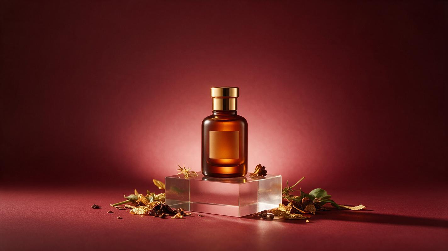
Table of contents
Turn a real product photo into an art-directed campaign visual
The safest way to create an AI product ad is to generate the world around the product—not regenerate the product itself.
A promising campaign image can quickly become unusable when AI changes a bottle silhouette, invents label copy, moves a logo, or alters the closure. The image may look polished at first glance, yet the advertised product is no longer accurate.
This workflow treats the approved product photograph as a locked brand asset. In this process, nano banana pro is used to explore environments, lighting, props, and atmosphere while the original product remains available for final compositing. The result is a campaign key visual that feels imaginative without asking a generative model to reproduce details it should not be trusted to rewrite.
Separate the fixed product from the generative scene
Start with the highest-quality approved product photograph available. A front three-quarter view usually provides enough depth for advertising compositions while keeping the label readable. Select a file with clean edges, believable reflections, and a camera angle appropriate for the intended placement.
Create two working assets:
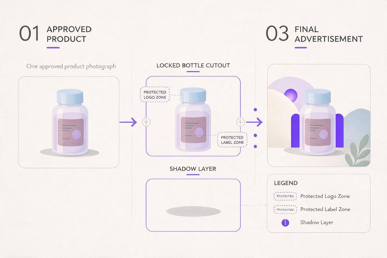
- A transparent product cutout containing the exact pack, label, cap, shadows that belong to the object, and any legally required copy.
- A flattened reference image showing the product against a simple neutral background, which can help communicate scale, viewing angle, and placement.
Do not rely on the generated result to preserve microtext or reproduce an approved mark. Even if one variation appears correct, another may quietly change letterforms, spacing, ingredients, symbols, or structural details.
Practical rule: if a detail would require client, regulatory, or production approval when changed, keep it outside the generative layer.
Before generating anything, define the product's approximate frame position. A quick layout containing a bounding box, horizon line, and copy zone is enough. This prevents attractive generations that leave no usable space for the headline or force the pack into an unsuitable crop.
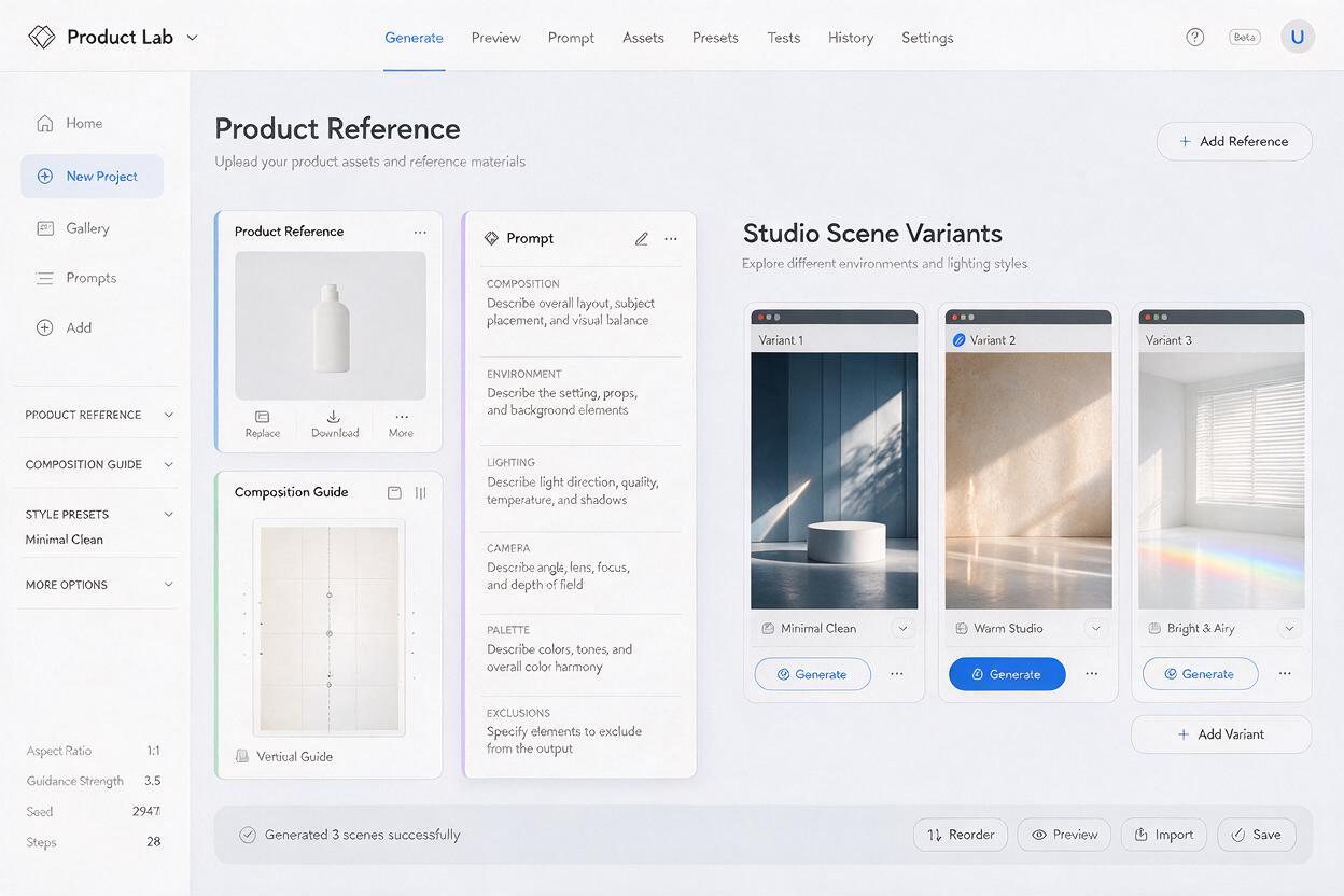
Give the model a composition map
A reference image should communicate more than aesthetic taste. It should tell the model where the visual weight belongs. Build a simple composition map using flat shapes:
- Gray rectangle for the product footprint
- Pale block for the headline area
- Thin line for the horizon or tabletop
- Arrows for directional movement
- Dark shapes for major props or foreground framing
Keep this map visually simple. It is not a finished design and should not contain decorative details the model might interpret as literal objects. Its purpose is to define hierarchy before style enters the process.
For a vertical launch poster, for example, the product might occupy the lower central third while a circular light source sits behind it. The upper third remains quiet for typography. For a wide retail banner, the product may shift right while ingredients or material fragments create motion from left to right.
| Campaign format | Product placement | Useful scene structure | Copy zone |
|---|---|---|---|
| Vertical poster | Lower center | Central halo or rising elements | Upper third |
| Wide web banner | Right third | Directional sweep across frame | Left third |
| Square social post | Center or lower third | Compact radial composition | Top edge or corners |
| Editorial crop | Off-center | Layered foreground and depth | Quiet negative space |
Write prompts around lighting, not product redesign
The prompt should describe the generated environment as precisely as an art director would brief a photographer. Concentrate on camera position, surface, light direction, material behavior, depth, palette, and negative space. Avoid phrases such as “redesign the packaging,” “luxury label,” or “add premium typography,” because they invite changes to the pack.
Use ai image generator to create the scene as either a product-photo reference composition or an empty set prepared for compositing. The empty-set method is usually safer when label accuracy is essential.
Create a premium studio campaign environment for the supplied product reference.

Composition: vertical poster, product position reserved in the lower center, generous clean negative space in the upper third for a headline.

Environment: translucent amber acrylic platform, shallow reflective surface, restrained botanical fragments framing the outer edges, no object crossing the product area.

Lighting: warm backlight behind the reserved product position, narrow cool rim light from camera left, soft frontal fill, realistic contact shadow, controlled highlights.

Camera: eye-level product photography, 85 mm lens appearance, minimal perspective distortion, crisp focal plane around the product position, gentle background falloff.

Palette: dark burgundy, amber, muted cream, small accents of copper.

Do not add text, logos, labels, extra packages, duplicate products, watermarks, or decorative symbols.
The wording “reserved product position” is useful when generating an empty scene. If the model repeatedly fills that area with an invented object, describe the space physically: “an empty acrylic platform with an unobstructed center.” Generate several scene candidates before adding the real pack.
Match generated light to the existing photograph
The final composite will only feel credible if the generated scene agrees with the source photograph. Inspect the product before writing the prompt:
- Which side carries the brightest highlight?
- Is the shadow soft, hard, or almost absent?
- Does the product appear photographed from above, below, or eye level?
- Are the reflections warm, neutral, or cool?
- Is the lens perspective compressed or wide?
If the original product has a strong highlight on its right edge, do not generate a scene whose dominant source comes from the opposite direction. Either change the scene lighting or use an alternative approved product photograph. Fixing contradictory light in retouching is slower than choosing compatible inputs.
Composite the approved pack back into the scene
Place the transparent product cutout over the selected environment. Match scale using the platform, horizon, and nearby props rather than judging the pack in isolation. Then rebuild the contact between object and scene.
A convincing integration normally needs:
- Contact shadow: a tight, darker shadow directly beneath the object
- Cast shadow: a softer shape extending in the direction established by the scene light
- Color interaction: subtle reflected color from the platform or surroundings
- Edge integration: selective softness that matches the scene's depth of field
- Shared grain: consistent texture across generated and photographed layers
Avoid applying one global color grade too early. Preserve the approved product colors, then grade the environment toward the pack. If atmosphere needs to pass in front of the product, place it on a separate masked layer and keep it away from logos, legal copy, and distinguishing structural edges.
Build a campaign set without losing continuity
Once one visual direction is approved, freeze its art-direction block. Keep the same palette, material family, lighting logic, lens language, and prop behavior across every output. Change only the variables required by the format.
LOCKED ART DIRECTION
Dark burgundy studio environment
Translucent amber acrylic surfaces
Warm rear halo with cool left rim light
Restrained botanical fragments at frame edges
Premium photographic realism
Clean negative space
No generated text, logos, or duplicate products

VARIABLE FOR THIS OUTPUT
Wide 16:9 composition
Empty product platform on the right third
Directional material flow from lower left to center
Clear headline area on the left
This separation between locked and variable instructions makes it easier to diagnose drift. If a wide banner suddenly becomes brighter or introduces new materials, restore the locked block rather than rewriting the entire prompt.
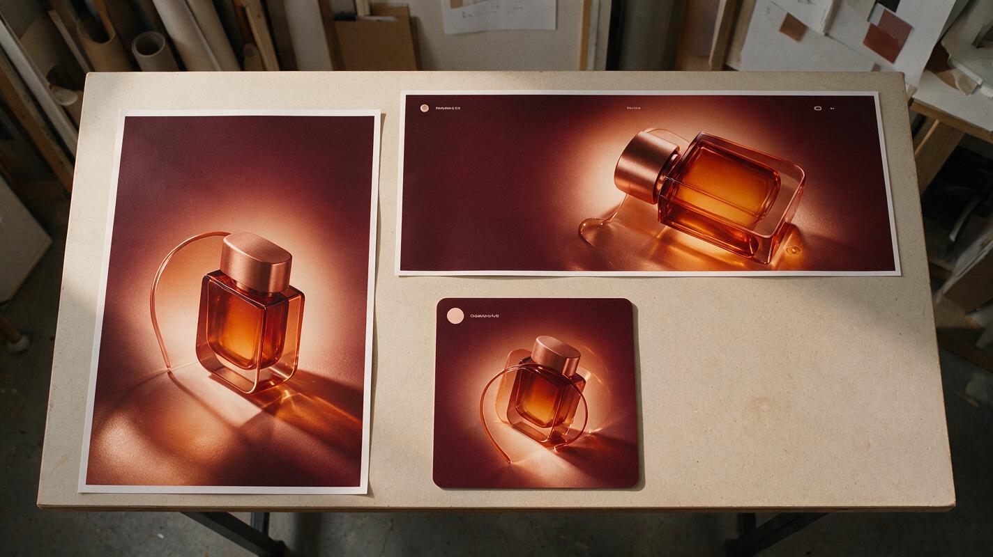
Build the set in small batches and compare outputs side by side. A strong family should share recognizable lighting and material behavior without repeating the same composition. The poster can use a central halo, the banner a lateral sweep, and the social crop a tighter radial arrangement while still feeling like one campaign.
Troubleshoot the failures that make product ads look artificial
The model keeps inventing another package
Generate an empty environment and composite the product later. Replace “product on a pedestal” with “empty pedestal reserved for later product placement,” and prohibit packages, containers, labels, and duplicate objects.
The pack looks pasted onto the background
Check light direction first, then rebuild contact shadow and reflected color. A technically clean cutout can still feel fake when it does not receive any visual influence from the environment.
Props cover important brand details
Move framing elements toward the outer edges in the prompt. Add “unobstructed central product area” and “no foreground element crossing the reserved product silhouette.” Composite atmospheric overlays manually when precise control is needed.
Every format feels like a different campaign
Reuse the locked art-direction block verbatim. Do not substitute new adjectives between generations. Keep a contact sheet of approved materials, lighting, palette, and prop density beside the working files.
The generated surface conflicts with the product perspective
Return to the composition map and correct the horizon height. If the top of the product is visible, the supporting platform should normally reveal a compatible amount of its upper surface. Extreme mismatches cannot be hidden with shadows.
Final checklist
- The product silhouette comes from an approved source photograph.
- Logo, label copy, legal text, and structural details remain untouched.
- The scene contains intentional negative space for campaign typography.
- Generated lighting matches the direction and softness of the product photo.
- Contact shadow, cast shadow, reflections, and grain connect the layers.
- Nothing important crosses the logo or recognizable packaging features.
- All campaign formats reuse the same locked art-direction block.
- The final artwork has been checked at actual delivery size.
When your cutout, composition map, and art-direction block are ready, try this prompt for free and generate the first empty campaign environment before committing to a full asset set.
Keywords
product photography AI, campaign key visual, Nano Banana Pro, AI product ads, brand design AI, packaging mockup, graphic design prompts