Seedream 4.5 Prompts for a Cohesive Single-Cover Series
Create a recognizable series of single covers without making every release look identical. This guide shows musicians how to define a visual system, write reusable Seedream 4.5 prompts, preserve artist identity, and adapt artwork for an album rollout.
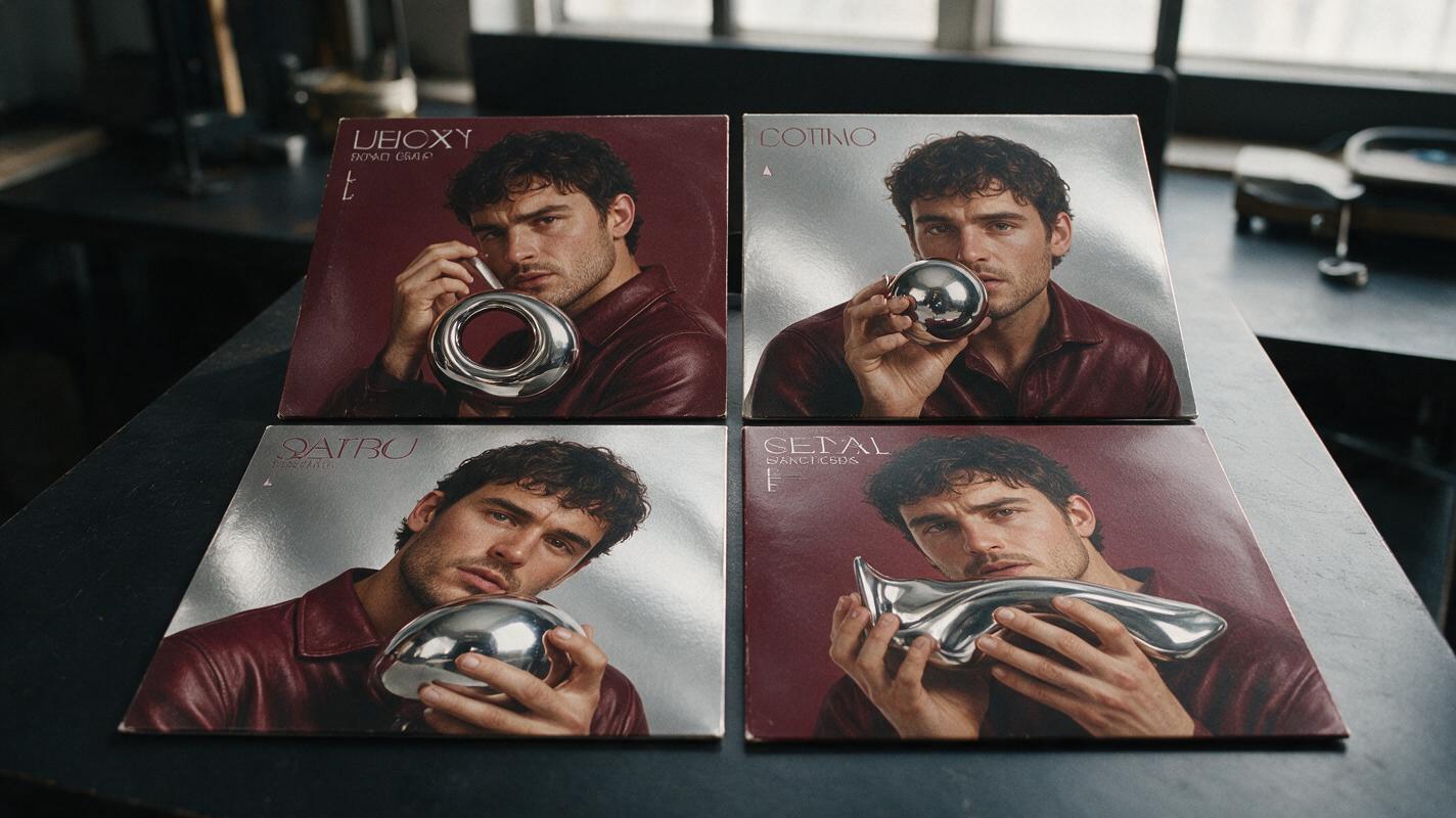
Table of contents
Build a recognizable cover series without repeating one design
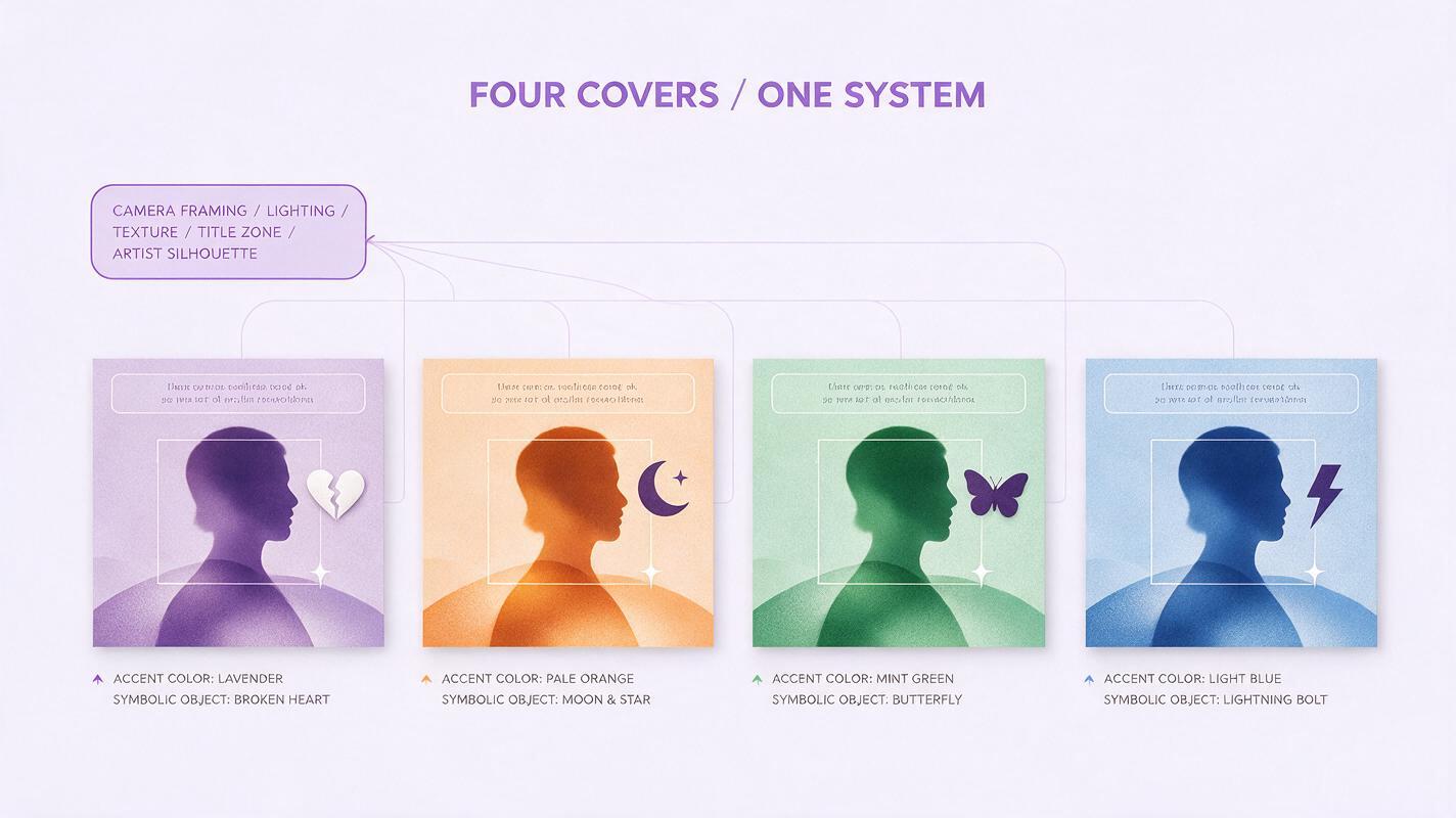
Your singles should look related at a glance, but each cover still needs its own mood. The solution is not to reuse the same composition and change one color. It is to build a small visual system—shared lighting, framing, texture, typography space, and recurring symbols—then let the subject and emotional accent change with each song.
This prompt-based workflow uses seedream 4.5 to develop a cohesive release campaign from one visual brief. It is designed for musicians preparing several singles before an EP or album, especially when the artwork must remain recognizable across streaming thumbnails, social posts, and animated promos.
Define what remains fixed across the campaign
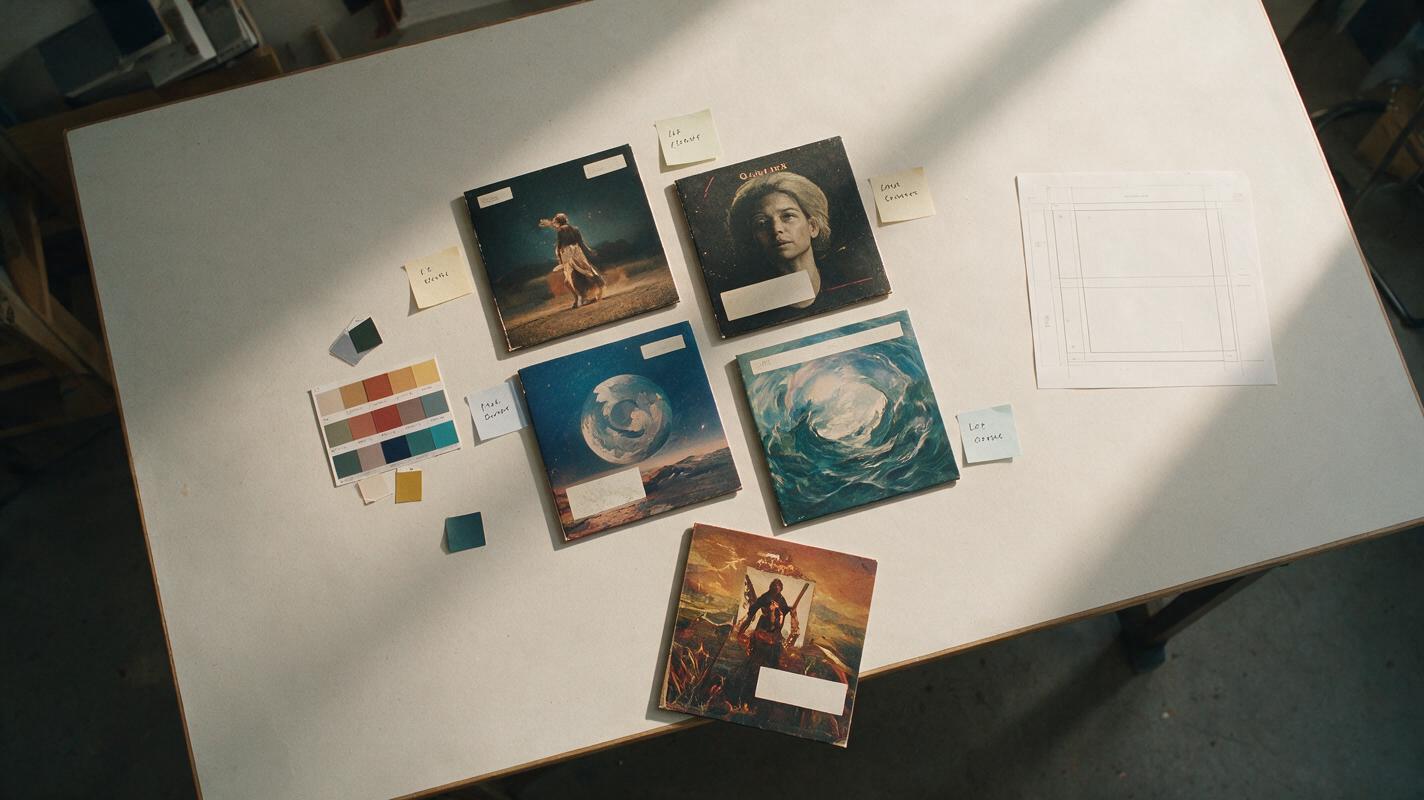
A consistent series needs rules. Without them, an ai image generator may produce attractive images that appear to belong to unrelated artists. Before writing prompts, divide your creative direction into fixed elements and variable elements.
| Visual element | Keep fixed | Allow to change |
|---|---|---|
| Composition | Camera distance, subject placement, horizon height | Pose, prop, or environmental action |
| Lighting | Direction, softness, contrast level | One song-specific accent color |
| Texture | Film grain, paper finish, lens character | Weather, particles, or surface details |
| Identity | Face, hair, key wardrobe silhouette | Accessory or garment color |
| Graphic space | Clear title zone and label placement | Song title and small campaign symbol |
A practical rule is to lock approximately three quarters of the art direction and vary the remaining quarter. If everything is fixed, the covers feel like alternate exports. If too much changes, the campaign loses recognition.
Thumbnail test: Reduce the covers to streaming-app size. They should read as one family before the viewer notices the individual song details.
Create a reusable visual DNA prompt
Start with a master prompt that describes the campaign rather than a specific single. Prioritize visible instructions: framing, palette, lighting, materials, subject position, and negative space. Avoid broad phrases such as “cinematic masterpiece” unless you explain what that means visually.
Square single-cover artwork for an alternative R&B release campaign.
Waist-up portrait of the same recording artist, centered slightly below the vertical midpoint.
Direct eye contact, restrained expression, dark tailored wardrobe with a clean silhouette.
Soft frontal key light and a narrow rim light from camera left.
Deep burgundy, smoked black, and muted silver palette.
Subtle 35mm grain, lightly worn photographic print texture, controlled contrast.
One small reflective chrome object appears in every cover as a recurring campaign symbol.
Leave uncluttered negative space across the upper quarter for title typography.
Editorial music photography, believable skin texture, square composition.
No embedded words, logos, extra people, duplicated jewelry, distorted hands, or busy background.
Generate a small test batch before developing individual songs. Select the result with the clearest silhouette, most useful title space, and most reproducible lighting—not simply the most dramatic image.
Give each single one controlled visual change
Duplicate the master prompt for every song, then replace only the variable lines. Each cover should have one dominant differentiator that reflects the track: an object, weather condition, gesture, environmental event, or accent color.
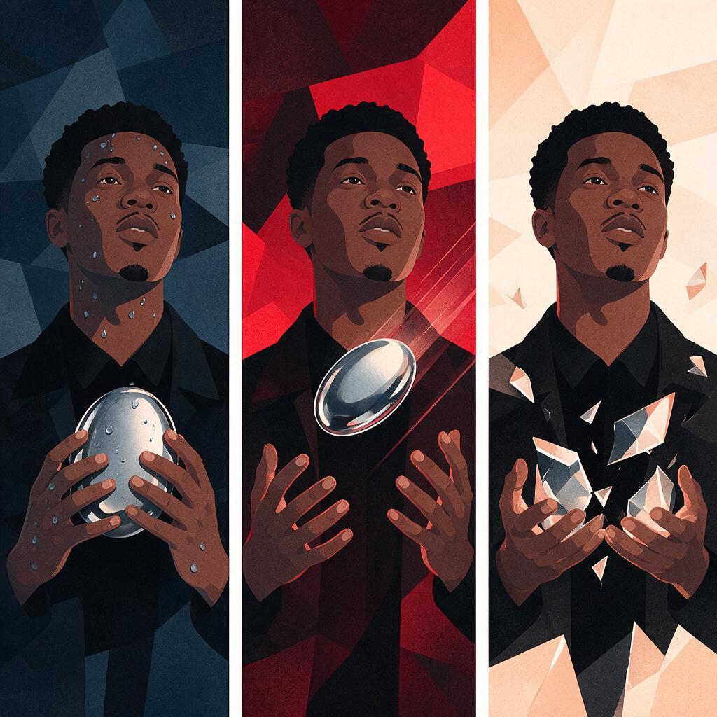
Intimate slow single
Keep the established campaign composition, artist identity, wardrobe silhouette,
frontal key light, silver rim light, film grain, and upper title space.
The artist holds the recurring chrome object close to the chest.
Introduce a muted midnight-blue accent and faint condensation on the background glass.
Quiet, vulnerable mood; minimal movement; no tears or exaggerated sadness.
High-energy lead single
Keep the established campaign composition, artist identity, wardrobe silhouette,
frontal key light, silver rim light, film grain, and upper title space.
The recurring chrome object is suspended beside the artist with a slight motion trail.
Introduce one electric-red accent and sharper shadows.
Controlled intensity, confident posture, no explosive effects or crowded scenery.
Final single before the album
Keep the established campaign composition, artist identity, wardrobe silhouette,
frontal key light, silver rim light, film grain, and upper title space.
The artist faces three-quarters away while looking back toward the camera.
The recurring chrome object appears fractured but remains recognizable.
Introduce pale dawn light, suggesting transition and resolution.
Limiting each version to one major visual event makes the series easier to recognize. It also gives fans a symbol or color to associate with each song.
Preserve the artist instead of regenerating the identity
When the artist appears on every cover, consistency depends on the source material as much as the prompt. Use a clear portrait with unobstructed facial features, neutral color, and enough resolution to inspect the eyes, mouth, hairline, and signature accessories.
- Describe stable traits once: Specify hairstyle, facial hair, makeup language, and important accessories in the master prompt.
- Keep the camera family stable: Do not jump from a close portrait to a distant full-body scene unless the campaign concept requires it.
- Change expression gently: “Restrained smile” is easier to preserve than an extreme scream, laugh, or profile distortion.
- Inspect accessories: Earrings, chains, glasses, tattoos, and piercings often reveal identity drift before the face does.
- Do not stack references carelessly: Conflicting portraits, outfits, and lighting references can weaken the visual hierarchy.
If the likeness begins to drift, return to the strongest approved cover and use that image as the primary campaign reference. Change only the song-specific variable rather than rebuilding the entire scene.
Reserve typography space during generation
Cover art becomes difficult to finish when the generated scene occupies every corner. Tell the model exactly where the title will go and what should—or should not—appear behind it.
Useful prompt phrases include:
- “uncluttered negative space across the upper quarter”
- “low-detail background behind the title zone”
- “subject does not overlap the upper-left text area”
- “balanced square composition that remains legible at thumbnail size”
For dependable release metadata, generate the artwork without embedded words and add the final artist name, song title, label mark, and advisory badge in a design application. This keeps spelling, kerning, and alignment under your control.
Judge the series as a grid, not one cover at a time
A beautiful individual cover can still damage the rollout if it breaks the family resemblance. Place every candidate in one grid and compare them using the same criteria.
| Check | What success looks like | Common warning sign |
|---|---|---|
| Identity | The artist is immediately recognizable | Different jaw, eye spacing, hairline, or age |
| Composition | Subjects occupy a similar visual zone | One cover feels unusually close or distant |
| Palette | Shared base colors support distinct accents | One image introduces several unrelated colors |
| Texture | Grain and finish feel campaign-wide | One cover appears glossy while others feel printed |
| Song distinction | Each single has one memorable variation | The covers are nearly interchangeable |
| Title space | Typography can use one repeatable template | Text placement must move on every cover |
Remove any outlier and regenerate it from the closest successful cover prompt. Do not compensate for a weak image by adding more graphic effects; correct the underlying composition or art direction first.
Adapt the approved art for the full rollout
Once the square covers are approved, create campaign derivatives from the same visual system: vertical story posters, horizontal announcement banners, profile headers, pre-save cards, and clean backgrounds for lyric excerpts. Preserve the subject scale, lighting direction, recurring symbol, and base palette while extending the environment around them.
Keep one production sheet containing the master prompt, song-specific changes, reference image, approved palette values, texture notes, and typography-safe zones. This becomes the source of truth for collaborators and prevents later promo graphics from drifting away from the release identity.
Change the canvas around the campaign; do not redesign the campaign for every canvas.
Fix the most common series failures
The covers look too similar
Increase the narrative difference rather than changing the entire style. Give each song a distinct gesture, recurring-object state, atmospheric condition, or accent color while retaining the master composition.
The covers no longer feel related
Reduce variables. Restore the same camera distance, light direction, wardrobe silhouette, title zone, and texture. Keep only one song-specific change.
The artist looks different in every image
Use one approved portrait or cover as the dominant reference. Simplify extreme expressions and remove secondary references that introduce conflicting facial information.
The artwork works large but fails as a thumbnail
Increase silhouette clarity and reduce tiny background props. The recurring symbol should be simple enough to survive reduction, while the subject-background contrast should remain obvious.
The title has nowhere to sit
Regenerate with a named typography zone instead of squeezing words over the face or detailed scenery. Treat title space as part of the composition from the beginning.
Final checklist
- The campaign has a written master prompt and one approved reference image.
- Camera distance, lighting direction, texture, and title space remain consistent.
- Every single changes only one dominant visual idea.
- The artist’s face, hair, wardrobe silhouette, and signature accessories remain recognizable.
- All covers work together in a grid and remain clear at thumbnail size.
- Final typography is added separately for accurate spelling and layout.
- Vertical and horizontal promo assets inherit the same visual rules.
When your visual DNA and first song variation are ready, create your own version and review the first batch as a complete release campaign rather than isolated pictures.
Keywords
seedream 4.5, single cover art, album rollout, cover art prompts, consistent album visuals, music release artwork, ai image generator