Seedream 4.5 Prompts for Matching YouTube Chapter Cards
Create a set of YouTube chapter cards that feels like one visual series rather than unrelated AI images. These Seedream 4.5 prompts use a shared scene, controlled changes, and editor-added titles to make transitions readable without misrepresenting generated images as real footage.
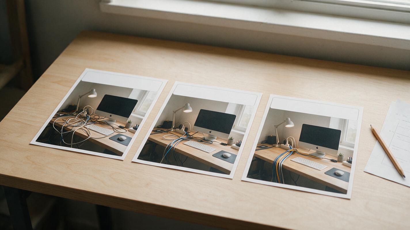
Table of contents
Make every chapter feel like part of the same video
A chapter card should tell viewers where the video is going without making them wonder whether they have switched channels. If each AI-generated card changes the room, color palette, and camera angle, even a well-edited faceless video can feel disjointed. The fix is to keep one visual foundation and change only the detail that signals the next section.
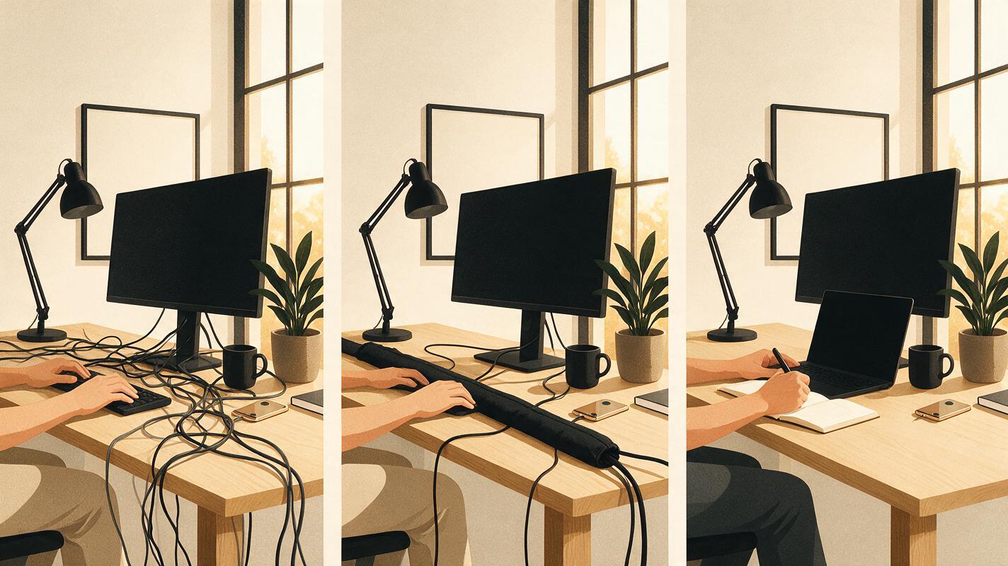
The prompts below use a faceless desk-setup video as a working example: an initial workspace, a cable-organizing section, and the finished arrangement. Adapt the objects to your own video, but keep the same reference image, framing instructions, and title placement across the set.
Choose a visual rule before writing prompts
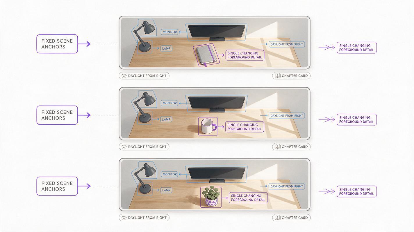
Decide what viewers should recognize in every card. For the desk example, that could be a pale wooden surface, a dark desk lamp on the left, a monitor at the back, and daylight arriving from the right. These are the fixed elements. The cable layout and a small foreground object can change to indicate the chapter.
Write your rule as a short production note before generating anything:
Every card shows the same desk from a slightly elevated, front-facing camera. Keep the lamp, monitor, wall color, daylight direction, and muted blue-and-wood palette consistent. Leave a clear area in the upper right for an editor-added chapter title.
For a tutorial, the recurring element might be one workbench. For a story video, it could be a fictional room or a distinctive object. Pick something that remains identifiable when a card appears briefly on a phone screen.
Generate a master card with usable title space
Use Seedream 4.5 through an ai image generator to make the base image. Request a 16:9 composition if that format is available. Keep titles, numbers, logos, and interface elements out of the generated artwork; add them later in your video editor, where you can control spelling and readability.
Editorial photograph-style chapter card for a faceless YouTube desk-setup video. A pale wooden desk viewed from a slightly elevated, front-facing camera; dark desk lamp on the left, simple monitor at the back, soft off-white wall, natural daylight from the right. A few visible cables near the center show that the workspace is not yet organized. Restrained muted-blue and warm-wood color palette. One clear focal point, uncluttered upper-right area reserved for a chapter title. Realistic proportions, no people, no words, no numbers, no logos, no watermarks.Choose the result for composition, not for the apparent quality of tiny details. At the size a chapter card will appear in the edit, viewers need to read “desk with visible cables,” not inspect individual connectors. Save the selected image as the reference for the remaining cards if your available image workflow accepts reference images. If it does not, repeat the full scene description in every prompt and expect to reject more variations.
Prompt the change, not a new scene
The middle card should communicate the action of the chapter while preserving the visual identity of the first. When reference-based editing is available, provide the chosen master card and specify what may change. Otherwise, reuse its exact setting and camera description in a fresh generation.
Use the supplied desk image as the visual reference. Preserve the camera position, pale wooden desk, dark lamp on the left, monitor at the back, off-white wall, daylight direction, and muted-blue and warm-wood palette. Show the cable-organizing chapter: a cable sleeve and a small group of loose cables placed neatly on the desk in the center foreground. Do not introduce a person or change the furniture. Keep the upper-right area uncluttered for an editor-added chapter title. No words, numbers, logos, or watermarks.For the final card, keep the change equally narrow:
Use the same desk reference and preserve its camera position, furniture, lighting direction, and color palette. Show the finished workspace with cables discreetly routed out of the main viewing area and the desktop otherwise unchanged. Keep the dark lamp on the left and monitor at the back. Leave the upper-right area clear for an editor-added chapter title. No people, words, numbers, logos, or watermarks.Do not present a generated “after” image as documentation of work you actually performed. If the video demonstrates a real transformation, use real footage or a real photo for the result. Generated cards can serve as illustrative section markers; they should not become false evidence.
Keep titles and transitions consistent in the edit
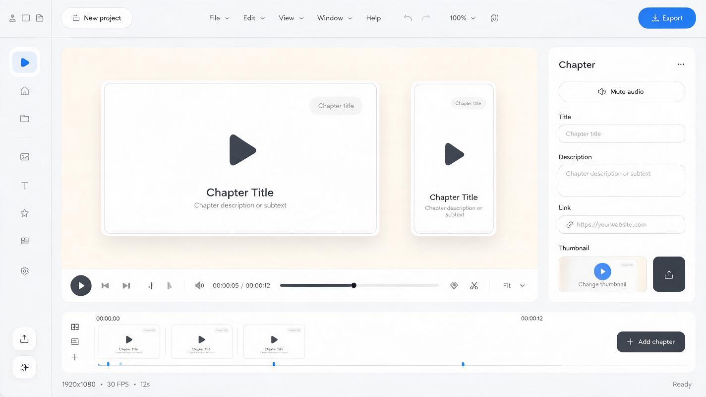
Bring the selected cards into your editor and apply one title template to all of them. A useful pattern is a short chapter label in the same position, typeface, weight, and color each time. For this example, “The Starting Point,” “Organizing the Cables,” and “The Finished Desk” tell a clearer story than three decorative numbers alone.
- Placement: Keep each title within the clear area you reserved in the prompts.
- Readability: Check the cards at phone size. Add a subtle dark overlay or title backing in the editor if the text blends into the image.
- Timing: Give viewers enough time to read the label, then return to footage or narration. A chapter card should orient the viewer, not interrupt the explanation.
- Motion: If you add a push-in, use the same restrained movement on every card. Motion is optional; consistency matters more.
Make one title template and duplicate it rather than rebuilding each card independently. This also makes revisions painless when you rename a chapter late in the edit.
Reject cards that break the series
Place all candidate images side by side before committing to them. The most attractive individual image is not necessarily the best member of the set.
| What changed? | Why it matters | What to do |
|---|---|---|
| Camera angle or room layout | The cards no longer read as one location. | Regenerate using the chosen master image or repeat its framing description. |
| Lamp, monitor, or other anchor object | Viewers lose the visual thread between chapters. | Name the fixed objects explicitly and request that they remain unchanged. |
| Light direction or color temperature | The sequence feels assembled from separate shoots. | Restate the daylight direction and shared palette. |
| Objects crowd the title area | Text becomes difficult to read at small sizes. | Move the changing detail toward the center or foreground; reserve the same clear area. |
| Strange cable or device details | The graphic may suggest equipment that does not exist in the video. | Choose a simpler composition or replace the card with an actual frame. |
If one card keeps drifting, simplify it. A sleeve beside a few cables is easier to recognize—and easier to keep consistent—than a densely detailed wiring diagram. To test a different subject, create your own version using the same fixed-scene rule and changing only one chapter cue at a time.
Final checklist
- All cards share recognizable objects, framing, lighting, and color.
- Each card signals a different chapter through one clear visual change.
- Titles are added in the editor, not entrusted to image generation.
- The set remains readable at phone size.
- Generated illustrations are not presented as footage or proof of a real outcome.
Keywords
youtube chapter cards, seedream 4.5 prompts, faceless youtube visuals, matching video graphics, ai image generator, chapter transition cards