Seedream 4.5 Prompts for Premium Packaging Material Finishes
Use Seedream 4.5 to visualize foil, embossing, spot UV, uncoated paper and translucent packaging without losing control of the underlying brand design. These reusable prompts help designers create material studies that are useful for client presentations while keeping production claims realistic.
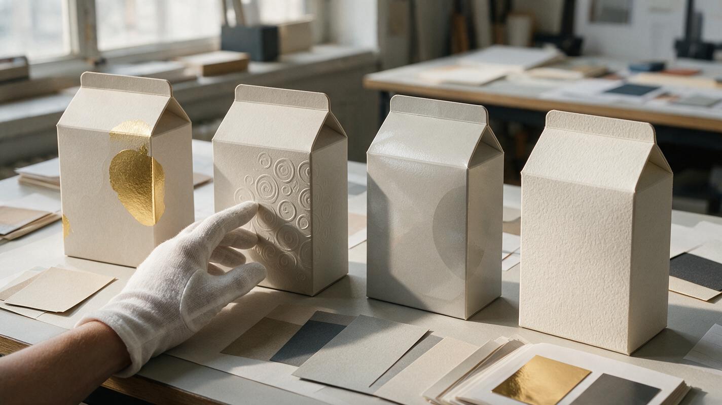
Table of contents
Visualize packaging finishes before committing to production
A flat packaging layout rarely communicates how metallic foil, deep embossing, spot UV or textured paper will behave under real light. Seedream 4.5 can help turn approved artwork into persuasive material studies—but only when the prompt separates the fixed brand design from the finish being explored.
This prompt collection is designed for packaging and brand designers who need client-facing concept visuals, not fabricated production proofs. The objective is to compare finishes while preserving the package structure, visual hierarchy and placement of approved graphics.
Use AI renders as visualization, not manufacturing evidence. Foil coverage, embossing depth, ink behavior and substrate tolerances still need to be confirmed with printers, converters and physical samples.
Build one neutral packaging base before testing finishes
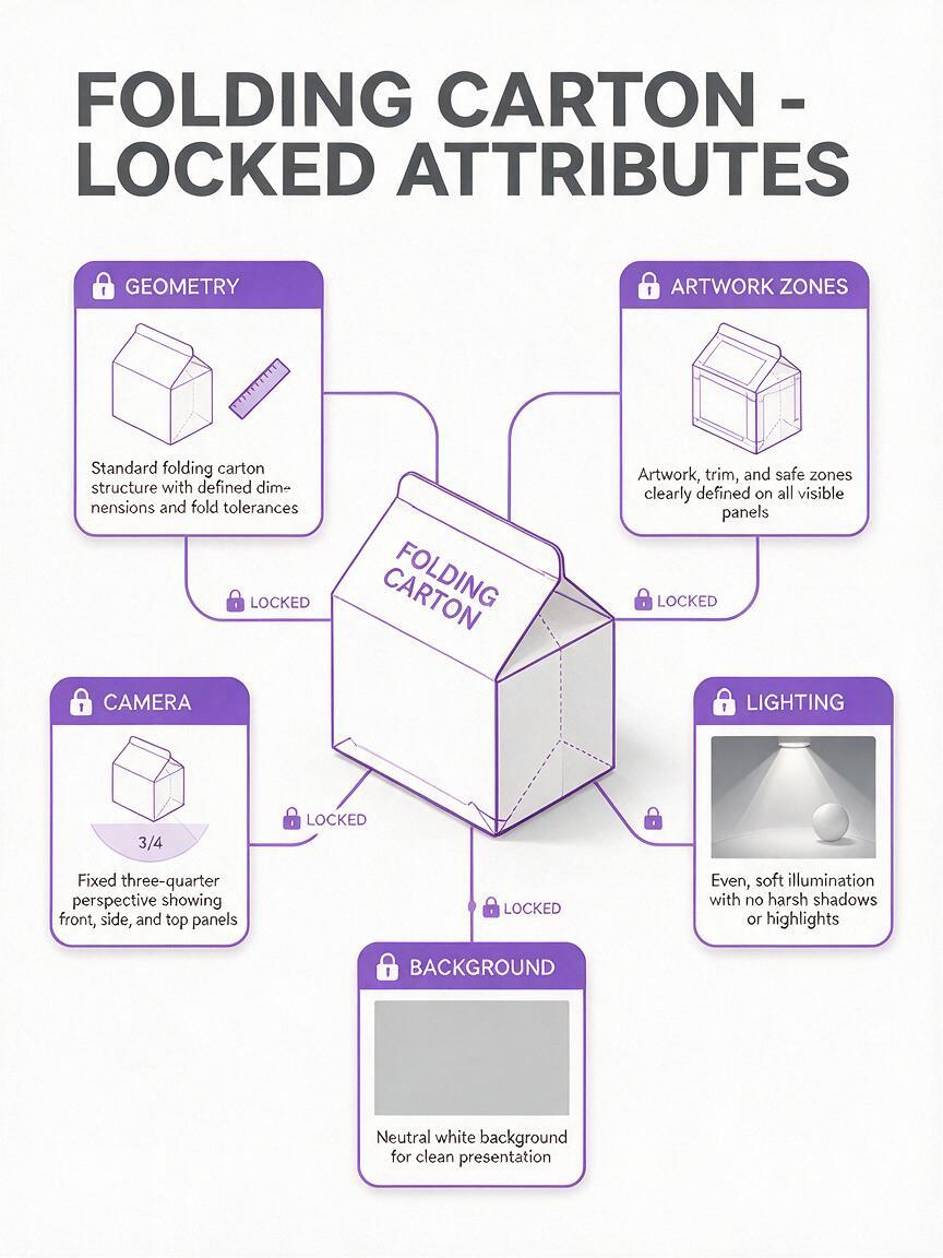
Material comparisons become unreliable when every generation changes the camera, package shape or artwork. Start with one neutral base image: a clean front three-quarter view, restrained studio lighting and enough empty space around the pack for a consistent crop.
If you already have an approved mockup, upload it as the primary reference. When you need to create the base from a written concept, seedream 4.5 can produce an initial packaging visualization for later finish variations.
Your base should establish these fixed elements:
- Structure: carton, pouch, bottle, tube or rigid box with believable proportions.
- Artwork zones: logo area, product descriptor, information panel and reserved legal copy area.
- Camera: lens character, viewpoint, crop and horizon height.
- Lighting: broad key light with a controlled side reflection that can reveal surface behavior.
- Environment: neutral sweep or simple retail-relevant surface without decorative clutter.
Premium [PACKAGE TYPE] packaging concept, front three-quarter view, exact rectangular geometry, restrained studio setup, soft neutral background, broad diffused key light from upper left, subtle side light revealing surface texture, centered composition, realistic scale, clean shadow, no props, no hands, no additional text, no invented symbols, presentation-quality material study.Keep this base image unchanged across the entire exploration. If the logo or mandatory copy must remain exact, replace AI-rendered text with the approved vector artwork during final compositing.
Prompt metallic foil without turning the whole pack into metal
Foil prompts often fail because words such as “gold luxury packaging” describe an overall aesthetic rather than a localized print process. The model may convert the substrate into polished metal, cover every graphic with reflections or introduce ornamental details that were never in the identity.
Define the substrate first, identify the precise foil zone and describe how light should reveal it.
Preserve the package geometry, camera angle, composition, base color and all graphic placements from the reference image. Apply warm gold hot-stamp foil only to [LOGO / BORDER / SYMBOL]. The remaining package is smooth uncoated [COLOR] paper with no metallic sheen. Foil is thin, sharply registered and slightly reflective, visible through one controlled highlight along the stamped area. No extra ornament, no new typography, no metallic package body, no holographic effect.For silver, copper or colored foil, change only the foil description. Generate all candidates under identical lighting so stakeholders compare the finish rather than different art direction.
Create embossing that follows the approved artwork
Embossing needs directional light, but excessive depth makes a carton look sculpted or molded. A useful concept render shows a shallow physical impression with crisp boundaries and restrained shadows.
Keep the original package structure, artwork scale, colors and layout unchanged. Add shallow blind embossing only to [SPECIFIC SHAPE OR LOGO AREA]. The emboss follows the exact silhouette of the approved graphic, with subtle raised paper fibers, crisp edges and realistic low-relief depth. Use soft raking light from the right to reveal the surface change. No beveled metal effect, no inflated lettering, no carved background, no additional graphics.Use “blind embossing” when the raised area should remain the color of the substrate. For registered embossing with ink or foil, state that the relief aligns exactly with the printed element—but treat the result as a communication visual until a production specialist confirms registration tolerances.
Show spot UV through contrast, not plastic-looking gloss
Spot UV is difficult to visualize because it appears only when the viewing angle catches a reflection. Asking for “glossy packaging” usually changes the whole surface and destroys the intended contrast between coated and uncoated areas.
Preserve the reference package exactly. The base substrate is matte [PAPER OR FILM DESCRIPTION]. Apply clear spot UV only over [PATTERN / WORDMARK / ILLUSTRATION AREA], precisely registered to the existing artwork. The coating is transparent and visible through restrained specular highlights, with no color change underneath. Keep all other surfaces dry and matte. No full-pack lamination, no wet appearance, no glass texture, no added pattern.A narrow side light is more informative than dramatic frontal lighting. Request two versions—one with the reflection visible and one with it nearly absent—to show why the effect changes as the package moves.
Compare finish prompts under controlled conditions
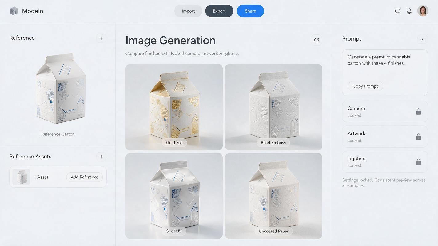
A finish study should function like a small design experiment. Change one production variable per generation while holding the artwork, camera and lighting constant. Using ai image generator output as a loose moodboard is fast, but a controlled comparison is much more useful during design reviews.
| Finish | Prompt emphasis | Common AI failure | Design check |
|---|---|---|---|
| Hot-stamp foil | Localized reflective layer | Entire pack becomes metallic | Foil stays inside the named artwork zone |
| Blind emboss | Shallow relief and raking light | Logo appears inflated | Relief follows the approved silhouette |
| Spot UV | Transparent gloss over matte stock | Wet or plastic surface | Color remains unchanged below coating |
| Uncoated paper | Visible fibers and diffuse reflection | Dirty or recycled appearance | Texture supports the intended price position |
| Translucent material | Controlled opacity and edge behavior | Package turns into clear glass | Product visibility matches the concept |
Name each output by variable—such as “copper foil,” “blind emboss” or “spot UV”—rather than by subjective labels like “premium option.” This keeps client feedback connected to the actual material decision.
Explore tactile paper without generating random damage
Prompts for natural or recycled stock can easily produce stains, torn edges and exaggerated fibers. Describe the texture at packaging scale and distinguish intentional material character from wear.
Maintain the exact reference composition, package construction and graphic layout. Render the carton in premium uncoated [WARM WHITE / NATURAL GRAY] paperboard with fine, evenly distributed fibers and a soft tactile tooth. Ink sits naturally on the surface with slightly diffuse reflection but clean edges. The package is new and precisely manufactured: no stains, no dents, no torn fibers, no distressed printing, no vintage aging.When comparing stocks, keep the base color numerically or verbally consistent. Otherwise, a warmer substrate may be mistaken for a stronger design direction rather than a material variation.
Render translucent packs without losing structural credibility
Translucent films, frosted bottles and vellum sleeves introduce another problem: AI may confuse translucency with perfectly clear glass. Specify what can be seen, how clearly it appears and which elements remain opaque.
Preserve the reference silhouette, proportions, cap, label dimensions and camera. Change only the package body to softly translucent frosted [MATERIAL]. The product inside is visible as a diffused color mass without sharp internal detail. Keep the printed label opaque and perfectly flat against the surface. Show realistic thicker edges, subtle internal light scattering and a restrained highlight. No crystal glass, no transparent label, no floating graphics, no deformed container.For a paper sleeve, describe overlapping layers and edge thickness. For a flexible pouch, request realistic seams and a small amount of material tension instead of a rigid glass-like body.
Repair the finish locally instead of regenerating the design
When the material effect is close but the logo changes, do not regenerate the entire package. Mask only the faulty region and request a local correction. This reduces the chance of altering the package silhouette, background or surrounding graphics.
Edit only the masked area. Restore the original [LOGO / GRAPHIC] shape and placement from the reference. Apply [FINISH] within its exact boundary while matching the existing camera, lighting, material scale and perspective. Do not change any unmasked pixels, package edges, colors, text positions or background elements.Some elements should bypass generation entirely. Approved logos, small legal text, barcodes, nutrition panels and regulatory icons are usually safer to composite from source files after the material render is selected.
Present the result as a material study
A client-facing board should make the comparison easy to understand. Use equal-sized crops, the same viewing angle and short factual labels. Include one close-up per finish to reveal reflection or relief, plus one full-pack view to show whether the effect supports the overall hierarchy.
- Show the neutral base beside each finish variation.
- Label the intended process and substrate separately.
- State that colors and effects are visualization targets.
- Attach printer samples or swatches when available.
- Avoid mixing finish exploration with new logos, layouts or structural concepts.
Once your reference image and finish variable are ready, test this prompt yourself and generate a small controlled set before expanding into presentation scenes.
Final checklist
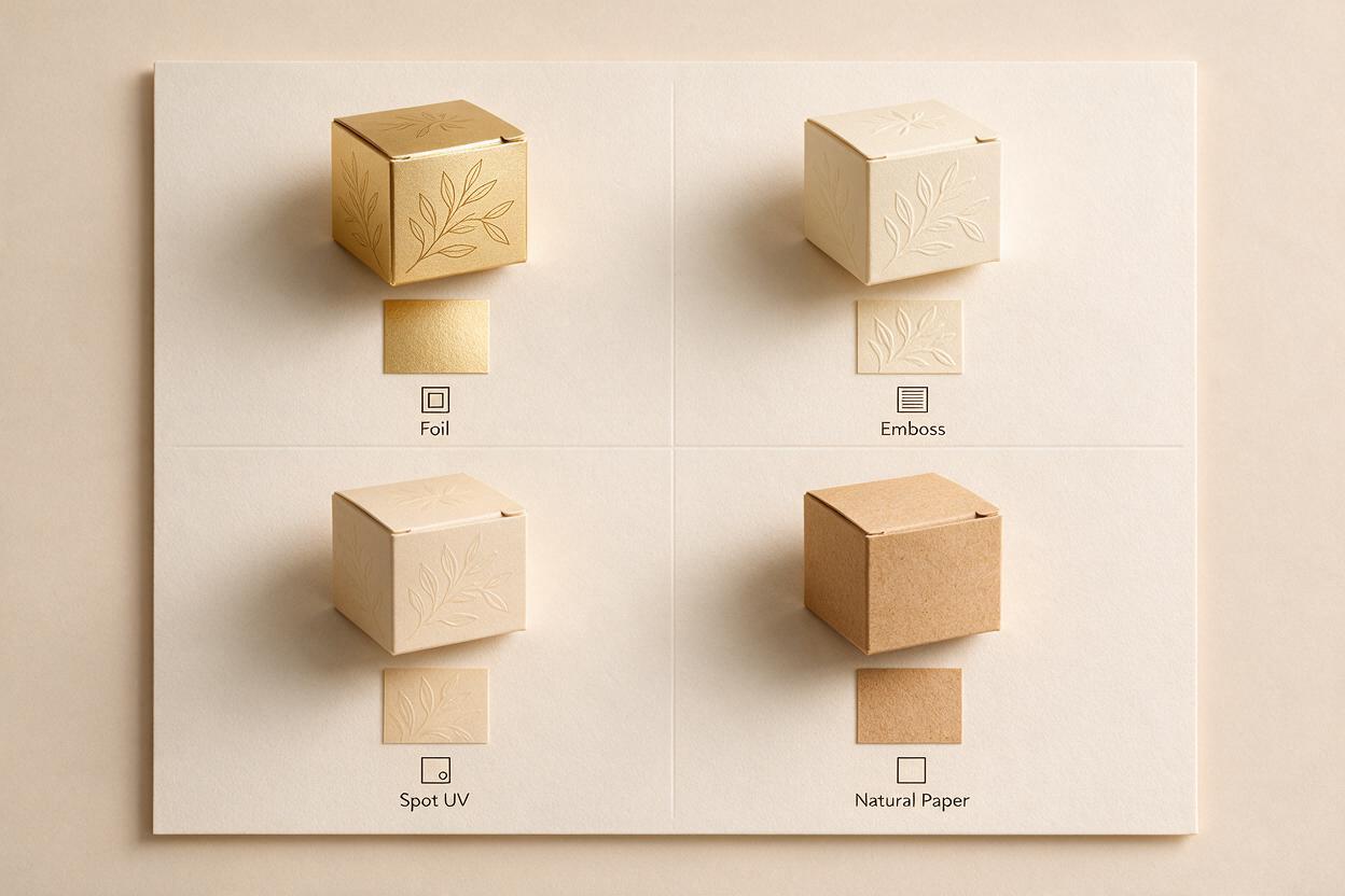
- The package geometry and camera remain consistent across every option.
- Only one material or print finish changes at a time.
- Foil, embossing and spot UV stay inside explicitly named artwork zones.
- Lighting reveals the finish without creating an unrealistic luxury effect.
- Approved logos and production copy are restored from original files.
- AI images are labeled as visualizations rather than color or production proofs.
- Final feasibility is checked with the relevant printer or converter.
Keywords
AI packaging design, Seedream 4.5, packaging prompts, foil packaging, embossed packaging, material visualization, brand design AI