Seedream 4.5 Prompts for Consistent SaaS Feature Illustrations
Create a coordinated set of SaaS feature illustrations with Seedream 4.5 instead of generating unrelated images for every section. This prompt system controls composition, color, materials, camera angle, and visual density while leaving interface text for final design.

Table of contents
Build a visual system, not six unrelated pictures
SaaS feature illustrations often fail as a set: one looks photorealistic, another becomes a cartoon, and a third introduces a completely different color palette. The solution is not six longer prompts. It is one reusable visual grammar that tells Seedream 4.5 what must remain consistent while each image communicates a different product benefit.
This approach is designed for landing-page feature rows, onboarding pages, product overviews, and interface showcases. It produces illustrations that feel related without making every section look identical.
Use generation for composition, depth, lighting, and atmosphere. Add accurate UI labels, numbers, logos, and small icons later in your design tool.
Define the illustration grammar
Before opening an ai image generator, decide which properties belong to the visual system and which can change from one feature to another. A useful grammar is specific enough to hold the series together but flexible enough to support analytics, collaboration, security, automation, and other product stories.
| Visual property | Keep consistent | Allow to change |
|---|---|---|
| Camera | Three-quarter elevated view | Minor crop and object placement |
| Materials | Frosted glass, matte polymer, soft metal | One feature-specific object |
| Palette | Warm white, charcoal, violet accent | Small semantic colors for status |
| Lighting | Large soft source from upper left | Subtle glow around the focal action |
| Background | Quiet studio surface with open margins | Very light tonal variation |
| Density | One focal module and two supporting elements | Content represented inside the module |
Write these decisions into a short style lock. Reuse it without paraphrasing. Seemingly harmless substitutions such as changing “matte polymer” to “smooth plastic” can push later images toward a different finish.
STYLE LOCK
Premium editorial SaaS feature illustration, three-quarter elevated view,
modular interface objects made from frosted glass and matte polymer,
warm off-white studio background, charcoal surfaces, restrained violet accent,
soft light from the upper left, subtle contact shadows, generous negative space,
clean geometric construction, moderate depth, no people, no device frame,
no decorative text, no logos, no floating alphabet characters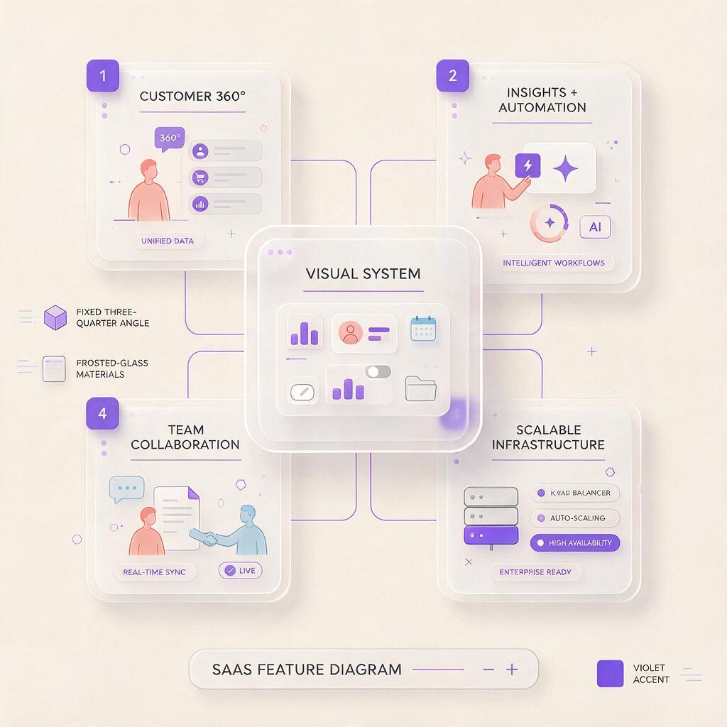
Use a master prompt with replaceable content
A reliable prompt separates the fixed art direction from the feature-specific scene. Start every generation with the same style lock, then replace only the subject, focal action, and supporting objects.
[STYLE LOCK]

FEATURE SCENE:
A central [INTERFACE MODULE] demonstrating [PRODUCT BENEFIT].
Show the action through [VISUAL METAPHOR OR STATE CHANGE].
Include [SUPPORTING OBJECT ONE] and [SUPPORTING OBJECT TWO].
Keep the focal module in the [LEFT / CENTER / RIGHT] portion of the frame.
Reserve calm empty space on the opposite side for landing-page copy.

OUTPUT CONTROL:
Single coherent scene, simple silhouette, clear hierarchy,
limited object count, believable shadows, no readable text,
no extra panels, no unrelated symbols, no busy background.
The phrase “demonstrating faster workflows” is too abstract on its own. Translate the benefit into a visible action: cards moving through a pipeline, duplicate tasks merging into one, or a status indicator changing from pending to complete.
Prompt for the meaning of the UI rather than a literal production interface. You can rebuild exact controls afterward with components from the real design system.
Prompt patterns for common feature stories
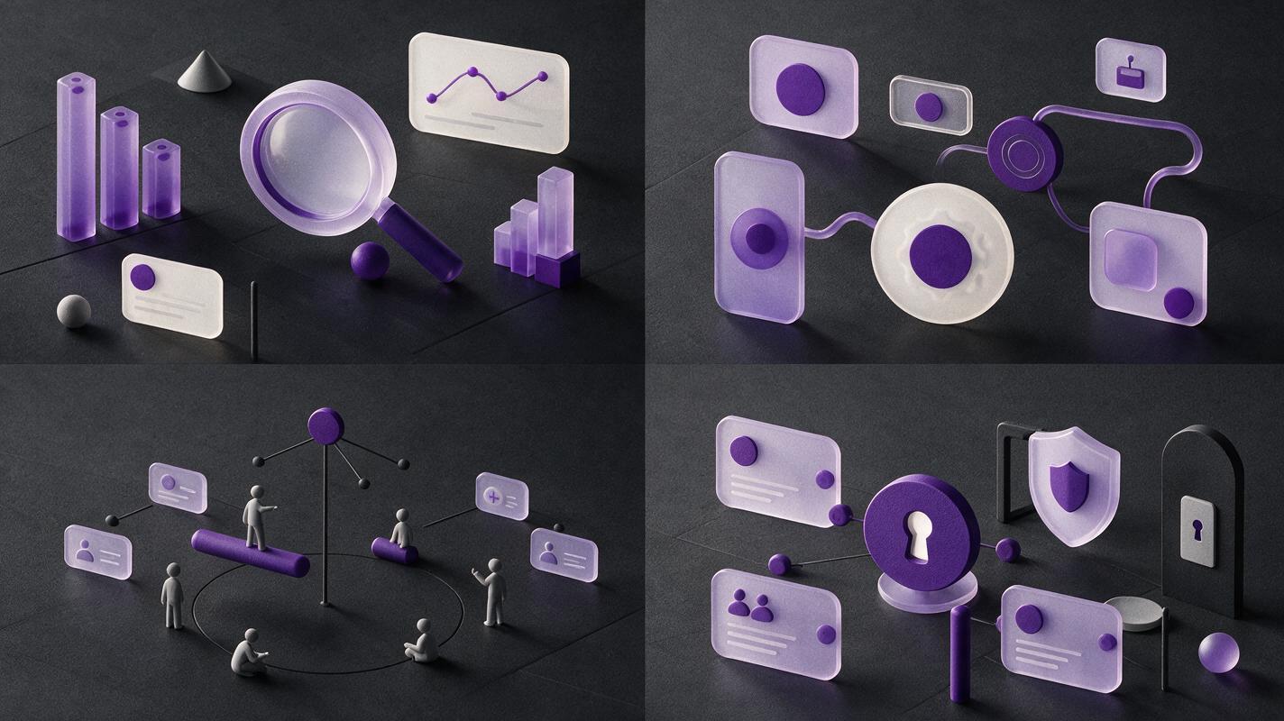
These prompt patterns share one visual language but use different silhouettes and actions. Paste the unchanged style lock above each prompt.
Analytics and reporting
A central translucent analytics module with three raised chart layers,
demonstrating real-time performance monitoring. Show one violet signal
traveling through a compact line chart and resolving into a clear summary tile.
Include two small metric blocks at different depths. Place the composition on
the right, with generous calm space on the left for headline and body copy.
No readable labels, no random numbers, no financial trading imagery.
Avoid asking the model to render a complete dashboard. A compact visual metaphor remains legible when the illustration is reduced inside a feature card.
Workflow automation
A modular workflow rail passing through three clean interface nodes,
demonstrating an automated approval process. Show an incoming task card,
a violet decision node, and one completed output card with a simple check state.
Use a gentle diagonal flow from lower left to upper right. Keep all objects within
one connected system. No robots, gears, conveyor belts, text, or human hands.
Excluding robots and gears prevents a predictable automation cliché. The connected rail explains the feature using product-like objects instead.
Team collaboration
Three interlocking interface cards gathered around one shared project module,
demonstrating coordinated teamwork. Use small colored presence dots and subtle
connection lines to show participation without depicting people. Keep the shared
module dominant and the supporting cards secondary. No speech bubbles, avatars,
readable names, office scene, or scattered decorative icons.
Security and permissions
A protected data module enclosed by two transparent permission layers,
demonstrating role-based access control. Show one approved access path in violet
and one blocked path fading before it reaches the central module. Use precise,
quiet geometry and restrained lighting. No padlock as the main object, no hooded
figures, no warning text, no dramatic cyberpunk effects.
Once one direction fits the page, test this prompt yourself with adjacent feature stories while keeping the style lock untouched.
Control layout for alternating feature rows
Many landing pages alternate copy and imagery from left to right. Do not generate one centered composition and expect every crop to work. Add explicit placement language to each feature prompt:
- Image on the right: place the object cluster in the right two-thirds and keep the left background quiet.
- Image on the left: place the focal module in the left two-thirds, with no floating objects crossing into the right copy area.
- Centered card: use a compact vertical silhouette and equal breathing room around the object.
- Wide showcase: use a shallow horizontal arrangement rather than stretching one object across the canvas.
Generate close to the final container ratio. If the website uses a portrait card, a wide cinematic concept will lose its hierarchy after cropping. Keep critical objects away from edges, especially when responsive layouts may trim the image further.
Fix inconsistency before generating the full set
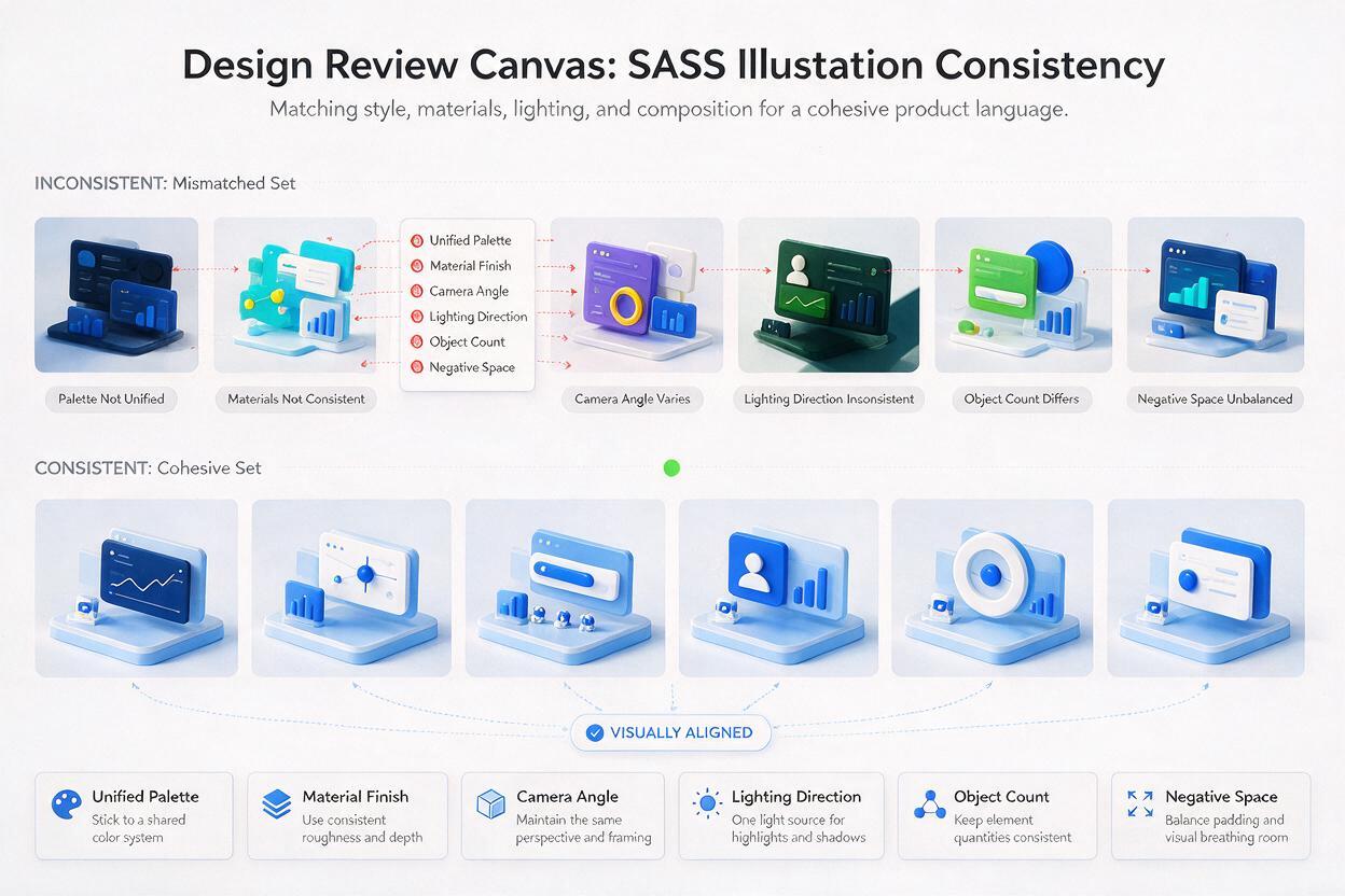
Generate two contrasting features first, such as analytics and security. If they look like members of the same family, continue. If not, identify the drifting property instead of rewriting everything.
| Problem | Likely cause | Prompt correction |
|---|---|---|
| One image looks like a cartoon | Material and lighting language is vague | Repeat the exact material list and soft studio lighting direction |
| Every scene becomes crowded | The prompt requests too many interface elements | Limit the scene to one focal module and two supporting objects |
| Feature images feel repetitive | The same silhouette is reused | Change the structural metaphor while preserving camera and materials |
| Colors drift between sections | New color adjectives appear in each prompt | Lock the palette and permit only one semantic status color |
| Text-like marks create noise | The scene asks for detailed dashboards | Request blank label areas and replace typography during compositing |
| Objects float without weight | Contact and shadow cues are missing | Add a shared studio surface, contact shadows, and consistent light direction |
Compare the images at their actual website size, not only at full resolution. Fine detail that looks impressive in a large preview may turn into visual noise inside a 480-pixel feature panel.
Finish the illustrations inside the design system
Treat the generated result as a visual foundation rather than a finished screenshot. In Figma or your preferred design tool, place authentic interface elements over the areas that need accuracy.
- Replace generated labels with real typography and localization-ready text.
- Redraw brand icons instead of attempting to repair distorted symbols.
- Match corner radii and shadows to the website component library.
- Use masks or gradient fades to integrate the illustration with the page background.
- Check contrast in both light and dark sections of the landing page.
- Export at sufficient density for responsive displays, then compress the final asset.
If a generated panel is visually strong but contains unusable details, cover it with a clean component rather than regenerating the entire scene. This hybrid method preserves the expressive lighting and dimensional composition while restoring interface credibility.
Final checklist
- The same camera angle, palette, materials, and light direction appear across the set.
- Each illustration communicates one feature benefit through a visible action.
- Every scene has one focal module and limited supporting detail.
- Compositions fit their final left, right, centered, or wide containers.
- No generated text, logo, metric, or icon is treated as final UI.
- The illustrations remain clear at their actual landing-page size.
- Accurate interface details are added from the real design system.
Keywords
Seedream 4.5, SaaS feature illustrations, landing-page visuals, UI illustrations, website illustration prompts, interface showcase, AI image generator