Seedream 4.5 Prompts for YouTube Thumbnail Backgrounds With Text Space
Create YouTube thumbnail backgrounds that leave a clear place for your headline instead of fighting it. These Seedream 4.5 prompts cover object-led, comparison, and mystery concepts, with practical checks for small-screen readability.
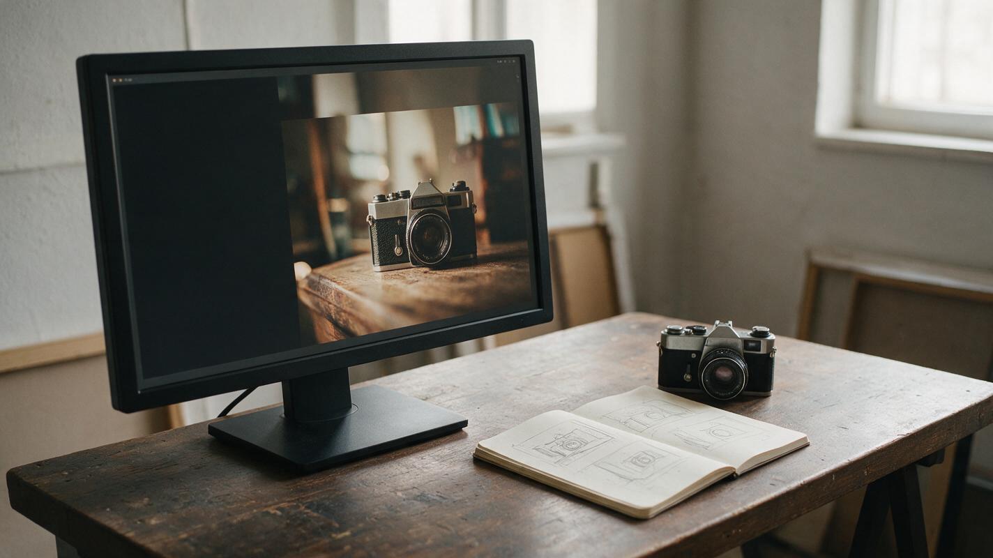
Table of contents
Make the background work around the headline
A striking image can still make a poor YouTube thumbnail if every corner is busy. Your headline ends up covering the subject, or the subject shrinks until it is unreadable on a phone. For faceless channels, the fix is to generate the background with a reserved text area from the start—not to hunt for an empty patch afterward.
The Seedream 4.5 prompts below are for thumbnail backgrounds, not finished thumbnails. Generate the image, choose the strongest composition, and add the actual headline in your editor. That keeps your typography editable and makes it easier to maintain a consistent channel style.
Give Seedream 4.5 a layout, not just a subject
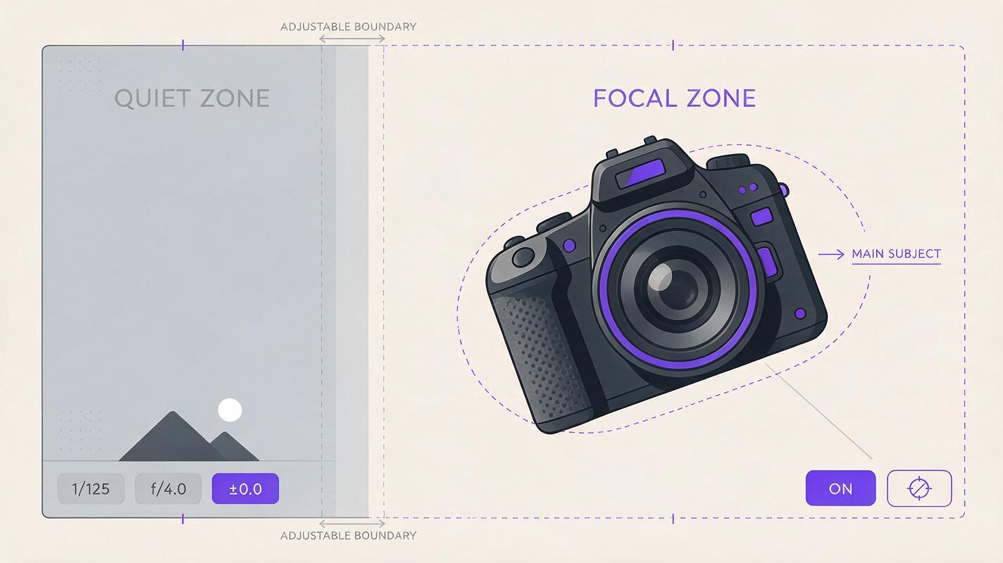
A request such as “dramatic image of an old camera” specifies what to draw but not where anything should go. A useful thumbnail prompt also states the canvas shape, the subject’s position, the quiet area’s location, and the detail that should survive at small size.
For these examples, use your ai image generator to make a wide thumbnail background. If aspect-ratio controls are available, select 16:9. Keep headline lettering out of the generation prompt; describe a clean area for text instead. Text-area directions are compositional requests, not guarantees, so inspect each result before editing.
Reusable layout line: “Wide 16:9 composition. One clear focal subject occupies the right third. Keep the left third visually quiet, with low-detail background and enough contrast for a short headline. No words, letters, logos, borders, or interface elements.”
Reverse “left” and “right” when your channel’s headline template calls for the opposite arrangement. Keep that choice consistent across a series so returning viewers can recognize your thumbnails quickly.
Object-led prompt: show what the video is about
Use an object-led background when the topic has a recognizable physical anchor: a microphone for an audio guide, a notebook for a planning video, or a damaged prop for a restoration story. Choose one anchor rather than filling the frame with related items.
Photorealistic editorial image for a YouTube thumbnail about restoring a vintage camera. A single worn film camera on a workbench occupies the right third, viewed close enough that its scratched metal body is recognizable at small size. Soft side light reveals texture. The left third is a simple, darker workshop wall with very low detail and clear space for a short headline. Wide 16:9 composition, strong subject-background separation, no person, no text, no logo, no extra cameras.The scratched camera signals the premise without pretending to document a specific restoration. If your video concerns a real item, use your own photograph instead when viewers need to see that exact item. A generated background should not imply that an invented object is the one shown or tested in the video.
For a softer look, replace the workshop wall with a plain tabletop or curtain. Do not add more tools until you have checked whether the camera itself reads at phone size.
Comparison prompt: reserve two distinct zones
Comparison videos often invite a cluttered “before versus after” thumbnail. The clearer alternative is to give each side a job: one large visual difference, a stable divider, and space for a brief label or headline. The prompt should define the contrast without asking Seedream 4.5 to invent performance results.
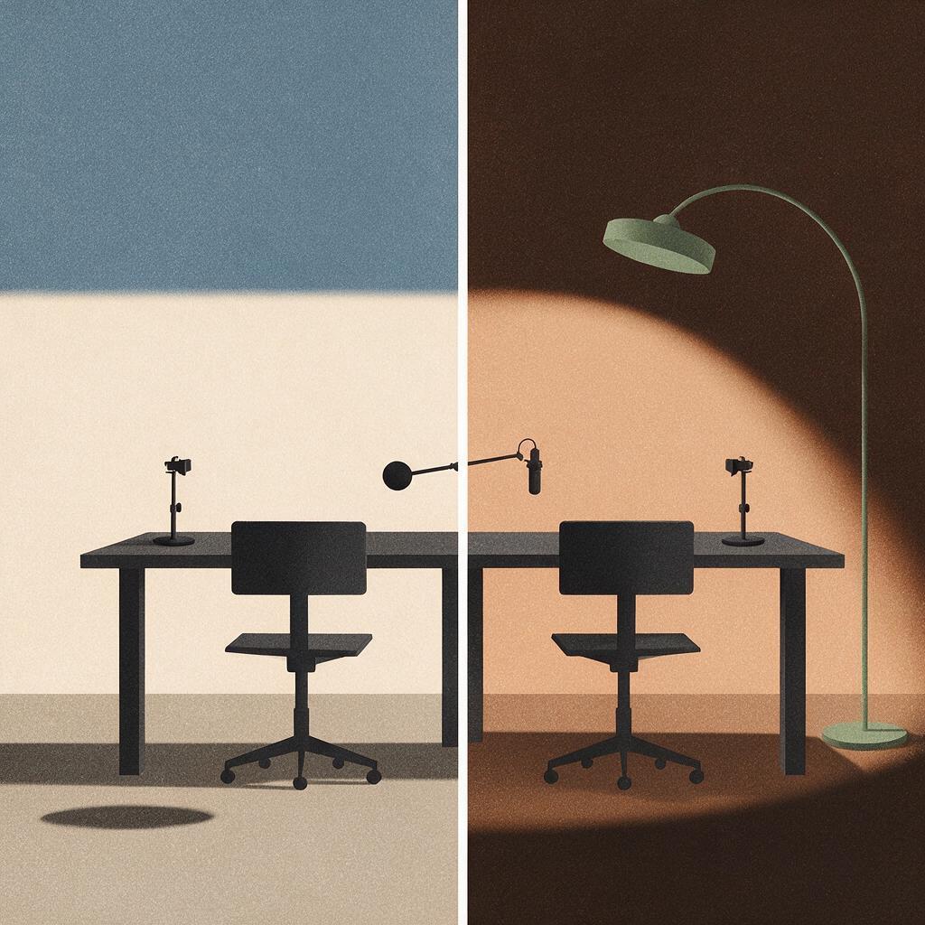
Editorial thumbnail background illustrating a comparison of two desk-lighting setups for video recording. A simple desk scene split into two equal visual zones: left side lit by flat overhead room light, right side lit by a soft lamp placed to the side. Keep the same empty chair, desk, and camera position in both zones so the lighting difference is immediately visible. Strong clean vertical separation, no people, no written labels, no logos. Leave an uncluttered band along the upper edge for headline text. Wide 16:9 framing, readable shapes, restrained props.This image illustrates a lighting concept; it is not evidence from a real test. If the video compares equipment you actually used, a side-by-side made from your own footage is more honest and usually more specific. Use the generated concept only when it accurately represents what the video explains.
Before accepting a comparison image, check that the two halves differ in the intended variable. If furniture, camera angle, and props change as well as lighting, the visual argument becomes confusing. Regenerate with a tighter instruction to preserve the scene.
Mystery prompt: create curiosity without inventing proof
Story and explainer channels can use a question-shaped image without claiming to show a real event. The strongest mystery backgrounds usually pair one familiar setting with one unusual, easily spotted detail. They do not need a collage of arrows, circles, and dramatic faces.
Cinematic but clearly illustrative YouTube thumbnail background for a faceless video about a fictional missing-key mystery. A close-up of one small brass key resting beside an open, empty wooden drawer; the key is prominent on the right third and the drawer creates a simple visual question. Warm practical light, dark neutral surroundings, restrained realistic detail. Leave the left third quiet and dark enough for a short headline. Wide 16:9 composition, no person, no text, no symbols, no extra keys.Replace “fictional” with a more appropriate visual brief only if you can support the story’s real-world claims. For historical or documentary topics, avoid generating an image that looks like newly discovered evidence. A caption in the video or description can clarify when a visual is an illustration.
Want to try the approach on your next upload? Test this prompt yourself with your own subject, then compare the result against a thumbnail made from an actual video frame. The better choice is the one that communicates the video truthfully at a glance.
Check the crop before adding type
A background can look balanced at full resolution yet fail in YouTube’s smaller placements. Put the candidate into your thumbnail editor, scale it down, and view it at roughly the size of a thumbnail in a mobile feed. Add a temporary headline in your usual font before deciding whether the composition works.
| If you notice… | Change the prompt or edit |
|---|---|
| The headline covers the subject | Move the focal subject farther into the opposite third and request a simpler text zone. |
| The image looks like a pile of small objects | Specify one dominant object and remove background props. |
| The text area lacks contrast | Request a darker or lighter low-detail surface behind the intended headline. |
| The subject disappears on a phone | Ask for a closer crop and a simpler silhouette, or crop the existing image tighter. |
| The image promises something the video does not show | Change the concept or use a truthful frame from the video. |
Keep the headline short enough to complement the image rather than explain it. After adding type, compare several candidates at the same small size. Pick the version whose subject and premise remain clear—not necessarily the most detailed generation.
Final checklist
- The subject is recognizable at mobile thumbnail size.
- The headline has a deliberately quiet, high-contrast area.
- There is one focal idea, not a collection of competing props.
- Any comparison changes the intended variable without suggesting untested results.
- The finished thumbnail represents what the video actually contains.
Keywords
seedream 4.5 thumbnail prompts, youtube thumbnail backgrounds, thumbnail text space, ai thumbnail concepts, faceless youtube thumbnails, thumbnail composition