Shopify Collection Thumbnails That Match Without Changing the Products
A Shopify collection can look uneven when product photos have different crops, lighting, and backgrounds. This guide shows how to build a consistent thumbnail system using the real product in every image and AI-generated backgrounds only where they help.
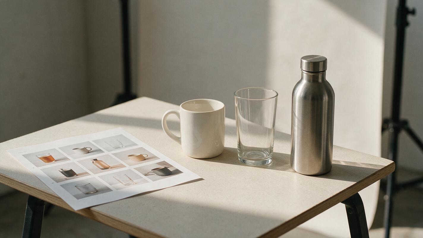
Table of contents
Why the collection grid looks uneven
A collection page can look disjointed even when every product photo looks good on its own. One item fills its thumbnail, another sits far away, and a third has a dark background that makes the whole row feel unbalanced. The fix is not to generate matching-looking products. It is to give photographs of the actual products a shared frame, scale rule, and background treatment.
This matters most when you sell a mixed catalog: perhaps ceramic mugs, glass tumblers, and insulated bottles in one drinkware collection. Those items should remain visibly different. Their thumbnails should simply feel as though they belong in the same shop.
Set a frame that works for the whole collection
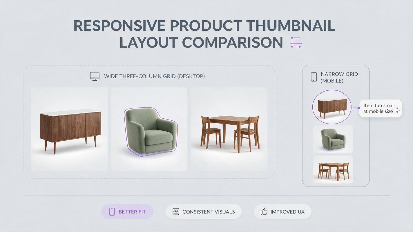
Before editing individual images, inspect the collection page in your Shopify theme. Note the thumbnail shape, where names or badges appear, and how the grid looks on a phone. Use that displayed shape as your working canvas; do not assume that a square export will display as a square everywhere.
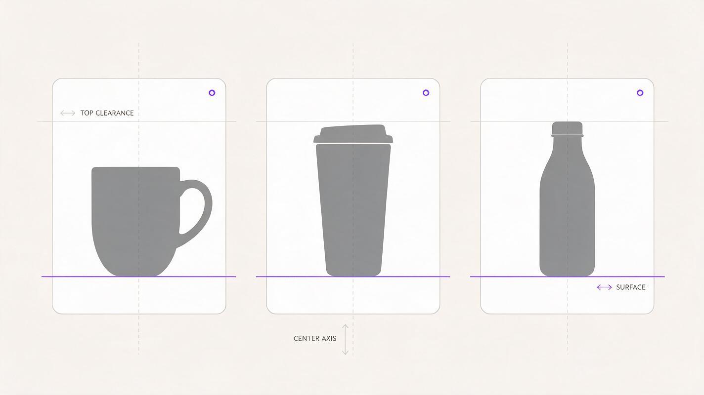
Choose a consistent visual rule rather than forcing every object to occupy identical pixels. For example, keep each product centered on the same vertical axis, leave a similar amount of space above it, and align the surface beneath it. A tall bottle and a wide mug will need different apparent widths to feel equally prominent.
| Keep consistent | Allow to vary |
|---|---|
| Canvas ratio, background palette, lighting direction, and bottom margin | Product shape and the space its silhouette needs |
| Approximate visual prominence at thumbnail size | Camera angle when a different angle is needed to identify the item |
| Softness and direction of contact shadows | Real differences in material, color, and finish |
Make a contact sheet of several candidate thumbnails at the size shoppers will actually see. A layout that looks meticulous at full resolution may still have one item that disappears in the grid.
Choose product photos you can safely match
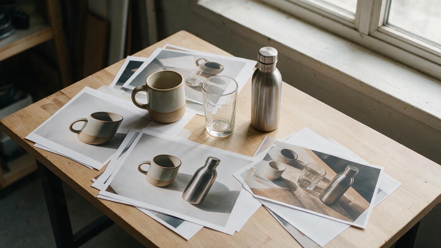
Start with a genuine photograph for each SKU. Select images with a comparable viewpoint and enough resolution to crop without cutting off handles, straps, lids, or other identifying features. If one product was photographed from above and the rest from the front, consider reshooting it rather than asking AI to invent an unseen side.
Keep a clean copy of each source file. Record which SKU it represents, especially if similar products differ by size or finish. For sets, photograph the exact components sold together; a matching background must not make separate accessories appear included.
Useful boundary: Edit the setting to make the catalog cohesive. Do not redraw a product to make it match the setting.
Generate one background system, not a new scene for every SKU
Seedream 4.5 is an option for exploring neutral, product-free settings. Use an ai image generator to make a background plate with an empty placement area, then composite the verified product photograph over it in an editor. This gives you a consistent setting without asking the model to reproduce labels, hardware, or packaging.
For the drinkware example, begin with a quiet tabletop and a softly lit wall. Generate a few variations, choose one that works behind both light and dark products, and reuse that plate across the collection. If a single background makes a white mug vanish, create a closely related lighter or darker version while keeping the same perspective and light direction.
Create a product-free background for a Shopify drinkware collection thumbnail: warm off-white wall, pale stone tabletop, soft daylight arriving from the upper left, subtle natural surface texture, straight horizontal surface line, generous clear space in the center for a photographed product. No cups, bottles, packaging, lettering, logos, hands, or decorative props. Keep the lighting and camera angle suitable for reuse across multiple product photographs.Check the generated plate for distracting edges or shadows where the product will sit. A background that already contains a strong object-shaped shadow can make the composited item appear to float or have two light sources.
Place each real product at a comparable visual weight
Remove the original background carefully, retaining genuine fine details such as handles and transparent edges. Place the cutout on your chosen plate without stretching it. Adjust its position using the same guide lines for every thumbnail: center axis, approximate top clearance, and surface contact point.
Judge scale by the visible object, not only by the dimensions of its image file. A slender bottle may need to be taller in the frame than a broad mug to carry similar visual weight. That is a composition choice, not a claim that the products are the same physical size. If relative dimensions matter to buyers, provide measurements elsewhere in the listing rather than relying on the grid to communicate them.
Add a restrained contact shadow only if the source photo and background light support it. Match the shadow's direction and softness across the set. Keep the original product colors and printed details intact; do not use generative fill over labels, artwork, or distinctive surfaces.
Review the grid as a shopper would
Export a small test batch and view it together in the actual theme before processing the full catalog. Check both desktop and mobile. Look for products that feel disproportionately small, backgrounds that shift color from tile to tile, cutout halos, and shadows that suddenly change direction.
Also check each thumbnail against its product page. The collection image should lead to the pictured SKU, color, and included components. If a shopper could reasonably mistake a styling prop for an included item, remove the prop or use the simpler background.
When the first batch works, save the canvas dimensions, alignment guides, chosen background plates, and export settings as a reusable template. New SKUs can then enter the grid without requiring you to redesign the collection every time.
Final checklist
- Every thumbnail shows a photograph of the correct, actual product.
- Canvas shape, lighting direction, and background palette are consistent.
- Products have comparable visual prominence without misleading size claims.
- Edges, contact shadows, colors, and labels survive inspection at full size.
- The complete grid works on both desktop and mobile.
Have a few product photos ready? test this prompt yourself to explore an empty background, then place your verified product cutouts into the result.
Keywords
Shopify collection images, product thumbnails, AI product photography, product photo background, Shopify product images, Seedream 4.5, product image consistency