Shopify Color Variant Images That Match the Product You Ship
AI can make a Shopify catalog look consistent, but a convincing color variant is not necessarily an accurate one. This guide shows sellers how to use Nano Banana Pro for presentation concepts while grounding every sellable variant image in a real product reference.
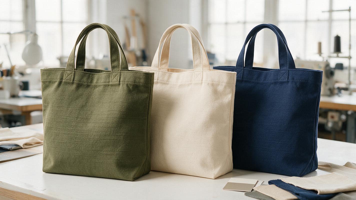
Table of contents
Make the variants consistent without making up the colors
A tidy row of Shopify variant thumbnails helps shoppers choose a color. The problem is that an AI-generated navy, sage, or cream can look plausible while differing from the item you ship. The safest approach is to photograph each real variant, then use AI to explore a consistent presentation—not to decide what an unphotographed product looks like.
That distinction matters most for fabric, leather, ceramics, and other materials whose appearance changes with lighting and texture. Here is a practical way to build a coherent variant gallery while keeping the actual product as the source of truth.
Decide what the image must prove
A variant image answers a specific shopping question: “If I select this option, what will I receive?” Treat it differently from a campaign image. A lifestyle scene may establish a mood; the image attached to a color selector should let the buyer distinguish the available items.
| Asset | Useful purpose | Source of product color |
|---|---|---|
| Variant thumbnail | Identify the selected option quickly | Photo of that physical variant |
| Detail image | Show texture, trim, and finish | Close-up of that physical variant |
| Lifestyle image | Show context or styling | Real variant reference, checked against the item |
| AI color concept | Plan a shoot or preview a proposed option internally | Not suitable as evidence of an unverified product |
If you have photographed only a black bag, a generated tan bag is a concept until you can compare it with the tan bag you sell. A supplier's color name or a small digital swatch is not enough to establish the appearance of its stitching, grain, edge paint, or hardware.
Capture a trustworthy reference for every sellable color
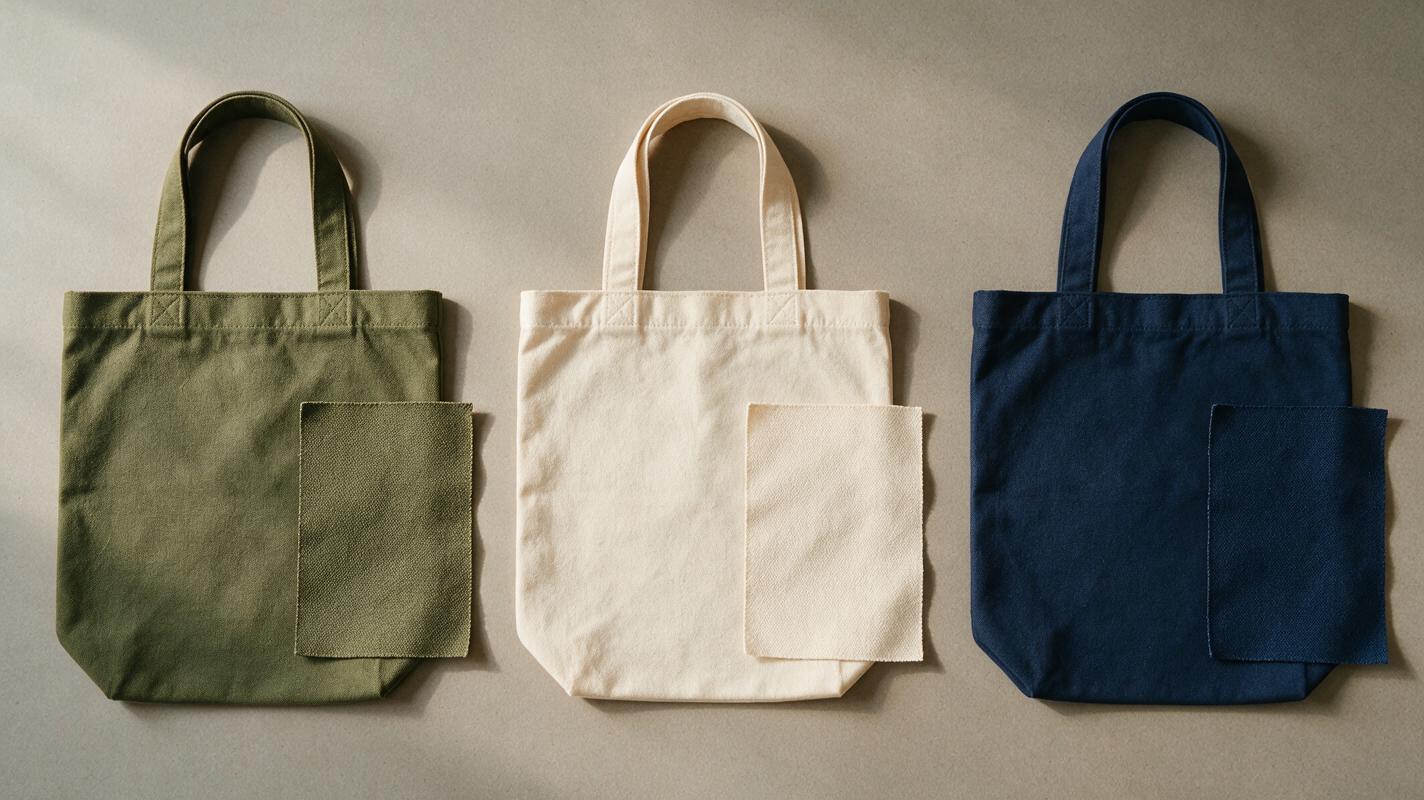
You do not need a full studio shoot for each SKU, but you do need a usable record of each physical variant. Place the product in soft, consistent light, avoid mixed warm and cool bulbs, and photograph the same angle at roughly the same distance. Capture a close-up wherever texture or finish helps distinguish two colors.
Keep a small neutral reference card in one frame of each shooting session if you have one. It can help you correct an overall color cast later; it does not make a phone screen or an AI output perfectly color-accurate. Check the product itself under ordinary viewing light before approving the final files.
- Match the visible product: Photograph the actual material, trim, label, and hardware for each option.
- Hold the setup steady: Use the same surface, lighting arrangement, orientation, and crop.
- Record meaningful differences: A cream canvas may have darker seams; a dyed leather may show variation across panels.
- Keep originals: Save the unedited source alongside each exported variant image for later comparison.
Use Nano Banana Pro to explore the gallery look
Nano Banana Pro is useful for testing how a product might sit within a consistent visual treatment. For example, you can use an ai image generator to explore a neutral shelf composition or a seasonal editorial layout before spending time producing the final assets. Keep those experiments separate from the product photographs used to verify the listing.
For a presentation test, supply a real product photo as the reference and ask for changes around the item rather than a new interpretation of it. A prompt should name both the desired change and the features that must remain untouched:
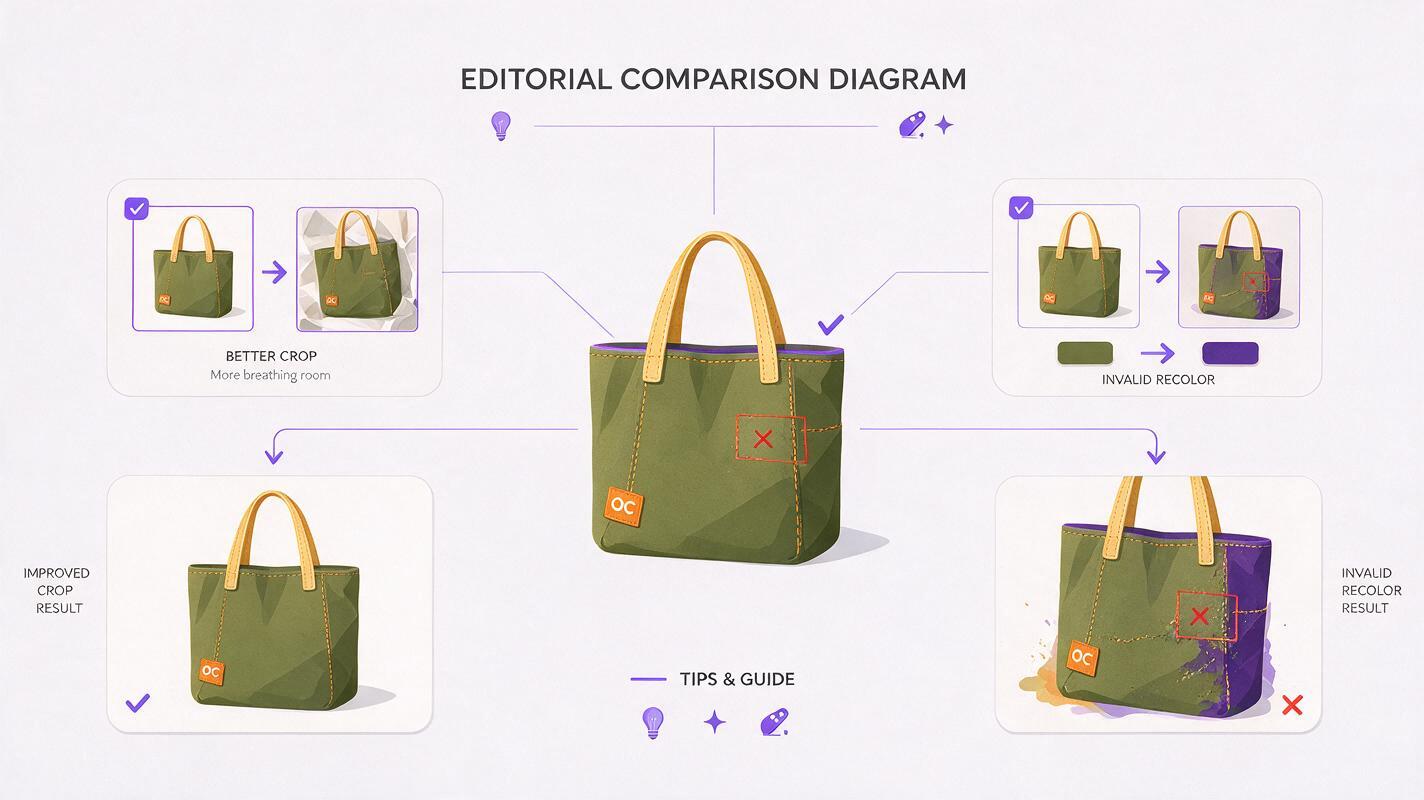
Use the supplied photograph of the actual olive canvas tote as the product reference. Create a clean Shopify gallery composition with soft daylight, a warm off-white setting, and space around the bag for a square crop. Preserve the tote's real silhouette, olive fabric color, weave, seams, handles, stitching, label, and hardware. Do not recolor the bag, invent details, add text, or change its proportions.This is a direction for generation, not a guarantee of preservation. Inspect the result beside the source. If the model redraws the tote or subtly changes its material, use the result as layout inspiration and build the final image from the original product photograph instead.
Practical rule: If the accuracy of a variant depends on a detail the model had to invent, do not use that output as the shopper's evidence of the product.
Build consistency around the product, not through it
Most catalog inconsistency can be fixed without generating a replacement item. Align the crop, product size within the frame, horizon, exposure, and surrounding space. Apply similar lighting corrections to the photographs, but do not force every material toward the same brightness. A deep burgundy item may naturally retain more shadow than a pale beige one.
When editing, work from the photographed variant associated with that SKU. Keep the product area protected if you change a setting or expand a canvas. Then compare three views: the original photo, the edited export, and the physical item. Look especially at color boundaries, reflected light, fine texture, and any small branding.
If a variant is not yet available to photograph, you can still create internal concepts and plan the gallery. Wait for a real sample before presenting a generated colorway as a faithful product image. Test this prompt yourself on a photographed variant first, where you can assess what the model actually changed.
Check the images where shoppers will see them
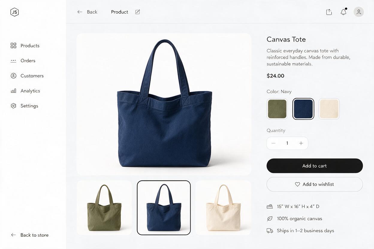
Export a consistent aspect ratio and preview the gallery on both desktop and mobile. A difference that is obvious in a large image can disappear in a small selector thumbnail. Conversely, two images with slightly different crops can make identical-size products appear to be different sizes.
Open each option in your storefront and verify that the selected color displays its corresponding photograph, not a generic image from another variant. Check the first gallery image, thumbnail, detail views, and any promotional image that accompanies the option. Use clear variant names; do not expect shoppers to infer the distinction between “sand” and “oat” from a heavily styled photograph.
Finally, ask someone unfamiliar with the catalog to match each thumbnail to the physical sample. If they cannot reliably distinguish the options, improve the reference photos or add an honest detail view. More generation is unlikely to solve a missing visual difference.
Final checklist
- Each sellable color has a photograph of its actual product or sample.
- AI-generated concepts are not presented as proof of an unverified variant.
- Shape, texture, stitching, trim, labels, and hardware match the photographed item.
- Crop and spacing are consistent without artificially equalizing product color.
- Each Shopify option opens the correct images on desktop and mobile.
- Final exports have been compared with source photos and physical samples.
Keywords
shopify color variant images, ai product photography, product listing images, nano banana pro, product photo editing, shopify product images, color accurate product photos